The network for creativity
Join 1.25M professional creatives like you
Connect with clients, get discovered, and run your business 100% commission-free
Creatives on Contra have earned over $150M and we are just getting started
Back to feedPost
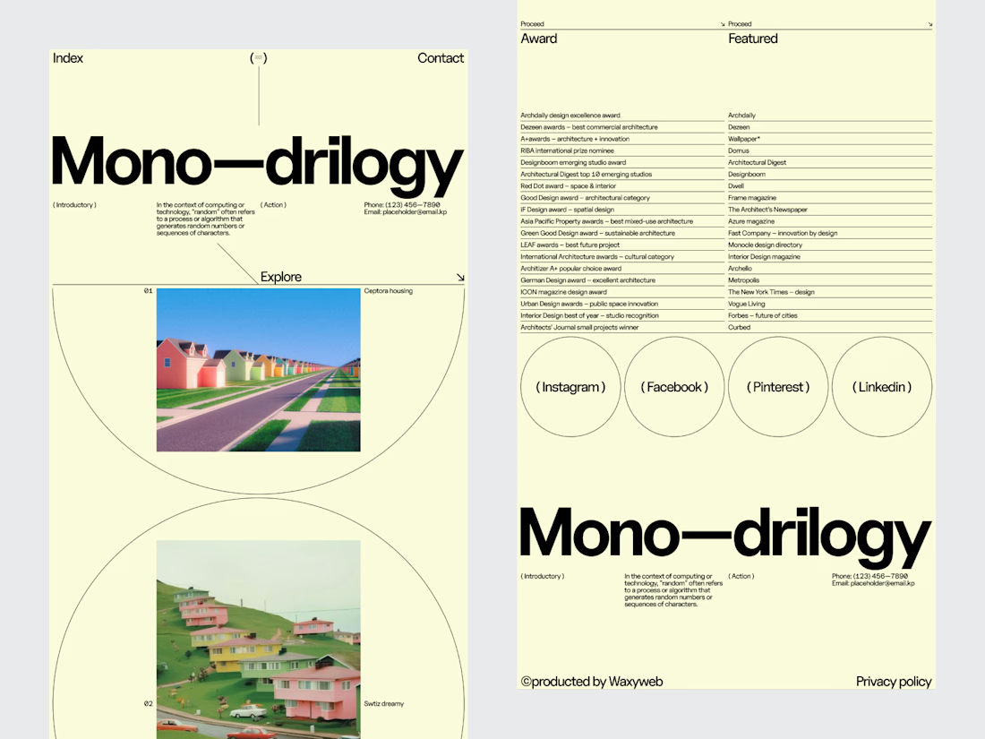
An architecture studio's website shouldn't compete with its projects.
It should give them the right environment to be seen.
For this editorial architectural website, we explored a digital experience inspired by the visual language of architecture publications.
Large-scale photography creates the first impression. Typography establishes the tone. Generous spacing keeps the interface calm, while restrained navigation makes the portfolio easy to explore.
The design deliberately avoids filling every space with information.
Instead, each project gets room to communicate through imagery, composition and editorial pacing.
Services: Architecture Website Design · UI/UX Design · Editorial Web Design · Architectural Portfolio Design · Web Development
The goal was to create a website that feels like an extension of the studio's creative thinking quiet, confident and focused on the work.
Designed by WaxyWeb.


Love it ❤️

Awesome 👍
The network for creativity
Join 1.25M professional creatives like you
Connect with clients, get discovered, and run your business 100% commission-free
Creatives on Contra have earned over $150M and we are just getting started
Trending
retrofuturism
Share your favorite designs from the past exploring the distant future. Or your own take on the aesthetic 🚀
halftone
Dots. Texture. Grain. Let's see your designs using the halftone technique.

Midjourney
Creatives are showing off what they're making with Midjourney.
colorgrade
Video editors sound off: How do you enhance the mood of your video in color grading?
Challenges
View all


Related posts

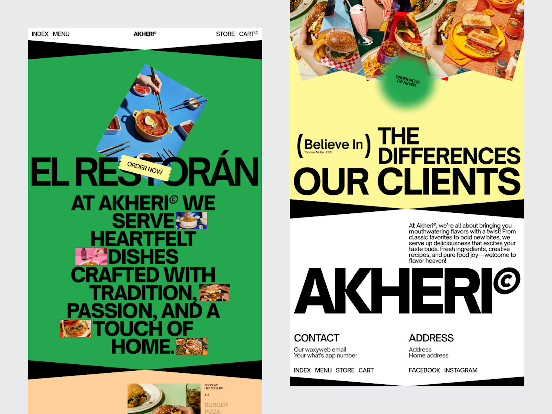
A restaurant website isn't simply a digital menu.
It's often the first place a potential guest experiences the brand.
For this restaurant website design, we created a digital experience that balances visual storytelling with practical usability.
The design uses strong imagery and a considered typography system to establish the restaurant's atmosphere, while the page structure keeps essential information easy to access.
Menu. Location. Opening hours. Reservations.
Everything has a clear place in the experience.
The responsive layout was also designed with mobile visitors in mind, where many restaurant searches and booking decisions happen.
Services: Restaurant Website Design · UI/UX Design · Responsive Web Design · Web Development · Hospitality Design · Brand Experience
The goal was simple: create a website that makes the restaurant feel worth visiting and makes taking the next step effortless.
Designed by WaxyWeb.

I like how the information architecture stays calm: strong imagery sets the mood, while the clear menu and reservation paths keep the experience practical.

I'm doing some A/B testing on a hero and would like some extra eyes and thoughts.
Please and thanks. 🙏🏾
14 voted
42%

19 voted
58%

33 votes
Closed

I like the warmth and flow of option 2.

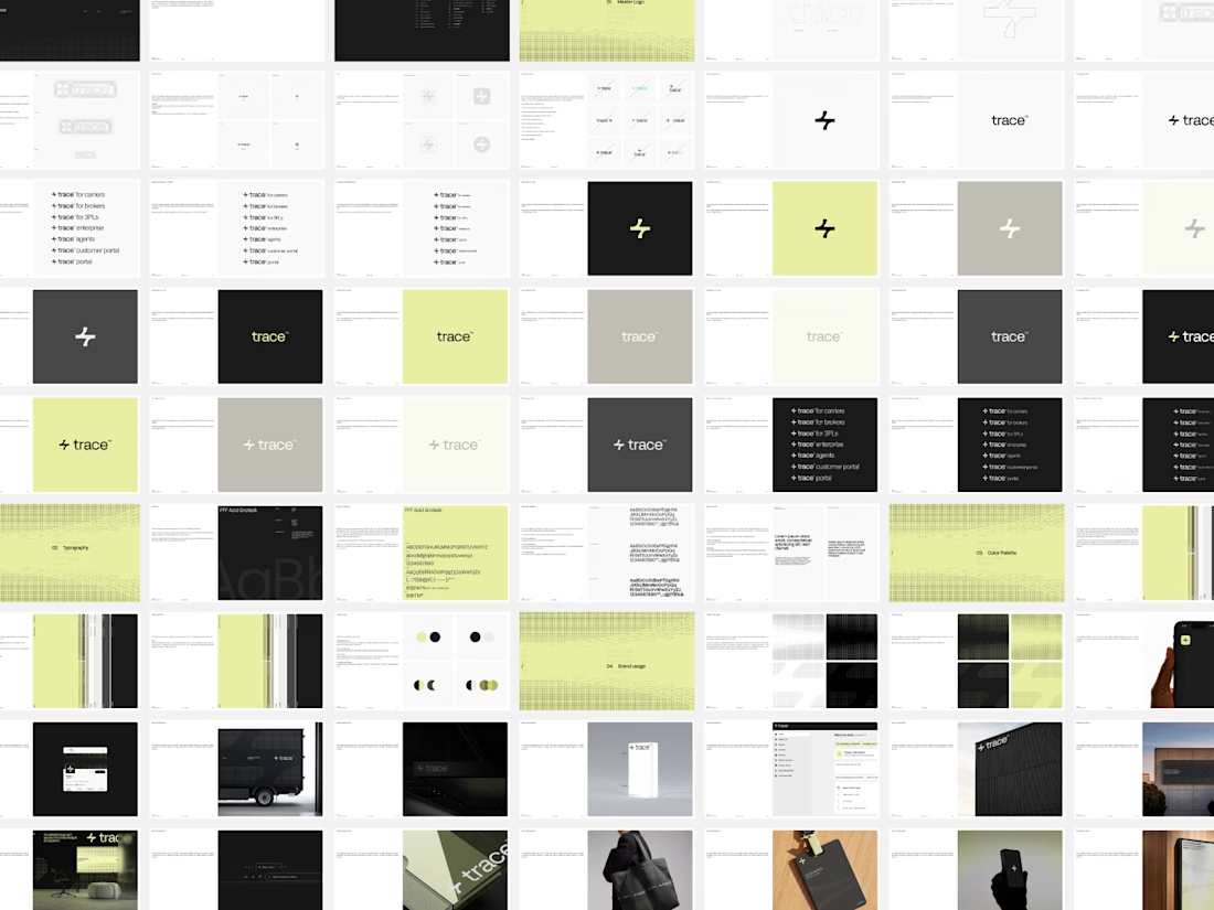
New Brand Guidelines delivered.
While it may seem trivial, this asset remains a key component of our final deliverables for every project. We offer a recommended guide for the proper use of the brand, with various layout options permitted within the visual language. This ensures the brand can expand over time with a truly functional visual system.
We always strive to be as concise as the brand allows, establishing the foundation for its effective use. This empowers the client to make informed decisions and implement each brand element in the ideal scenario with optimal adjustments.



"As concise as the brand allows" is the hard part, because the guidelines that get ignored are almost never the thin ones. Curious whether you pair the PDF with a live component library so the document only has to explain the rules and doesn't also have to enforce them - that split has saved me a lot of pages.