The network for creativity
Join 1.25M professional creatives like you
Connect with clients, get discovered, and run your business 100% commission-free
Creatives on Contra have earned over $150M and we are just getting started
Back to feedPost
Taste Test

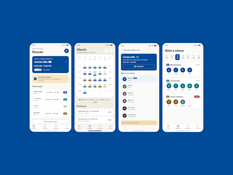
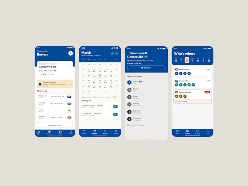
Two directions for the same staff scheduling app concept for Burke Orthodontics. Same core system and information, but a pretty different approach to color, hierarchy, navigation, and how much of the brand shows up in the interface.
I keep going back and forth between the cleaner, lighter direction and the more branded blue version.
Which one are you choosing: A or B?
2 voted
40%
3 voted
60%
5 votes
Closed


branded blue one
The network for creativity
Join 1.25M professional creatives like you
Connect with clients, get discovered, and run your business 100% commission-free
Creatives on Contra have earned over $150M and we are just getting started
Trending
retrofuturism
Share your favorite designs from the past exploring the distant future. Or your own take on the aesthetic 🚀
halftone
Dots. Texture. Grain. Let's see your designs using the halftone technique.

Midjourney
Creatives are showing off what they're making with Midjourney.
colorgrade
Video editors sound off: How do you enhance the mood of your video in color grading?





Related posts

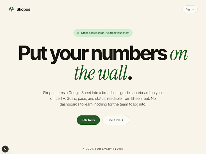
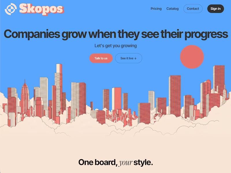
Skopos just went through a rebrand. Skopos is a Dashboard app I offer for companies that want to pay a one-time fee to permanently have their metrics on their displays.
Which one is better?
skopos.cc
4 voted
27%
11 voted
73%
15 votes
Closed

The new one reads way more confident, "put your numbers on the wall" as a headline just sells the product better than the illustration-heavy version did. What was driving the rebrand, was it more about conversion on the landing page or repositioning the product overall?


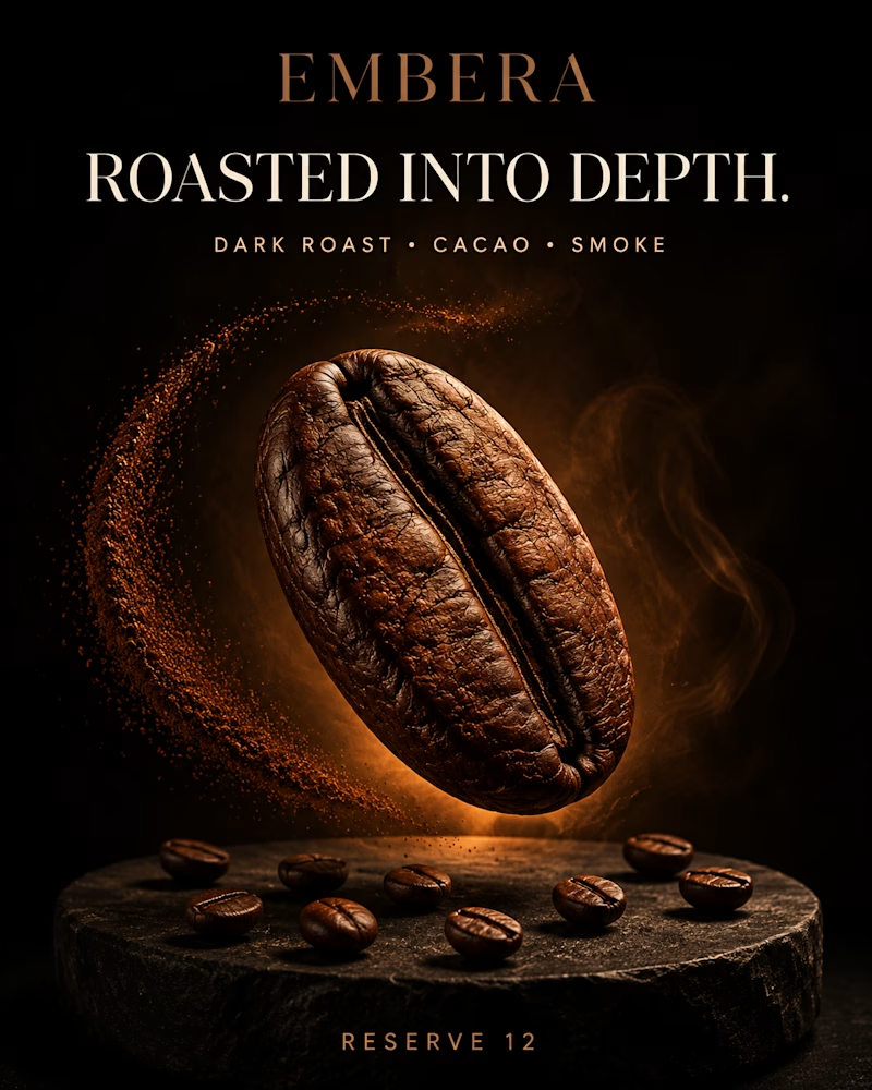
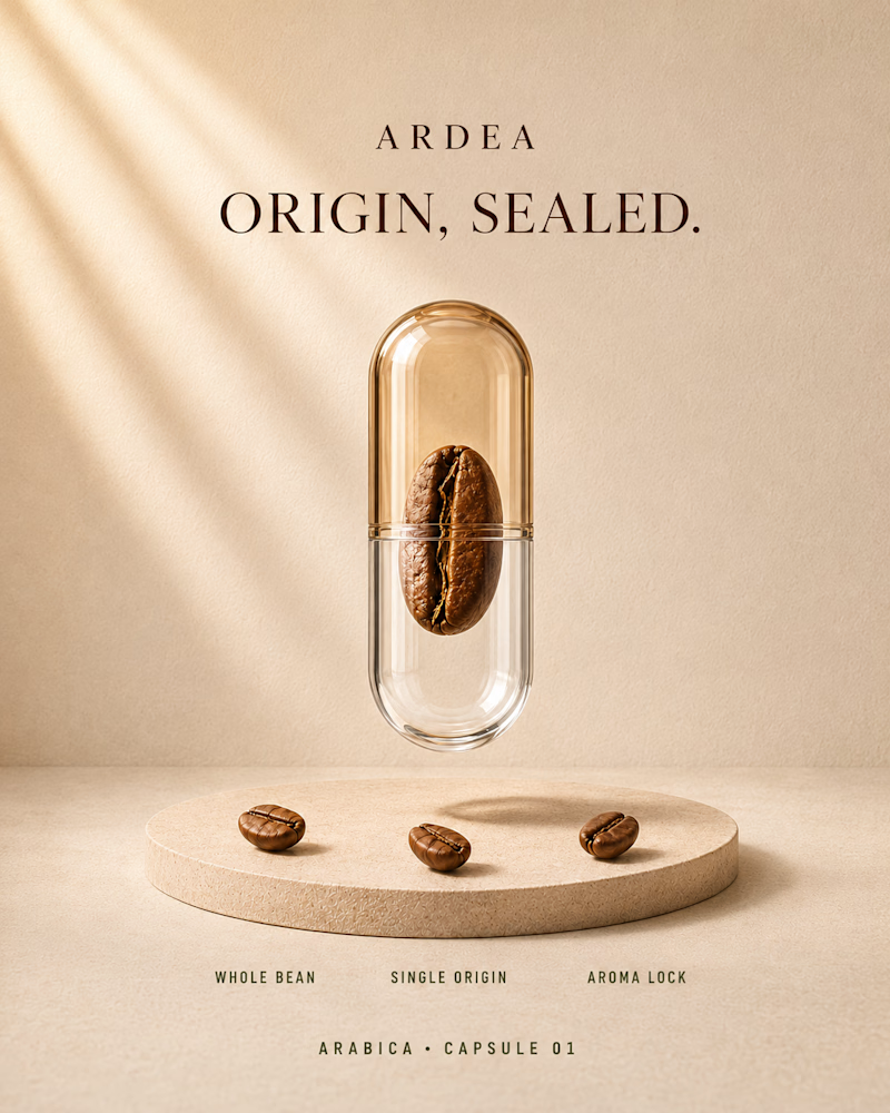
One bean, two ways to make it the hero.
One blows it up in the dark: cracked surface lit like stone, smoke curling past, ground coffee thrown in an arc behind it.
The other seals it inside amber glass and sets it in soft daylight on sand coloured plaster, one bean, three words underneath.
One sells intensity. The other sells preservation. 👇
#brandconcept #coffeebranding #artdirection
2 voted
40%
3 voted
60%
5 votes
Closed
Embera pulls me in, that ground coffee frozen mid-arc sells the intensity angle instantly. If you had to bet, which direction converts better for a premium specialty roaster versus a mass grocery shelf?


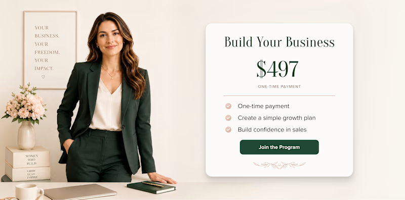
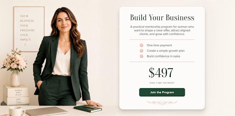
What should come first: the price or the value?
Version 1 presents the price immediately, making the offer transparent and easy to evaluate at a glance.
Version 2 introduces the program and its benefits first, giving users more context before revealing the investment.
One supports clarity and faster decision-making. The other builds interest before asking users to consider the price.
Which approach would make you more likely to explore the offer: seeing the price first or understanding the value first?
27 voted
47%
30 voted
53%
57 votes
Closed
My gut says value first, mostly because $497 cold with zero context reads like a paywall. Have you actually run this as a live A/B on real traffic, or is it more of a design gut-check for now?