The network for creativity
Join 1.25M professional creatives like you
Connect with clients, get discovered, and run your business 100% commission-free
Creatives on Contra have earned over $150M and we are just getting started
Back to feedPost
Taste Test


wonderful!

Right's better! Left has a luxury feel tho

Abby this is stunning! The typography is so elegant and timeless. Love how the name just flows. Your rebrand is looking fire!

I’m sorry but I love both! The boldness of the all caps and the ‘g’ in small caps make it so difficult to pick one 🥲

Hi Abbie! I voted the one on the left (I TRULYYY LOVE it!! Esoecially the g eheh) because, perhaps it's my ocd, idk, but what threw me off about the logotype on the right is the uneven thickness between the e and the rest of the letters. Hope it helps in making your final decision!
Wonderful work either way!

The first one on the left is miles ahead!

I had to pick the left one but the both seems really cool I went with the left cause its minimal and minimal pairs well with bold modern basically anything you pair it with

Right logo feels very sophisticated and established!


Definitely the right one.

Both are quite pretty but there's just something sacramental about that option on the right!

picking the right because of the boldness, main attention RELIGION.

Left

Definitely right one Abby 🙌 A good logo is simple, memorable, and instantly recognizable.
It speaks for the brand even when no words are used. Amazing!

"Right version wins for me because it has more personality. Left leans towards editorial/magazine-y, like it belongs on a fashion cover instead of a design studio. Great work😊

First of all both type selections are BEAUTIFUL! but I will go with Right one because it will be versatile for both print and digital media, also better in terms of scalability...

this was a tough one, but the 2nd won for me!

The boldness stood out immediately.

nice work

one on right have clear and easy to read

They're both beautiful logos💯, but the logo on the right is better in my opinion in terms of readability from a far distance.

First look? - The right one grabs attention right away. Great work though @Abby Rose.

right, both looks so good!

The bold one

Right

HArd to choose, But right for me

Both attract attention, that's good enough. My favorite is the right

The network for creativity
Join 1.25M professional creatives like you
Connect with clients, get discovered, and run your business 100% commission-free
Creatives on Contra have earned over $150M and we are just getting started




Related posts


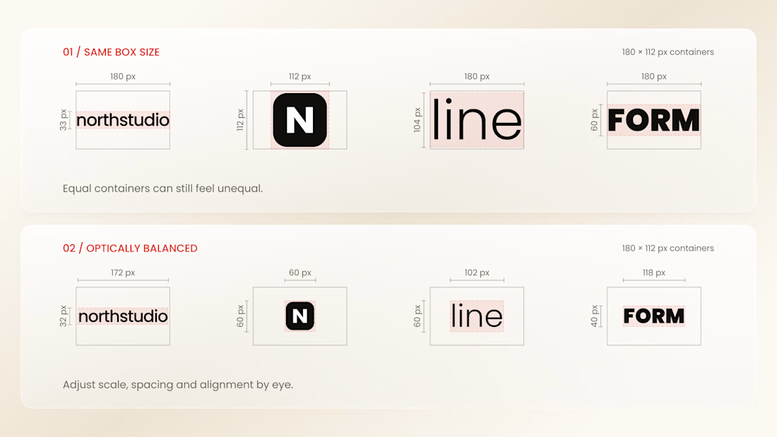
Why do logos look uneven even when they have the same size?
Every logo has a different shape, proportion, and visual weight. A wide wordmark can appear smaller than a compact symbol, while a bold logo may dominate a thinner one - even when their dimensions are technically identical.
That’s why logo sections shouldn’t be aligned by numbers alone.
Adjusting each logo optically, using a consistent visual area, balanced spacing, and a shared baseline helps every brand feel equally represented.
The goal isn’t to make every logo exactly the same size.
It’s to make them feel equally important.
Because visual consistency is based on perception, not just pixels.


Thanks for the information you shared


Has AI taken my job yet? 👀
As a designer, I feel like I constantly need to keep up with new tools and products, if only to keep my "has a computer replaced me already?" anxiety under control
At first, we expected AI to do everything with one click
Then we moved on to writing ridiculously long and detailed prompts
And now I feel like we're finally getting to a healthier place with our expectations: build a good system → get good results
I went to play with Recraft's new Logo Maker to see if AI can actually make decent logos now
Weeeeell, you can see the result for yourself! 🤩
Sure, it's not a magic button that reads your mind and does everything for you. But if you have a clear sense of your brand's style and personality, the results can be surprisingly good
Left - my usual aesthetic. Right - Recraft's take on me
So, what do you think of my one-click logo?
Does it feel like me? 🪩✨


“Build a good system, get good results” is exactly where I’ve landed too. The tool only goes as far as your sense of what you’re after. How many tries did it take to get there?


Great concept and a very strong visual direction.