The network for creativity
Join 1.25M professional creatives like you
Connect with clients, get discovered, and run your business 100% commission-free
Creatives on Contra have earned over $150M and we are just getting started
Back to feedPost
Architecture logos are surprisingly difficult to get right.
Most end up looking the same:
Generic buildings
Generic monograms
Generic skylines
For Spaceborne Architects, I wanted something that felt modern, ambitious, and instantly recognizable.
The three structures represent architectural growth and scale, while the orbital lines introduce a sense of movement, innovation, and the idea of shaping spaces beyond the ordinary.
Simple.
Bold.
Memorable.
What was the first thing you saw when you looked at this logo?


Cool!

Thanks

Nice One
Thank You
The network for creativity
Join 1.25M professional creatives like you
Connect with clients, get discovered, and run your business 100% commission-free
Creatives on Contra have earned over $150M and we are just getting started



Related posts

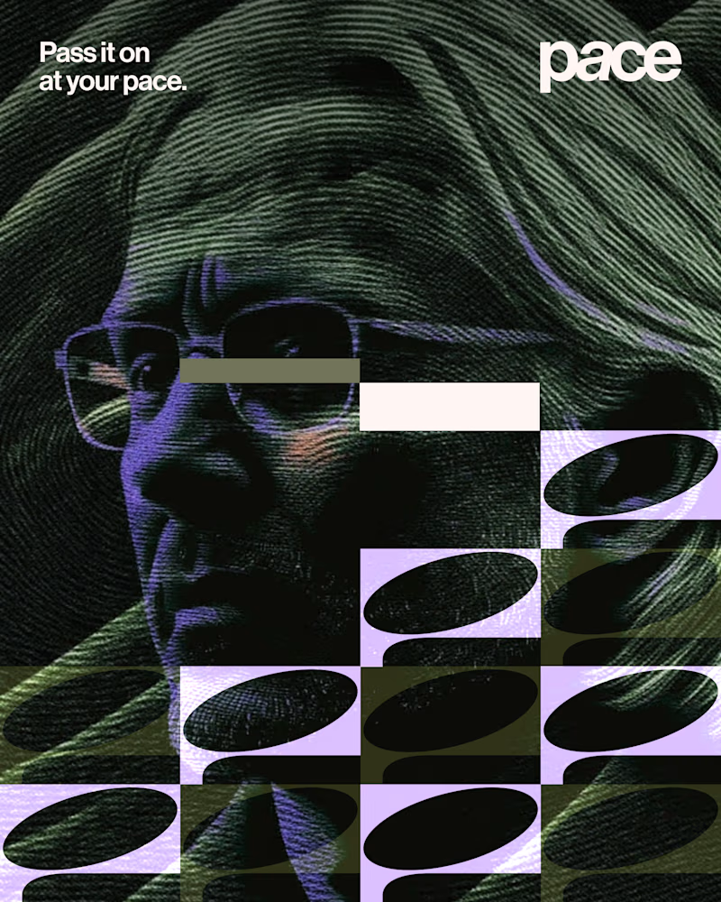
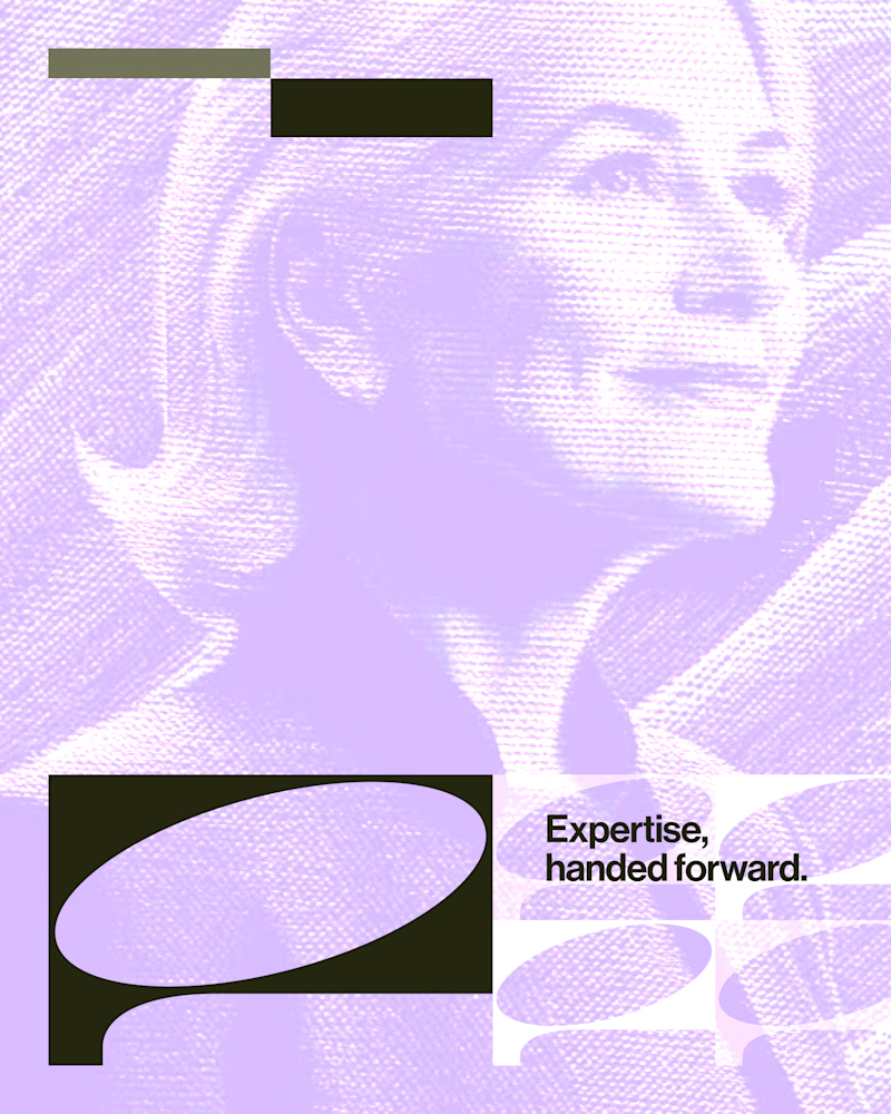
Experimental layouts for Pace. Which one do you like?
23 voted
52%
21 voted
48%
44 votes
Closed

Looks cool.

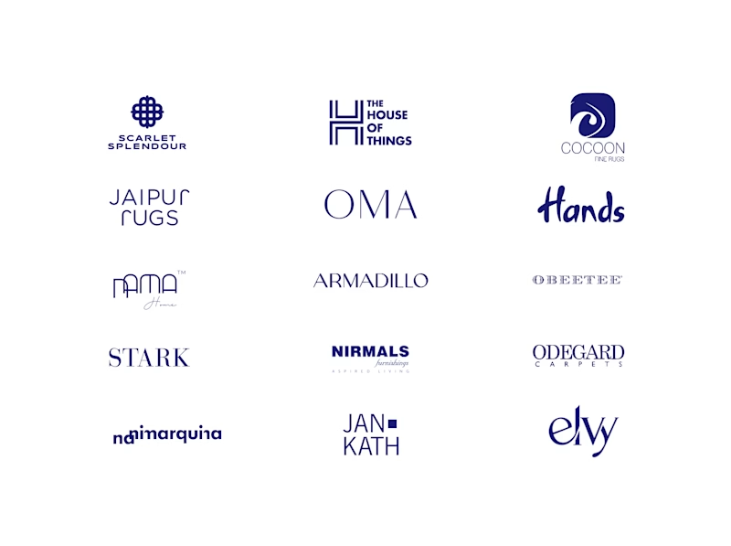
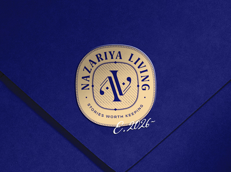
A little look at how Nazariya Living stands apart from its category.
On one side, familiar visual conventions. On the other, an identity with its own character, rooted in stories worth keeping.
We chose not to blend in. :)
Which side catches your eye?


3 voted
30%
7 voted
70%
10 votes
Closed

That side with all the competitor logos in one grid is the slide I'd steal for a client presentation. Nothing explains "why this direction" faster than showing the sea of sameness first. The navy seal wins easily after that.

What do you do with a brand that’s 80% done and nobody asked for it?
I have a whole folder of them.
A name here, a palette there, a few campaigns that never saw daylight.
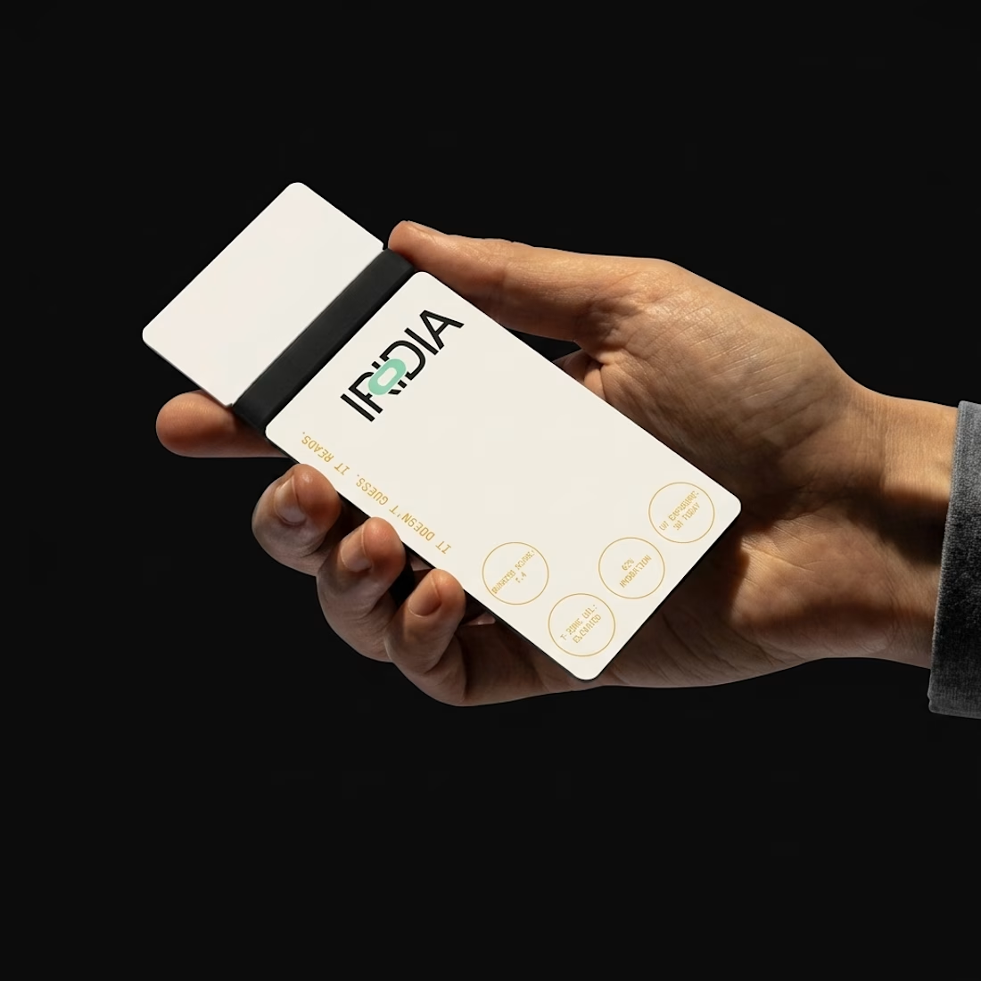
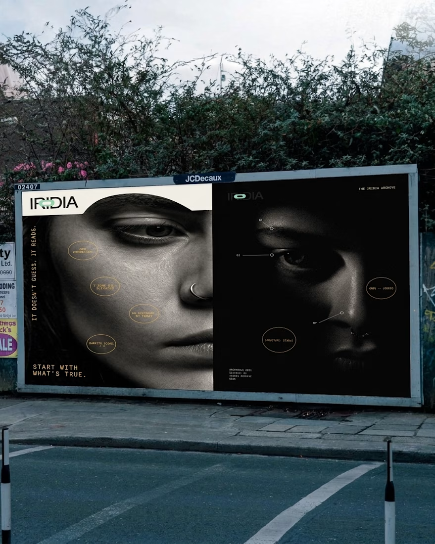
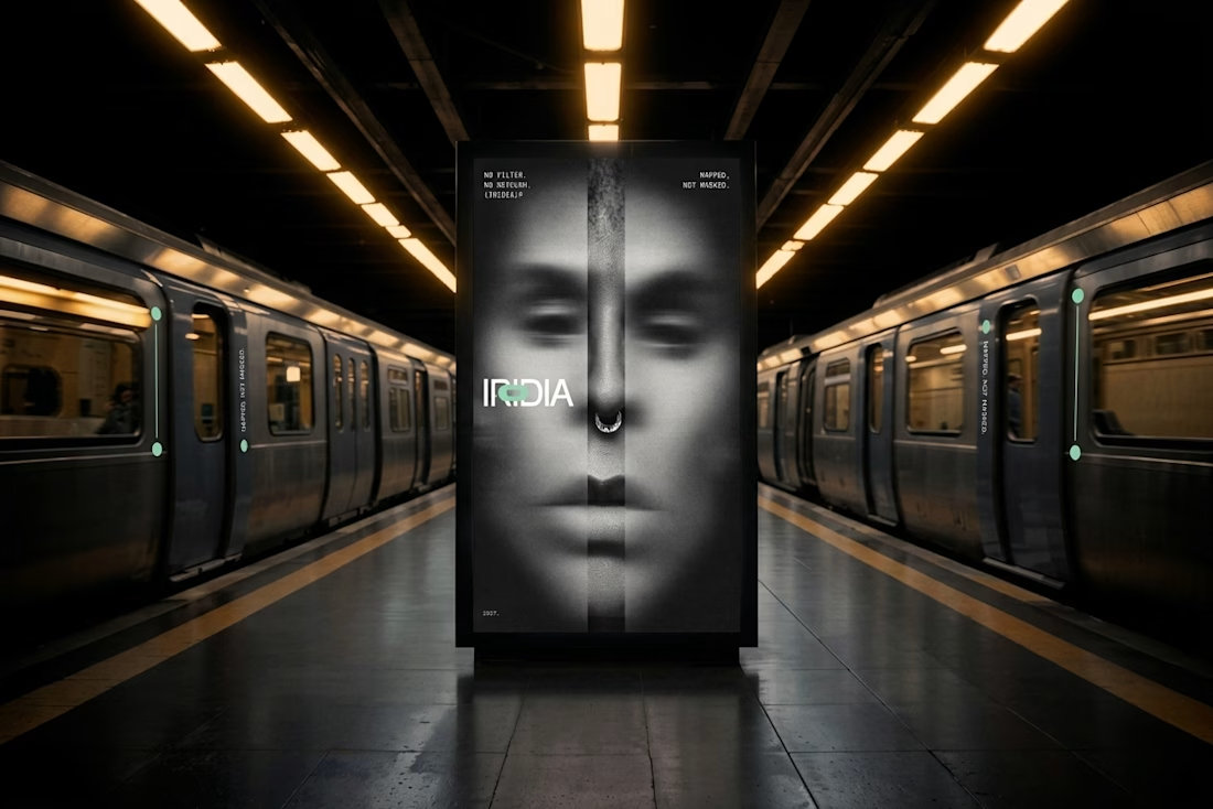
One of them finally got the full treatment. The Iridia case study drops soon.