The network for creativity
Join 1.25M professional creatives like you
Connect with clients, get discovered, and run your business 100% commission-free
Creatives on Contra have earned over $150M and we are just getting started
Back to feedPost
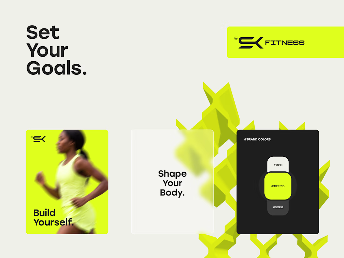
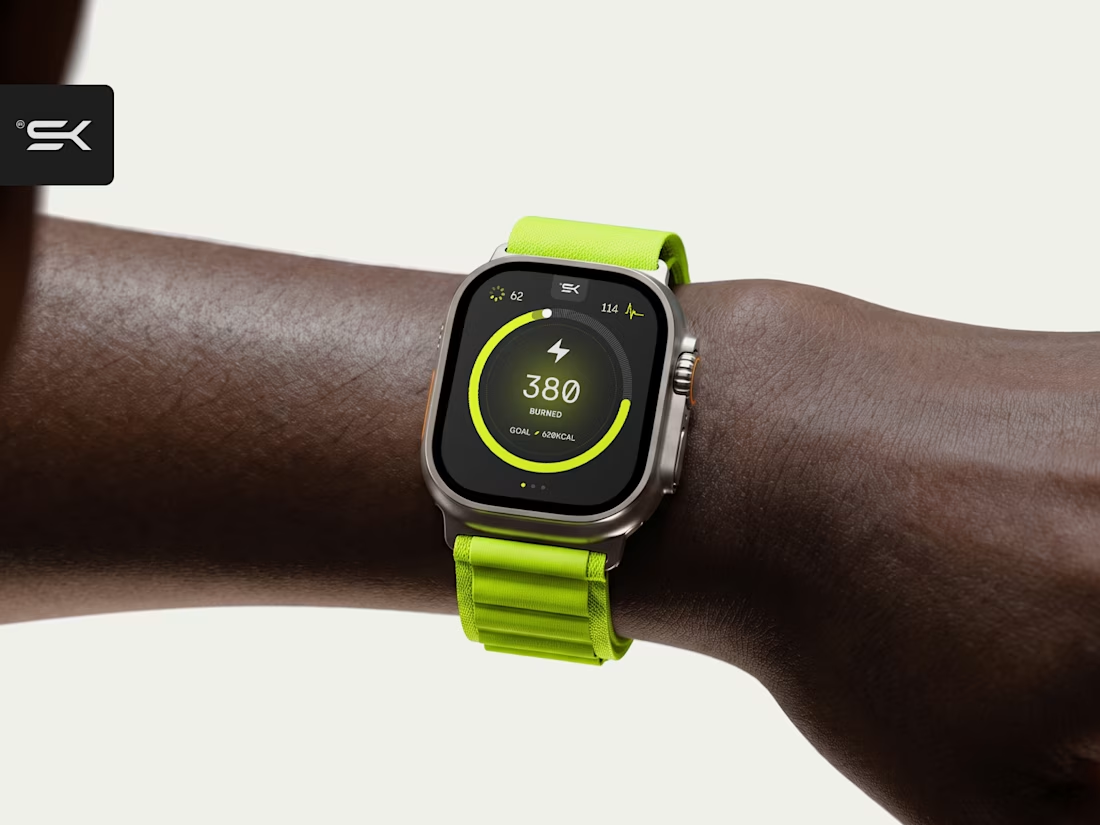
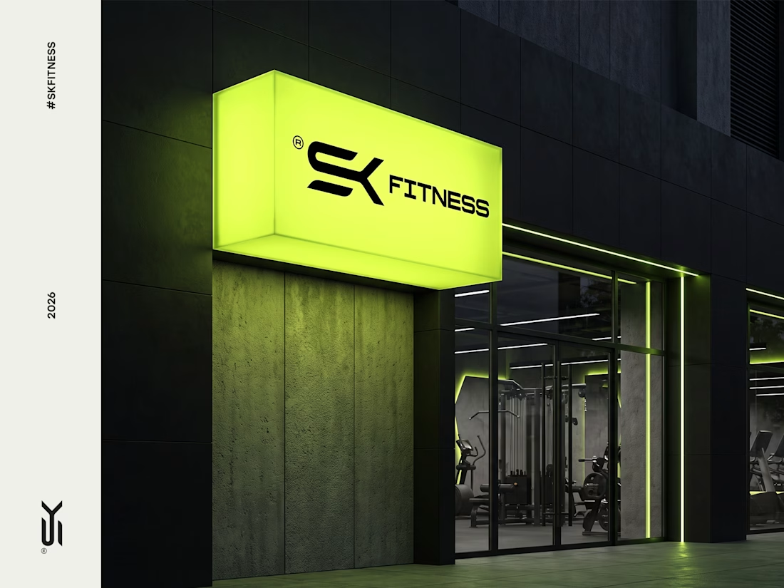
Brand visual identity for SK Fitness, a New York based fitness brand. The goal was to create a bold, modern look that reflects its strong yet health focused approach to building better bodies. We chose a bright green palette to bring energy, confidence, and a fresh edge to the brand.



Sick 🔥

Love this!


The bright green gives it the right balance of energy and freshness.

Sleek and professional branding 💫

Looks amazing! ❤️

Thanks


Cool😍


Looks amazing!

Nice one

'fresh' is an understatement, you've taken one of the hardest shades to work with & totally owned it. incredible stuff, that shot of the watch in action is stunning.

This is sick, good work mann


that green is doing a lot of work

Clean work


Nice work👏🔥🔥

I've seen sooo many SK logos for fitness brands but this is on a whole new level. Amazing work


Amazing work 😍

Volt green has quietly become the default for performance brands, which cuts both ways: instant category read, less room to be distinct. Curious what ended up carrying the health-focused half of the brief for you, because the palette on its own lands closer to pure performance.


This is top notch extraordinary. Nice work

Amazing brand Identity!

Very vibrant and energetic feeling!


That neon green against the dark backgrounds hits exactly right for a NY fitness brand, it feels electric without losing the premium edge. The signage mockup especially shows how far a strong color system can carry when the environment actually gets to use it at scale

super!

Cool work

This branding is on another level

Love it 🧡


goated

that green was a risky choice but definitely the best one, great job! 🔥

This is good, Kristaps, well done.
The network for creativity
Join 1.25M professional creatives like you
Connect with clients, get discovered, and run your business 100% commission-free
Creatives on Contra have earned over $150M and we are just getting started





Related posts

Brand identity work for WesoftAI


Zyro - Activewear and Fitness Brand


Still waiting to hear back from @Contra HQ
So I did what any designer would do: I made the card myself 😂
Brushed metal. Laser-engraved logo. Holographic Mastercard rings. Full 360° spin. I'm going to keep polishing this until the real one shows up in my mailbox. Your move, Contra 👀
(Concept / fan design, not an official Contra product..Yet 🙌 )


“Okay, this looks WAY too good 🔥 Contra needs to make this real 👀”