The network for creativity
Join 1.25M professional creatives like you
Connect with clients, get discovered, and run your business 100% commission-free
Creatives on Contra have earned over $150M and we are just getting started
Back to feedPost

I built a small data-cleaning workflow around one simple rule: bad rows should never silently disappear.
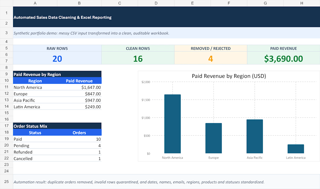
Synthetic demo results:
• 20 raw order records
• 16 clean rows
• 2 duplicates removed
• 2 invalid rows quarantined
• $3,690 paid revenue reconciled
The output includes a clean CSV, a rejected-row file, an audit log, and an Excel dashboard. Dates, names, emails, regions, products, and payment statuses are standardized.
The key design choice is quarantine + reasons, not just dropping bad rows and exporting. That lets a reviewer trace exactly what changed and decide whether rejected records should be repaired.
For recurring exports, what needs the most manual review in your workflow: duplicates, inconsistent labels, or invalid amounts and dates?



Really like the quarantine + reasons approach — 'silently disappearing rows' is exactly the kind of thing that erodes trust in a dashboard later. In my own Excel/data cleanup work, inconsistent labels tend to cause the most manual review, especially free-text fields where the...
The network for creativity
Join 1.25M professional creatives like you
Connect with clients, get discovered, and run your business 100% commission-free
Creatives on Contra have earned over $150M and we are just getting started




Related posts

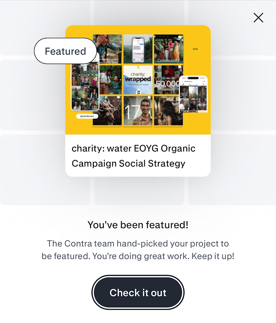
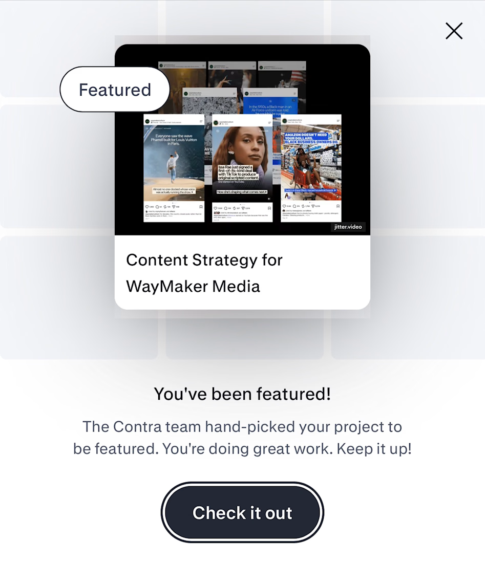
thank you to the Contra team for featuring my case studies for EOYG with charity: water & content strategy for WayMaker Media!
i appreciate all the support you always show to my work! 🌻


Congrats🎉

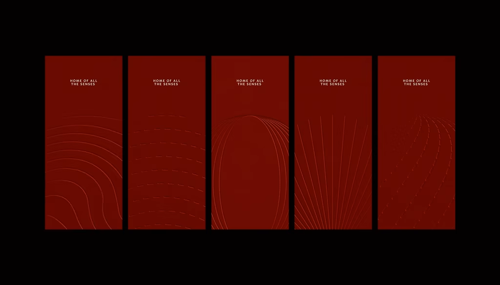
How do you turn a sense into a symbol?
Sensorium is a luxury wellness brand from Dubai built around the connection between the senses, the body and emotional wellbeing.
For this project, I created a visual language around the five senses, with a unique symbol for each one. Each symbol is built within the same circular structure, giving the elements shared proportions and a cohesive relationship, while keeping enough movement to work across different scales, textures and applications.
How important is visual cohesion to you when building or evaluating a brand system, and how do you approach it?

This is a beautiful way to turn an abstract sense into a system—the shared geometry makes the five symbols feel related without flattening their individual character. The balance between repetition and movement should give the identity a lot of range across touchpoints.


Great visual hierarchy.