The network for creativity
Join 1.25M professional creatives like you
Connect with clients, get discovered, and run your business 100% commission-free
Creatives on Contra have earned over $150M and we are just getting started
Back to feedPost


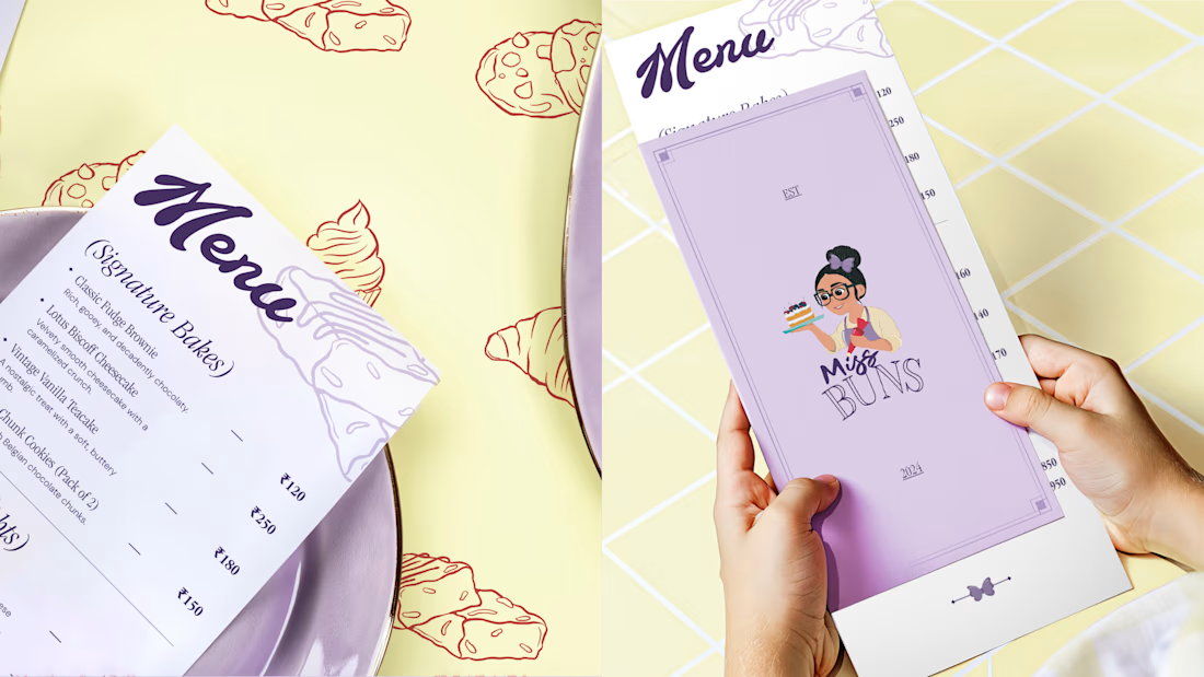
Would you like to have your restaurant menu designed with this type vibe?
I dab.


It's a clear and clean design

Beautiful design
The network for creativity
Join 1.25M professional creatives like you
Connect with clients, get discovered, and run your business 100% commission-free
Creatives on Contra have earned over $150M and we are just getting started



Related posts

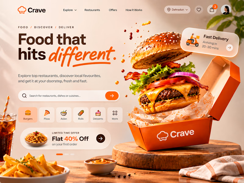
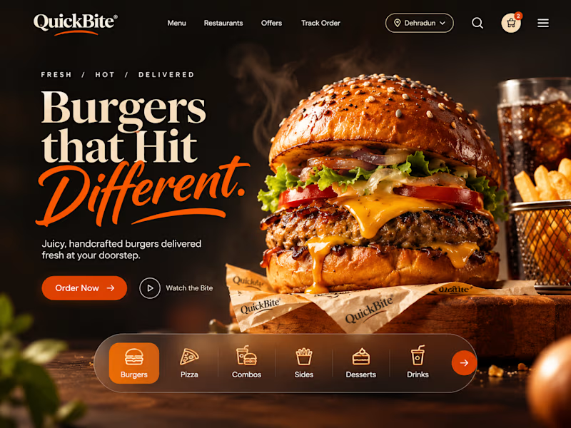
ONE CRAVING. TWO VERY DIFFERENT EXPERIENCES. 🍔
What if the same food-delivery industry could tell two completely different visual stories?
🍊 CRAVE — Made to Tempt
Warm tones, expressive typography, vibrant food photography and playful 3D elements. Designed to make food discovery feel exciting, inviting and full of personality.
🖤 QUICKBITE — Made to Indulge
A darker, richer visual direction with cinematic burger photography, bold editorial typography and immersive layouts. Designed to put the food front and centre and make every interaction feel intentional.
Two brands. Two moods. Two approaches to the same experience.
Now I'm curious:
Which direction would make YOU stop scrolling and place an order?
Drop your pick below. I'd love to hear the reasoning behind it!
2 voted
29%
5 voted
71%
7 votes
Closed

QuickBite is unique in a good way!

Rejected or Final Cut? 👀
Let's see how well you can read a brand direction.
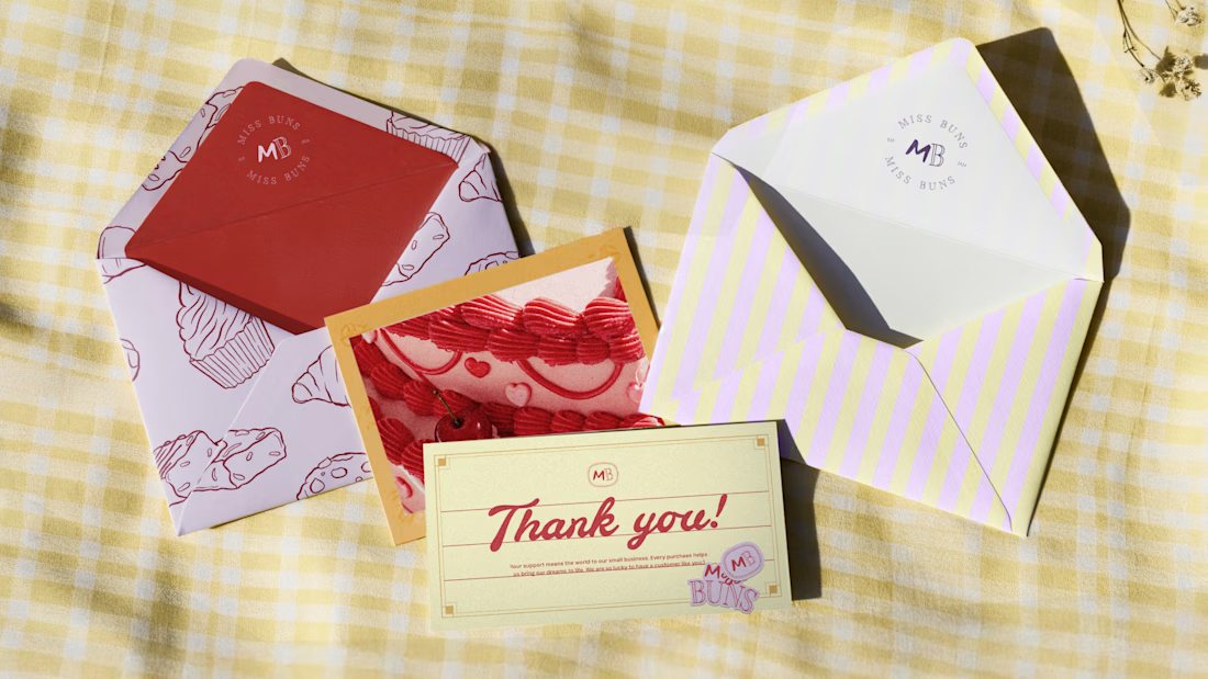
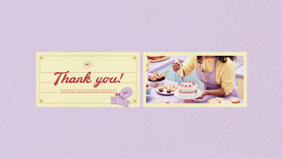
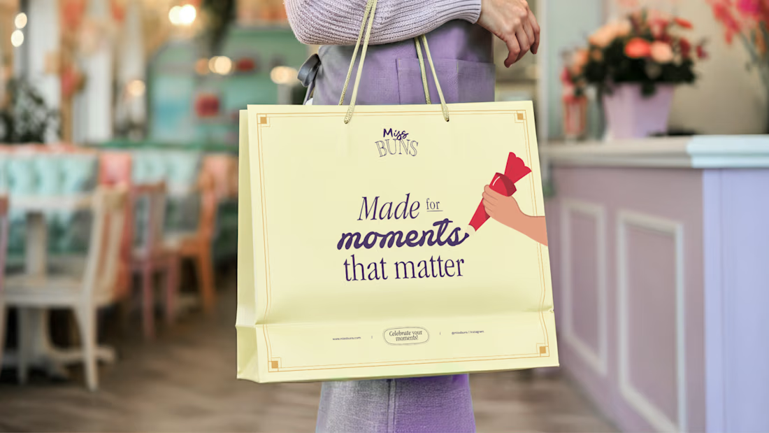
These are some collaterals we designed for Miss Buns, a patisserie brand. The direction explores a nostalgic, whimsical and premium feel through pastel colours, hand-drawn typography and vintage-inspired visuals.
The idea was to capture personalisation, indulgence and those little sweet moments that make the experience special.
But here's the question:
Did this direction make the final cut, or was it rejected?
Drop your guess in the comments. I'll reveal the answer soon!