The network for creativity
Join 1.25M professional creatives like you
Connect with clients, get discovered, and run your business 100% commission-free
Creatives on Contra have earned over $150M and we are just getting started
Back to feedPost
Rejected or Final Cut? 👀
Let's see how well you can read a brand direction.
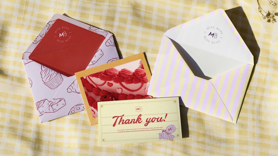
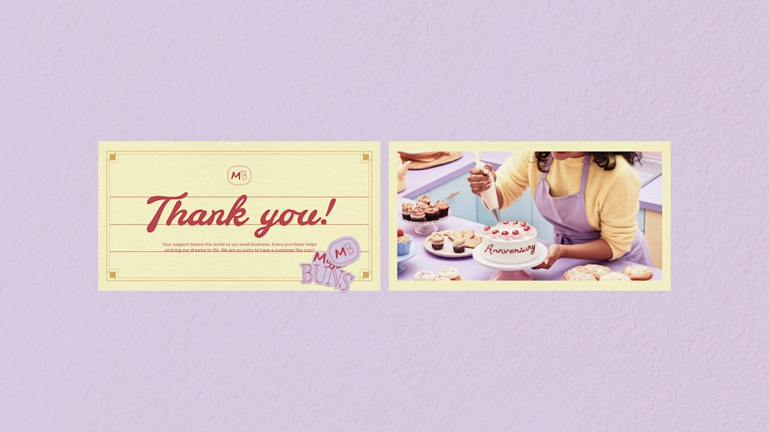
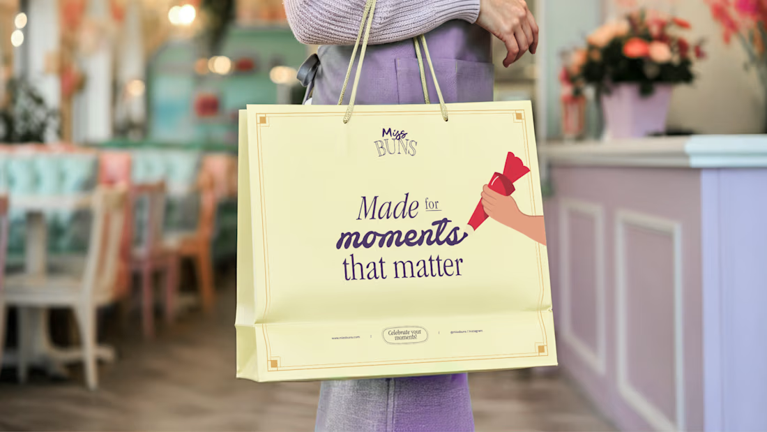
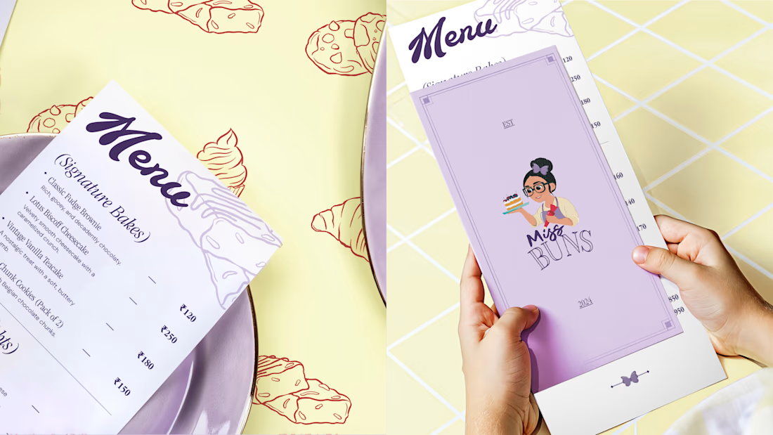
These are some collaterals we designed for Miss Buns, a patisserie brand. The direction explores a nostalgic, whimsical and premium feel through pastel colours, hand-drawn typography and vintage-inspired visuals.
The idea was to capture personalisation, indulgence and those little sweet moments that make the experience special.
But here's the question:
Did this direction make the final cut, or was it rejected?
Drop your guess in the comments. I'll reveal the answer soon!
The network for creativity
Join 1.25M professional creatives like you
Connect with clients, get discovered, and run your business 100% commission-free
Creatives on Contra have earned over $150M and we are just getting started



Related posts

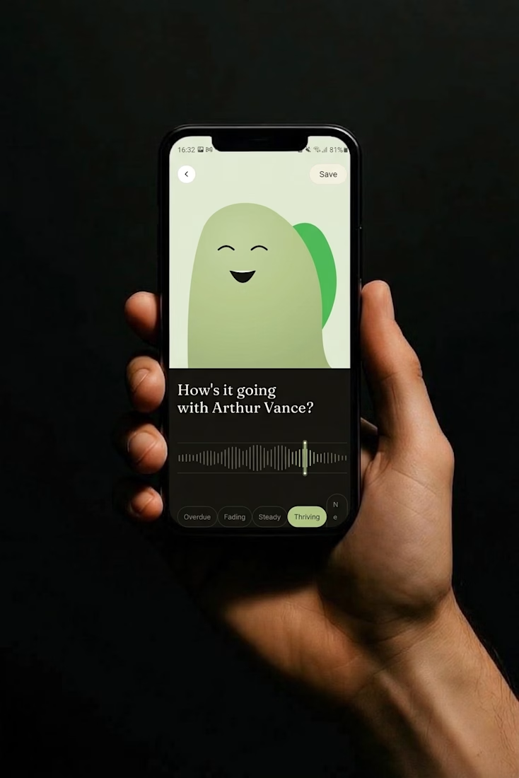
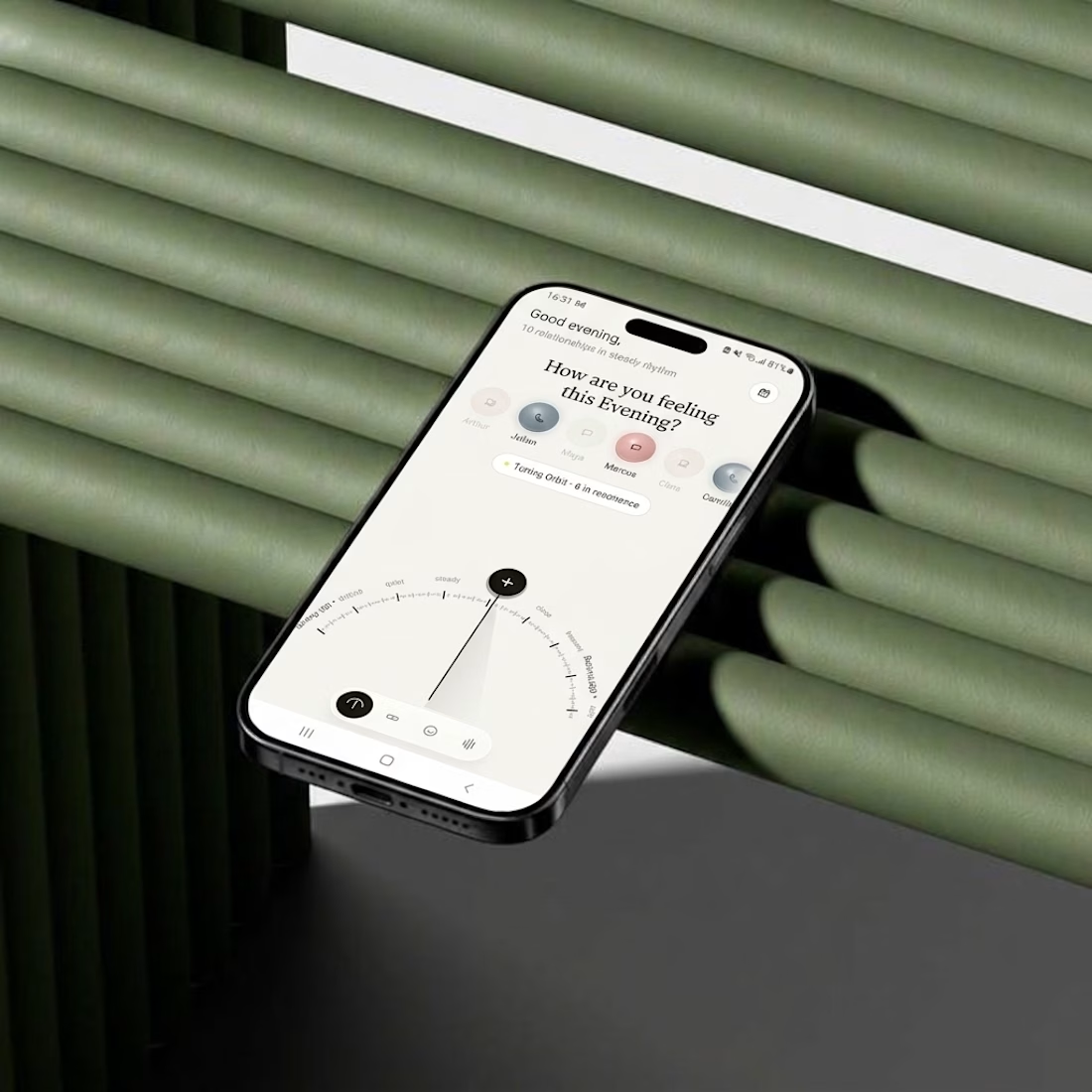
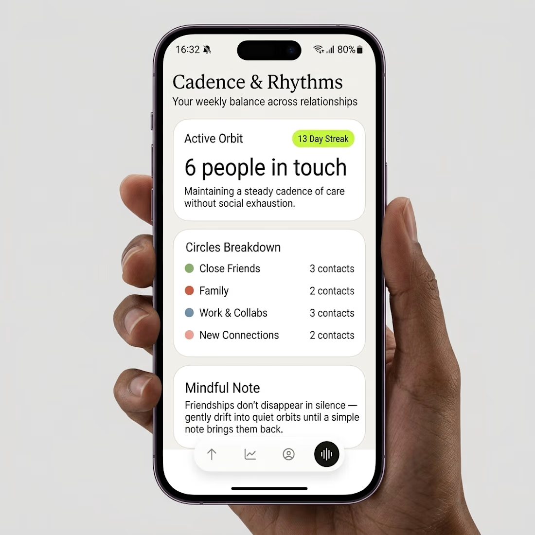
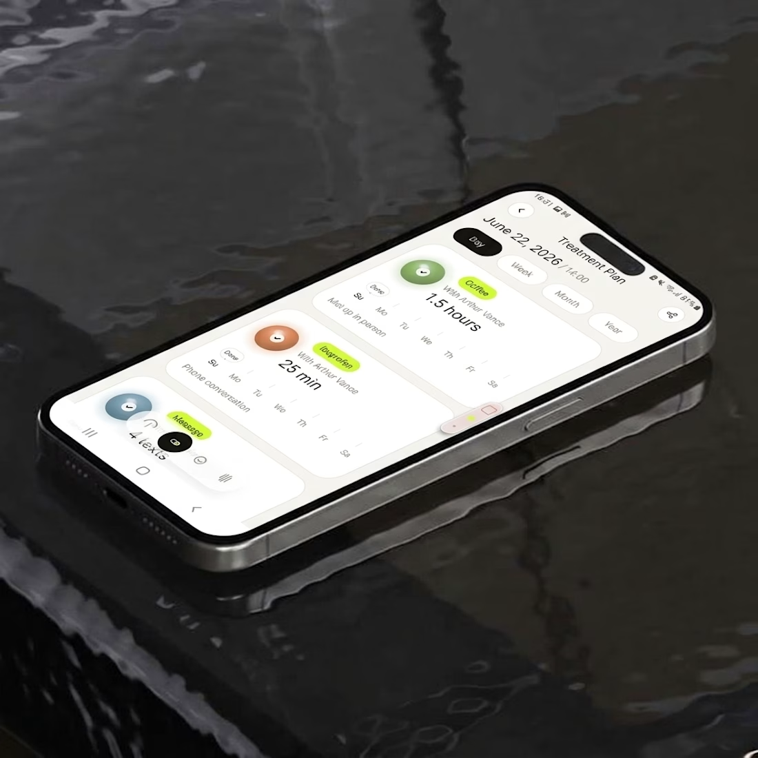
What if your contacts looked less like a phone book and more like a night sky?
Friday app, a day late: Parallax.
Every person is a glowing orb placed by how recently and how often you talk.
Turn a dial to filter by frequency, scrub a word to log how it’s really going.

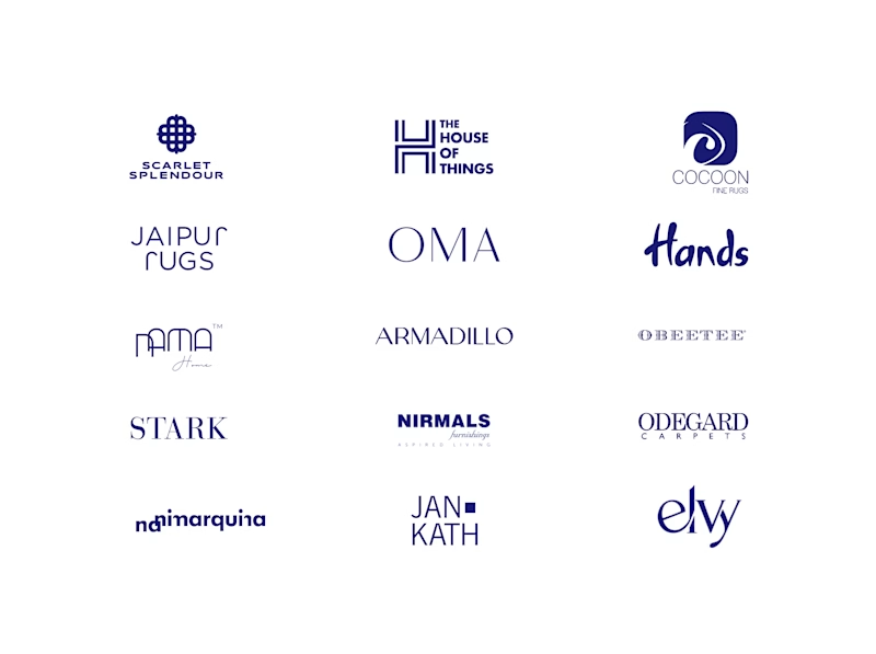
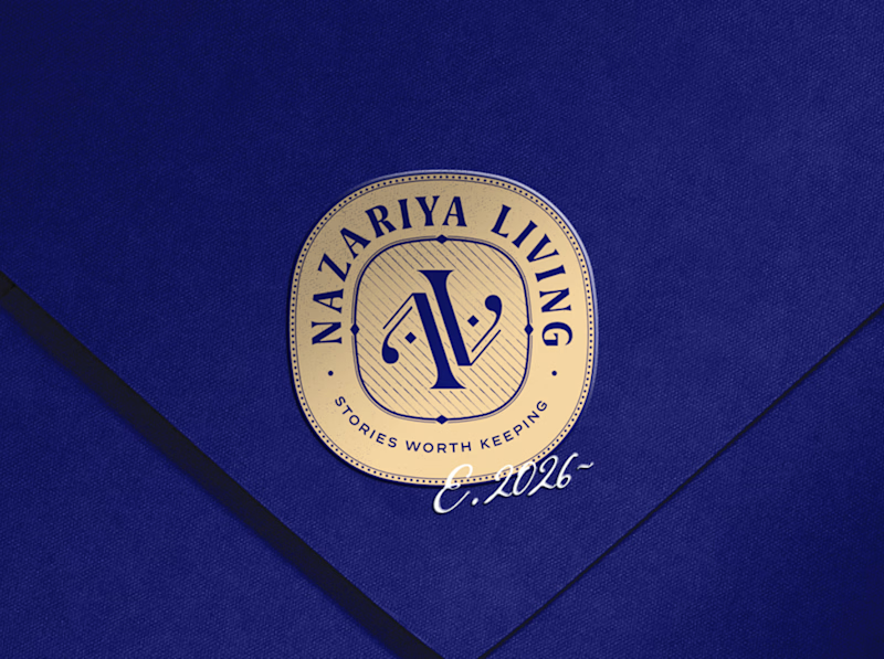
A little look at how Nazariya Living stands apart from its category.
On one side, familiar visual conventions. On the other, an identity with its own character, rooted in stories worth keeping.
We chose not to blend in. :)
Which side catches your eye?


3 voted
30%
7 voted
70%
10 votes
Closed

That side with all the competitor logos in one grid is the slide I'd steal for a client presentation. Nothing explains "why this direction" faster than showing the sea of sameness first. The navy seal wins easily after that.

AURÉLIA - Luxury Beauty Brand Identity & Packaging I designed a complete luxury beauty brand concept for AURÉLIA. What I created: - Gold Crown Logo - Luxury Packaging for Face Cream, Serum & Perfume - Beige & Gold Brand Color Palette - Elegant Product Photography Style My goal was to make the brand feel Royal, Soft & Premium. If you want a luxury brand like this for your beauty business, let's work together!