The network for creativity
Join 1.25M professional creatives like you
Connect with clients, get discovered, and run your business 100% commission-free
Creatives on Contra have earned over $150M and we are just getting started
Back to feedPost
I just published a new template on the Framer Marketplace: STUDIO HRSE.
I built this one differently, slower, with more attention to craft and interaction than most templates I ship. A full design studio site: case studies, team, services, motion throughout.
It's free. I wanted more people to experience the level of detail before deciding if they need it.
https://www.framer.com/marketplace/templates/studio-hrse/


Amazing work!

Thank you, Bella!

Nice one, Matheus
Thank you, Damilola!

Woooah🔥
🔥🔥

Really inspiring work. The level of detail, consistency, and visual balance
Thanks, bro!


Excellent work !
Thanks, man!

Yeah, thanks!

🔥

Top quality work! 😯
Thanks, Akriti!

This template is absolutely fire! 🔥 Outstanding work on this, seriously impressed!
Thanks man, I really appreciate that!

nice template
Thanks!
The network for creativity
Join 1.25M professional creatives like you
Connect with clients, get discovered, and run your business 100% commission-free
Creatives on Contra have earned over $150M and we are just getting started

Challenges
View all


Related posts


another week another @framer template dropping soon 👀

this is so heart eyes
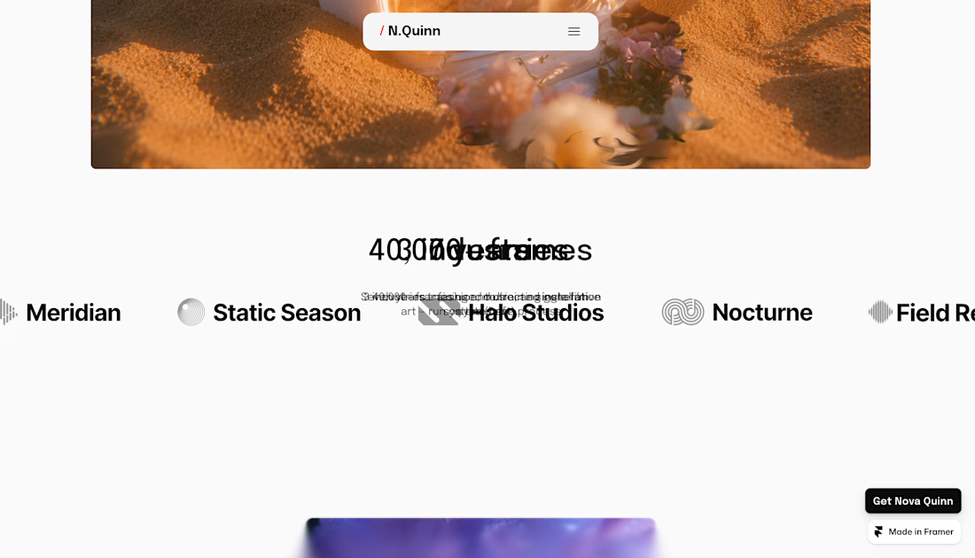
Nova Quinn is live, a Framer portfolio template for visual artists and small studios. Lots of motion on the landing page, best seen on desktop.
$99, or $129 with the Figma file.

I guess there is a problem with the sticky text.

I usually don't stop at 3 breakpoints when building a website.
Most people think about: Mobile, Tablet, Laptop
I like adding one more: Desktop
Because what looks great at 1440px can feel completely different at 1920px...
- The layout gets too wide.
- Spacing starts feeling off.
- Content loses its balance.
So I like testing the system across: Mobile → Tablet → Laptop → Desktop
Not because every website needs exactly 4 breakpoints. But because responsive design isn't about making a few screen sizes work.
It's about making the whole system work.
Follow Rushabh for more website fundamentals, experiments, and things I learn while building for the web.
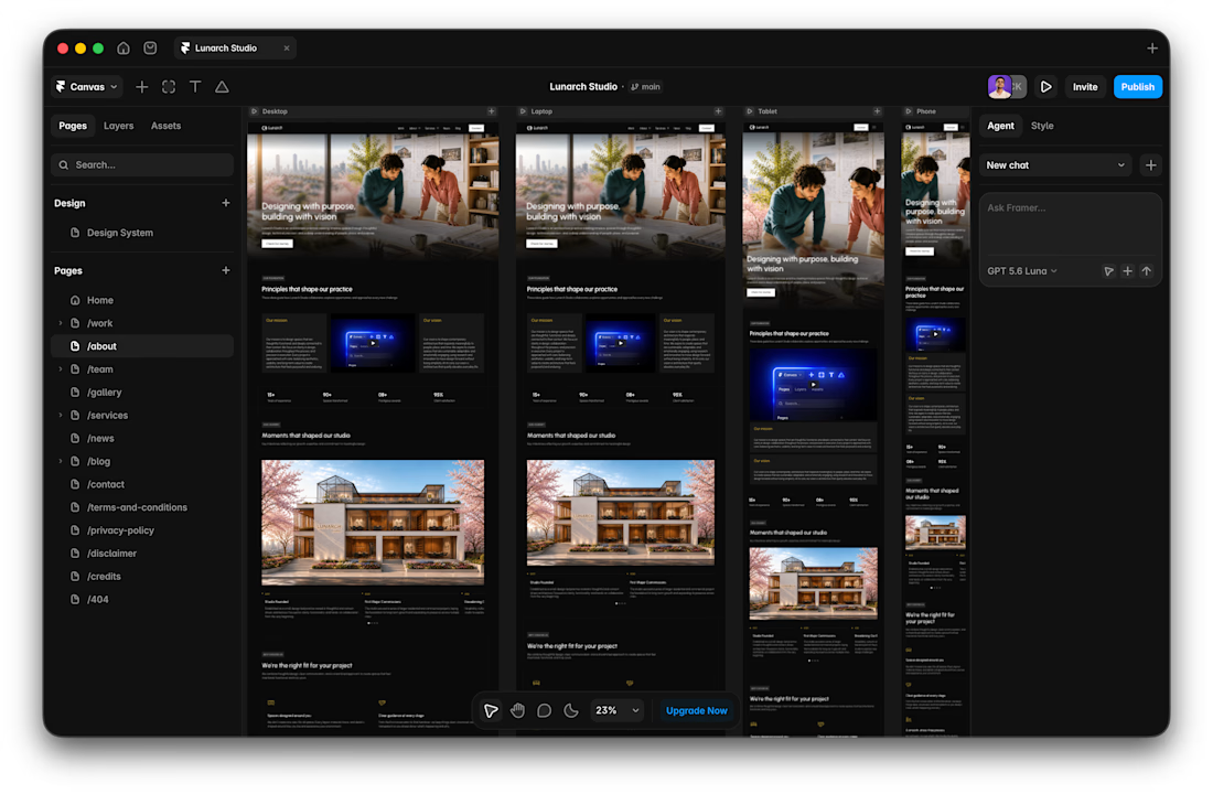

Wide screens expose spacing issues that laptop previews can hide.