The network for creativity
Join 1.25M professional creatives like you
Connect with clients, get discovered, and run your business 100% commission-free
Creatives on Contra have earned over $150M and we are just getting started
Back to feedPost

Okay designers, settle a debate for me. 👀
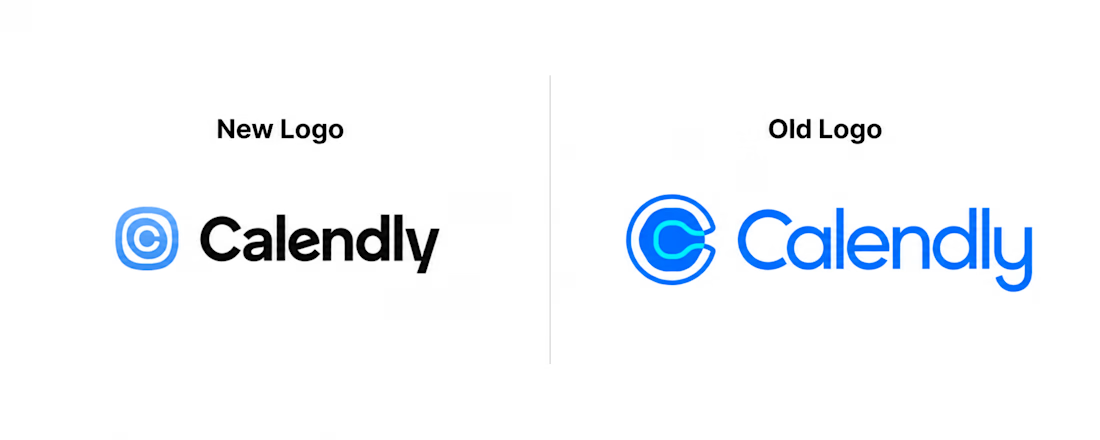
Calendly just got rebranded by Smith & Diction... and I can't stop thinking about the new symbol.
Old logo: literal calendar shape, took its fair share of jokes online over the years, but did the job.
New logo: a squircle with one wobbly, off center ripple cut into it. No calendar in sight.
The logic behind it is actually kind of great, one meeting link creates a ripple through your whole week. The shape is the business model. They also hid the word "connection" inside the wordmark itself, the C flows into the A, the E leans into the N. You'd never notice unless someone pointed it out.
But also... it's a big swing. Trading instant recognizability for a smarter concept isn't free.
Vote below: which one's actually doing its job better? 🗳️
#Branding #LogoDesign #DesignCritique

The network for creativity
Join 1.25M professional creatives like you
Connect with clients, get discovered, and run your business 100% commission-free
Creatives on Contra have earned over $150M and we are just getting started





Related posts

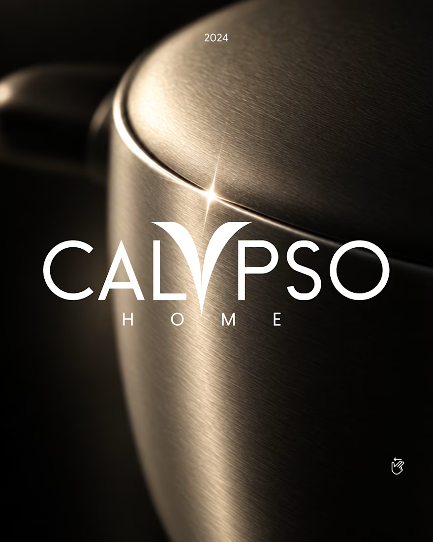
Calypso Home ✦ Logo, 2024
In myth, Calypso was the nymph who welcomed travelers home. Her raised arms became the "Y", holding a star.
One custom letter, built to survive metal, glaze and leather.
Full case study in my portfolio.
The last project from 2024, just added to my refreshed portfolio.
Got a project ? Let's talk about it.
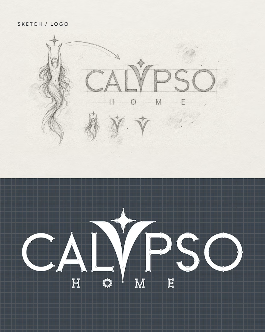
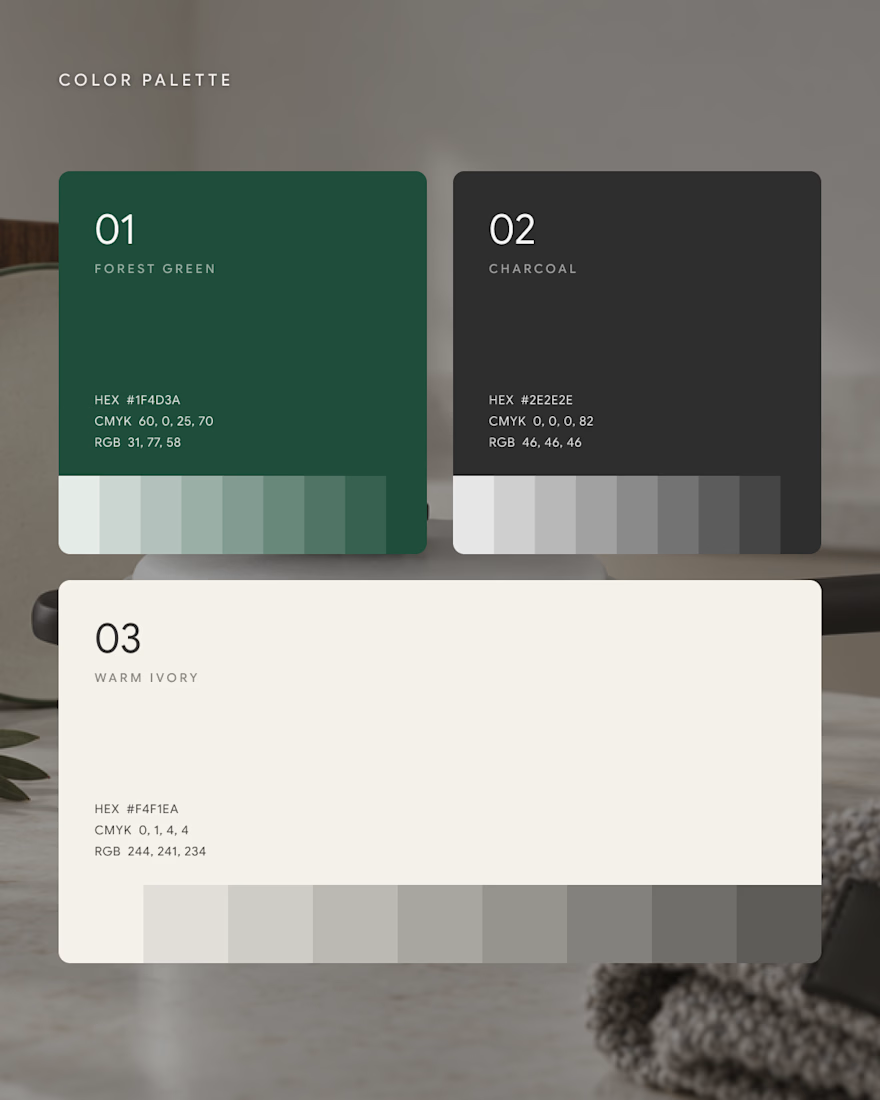
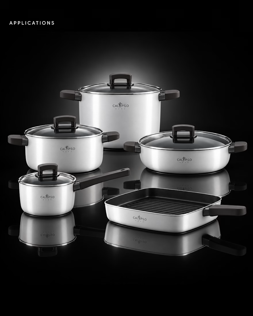

Turning Calypso's raised arms into the Y holding a star is the kind of story that makes a logo stick, the myth is baked right into the letterform. Built to survive metal, glaze and leather shows you designed for the real product, not just the deck. Beautiful mark.

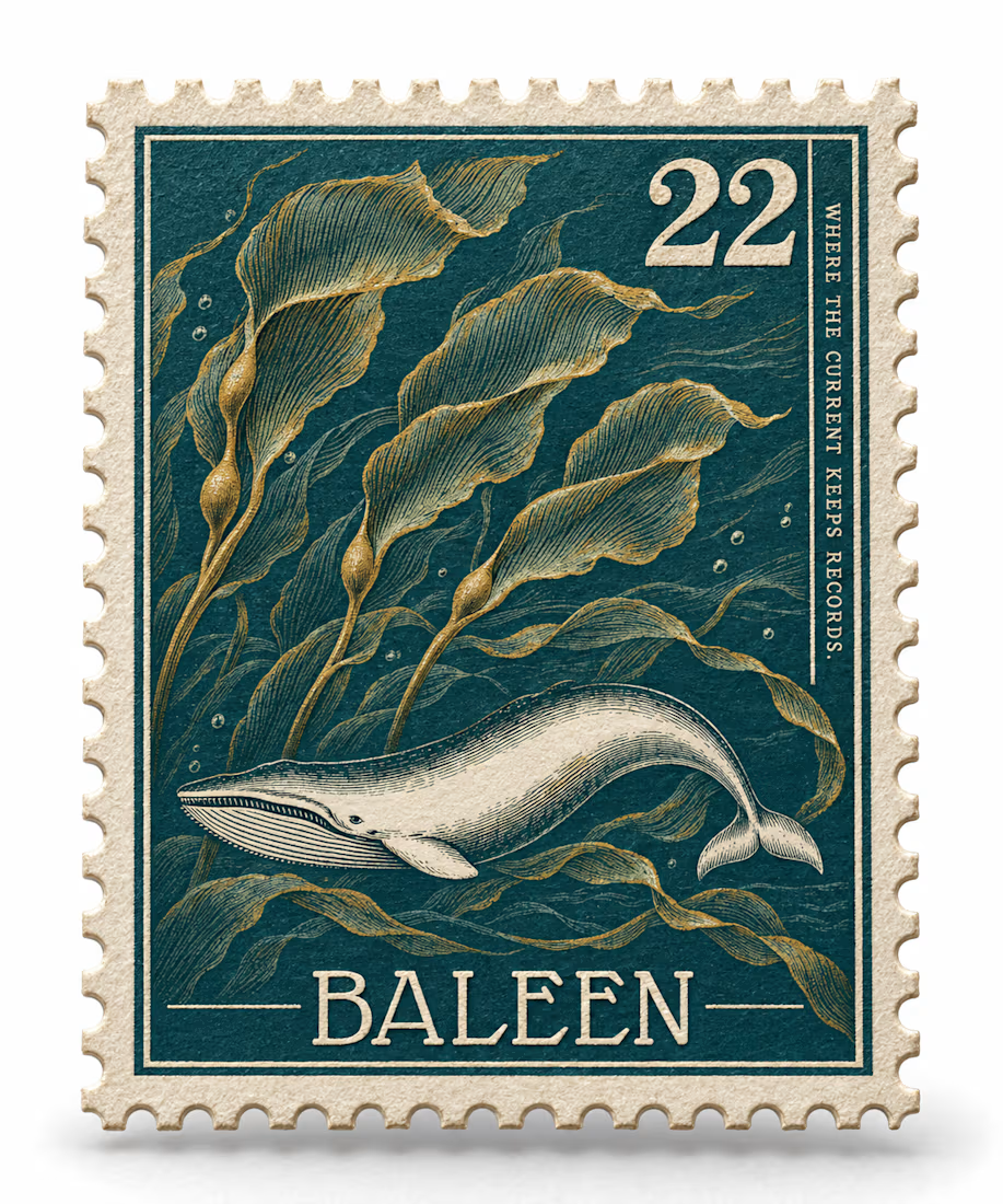
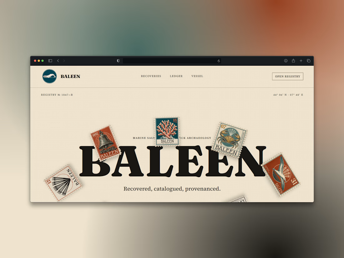
What if a salvage company's brand looked like it belonged in a stamp album, not a treasure map?
Introducing BALEEN — marine salvage & shipwreck archaeology, built on vintage natural-history stamp DNA. Every object recovered, catalogued, provenanced.
Website here


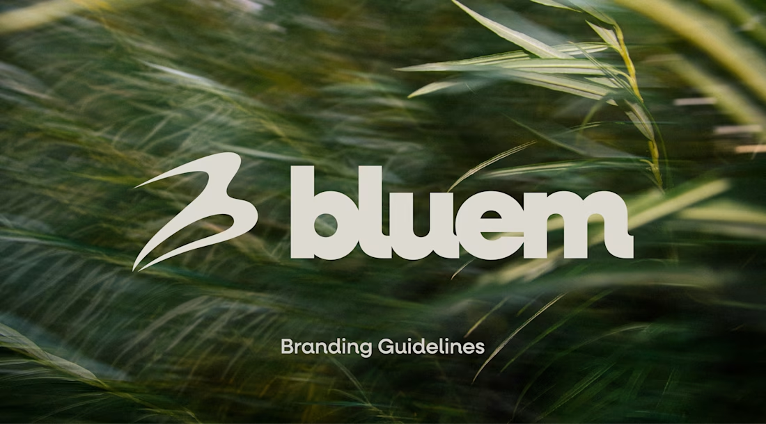
Check it out, I just uploaded a case study on a brand project for Bluem, an activewear brand from Vancouver, CA.
Look through the case study to see some of my thoughts, and the project in full, worth the time!


Love this! 🥂