The network for creativity
Join 1.25M professional creatives like you
Connect with clients, get discovered, and run your business 100% commission-free
Creatives on Contra have earned over $150M and we are just getting started
Back to feedPost

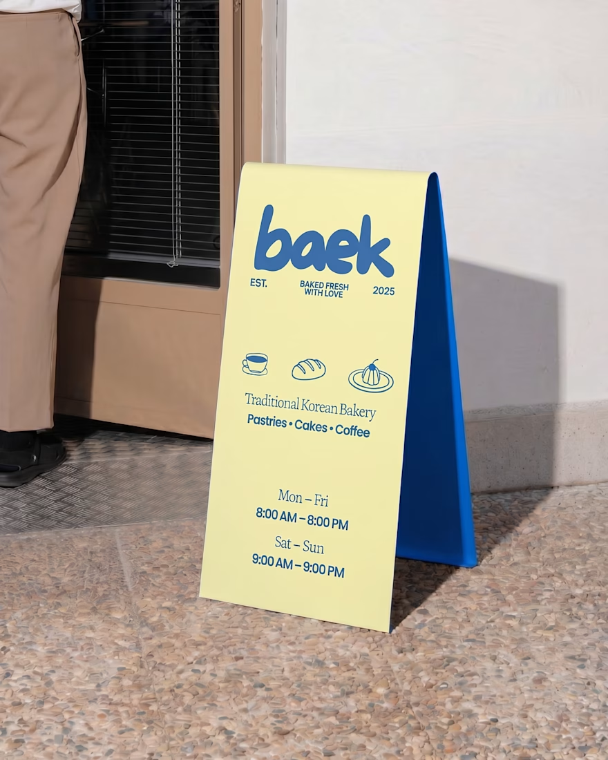
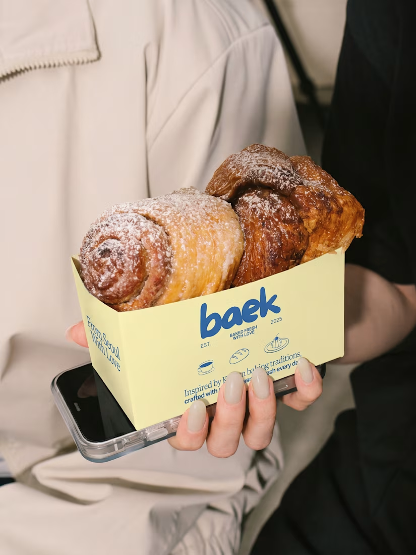
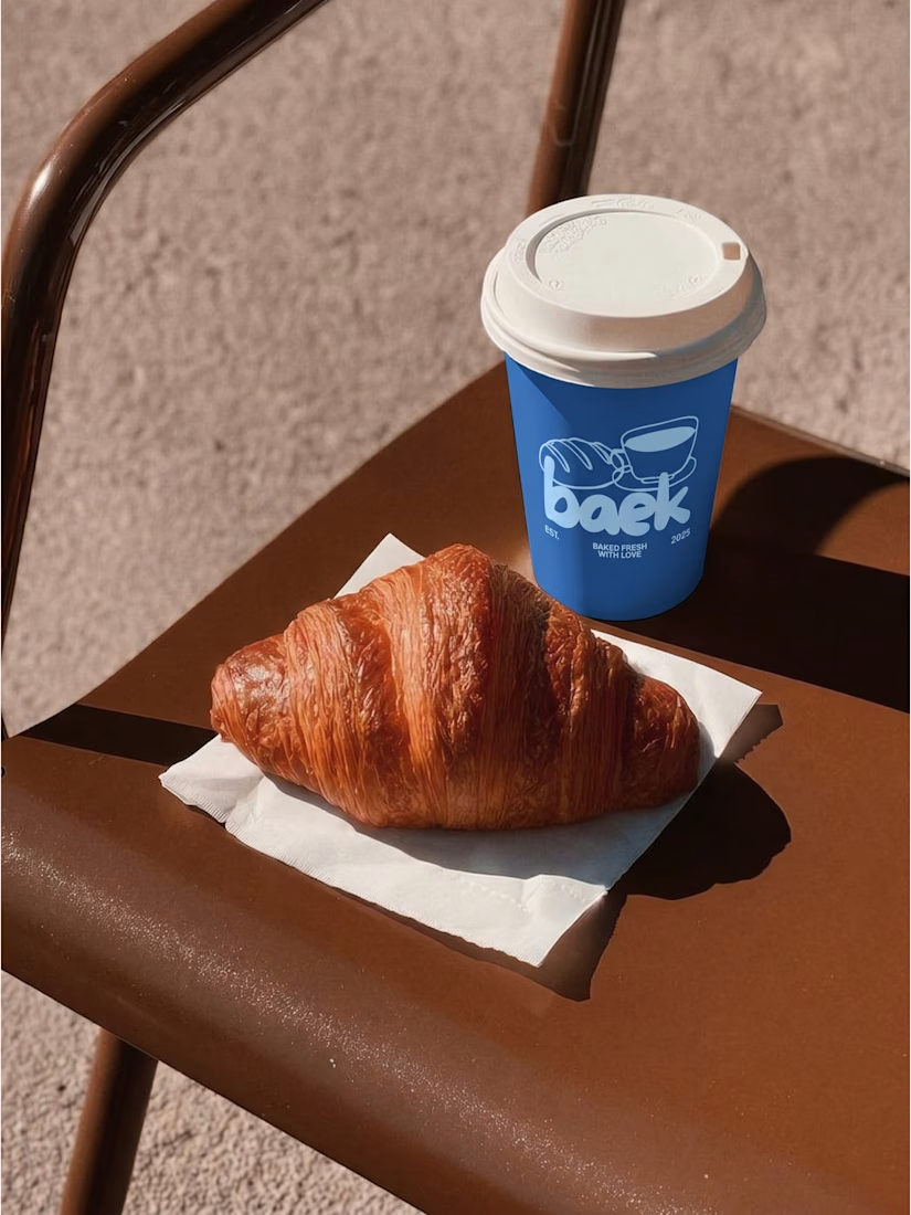
BAEK 🍰 – Korean Bakery / Part 1
BAEK is a modern Korean bakery focused on pastries and baked goods, featuring simple, playful, and expressive illustrations with clear shapes and bright, cheerful colors that bring a fresh and fun personality to the brand
The network for creativity
Join 1.25M professional creatives like you
Connect with clients, get discovered, and run your business 100% commission-free
Creatives on Contra have earned over $150M and we are just getting started



Related posts

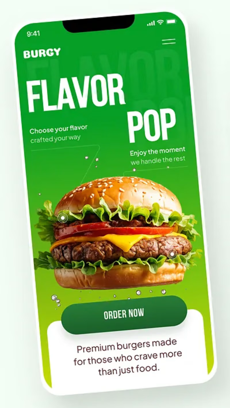
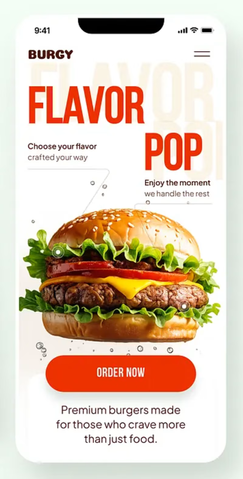
Burgy, a mobile concept for burger ordering. 🍔
Bold type, premium food visuals, and a fast path from craving to checkout.
Two color directions for the hero screen. Which one converts better?
Vote and tell me why 👇
Poll options: 🟢 Green | 🔴 Red
#UIDesign #MobileApp #FoodApp #AppDesign #UX #RestaurantApp


13 voted
43%
17 voted
57%
30 votes
Closed

Green for me, and I'd bet on it converting better too. The red version is loud in the way every food app is loud, while the green makes the burger the hero and the screen instantly recognizable in a feed. The green background also gives the white FLAVOR POP type far more contrast, so the message lands a beat faster.

Some people think having text on an album cover is tacky.
But I think it really comes down to how the typography is incorporated.
There's a difference between simply placing text on an image and making it an integral part of the artwork.
So I decided to explore this idea by designing a fictional album cover of my own.
For this concept, I used playful colors, handwritten text and hand-drawn elements to capture the album's imaginative and whimsical personality.
Rather than treating the title as a separate element, I wanted it to feel like a natural part of the overall design.
What do you think?
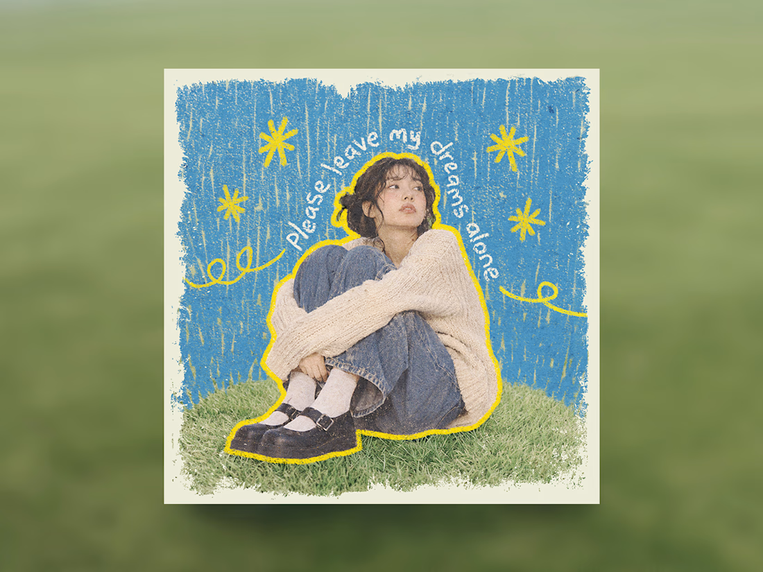

Treating the handwritten title as part of the artwork rather than a label on top is the right call. Email designers fight the same battle with hero images: text baked into the picture looks great until an inbox blocks images. Which came first for you, the lettering or the collage?

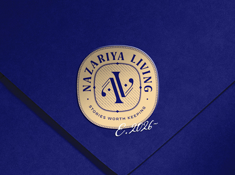
A little look at how Nazariya Living stands apart from its category.
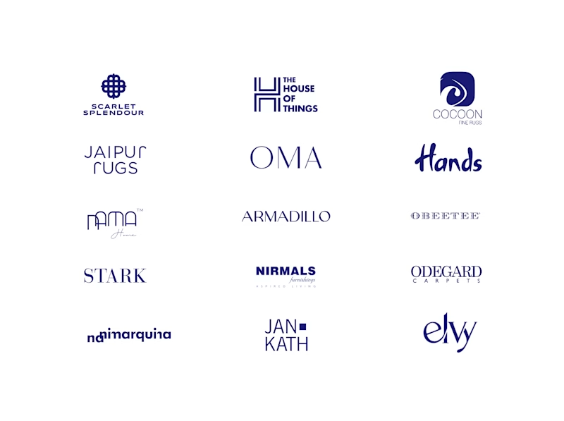
On one side, familiar visual conventions. On the other, an identity with its own character, rooted in stories worth keeping.
We chose not to blend in. :)
Which side catches your eye?

3 voted
30%
7 voted
70%
10 votes
Closed

That side with all the competitor logos in one grid is the slide I'd steal for a client presentation. Nothing explains "why this direction" faster than showing the sea of sameness first. The navy seal wins easily after that.