The network for creativity
Join 1.25M professional creatives like you
Connect with clients, get discovered, and run your business 100% commission-free
Creatives on Contra have earned over $150M and we are just getting started
Back to feedPost

Most local service websites make visitors work too hard to get in touch.
For Jason Lauer Electrical, I wanted the opposite.
The goal was to create a website where a potential customer could quickly understand what the business does, trust the company, find the service they need, and take action.
I handled the entire website from UX strategy and structure to UI design and Framer development.
The UX was built around a simple journey:
Understand the service → Build trust → Find the right solution → Request an estimate.
That influenced several design decisions.
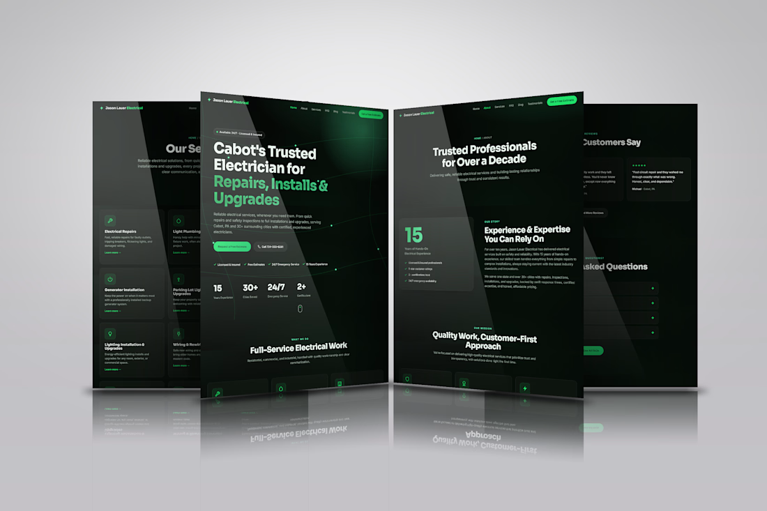
The hero immediately communicates the service, location, experience, and key trust signals, while giving visitors two clear options: request a free estimate or call directly.
Services are presented in scannable cards instead of forcing visitors through long paragraphs. Testimonials, experience, certifications, and an FAQ section then answer common objections and reinforce credibility before the visitor reaches the final CTA.
The lesson?
A website doesn't need more sections to convert better.
It needs a clearer path from “What does this business do?” to “I want to contact them.”
Built in Framer.
#Framer #WebDesign #UXDesign #WebDevelopment #WebsiteDesign
The network for creativity
Join 1.25M professional creatives like you
Connect with clients, get discovered, and run your business 100% commission-free
Creatives on Contra have earned over $150M and we are just getting started
Challenges
View all


Related posts


Product first or brand first? 🤔
We're cutting the promo reel for our case study and can't agree on its start. ✨
Which product ad opening would make you stay past the first 3 seconds?
Vote and tell why! 👇
Product DesignSoftware DevelopmentAdobe After EffectsCinema 4DFigmaBrand DesigncreativeaiworkflowUX Design


15 voted
25%
46 voted
75%
61 votes
Closed

I think both is important, but good product first.

Luxury Fashion E-commerce Landing Page
A premium e-commerce website concept created for a modern luxury fashion brand. The experience focuses on elegant visuals, refined typography, and an intuitive shopping journey that reflects the brand's premium identity.
Project Goal💯
The objective was to design a sophisticated online shopping experience that combines visual storytelling with seamless product discovery. Every section was crafted to highlight the brand's quality, build trust, and encourage conversions while maintaining a clean, minimal aesthetic.

Stunning work

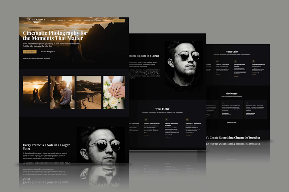
Designed a photography website focused on portfolio presentation, visual storytelling, and client conversion. The project combines photographer website design, photography portfolio, wedding photography, couples photography, personal branding, responsive web design, UX/UI design, and booking website functionality. The cinematic layout uses calls-to-action, service sections, testimonials, and image led content to build trust and guide visitors from exploring the photographer’s work to making an inquiry. The structure supports mobile friendly browsing and a polished creative brand experience.