The network for creativity
Join 1.25M professional creatives like you
Connect with clients, get discovered, and run your business 100% commission-free
Creatives on Contra have earned over $150M and we are just getting started
Back to feedPost

This project focused on shaping the positioning, messaging and digital presence for Root & Wander, a social compliance and living wage consultancy working across global supply chains.
The goal was to create a clearer and more cohesive brand system that reflected both the analytical and human side of the work — moving the brand away from sounding purely corporate, while still maintaining credibility and structure.
The scope included brand direction, messaging refinement, website strategy and visual cohesion across the digital presence, helping translate complex topics into communication that felt grounded, accessible and aligned.


The network for creativity
Join 1.25M professional creatives like you
Connect with clients, get discovered, and run your business 100% commission-free
Creatives on Contra have earned over $150M and we are just getting started




Related posts

One pixel grid. A whole brand.
For Appy, a London product studio for impact-driven startups, the wordmark, icons, 3D smile and Appy Pixel, its custom typeface, all come from the same grid.
Appy Pixel won Typography at the Online Design Awards.
Type first or symbol first: where do you start a rebrand?


thats so nice, i loveee

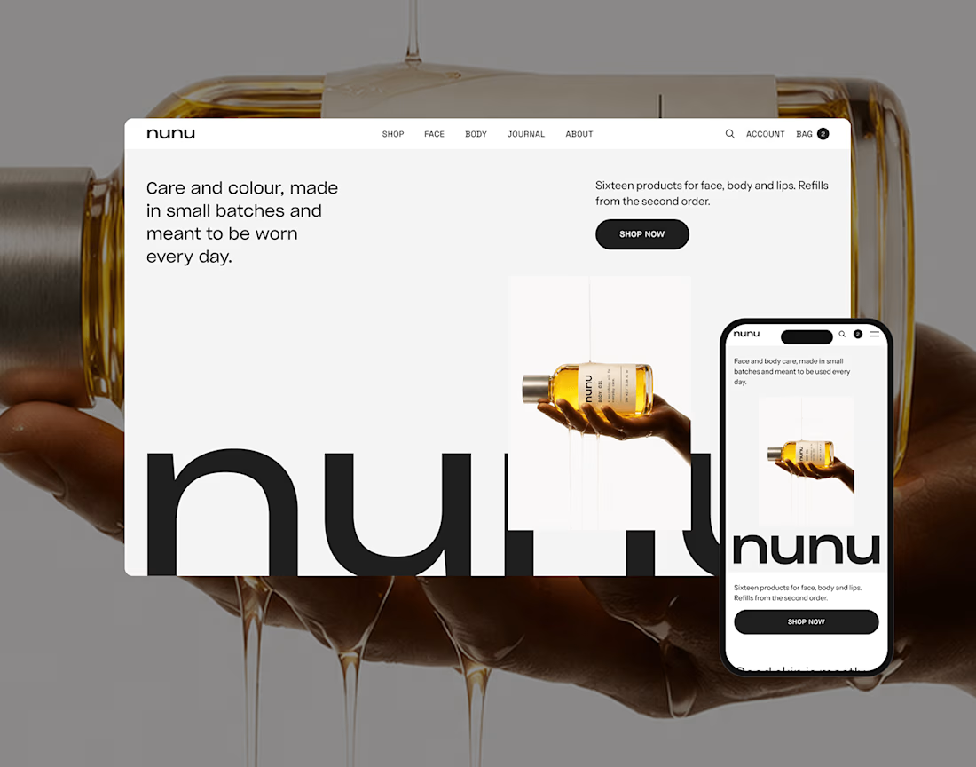
nunu is a self-initiated skincare and body care brand built from zero: naming, brand identity, art direction, product imagery and a responsive e-commerce websit

Nice work!

"Is it too late to eat?"
"Not yet."
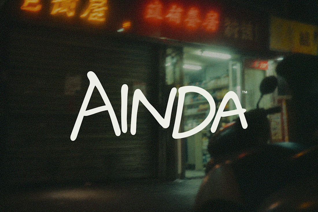
That's pretty much where AINDA started.
It's a fictional Chinese neighborhood restaurant I'm designing around the hours between today and tomorrow. Somewhere to have a proper meal, sit for a while, and maybe stay a little longer if the conversation isn't over.
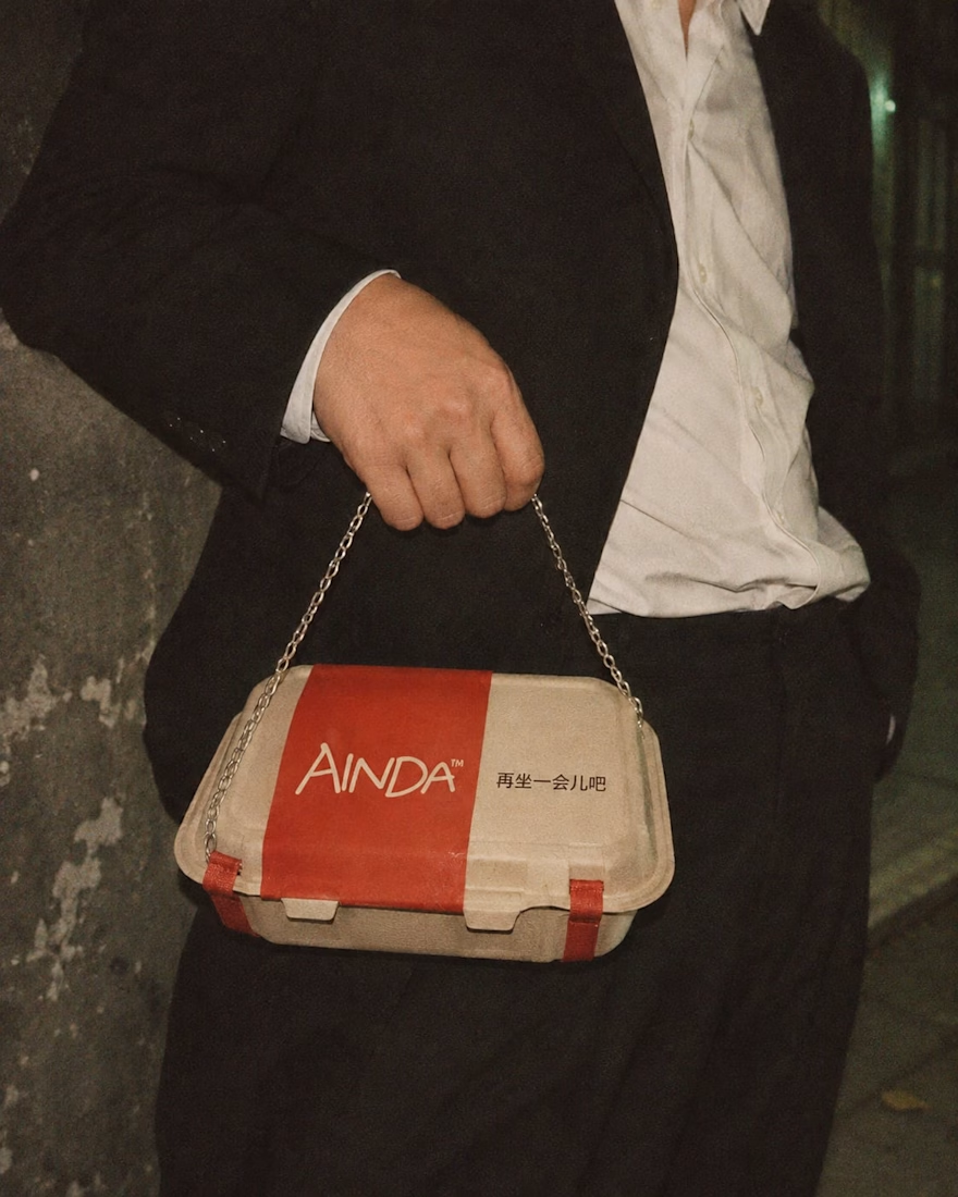
I've been developing its identity around that everyday feeling, from the hand-drawn lettering and late-night atmosphere to the packaging and service objects, some of which have gotten a little out of hand.
Here are a few experiments from the project so far. Still a lot to explore.
The restaurant doesn't exist, but apparently its takeout already has places to be.

Love this! Turning a takeout box into a handbag is genius — strong brand storytelling. I do brand & packaging concepts like this too, my DMs are open for collabs. 🔥