The network for creativity
Join 1.25M professional creatives like you
Connect with clients, get discovered, and run your business 100% commission-free
Creatives on Contra have earned over $150M and we are just getting started
Back to feedPost
Dark sites don't need white text everywhere.
On omnium.tools the headlines are almost the same colour as the background. They're pressed out of the page, and a soft green light moving across them makes them readable. It's quieter than white on black and feels more physical.
Would you ship low-contrast headlines on a real client site, or is that only for your own portfolio?
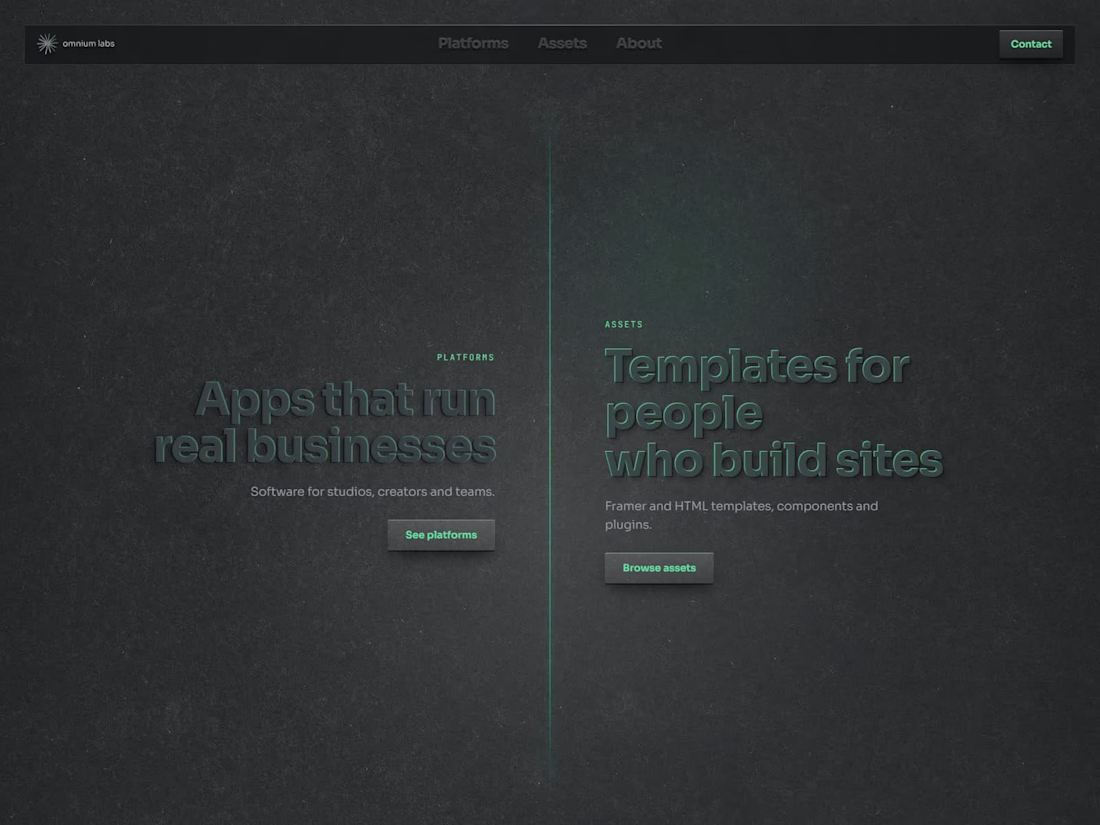
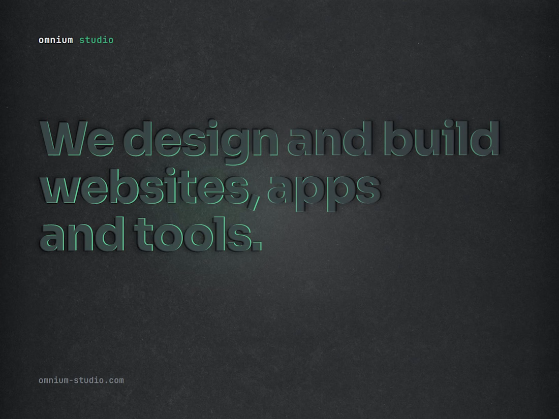


Thanks! And I agree, portfolio sites are what I had in mind. More precisely, portfolio sites for studios and creatives, where the site itself is part of the pitch. For a client who sells something, I’d bump the H1 contrast too and keep the light as a bonus, not as the thing that makes it readable.
The network for creativity
Join 1.25M professional creatives like you
Connect with clients, get discovered, and run your business 100% commission-free
Creatives on Contra have earned over $150M and we are just getting started











Related posts



Brilliant work

Poster Club turns a simple event template into your own print. I built two working Flutter versions and recorded the same editing flow in each.
Print Room: calm, editorial, with a mounted canvas and bottom tools.
Cutout Playground: bold, playful, with loose prints and tools at the edge.
Which one would you rather use?
What made the difference?
Grab it for free:
https://contra.com/products/cUHBysMu-poster-club-free-flutter-ab-ui-kit


37 voted
60%
25 voted
40%
62 votes
Closed

Print Room looks great!!


EarthHub – A Platform for Nature Expeditions ⛰️
Stumbled upon this project in my hard drive, had to publish!


Top to bottom nice work