The network for creativity
Join 1.25M professional creatives like you
Connect with clients, get discovered, and run your business 100% commission-free
Creatives on Contra have earned over $150M and we are just getting started
Back to feedPost

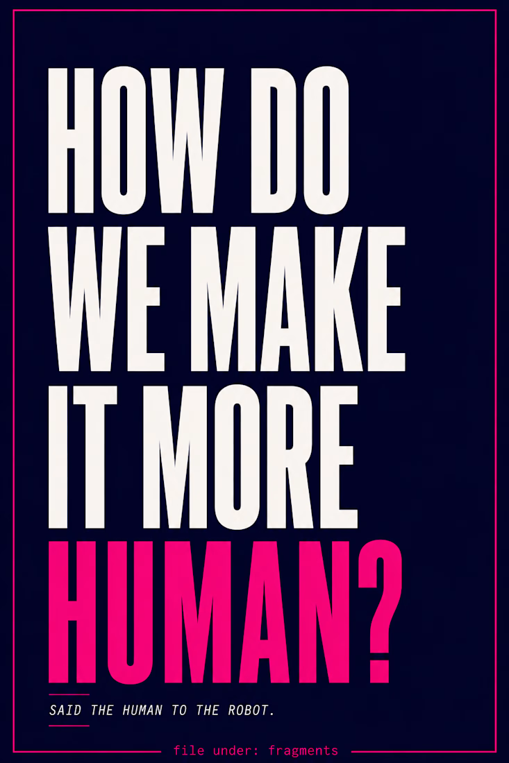
I was working on a piece with AI when I caught myself asking:
“How do we make it more human?”
I stopped.
Said the human to the robot.
It sounded absurd enough that I had to make something out of it.

That one line, said the human to the robot, flips the whole script in a way that sticks with people way more than another AI explainer post would. Did the poster design come first, or did the type treatment change once you had the words locked in?
The network for creativity
Join 1.25M professional creatives like you
Connect with clients, get discovered, and run your business 100% commission-free
Creatives on Contra have earned over $150M and we are just getting started





Related posts

Winder is a bold brand identity built around a geometric W-inspired symbol, combining sharp angles and forward movement to represent progress, speed, and direction.
The identity uses a striking red and deep burgundy palette, supported by clean typography and a consistent visual system across brand guidelines, digital applications, and product mockups.
Progress in Motion.




Great logo it feels it really has an identity 🎉🎉

Awesome dude

One-take cinematic AI film production
This is an FPV drone flight through a city during a solar eclipse.
The camera moves from a crowded square to a football stadium without any cuts or transitions. I wanted to show how people react when something unusual happens, and routine...
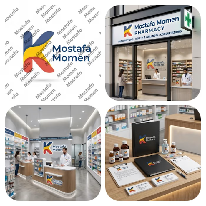
That's my pharmacy logo design it was special by it's color palette and smooth shapes
This design focus on (professionalism, trust, authenticity, showing business identity)
This design is special because it's color palette can be used in the business itself from furniture notes it will be suitable on them
Thanks for everyone who support me ❤️