The network for creativity
Join 1.25M professional creatives like you
Connect with clients, get discovered, and run your business 100% commission-free
Creatives on Contra have earned over $150M and we are just getting started
Back to feedPost

Very little of the Heron site is layout, which makes responsive a design problem rather than a build task.
The hero depends on a cursor drag, the preloader on a datum line moving up a full elevation, the explanation on a four-beat scroll sequence, and the whole visual system on architectural linework that fails when scaled down.
Each of those was re-solved for mobile. The hero interaction was rebuilt for touch and reframed to portrait. The scroll sequence was re-timed for shorter distances. Drawings were recropped so the relevant part of the plan is shown at a readable size instead of the whole drawing at an unreadable one. Motion weight was reduced to hold performance on mid-range devices without dropping any of the beats that carry the story.
Since most traffic arrives on mobile, this version had to stand on its own rather than gesture at the desktop experience.


The network for creativity
Join 1.25M professional creatives like you
Connect with clients, get discovered, and run your business 100% commission-free
Creatives on Contra have earned over $150M and we are just getting started











Related posts

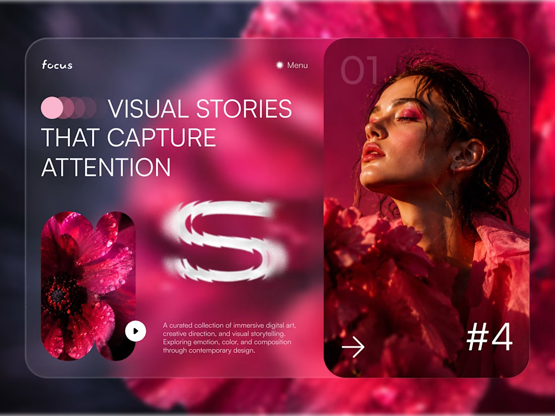
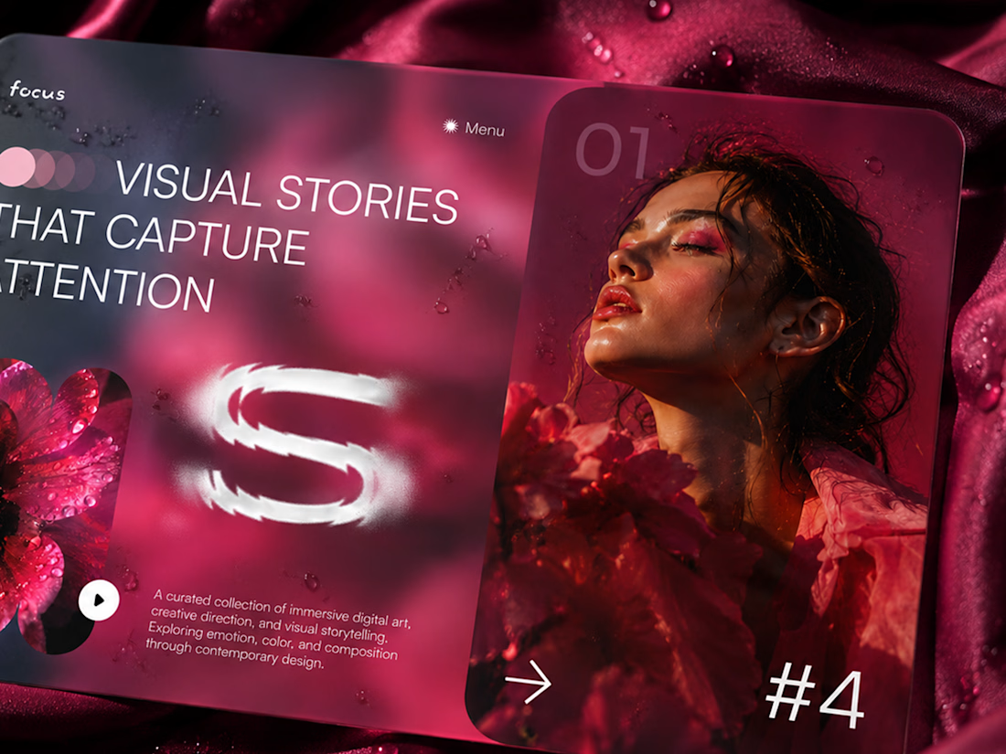
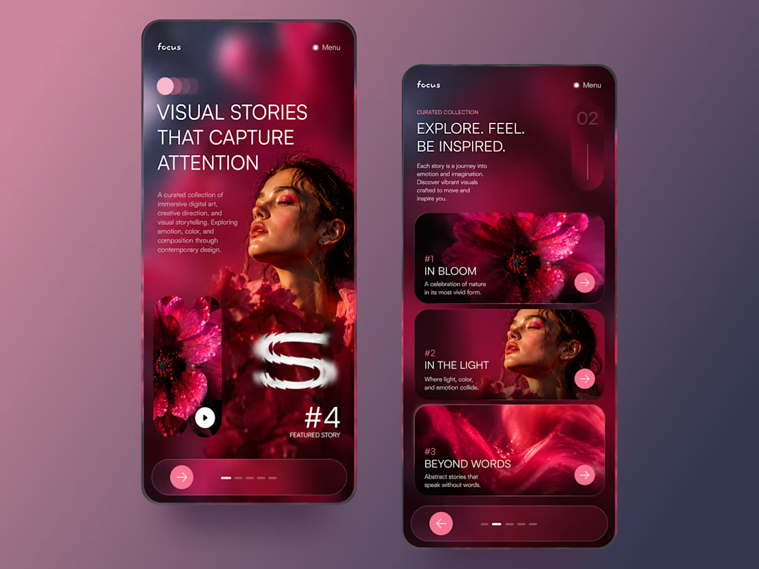
FOCUS — Creative Portfolio & Digital Art Website 🌸✨
A visually expressive website concept for a creative portfolio, built around digital art, bold imagery, and visual storytelling
The design combines vibrant pink tones, soft gradients, experimental typography, and immersive photography to create a distinctive editorial experience
Special attention was given to:
• Bold editorial hero composition
• Vibrant pink and dark color palette
• Experimental typography and visual details
• Immersive photography and digital artwork
• Creative project gallery and navigation
• Responsive mobile experience
• Clean layouts with a strong visual identity
The result is an expressive digital experience that puts creativity, emotion, and visual storytelling at the center of every screen 💗
Looking to create a standout portfolio or website for a creative brand? Let’s connect 🚀




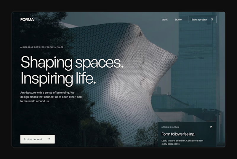
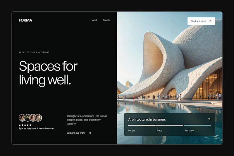
Design Exploration: Hero Section of Architecture Website. Which one do you think much better?


12 voted
43%
16 voted
57%
28 votes
Closed


This UI was really great nice job Piotr🔥🔥🔥