The network for creativity
Join 1.25M professional creatives like you
Connect with clients, get discovered, and run your business 100% commission-free
Creatives on Contra have earned over $150M and we are just getting started
Back to feedPost

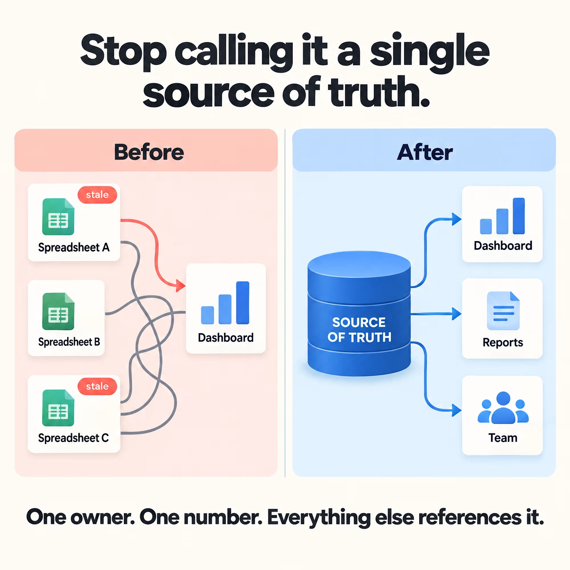
A "single source of truth" is a phrase everyone uses and almost nobody has. Usually there are three spreadsheets, two of which are stale, and a dashboard pulling from whichever one someone remembered to update last.
Fixing that isn't a bigger dashboard, it's deciding, on paper, which system owns which number, and building everything else to reference it instead of duplicating it.
The network for creativity
Join 1.25M professional creatives like you
Connect with clients, get discovered, and run your business 100% commission-free
Creatives on Contra have earned over $150M and we are just getting started




Related posts

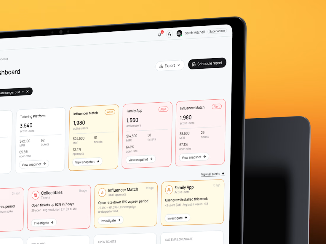
See how five products fit on one screen — B2B SaaS CRM dashboard and admin panel UX/UI🧡 Share your thoughts!

I bet it was a complicated task - to add 5 different products, but you did great!

📊 Interactive Sales Analytics Dashboard in Excel
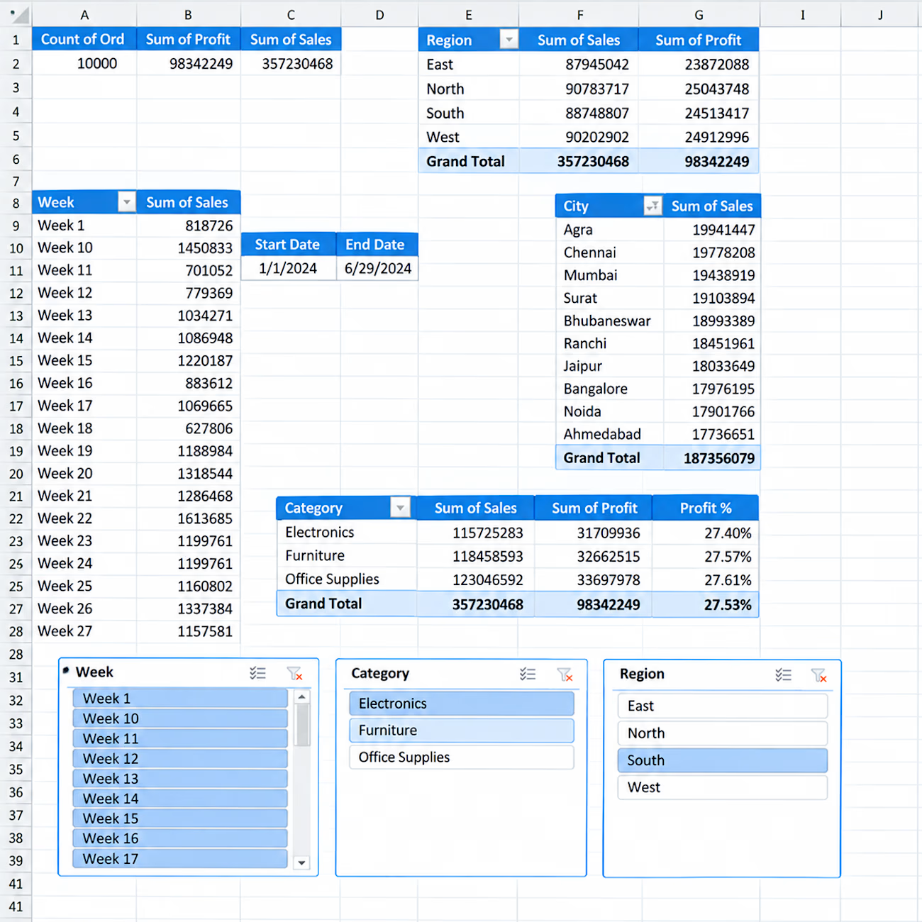
I created an interactive Excel dashboard to analyze sales performance across different business dimensions.
Key Insights & Features:
• Total Orders, Sales & Profit KPIs
• Sales & Profit by Region
• Sales by City
• Category-wise Sales, Profit & Profit %
• Weekly Sales Analysis
• Interactive Slicers for Week, Category & Region
• Start Date & End Date tracking
• PivotTable-based analysis
This dashboard is designed to turn raw sales data into clear and actionable business insights using Excel.


Hello.
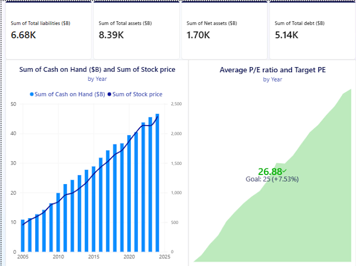
I guess we're in the same page about data analysis and visualization
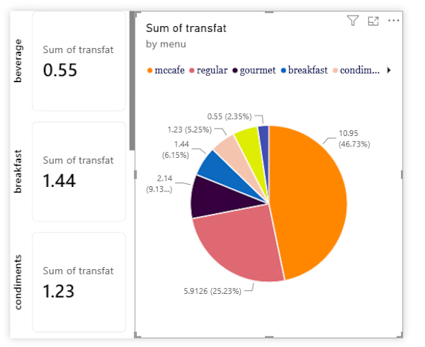

Everyone thinks a data dashboard should look complicated.
I think that is exactly why most of them fail.
I just finished Helios, a tool that tracks solar energy assets in real time. Dozens of sites, live output, verification records, a wall of numbers. The kind of screen people drown in.
Most designers would make it feel technical. More lines, more glow, more charts. I did the opposite. Every number had to answer one question in half a second, is this good or is this a problem. If it could not, it lost its place.
Because design is not decoration, it is closer to math. It is deciding what to remove until only the truth is left.
Complexity was never the enemy. Confusion is.
Get that right, and people trust you before you have said a word.
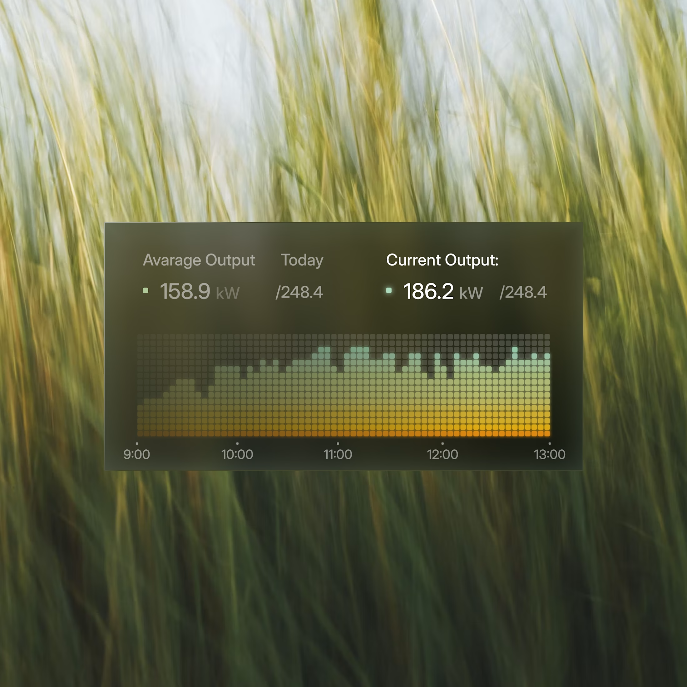
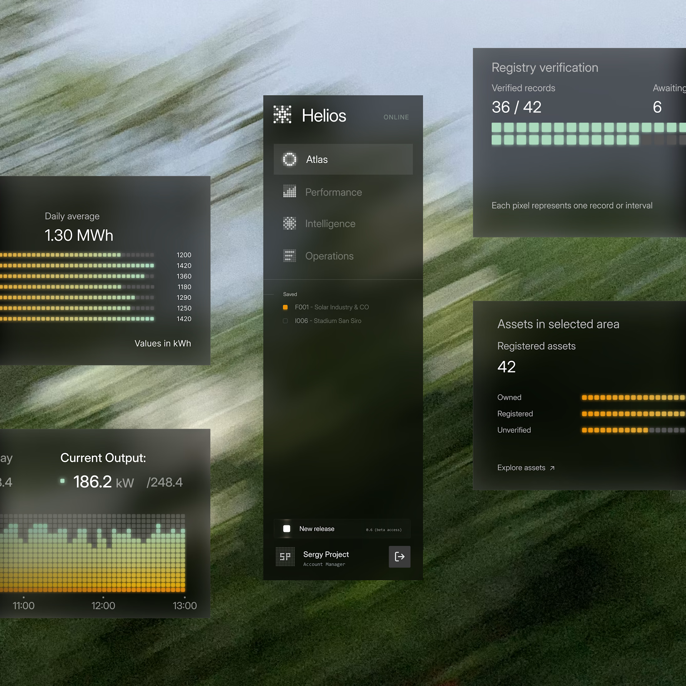

These components are perfectly executed, and the background is perfect for them.