
Eric Rajoriya
Data Analyst | SQL, Excel, Power Bi & Tableau
New to Contra
Eric is ready for their next project!


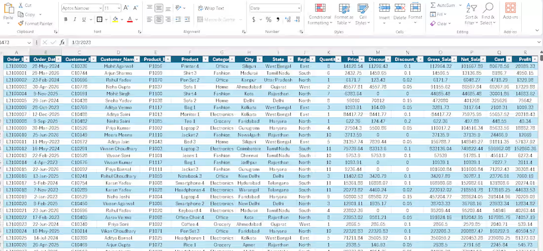
Cleaned and analyzed a retail sales dataset using Microsoft Excel to transform raw transaction data into structured, analysis-ready information.
The dataset includes Order Date, Customer, Product, Category, City, State, Region, Quantity, Price, Discount, Gross Sales, Net Sales, Cost, and Profit.
I worked on data organization, sales calculations, discount analysis, revenue and profit analysis, and prepared the dataset for reporting and dashboard visualizatio
🛠️ Tools
Microsoft Excel | Data Cleaning | Data Analysis | PivotTable | Data Visualization
📊 What I Worked On
Raw sales data cleaning & formatting
Sales and discount calculations
Gross Sales & Net Sales analysis
Cost & Profit calculation
Customer and product analysis
Category, region & city-wise analysis
Dataset preparation for dashboard/reporting
0
36
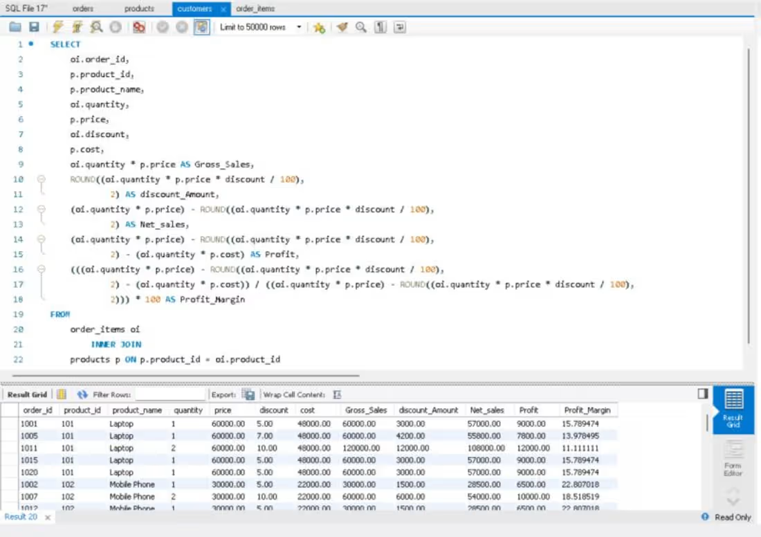
Analyzing Sales Data using SQL!
Converting raw data into meaningful business insights is a key part of Data Analytics. Today, I wrote a SQL query to calculate key sales and profitability metrics.
Key Metrics Covered:
Gross Sales: Quantity * Price
Discount Amount: (Quantity * Price * Discount / 100)
Net Sales: Gross Sales - Discount Amount
Profit: Net Sales - Total Cost
Profit Margin (%): (Profit / Net Sales) * 100
By joining the order_items and products tables, I extracted clear financial insights that help drive better business decisions.
0
47
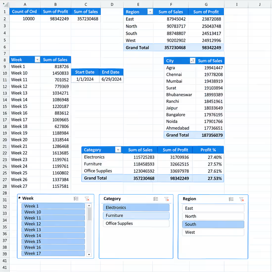
📊 Interactive Sales Analytics Dashboard in Excel
I created an interactive Excel dashboard to analyze sales performance across different business dimensions.
Key Insights & Features:
• Total Orders, Sales & Profit KPIs
• Sales & Profit by Region
• Sales by City
• Category-wise Sales, Profit & Profit %
• Weekly Sales Analysis
• Interactive Slicers for Week, Category & Region
• Start Date & End Date tracking
• PivotTable-based analysis
This dashboard is designed to turn raw sales data into clear and actionable business insights using Excel.
0
60
Created an interactive geographical analysis dashboard to visualize sales performance across cities and countries.
Key Features:
• Global sales visualization by location
• City-wise Orders, Sales & Profit
• Interactive map with location-based insights
• Country and city-level analysis
• Hover tooltips for detailed metrics
• Easy identification of sales performance across different markets
The dashboard helps transform geographical sales data into an easy-to-understand visual format for business analysis and reporting.:
0
61