The network for creativity
Join 1.25M professional creatives like you
Connect with clients, get discovered, and run your business 100% commission-free
Creatives on Contra have earned over $150M and we are just getting started
Back to feedPost

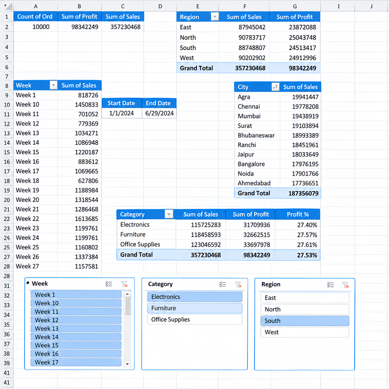
📊 Interactive Sales Analytics Dashboard in Excel
I created an interactive Excel dashboard to analyze sales performance across different business dimensions.
Key Insights & Features:
• Total Orders, Sales & Profit KPIs
• Sales & Profit by Region
• Sales by City
• Category-wise Sales, Profit & Profit %
• Weekly Sales Analysis
• Interactive Slicers for Week, Category & Region
• Start Date & End Date tracking
• PivotTable-based analysis
This dashboard is designed to turn raw sales data into clear and actionable business insights using Excel.


The network for creativity
Join 1.25M professional creatives like you
Connect with clients, get discovered, and run your business 100% commission-free
Creatives on Contra have earned over $150M and we are just getting started







Related posts

AI-Assisted Sales Intelligence Dashboard
Project Overview
This project is an end-to-end Sales Analytics solution built using Python, SQL, and Power BI.
The workflow includes:
Data Cleaning using Python (Pandas)
Data Storage using SQLite
Business Analysis using SQL Queries
Interactive Dashboard using Power BI
Automated Business Report Generation using Python
The goal of this project is to analyze sales performance, identify profitable products, monitor regional performance, and generate business recommendations.
Dataset
Dataset: Sample Superstore Dataset
Records: 9,994
Features:
Order Details
Customer Information
Product Information
Sales
Profit
Discount
Region
Category
Sub-Category
Tools & Technologies
Python
Pandas
SQLite
SQL
Power BI
Data Visualization
Business Intelligence
Project Workflow
CSV Dataset
↓
Data Cleaning (Python)
↓
SQLite Database
↓
SQL Analysis
↓
Power BI Dashboard
↓
AI Business Report
Dashboard Pages
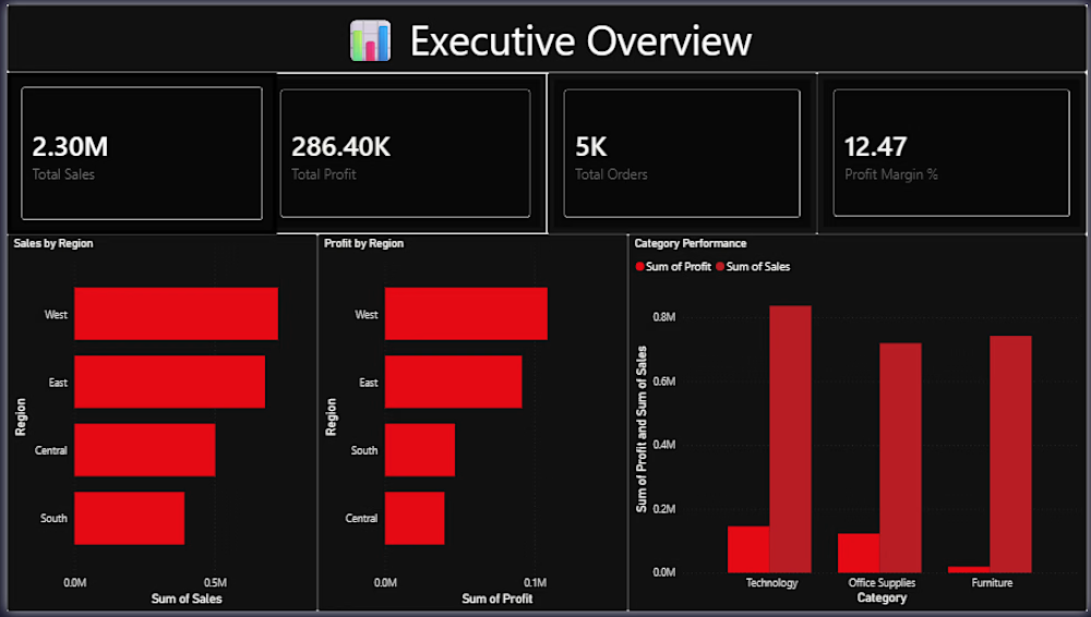
Executive Overview Total Sales Total Profit Total Orders Profit Margin Regional Sales Analysis Category Performance Analysis
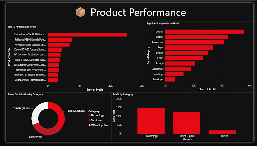
Product Performance Analysis Top Profitable Products Loss-Making Products Profit by Category Sales by Sub-Category
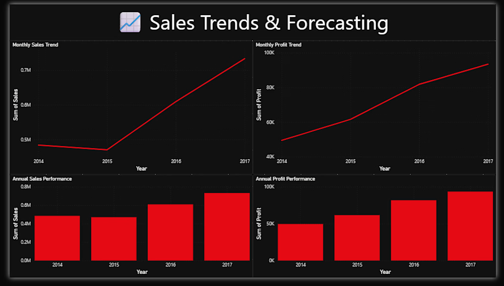
Sales Trends Analysis Sales Trends Over Time Profit Trends Seasonal Performance Insights Key Business Insights West Region generated the highest sales. Technology is the most profitable category. Several products generate significant losses and require pricing review. Sales performance varies significantly across regions. Automated AI Report The project includes a Python-based reporting system that automatically generates:
Total Sales
Total Profit
Business Insights
Strategic Recommendations
Author
Gourav Jangid
Aspiring Data Analyst
Open to Data Analytics Opportunities



Manufacturing ERP & Production Intelligence Dashboard


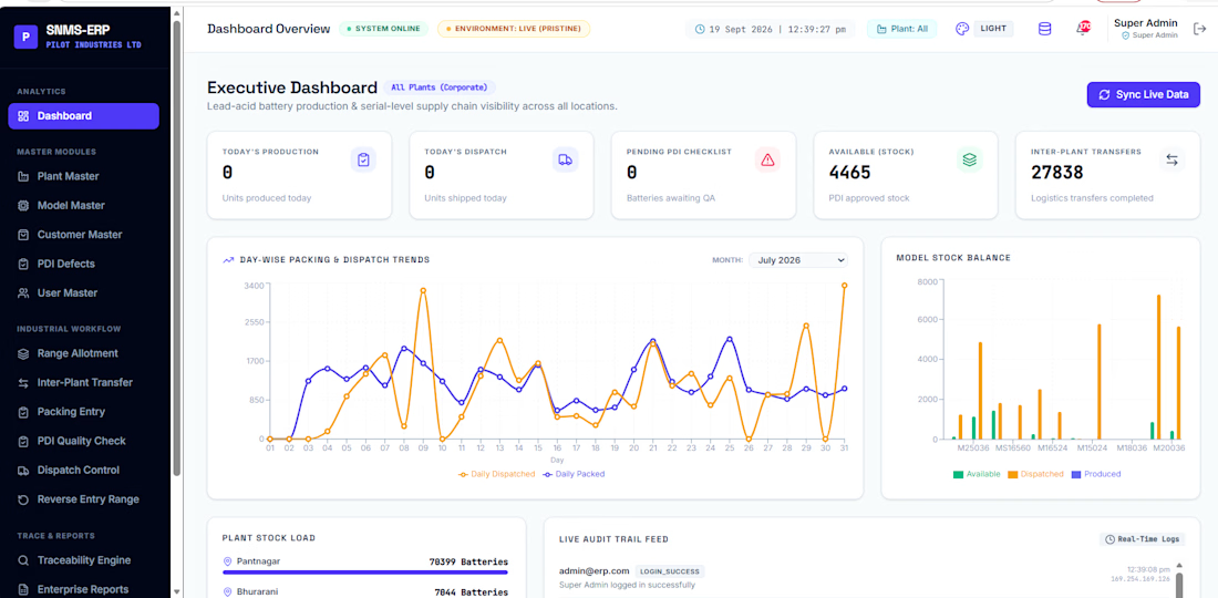

The dark plant nav next to the light data canvas keeps the menus from fighting the charts. Putting the packing trend beside stock balance makes the floor numbers readable at a glance.

Personal Finance Dashboard UI/UX Design
Designed a modern Personal Finance Dashboard UI/UX, focused on making financial management simple, clear, and visually engaging.
The dashboard includes financial overview cards, income and expense tracking, spending analytics, expense breakdown, recent transactions, savings goals, budgets, accounts, and quick actions.
The dark-mode interface combines a clean layout, modern typography, subtle shadows, gradient background, rounded cards, and vibrant accent colors to create a premium SaaS dashboard experience.

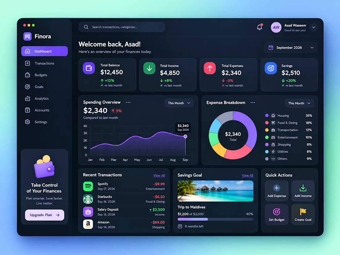

How did you prioritize the financial overview over the deeper analytics?