The network for creativity
Join 1.25M professional creatives like you
Connect with clients, get discovered, and run your business 100% commission-free
Creatives on Contra have earned over $150M and we are just getting started
Back to feedPost
Clean and accessible pricing UI.
I think the CTA is big and almost too big what do you think?


Good job

Thank you Rasel
The network for creativity
Join 1.25M professional creatives like you
Connect with clients, get discovered, and run your business 100% commission-free
Creatives on Contra have earned over $150M and we are just getting started



Related posts




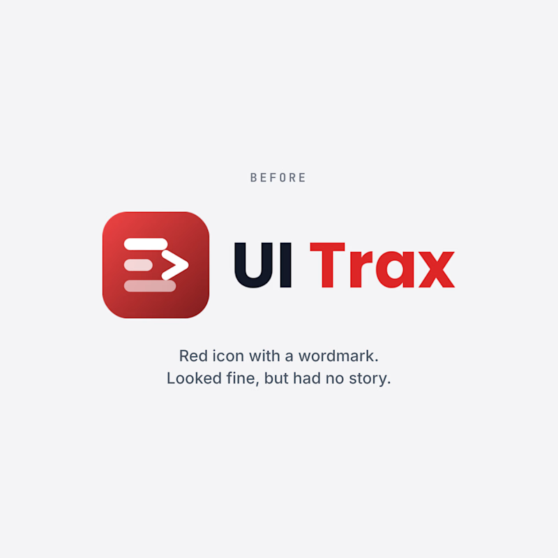
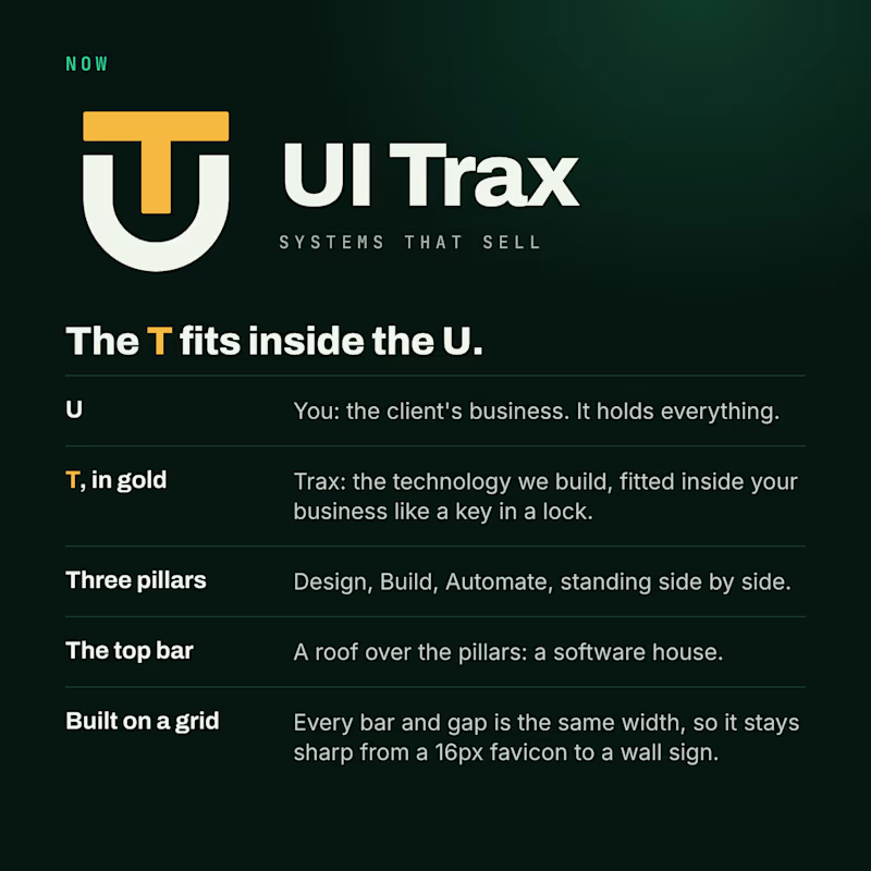
We redesigned the UI Trax logo, and this time every part has a meaning.
The U is you, the client's business. The gold T is Trax, the technology we fit inside it like a key in a lock. The three pillars are Design, Build and Automate. The top bar is a roof over them: a software house.
The old logo was a red icon with a wordmark. It looked fine, but it had no story.
Which one would you trust with your project? Vote, and tell me why in the comments.
#Branding #BeforeAndAfter #UITrax
3 votes
Ends in 22h

Now — the UT badge tells the story better.

