Samsudeen Afolabi
Mobile App Designer and IOS Design Engineer
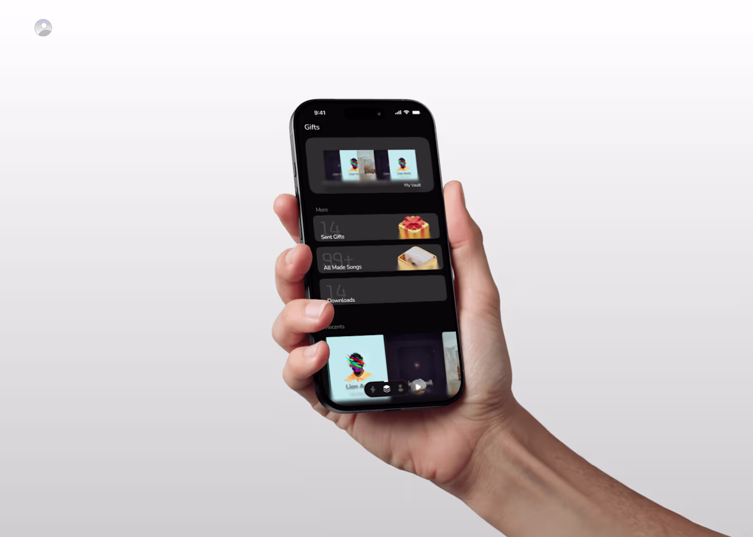
- $1k+
- Earned
- 2x
- Hired
- 5.00
- Rating
- 26
- Followers
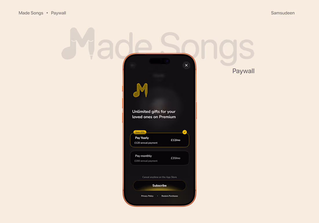
Paywall Design
How you ask users to pay cant be exaggerated.
Helper texts, clear hierarchy etc
send me a dm for design collabs and gigs
1
28
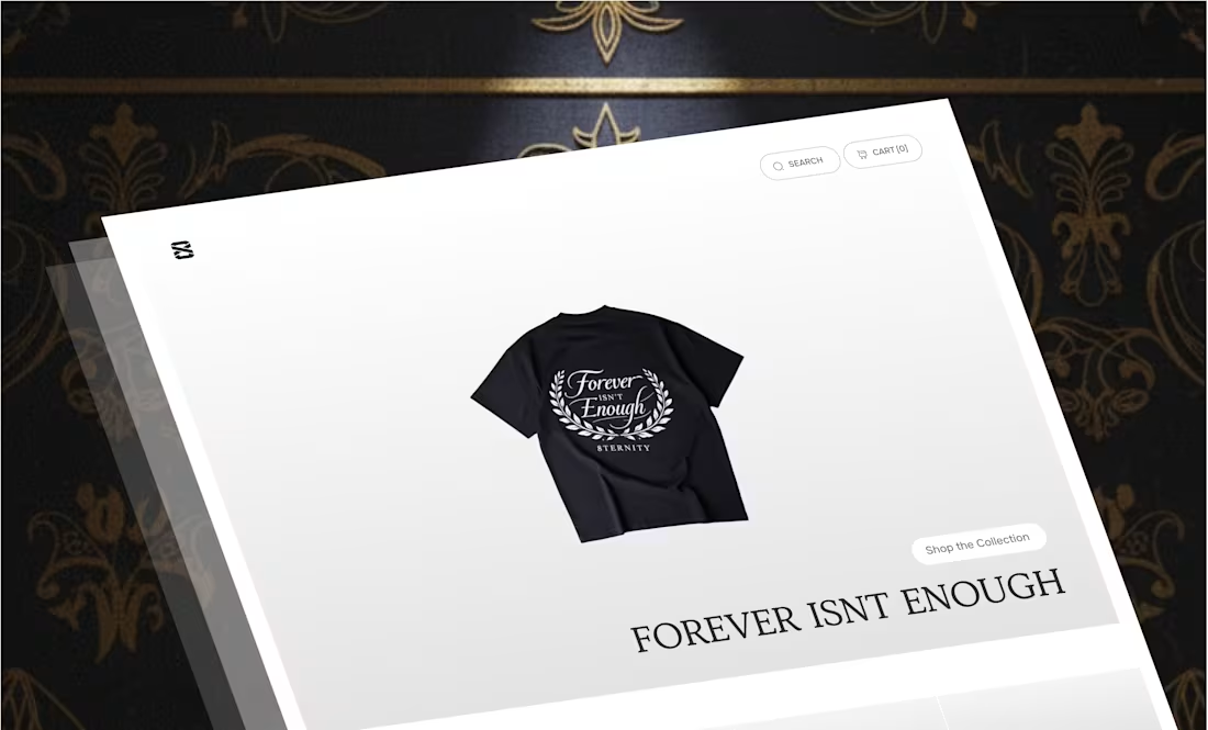
8TERNITY was an exploration of luxurious digital shopping experience.
An evergreen fashion collectible where 'forever isn't enough'
the aim of the layout is to exercise a clear and easy to navigate UI
I fashioned the UI and pieced the functional built together. I engineered the whole item of joy and delightful e-commerce together.
Its a very uniquely detailed experience both on web and mobile. The page is heavily white spaced and information about the model are provided relative to the user... all these pieces make up for a wholesome shopping experience where churn is catered to and every user is equally served .
That's Design engineering I master pieced.
3
5
158
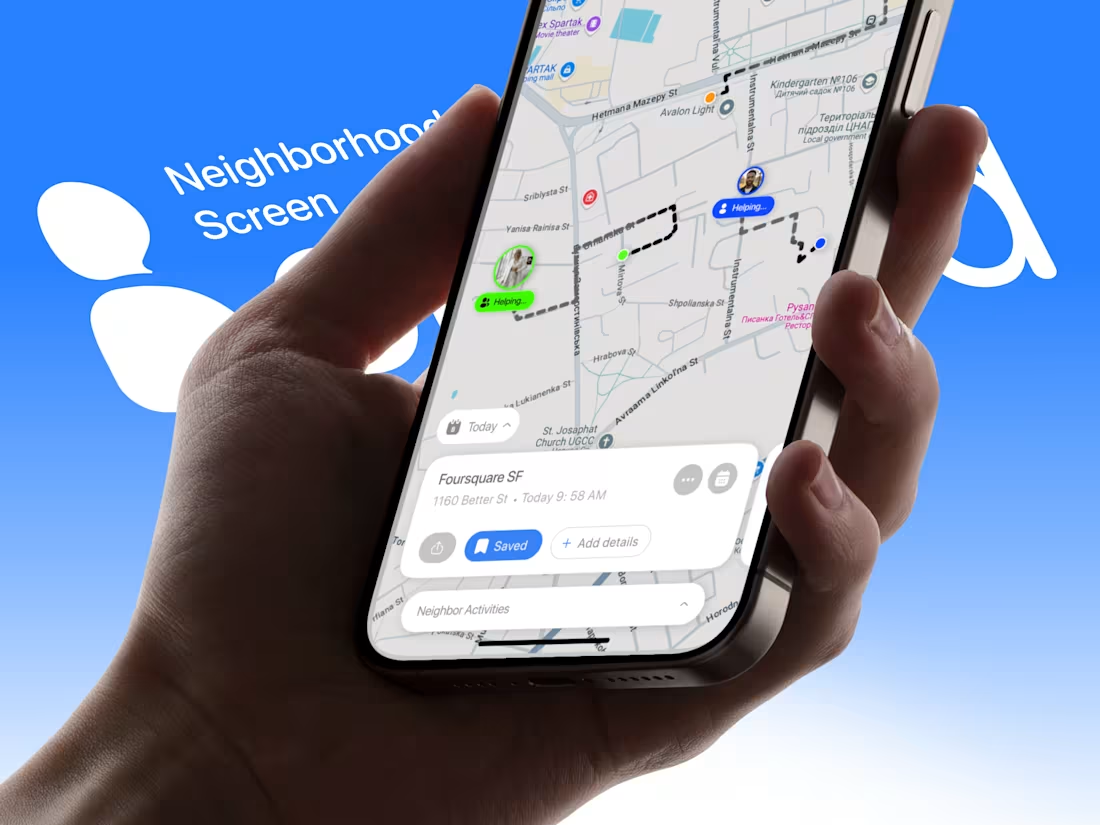
Imagine a virtual neighborhood is the live, thats what I built.
You see distinct markers for neighbors who are currently active. The dotted lines represent the active paths neighbors are taking. It puts real-time and community support in the same expression.
A lot of details I'm exercising in this project are eye-opening.
I'm open to gigs and project collaborations.
1
3
155
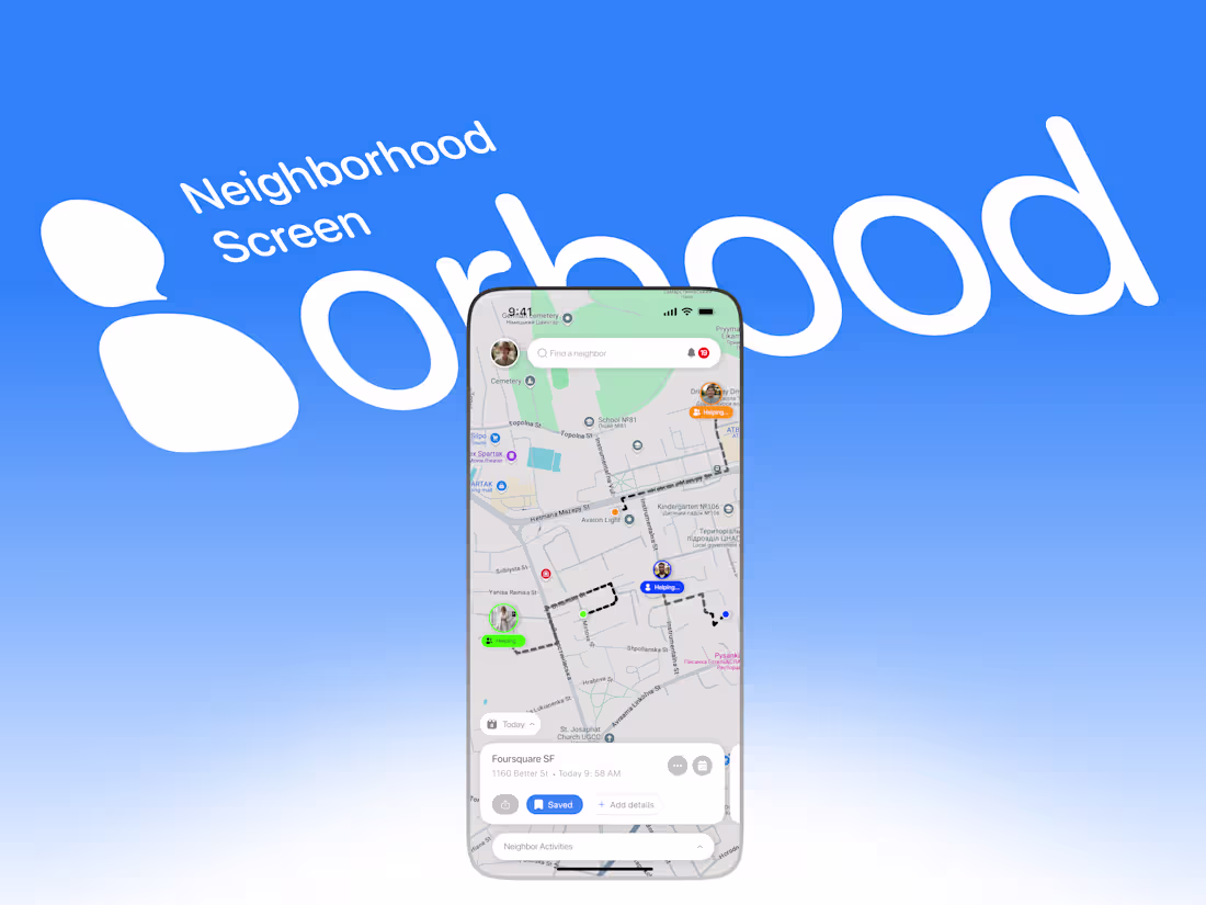
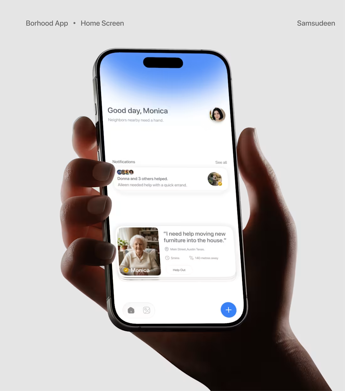
The Neighborhood Screen is the live, virtual neighborhood.
You see distinct markers for neighbors who are currently active. The dotted lines represent the active paths neighbors are taking. It puts real-time and community support in the same expression.
A lot of details I'm exercising in this project are eye-opening.
I'm open to gigs and project collaborations.
1
3
181
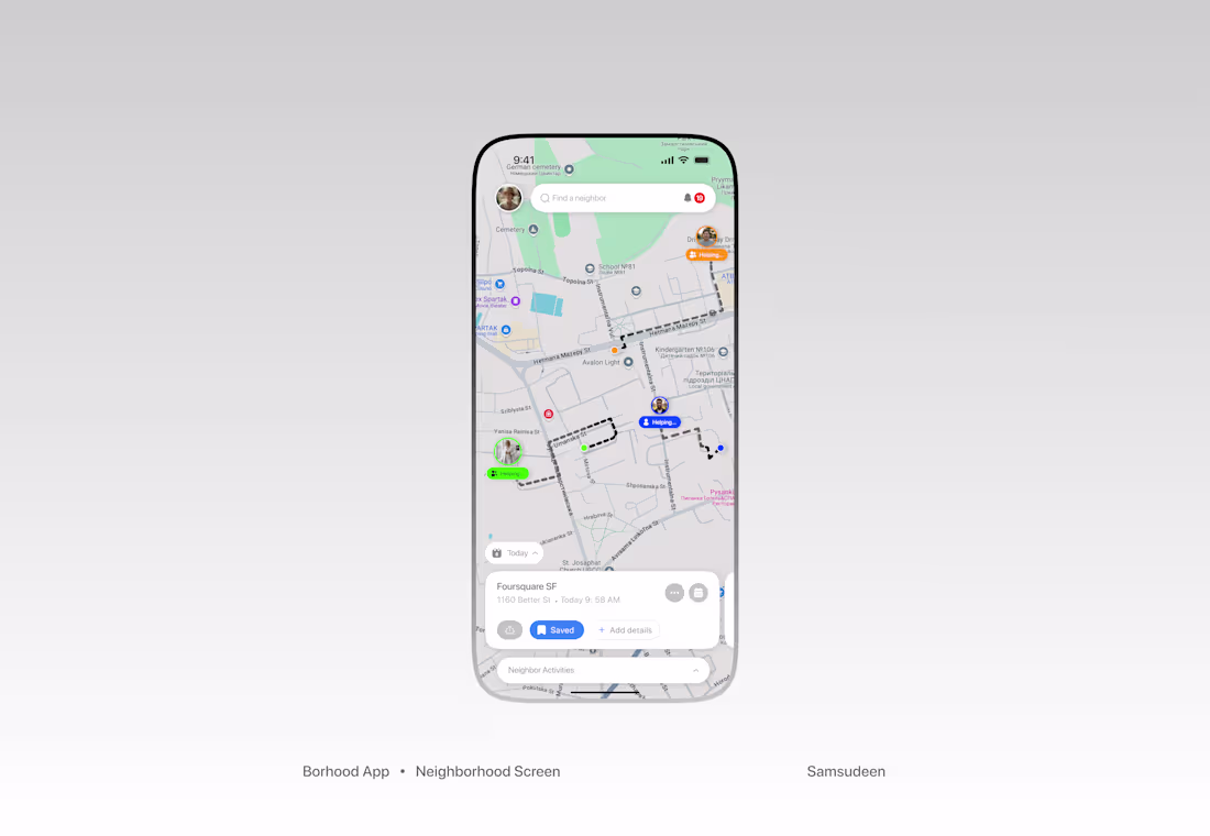
Neighborhood Screen is the virtual neighborhood. It feels live.
You see distinct markers for neighbors who are currently active. The dotted lines represent the active paths neighbors are taking. It puts real-time and community support in the same expression.
"Find a neighbor" quickly, with a prominent notification bell showing 19 active updates or alerts.
The background uses a clean, high-contrast map style to ground the app in your actual physical surroundings.
High-resolution avatars are used as map pins.
At the base, a card provides the exact address, the time of the request, and quick-action buttons to Save, Share, or Add details.
A lot of details I'm exercising in this project are eye-opening.
I'm open to gigs and project collaborations.
1
3
155
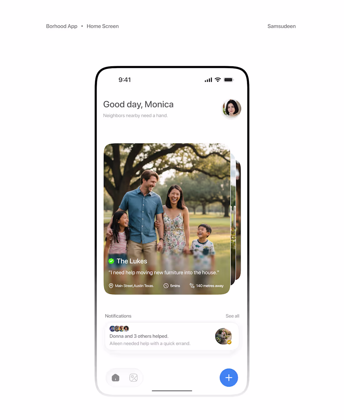
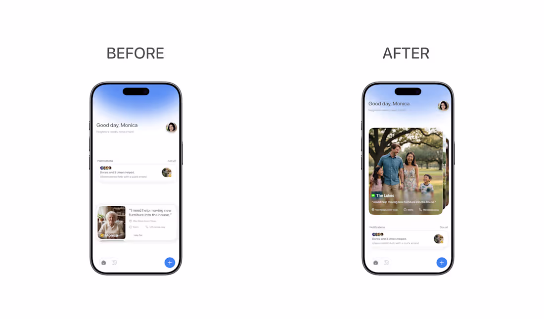
The home page I initially explored was'nt enough. It lacked craft and direction. I redesigned how the cards are experienced and how much information they convey. its been fun building this project in public with y'all and I'm open to new projects and collaborations.
1. I improved the balance between visual "breathability" and the data users need at a glance.
2. I also rebuilt the card component to feel more tactile and responsive to user interaction.
3. Scalable Design System in a cohesive visual language for future iterations to maintain the same level of craft.
3
6
204
More on Borhood,
The home page I initially explored was'nt enough. It lacked craft and direction.
I redesigned how the cards are experienced and how much information they convey.
its been fun building this project in public with y'all and I'm open to new projects and collaborations.
2
107
A lot of the pieces of the Borhood exploration I cant keep just for my eyes.
the full casestudy is in the works.
1
116
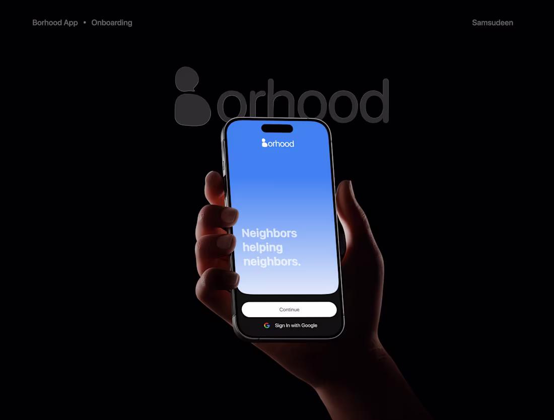
Borhood is coming to life gradually.
My intent was to build a product that feels 'safe' and maintains command.
A space that feels safe for neighbors to ask neighbors for help.
Seeing the high engagement and the way the app executes in real-time shows that the focus on the user is paying off, stay tuned as there's more to come.
Reach out for your app and collaborations.
2
3
123
I recently closed a $3k mobile app with a client
Super grateful for the trust, the relationship we're building and something this has signalled to me.
1. There's more to the creative juice I squeezed into the details of the project
2. With love, curating a bespoke apps to serve one use is a muscle I'm willing to grow in coming days
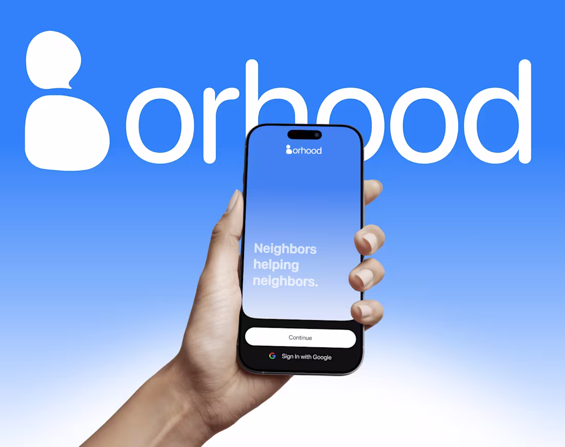
For my presentation, I'll be sharing my progress with Borhood; currently exploring this sky-blue feel and more to come on the project in coming days.
Feel free to reach out to me for a collaboration or to have me bring craft to your projects.
3
3
181
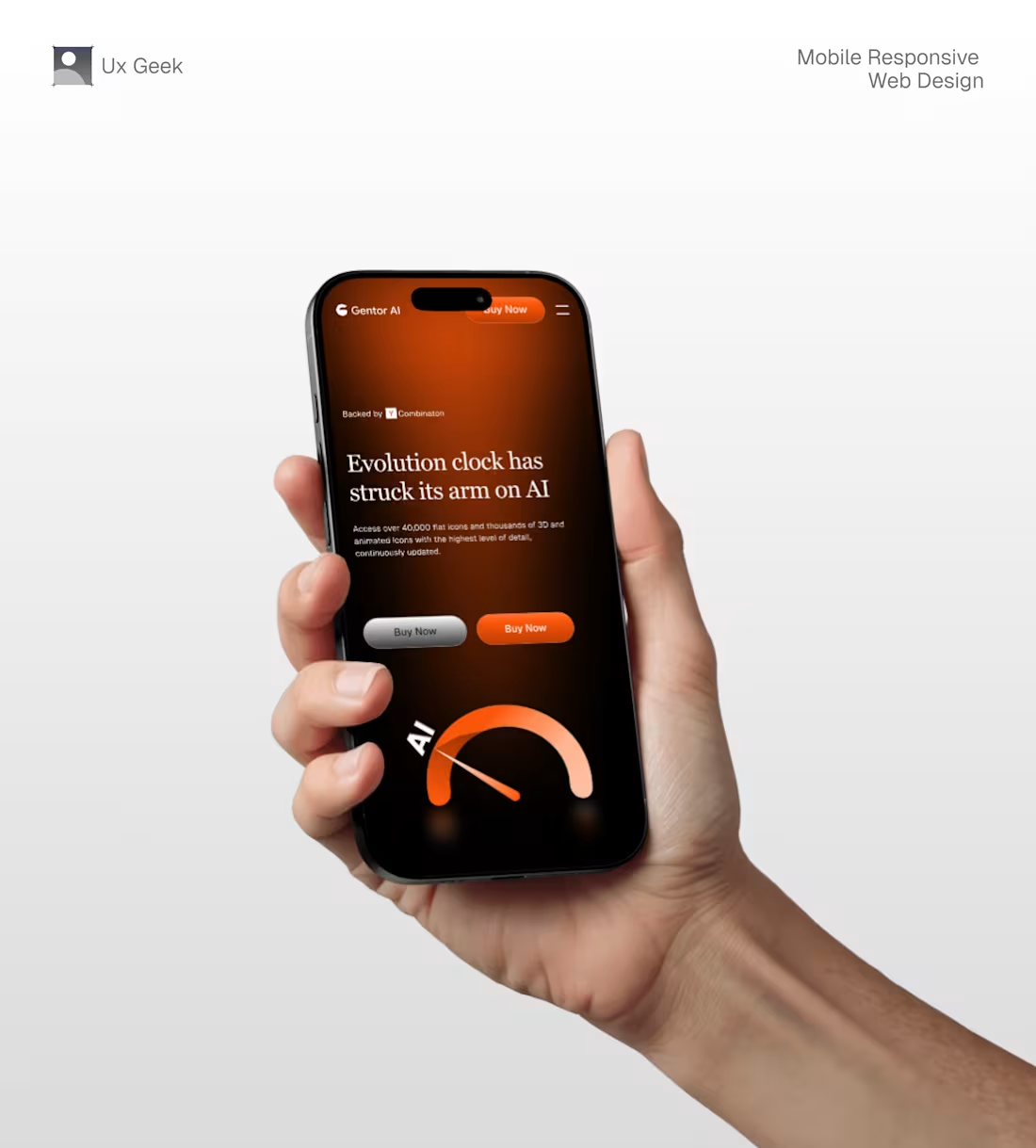
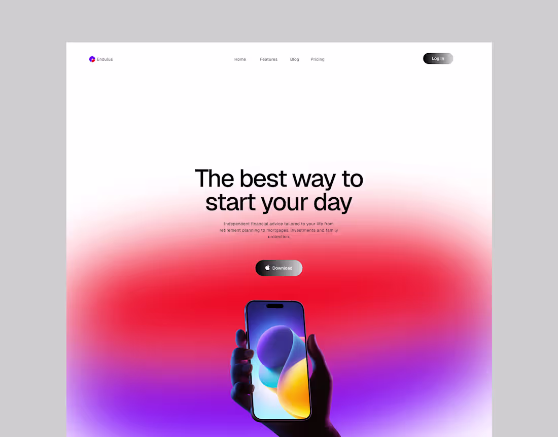
Mobile-first Responsive Web UI with sheer command of legibility and whitespacing
2
109
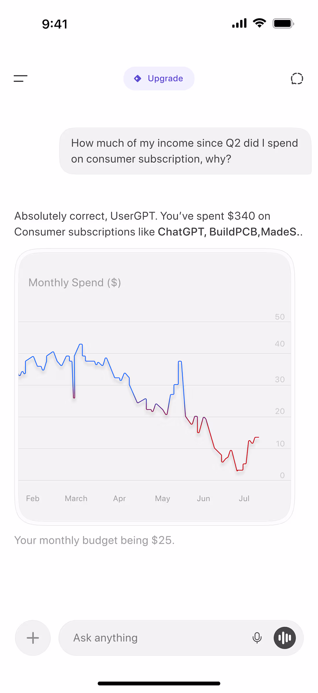
What if ChatGPT had taste to its responses✨
1
89
Illustrations for a product in the cooks✨
1
104
Liquid Metal✨
1
52
I read enjoyed working on this (Unicorn Studio + TypeScript+ Figma
1
2
67

What if ChatGPT with that context had ✨Taste.
1
62
My design has been engineering easily of late I used css animation for the spinner and typescript for the execution’s heavy lifting .
Let’s hop on calls, let’s build stuff!
2
75
Concept Hero Section Design✨
1
2
68
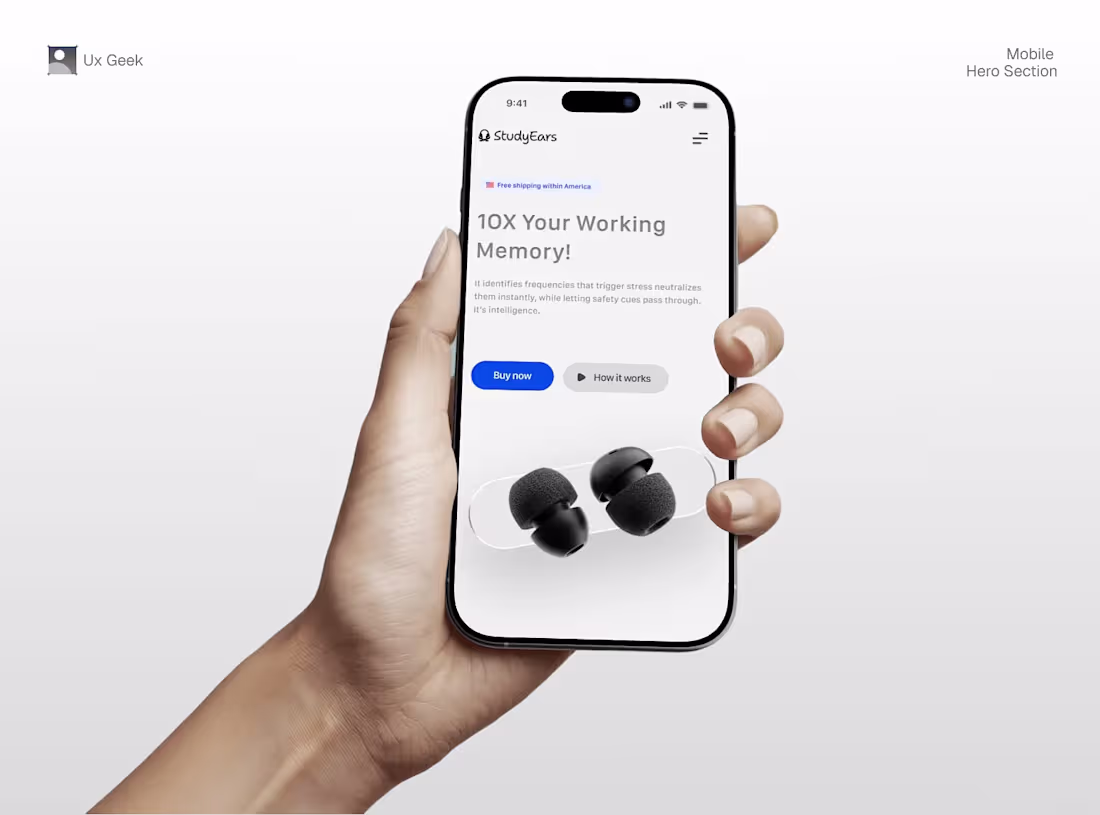
Noise cancellation earmuffs -StudEars.
1
54

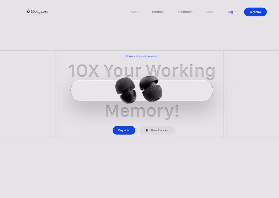
Concept Hero Section Design ✨
I love the unique layout.
2
3
70
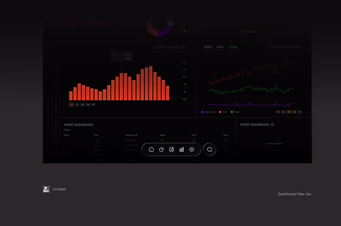
Which one of these Navs would you reckon?
2
2
75
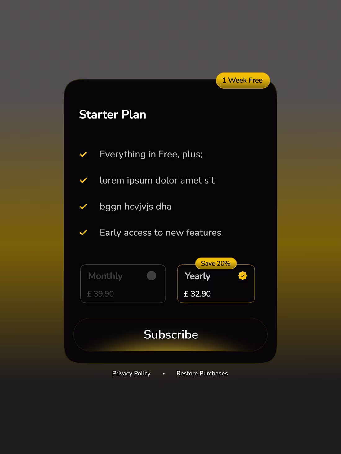
Pricing card ✨
1
58
✨
2
3
68
Glassy poster exploration this
1
2
77
A clean modern productivity website design. Made in Figma and unto Framer.
Very accessible and mobile responsive.
#WIP
1
36
108
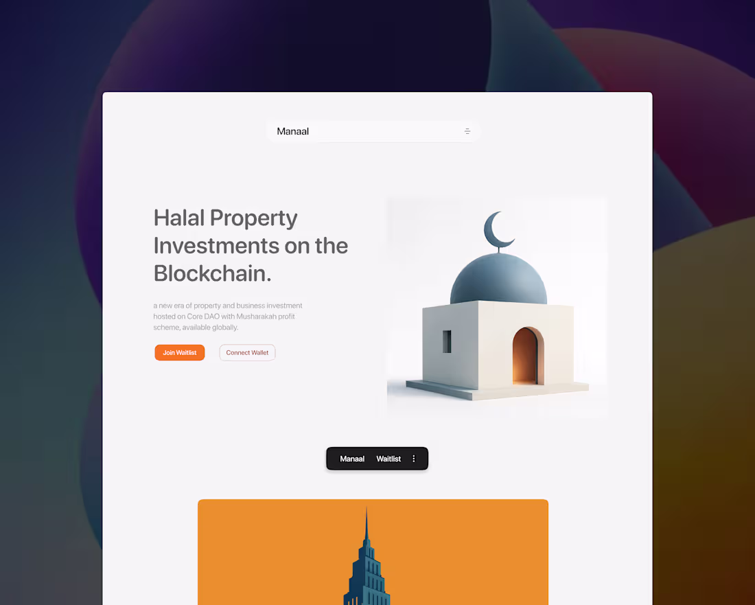
Manaal Halal Investment Platform
2
8
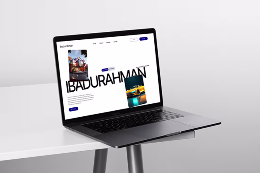
Ibadurahman || Website for Automobile Company
2
4