The network for creativity
Join 1.25M professional creatives like you
Connect with clients, get discovered, and run your business 100% commission-free
Creatives on Contra have earned over $150M and we are just getting started
Back to feedPost

Prestige Lifestyle Management; A Lifestyle Management Brand
A website designed for a luxury lifestyle management brand built around discretion, access, and exceptional service.
The goal was to create a digital presence that feels as premium as the experience Prestige Lifestyle offers, clean, refined, and intentionally understated.
I focused on visual direction, UI design, layout, typography, and conversion-focused sections, creating a website that communicates trust while making the brand’s services easy to understand and explore.
The result is a sophisticated web experience designed to turn interest into enquiries.
Link to live site:https://prestige-lifestyle.vercel.app/
Services: UI/UX Design · Web Design · Art Direction · Responsive Design


The network for creativity
Join 1.25M professional creatives like you
Connect with clients, get discovered, and run your business 100% commission-free
Creatives on Contra have earned over $150M and we are just getting started




Related posts

What should a creative agency website actually feel like?
For Orvika, we didn't want another agency site built around the same safe layouts and predictable sections.
We pushed the visual direction further with oversized typography, editorial layouts, bold imagery, and stronger contrast, while keeping the experience structured enough to communicate the agency's work and capabilities clearly.
The goal wasn't just to make it look different.
It was to make the agency feel different.
Designed in Figma and built in Framer.
We're sharing more of the websites and digital experiences we've been working on here over the next few weeks.



Very neat man

Most furniture websites try to help you buy faster. This concept for SÖDER ATELIER explores a different idea:
What if the experience helped you choose better?
The design is built around the values shown throughout the concept craftsmanship, natural materials, longevity, repairability, and thoughtful living. So instead of treating the homepage like a catalogue, the experience gives space to:
→ The story behind the pieces
→ Curated collections
→ Craft and material details
→ Long-term value
→ Customer perspectives
→ Clear product discovery
The visual language stays quiet and editorial, letting the furniture carry the attention. Because when a product is made to live with for years, the website shouldn't make it feel disposable.
SÖDER ATELIER — a responsive furniture e-commerce exploration.
🏀 Full Design Showcase – Better View on Dribbble.
↗ Furniture E-commerce Product Website

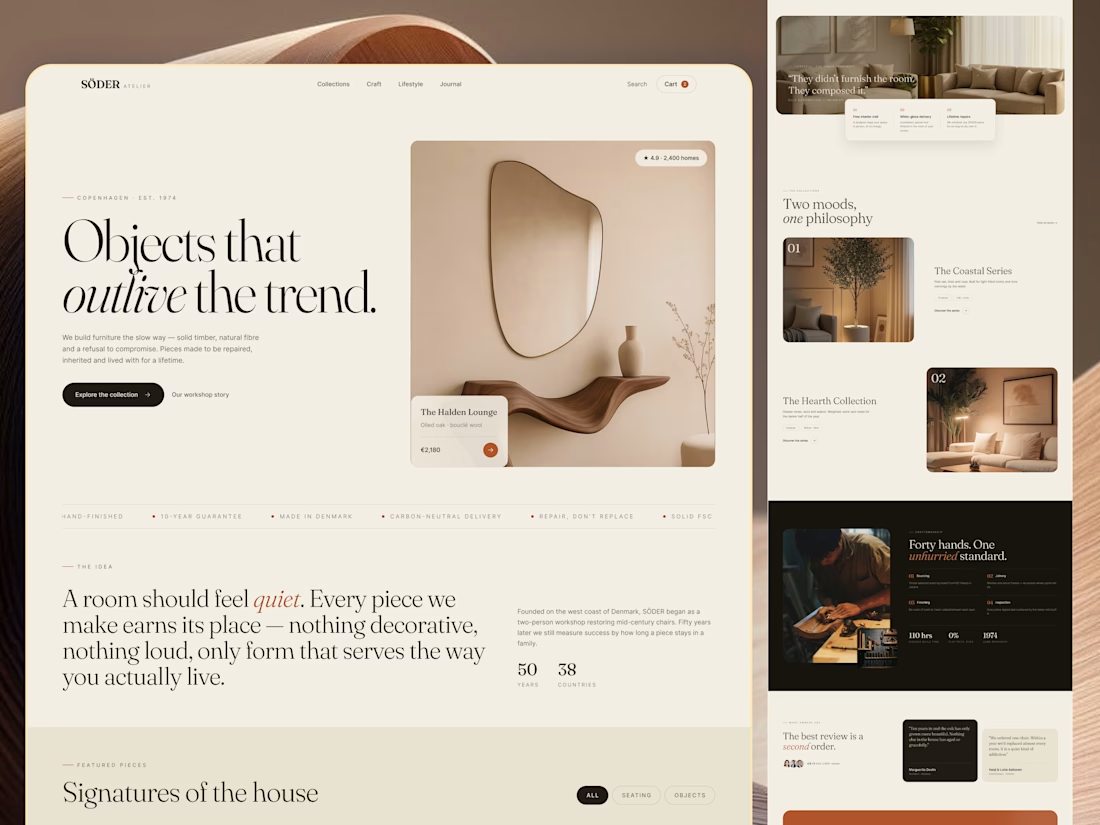

The homepage sells longevity, and Signatures of the house still gives you category chips to browse by. Curious whether the product page carries the craft and repairability fields too.

ADCB × Shukran - Credit Card Landing Page.
I designed a landing page for the co-branded credit card partnership between ADCB and Shukran, Landmark Group’s loyalty programme.
The page brings together the card’s benefits, participating brands and application entry point, helping visitors understand the offering and explore how to get started.
The design uses a black-and-gold palette, prominent card imagery and distinct content sections to present a wide range of rewards in a cohesive visual experience. The work shown includes the landing-page design, benefits presentation and “How it works” section.

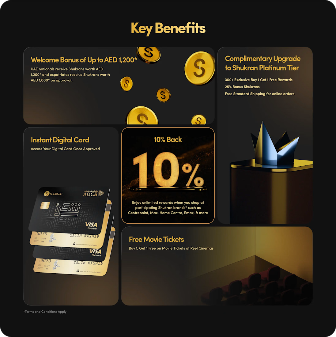
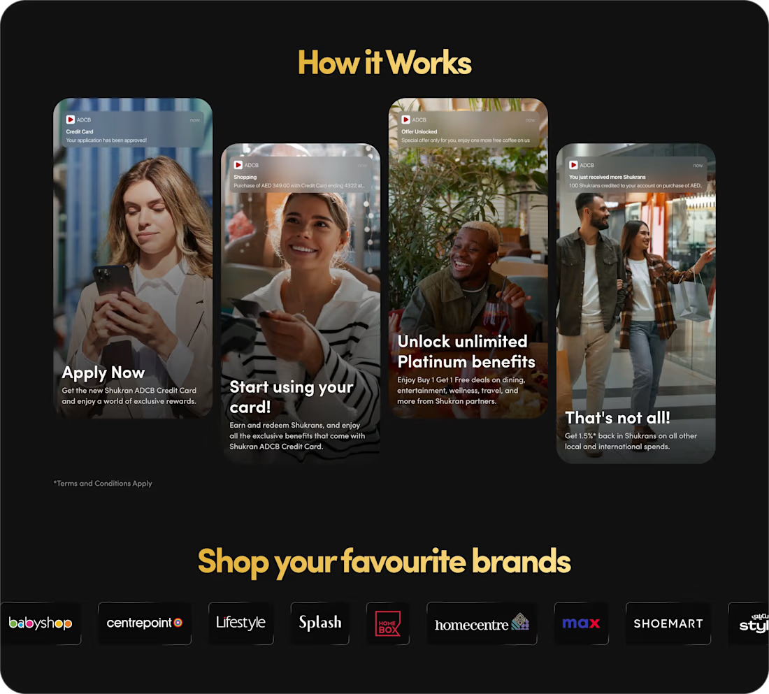
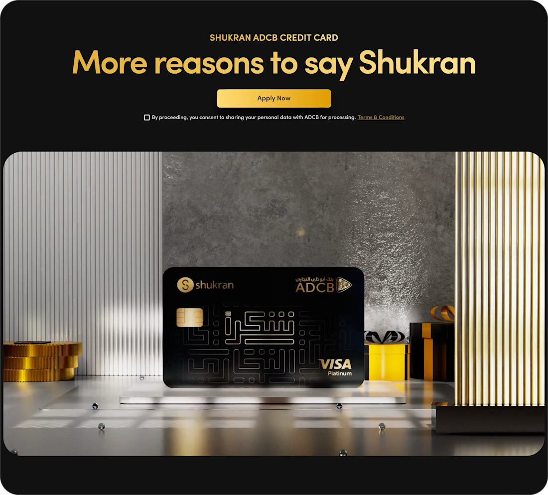
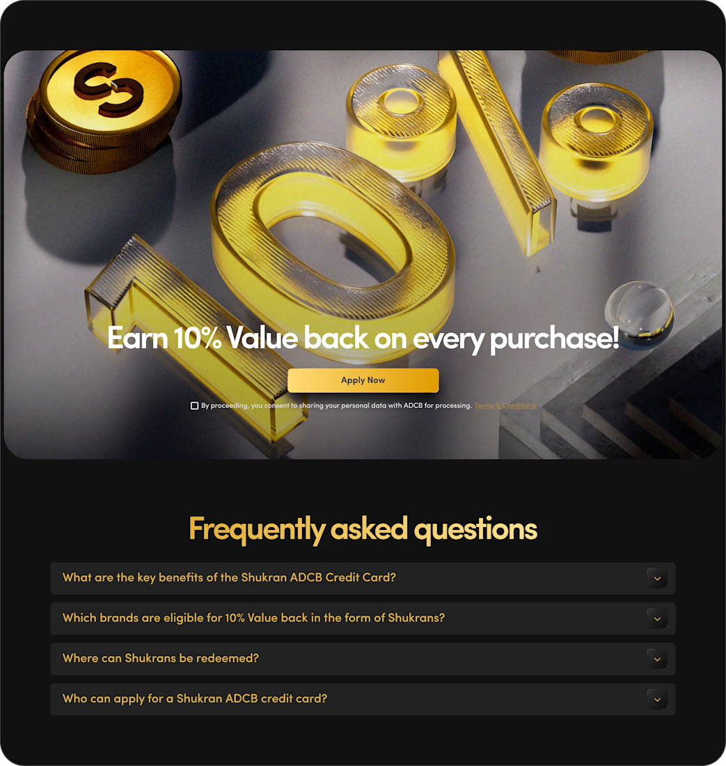

The benefits and application path are presented with clarity.