The network for creativity
Join 1.25M professional creatives like you
Connect with clients, get discovered, and run your business 100% commission-free
Creatives on Contra have earned over $150M and we are just getting started
Back to feedPost
Designed a sleek AI automation platform dashboard with a modern dark UI, intuitive data visualization, workflow tracking, and automation insights.
Built to help teams monitor AI operations, manage workflows, and make faster decisions through a clean and scalable user experience.


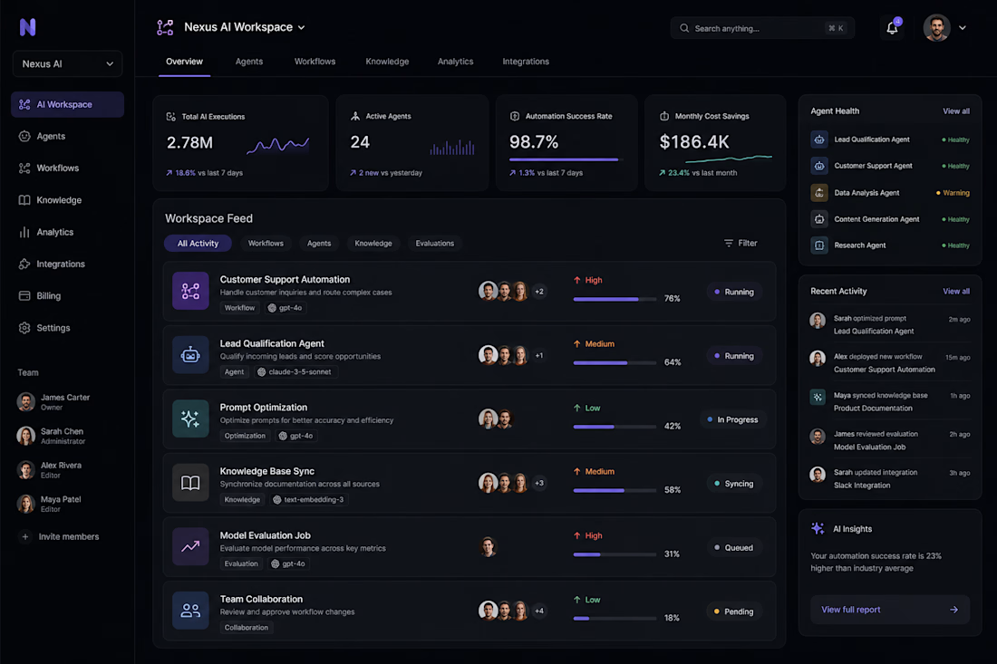

The workflow tracking feed and data visualization metrics look incredibly clean, Pranto. Did you build custom SVG charts in Next.js or use a library like Recharts for those smooth area graphs?

Thanks! We used Recharts for the charts and data visualizations. It gave us the flexibility to build smooth, responsive area graphs while keeping the dashboard performant and easy to maintain.

The agent health sidebar with status indicators is a nice touch, most AI ops dashboards bury that kind of monitoring. Was the dark theme a client requirement or your own call for this kind of data-heavy interface?
It was actually the client's decision initially. Later on, we added a light mode option as well so users could choose the experience that works best for them, especially during longer sessions.
The network for creativity
Join 1.25M professional creatives like you
Connect with clients, get discovered, and run your business 100% commission-free
Creatives on Contra have earned over $150M and we are just getting started
Related posts

What started as friends scheduling weekend classes somehow evolved into a community that partners with studios and hosts events.
Naturally, I couldn't resist giving it a brand identity 🥴
Here's the visual system I created for Pilates Pals, inspired by movement, connection, and making fitness feel a little less intimidating.

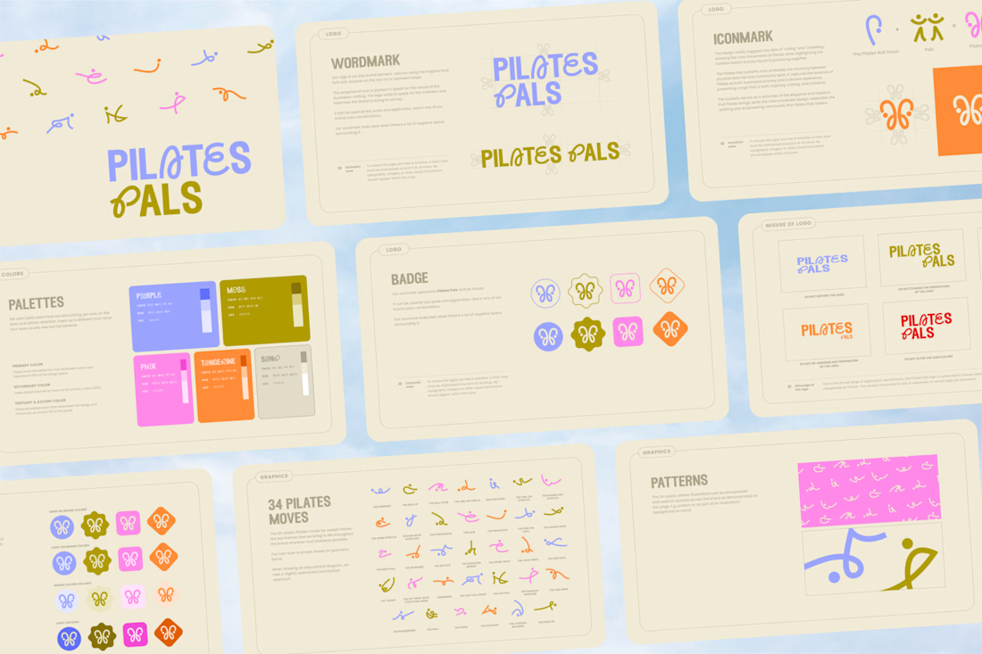
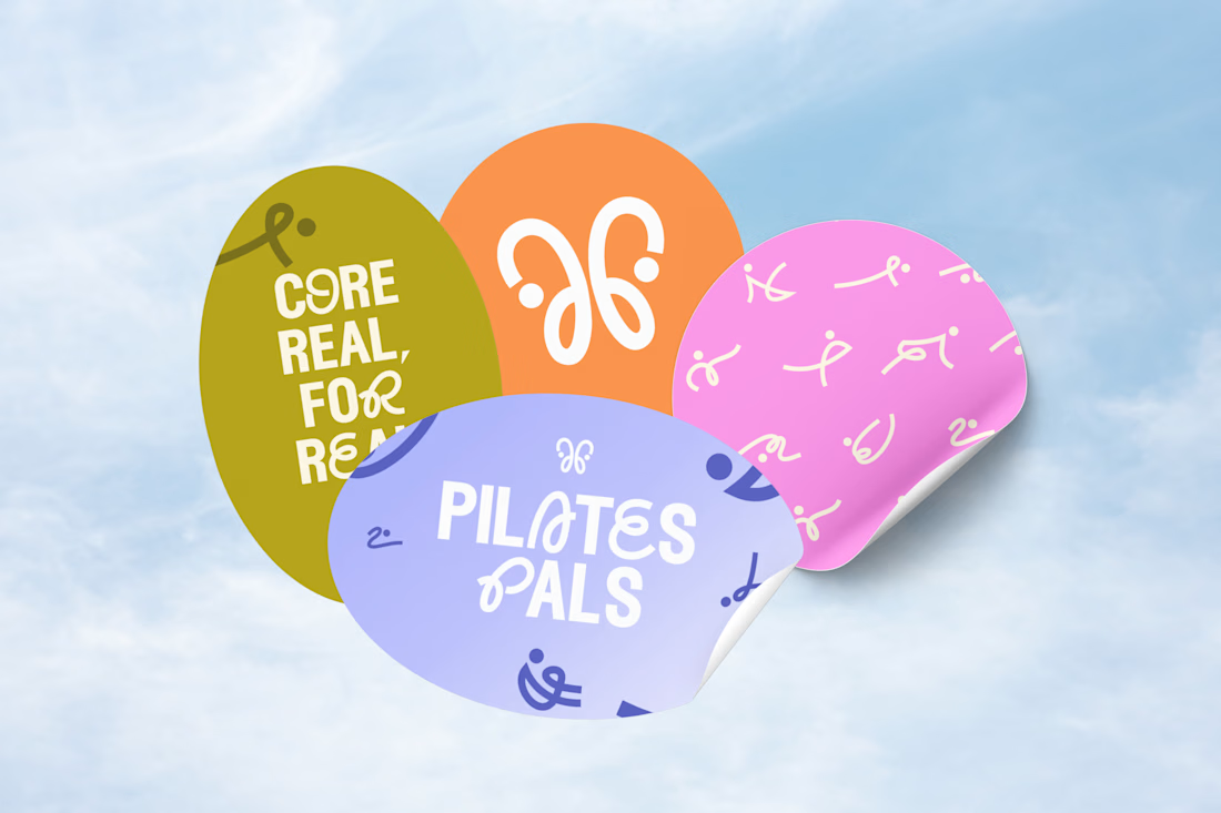
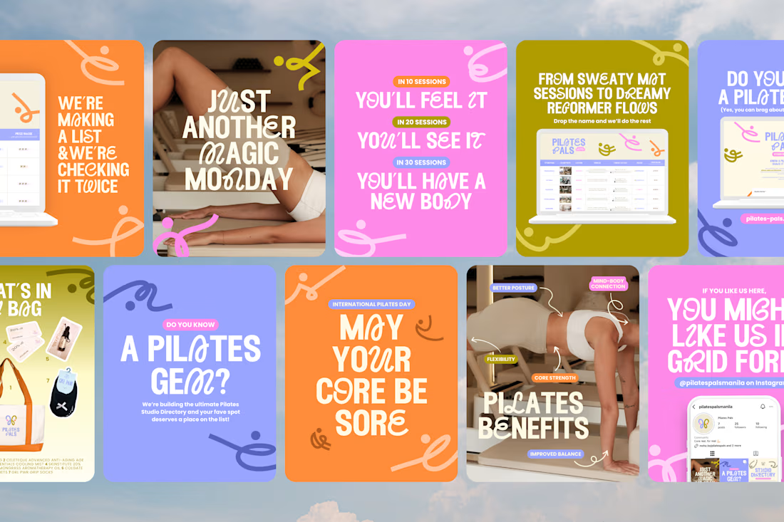

the branding, the posts, the logo, the deck. soo good

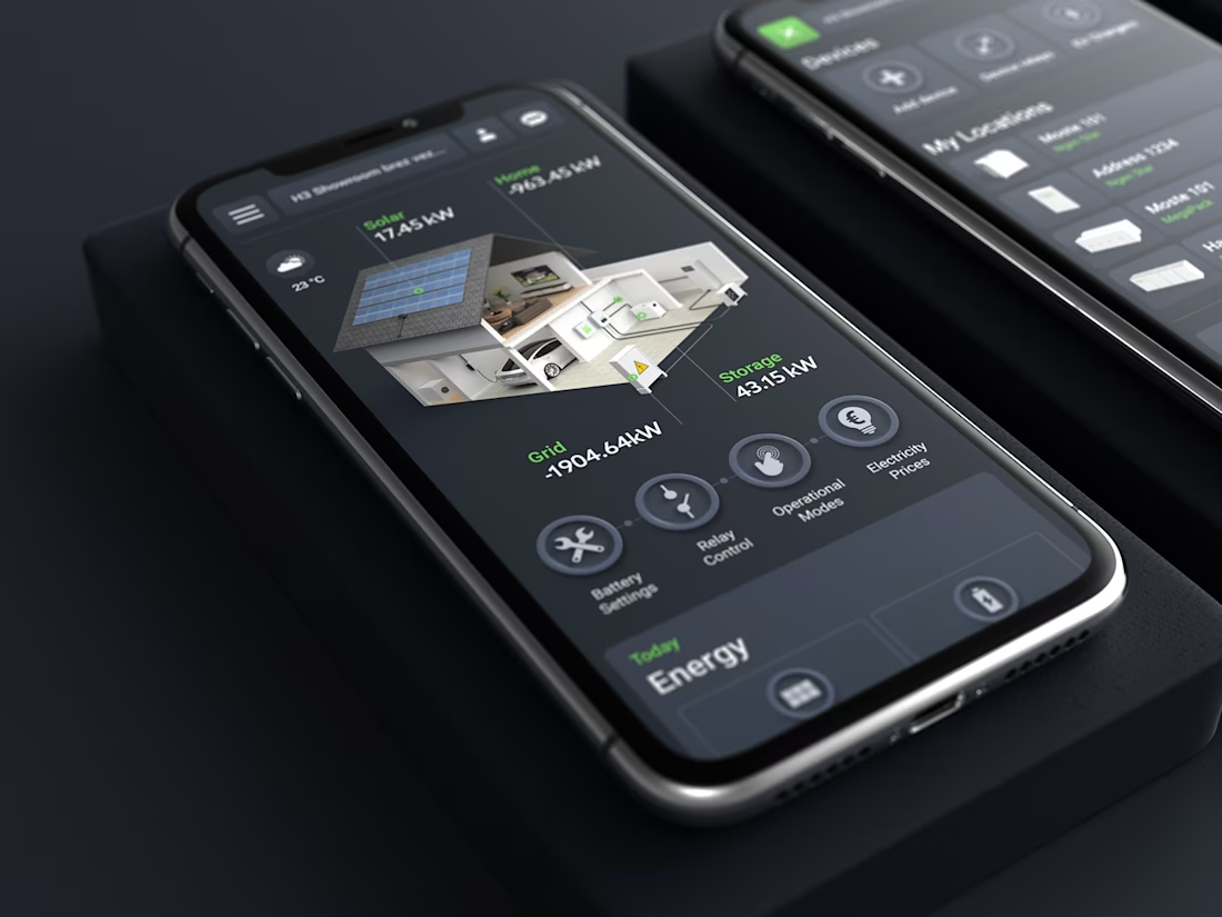
A short case study for SG Connect, a smart energy app I designed.



Impressive !


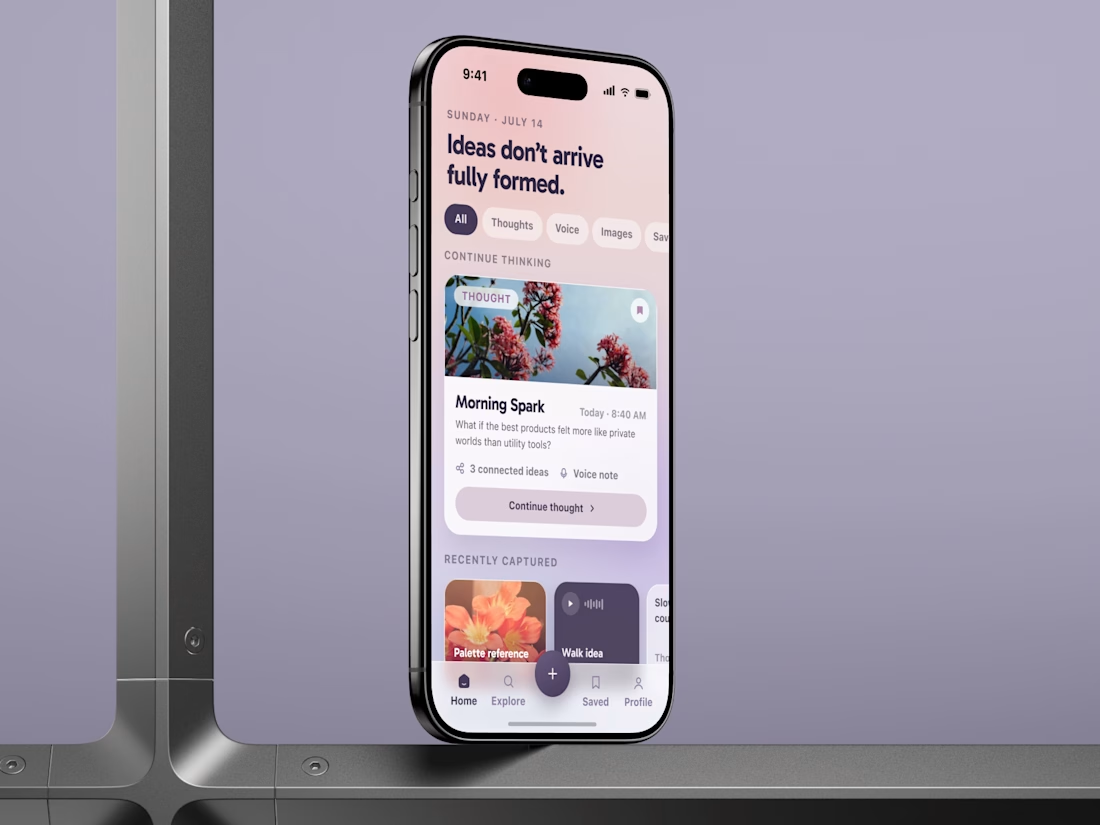
Built not just to save ideas, but to bring users back to the product ✨
Most note taking apps solve only one problem: helping users capture something quickly.
But the real growth challenge comes later.
Users collect voice notes, images, links, and unfinished thoughts, but rarely return to them. The archive keeps growing while its value barely increases.
That is why we built the experience around one retention loop:
Capture. Connect. Rediscover. Continue.
Continue Thinking brings users back to unfinished ideas.
Connected Ideas reveals relationships between notes, voice recordings, and references.
Resurfaced Thoughts brings older content back at the right moment.
As a result, the product works not as passive storage, but as a living personal knowledge system that creates a real reason to return.
Full case study ↓
#MobileAppDesign #UIUXDesign #IdeaCaptureApp #VoiceNotesApp #NotesApp #KnowledgeManagement #ProductDesign #RetentionDesign #GrowthDesign #UXDesign #iOSDesign #SecondBrainApp


I like that the focus is on retention, not just capture. The products people keep using are usually the ones that help users rediscover value, not just store more information.












Trending

Claude
Claude has entered the design space. How are you using Claude Design?

Contra University
Learn from expert creatives how to earn more using next-gen AI tools.
creativeaiflow
Creative AI workflows are evolving. What tools do you use, and what are their strengths and weaknesses?
freelancerlife
Freelancer life is wins, pivots, and everything in between. What’s yours right now?