The network for creativity
Join 1.25M professional creatives like you
Connect with clients, get discovered, and run your business 100% commission-free
Creatives on Contra have earned over $150M and we are just getting started
Back to feedPost

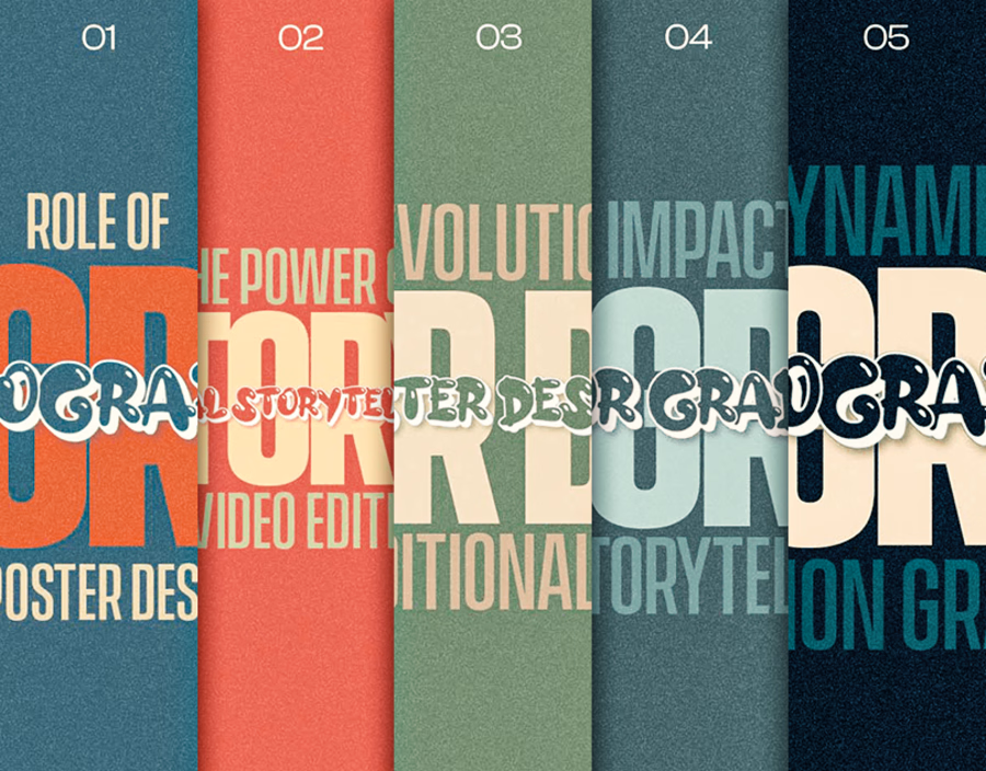
I developed this series of custom graphics for a weekly LinkedIn design column. Each piece was crafted to visually summarize complex design topics from typography to motion graphics into a single high impact thumbnail that boosts reader engagement.


The network for creativity
Join 1.25M professional creatives like you
Connect with clients, get discovered, and run your business 100% commission-free
Creatives on Contra have earned over $150M and we are just getting started

Challenges
View all


Related posts

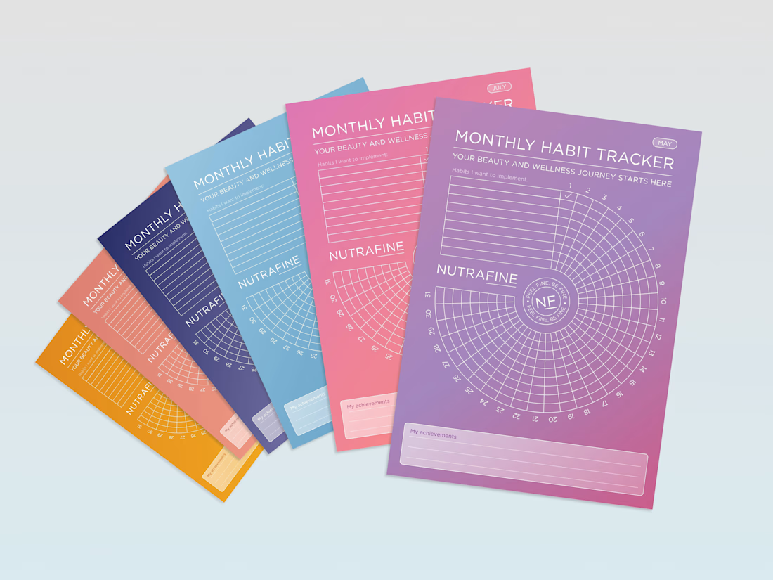
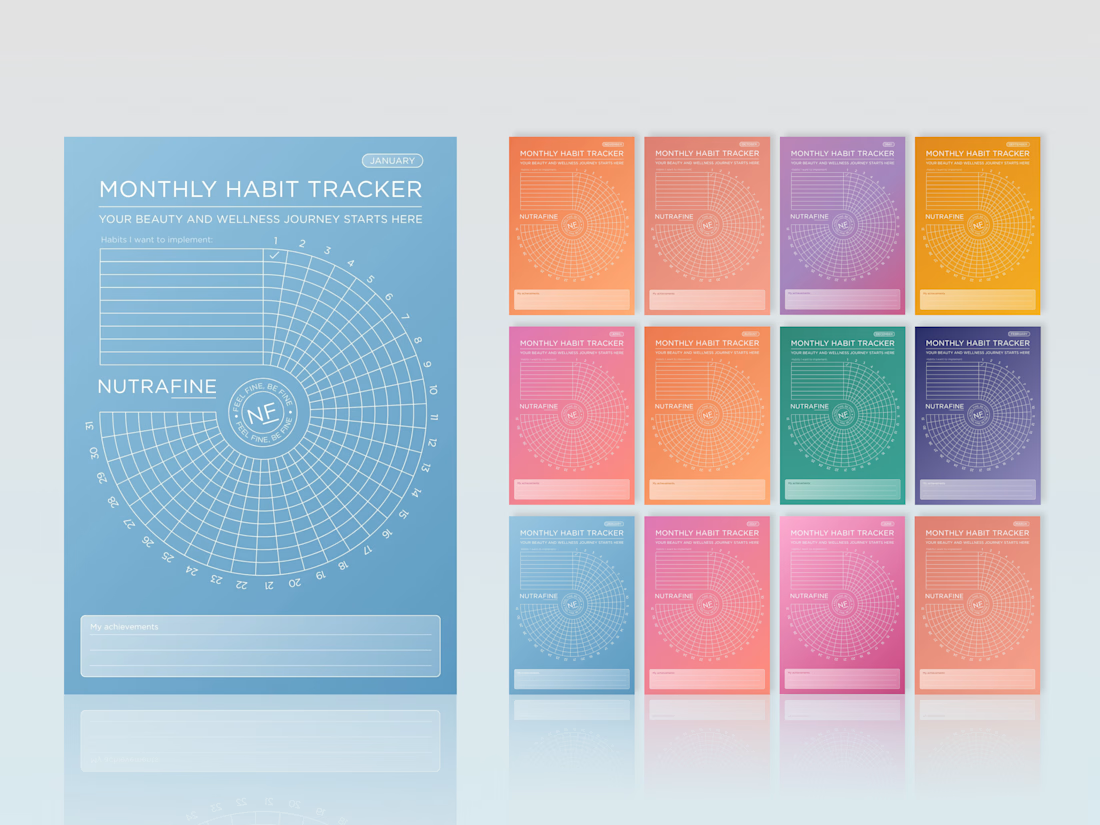
Can a habit tracker feel like a brand experience, not just a table?
For Nutrafine’s corporate gifting, each month is tied to one SKU, using the same colour as its packaging. It’s more colour than I would usually choose, but the depth of the palette, white linework and typography make the system hold together.
The bigger idea was to make the tracker itself feel less expected. Instead of a grid, we built a spiral, turning a practical tool into something more playful, memorable and distinctly Nutrafine.
#BrandDesign #CorporateGift #WellnessBranding #BrandExperience #CreativeDirection



Love these!

Logo design for StocksWithJosh, a prominent online trading mentor with 195K YouTube subscribers.
The concept was simple: blend the initials SWJ with a subtle nod to his status as the "GOAT" (Greatest Of All Time), a moniker earned from his community.
The result is a bold, recognizable brand mark that fits his business perfectly.
What do you think of the end result?


The mark reads instantly at thumbnail size, and the framed SWJ lockup gives it a strong YouTube-avatar presence. The subtle crown/GOAT cue is a nice detail without overpowering the initials.

NEXOR — Creative Digital Agency Website 🔥
NEXOR is a futuristic website concept for a creative digital studio focused on digital products, brand systems, and bold digital experiences.
The goal was to create a memorable first impression while keeping the agency’s services and next steps clear.
Special attention was given to:
• a bold hero composition with oversized typography and futuristic imagery;
• a vibrant orange and black palette that creates a distinctive visual identity 🟠;
• a strong visual hierarchy that balances creative expression with usability;
• clear CTAs for starting a project or booking a call;
• a contact form integrated directly into the hero section;
• responsive mobile layouts that preserve the visual impact 📱;
• a full-screen mobile menu with intuitive navigation and prominent contact options.
The result is an expressive digital experience that combines bold visual storytelling with a clear path to conversion.
Looking to create a distinctive website for your creative agency, digital studio, or technology brand? Let’s build something extraordinary together ⚡
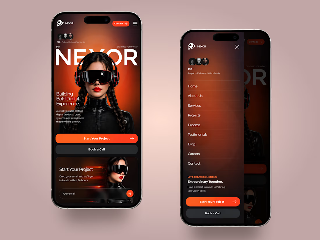
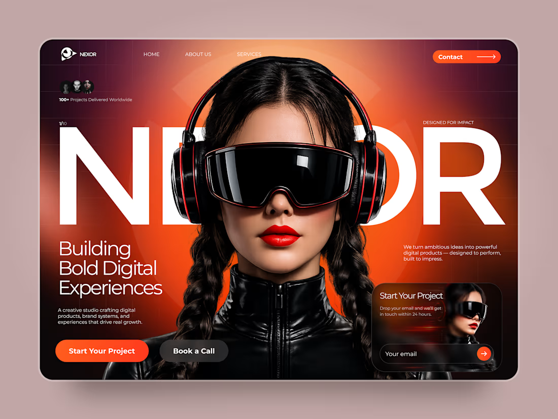
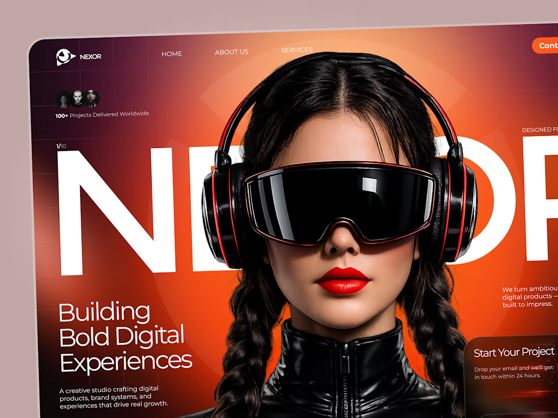
The orange-and-black system has real presence, and the mobile frames show the hierarchy holding together rather than just shrinking. The clear CTA placement is a smart counterweight to the oversized hero type.