The network for creativity
Join 1.25M professional creatives like you
Connect with clients, get discovered, and run your business 100% commission-free
Creatives on Contra have earned over $150M and we are just getting started
Back to feedPost

What if a supplement brand felt closer to nature than a pharmacy?
That was the starting point for SALUS.
SALUS is a wellness brand shaped around earth, plants, natural textures, and everyday balance. The visual identity combines bold typography with a restrained earthy palette, tactile photography, frosted packaging, and a strong contemporary layout system.
The SALUS underline becomes more than a graphic device - it represents supporting health, creating a simple idea that connects directly back to the meaning of the brand.
The final system extends across packaging, campaigns, social media, e-commerce, and brand storytelling, creating one cohesive visual world.
Explore the full project: https://contra.com/p/R623bWsN-salus-supplement-brand-identity?r=kiran_uk_iyhjn4vj
#SALUS #BrandDesign #BrandIdentity #Packaging #ArtDirection #WellnessBrand #CreativeDirection


The network for creativity
Join 1.25M professional creatives like you
Connect with clients, get discovered, and run your business 100% commission-free
Creatives on Contra have earned over $150M and we are just getting started

Challenges
View all


Related posts


Spent the last few months rebuilding the digital presence for Shiva Group, a multi-brand automotive dealership group running JLR, Mahindra, Triumph, KTM, Bajaj, and MG Select showrooms across North India.
New site architecture, cleaner model pages, a live outlet locator across 50+ locations built entirely on Framer. Genuinely happy with how it turned out, and it's already paying off for them too, with $1.2M+ in vehicle bookings coming through the site in the first month!


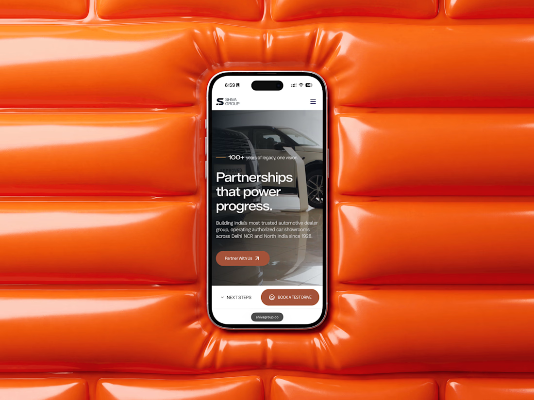

Running JLR, Mahindra, Triumph, KTM, Bajaj and MG under one coherent site architecture without it feeling generic is genuinely hard, those brands pull in very different visual directions. How much did each individual brand's voice have to bend to make the system hold together?

More visuals from the rejected brand direction I shared earlier.
Really good to see this direction resonating with so many of you. It was one of our favourite explorations to build, from the narrative behind it to the visual world that brought it to life.
Great work doesn’t always make the final cut, and sometimes the reason has little to do with the quality of the direction.
Curious why this one was rejected? I’ve shared the story in the first comment✨


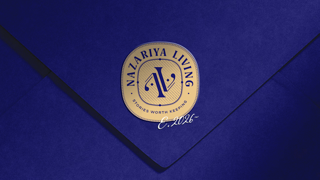
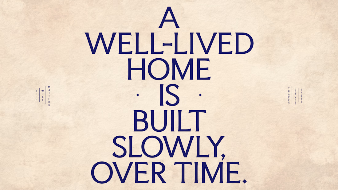
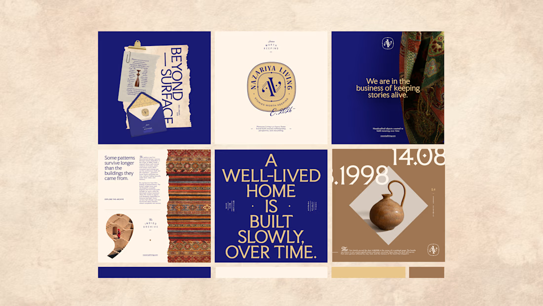
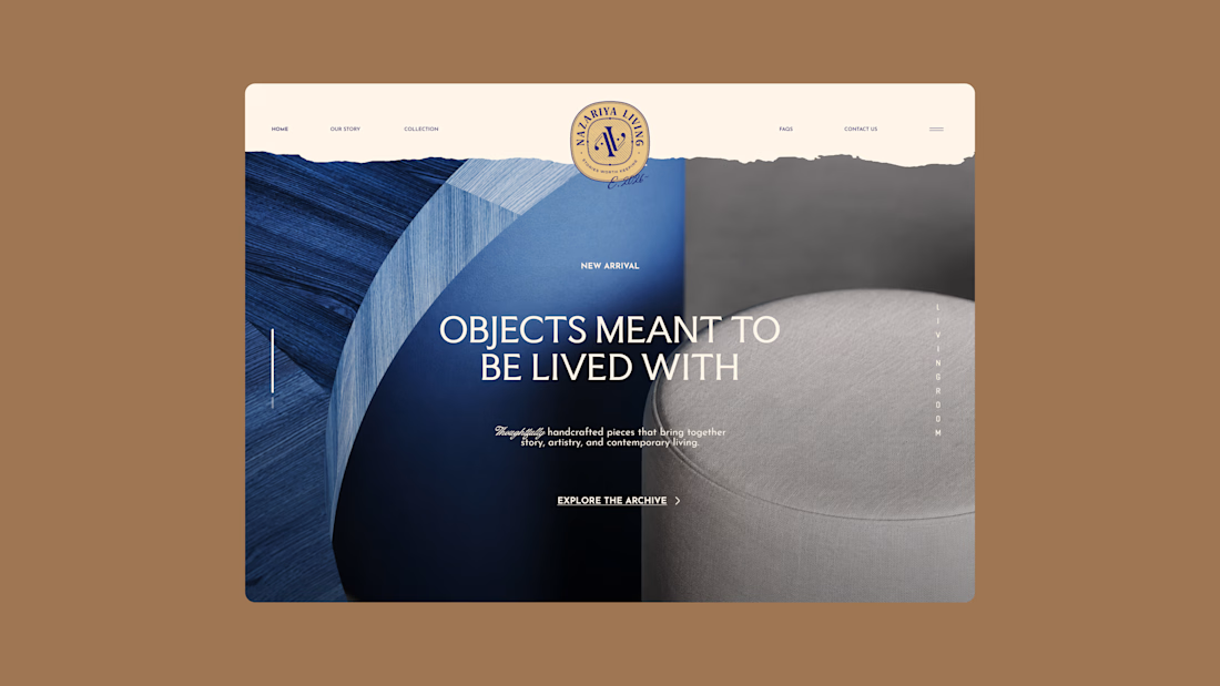
Nazariya Living is a premium carpet and home décor brand shaped by craftsmanship, culture and the stories objects carry into our homes.
This direction brought that idea to life through a seal-inspired logo, archival textures, unexpected colours and editorial typography, creating...

Working on the homepage for Still Blooming, a wedding and floral studio, I explored two different layout directions for the hero section. Same brand, same copy, just a different structure and visual rhythm.
Option 1 : Left Aligned. Text sits on the left with supporting content beside it, giving an editorial, asymmetrical feel.
Option 2 : Centered. Everything is stacked and centered, giving a clean, balanced, more classic hero layout.
Would love your honest UX/UI take which direction feels more elegant, functional, and true to a wedding/floral brand, and why?
22 voted
41%
32 voted
59%
54 votes
Closed

Great Design :)