The network for creativity
Join 1.25M professional creatives like you
Connect with clients, get discovered, and run your business 100% commission-free
Creatives on Contra have earned over $150M and we are just getting started
Back to feedPost

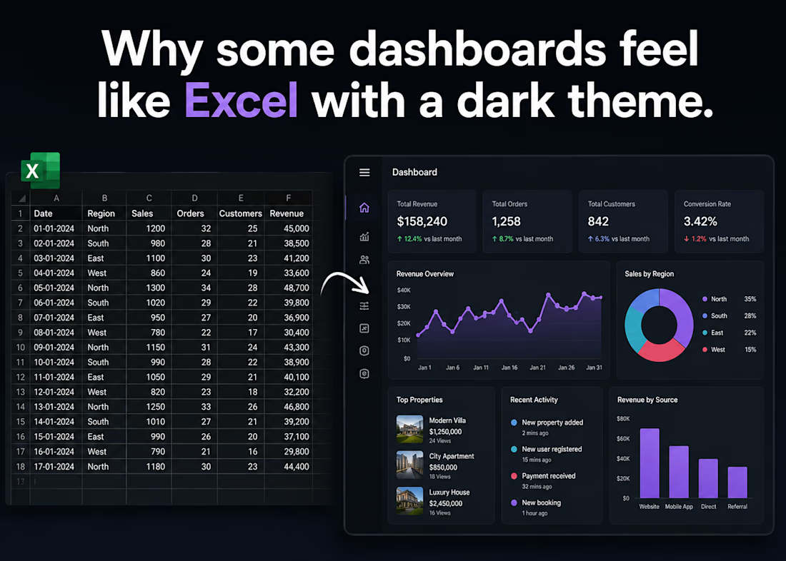
Why some dashboards feel like Excel with a dark theme.
Ever open a "modern" SaaS dashboard only to find a giant spreadsheet wrapped in moody dark mode? It happens more often than we'd like to admit.
Here is why so many products trap us in spreadsheet purgatory:
The Data Dump: When stakeholders want "everything on one screen," teams often skip the hard work of UX prioritization and just slap a grid up.
The B2B Myth: There's a false belief that professional users only want raw numbers and don't care about design.
Tighter Timelines: When discovery gets squeezed, building custom data viz gets cut, leaving a default tabular layout.
The fix isn't hiding data—it's hierarchy. Show the key insights upfront, and leave the grid for when they actually need to drill down.
Anyone else burnt out by the dark-mode spreadsheet trend?
The network for creativity
Join 1.25M professional creatives like you
Connect with clients, get discovered, and run your business 100% commission-free
Creatives on Contra have earned over $150M and we are just getting started
Trending
retrofuturism
Share your favorite designs from the past exploring the distant future. Or your own take on the aesthetic 🚀
halftone
Dots. Texture. Grain. Let's see your designs using the halftone technique.

Midjourney
Creatives are showing off what they're making with Midjourney.
colorgrade
Video editors sound off: How do you enhance the mood of your video in color grading?





Related posts

Designed a SaaS dashboard where the old version felt like a wall of numbers.
The biggest change wasn’t adding more features. It was deciding what each screen actually needed to answer.
Our rule was simple:
→ One primary question per screen
→ Everything else stays secondary
→ Fewer widgets
→ Larger, clearer type
→ One accent color for status and state
The result? A dashboard that was easier to scan and easier to understand.
Support tickets around “where do I find…” dropped noticeably after the redesign.
Good SaaS UI doesn’t show users everything at once. It helps them find the right thing faster.



Skopos just went through a rebrand. Skopos is a Dashboard app I offer for companies that want to pay a one-time fee to permanently have their metrics on their displays.
Which one is better?
skopos.cc
4 voted
27%
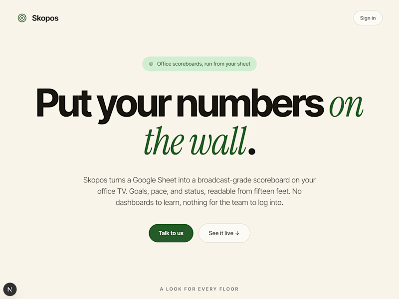
11 voted
73%
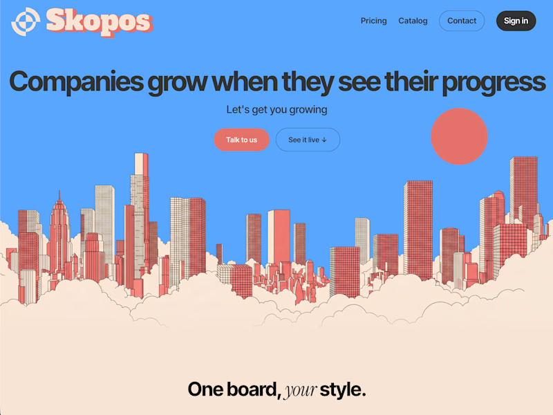
15 votes
Closed

The new one reads way more confident, "put your numbers on the wall" as a headline just sells the product better than the illustration-heavy version did. What was driving the rebrand, was it more about conversion on the landing page or repositioning the product overall?

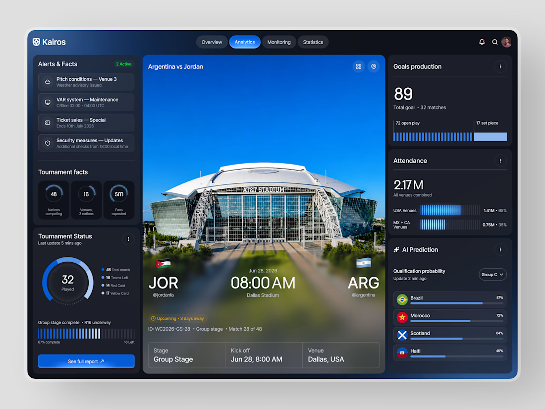
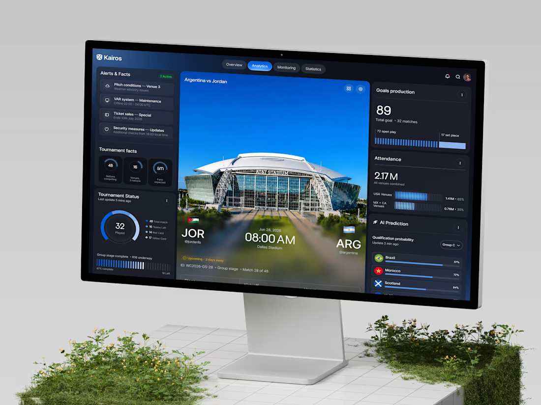
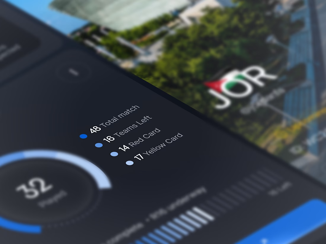
Kairos - FIFA World Cup 2026 Tournament Analytics Dashboard
Kairos is a tournament analytics dashboard designed for analysts and broadcasters who need every match, venue, and performance metric visible in one place built for the scale of a World Cup.
𝗦𝗽𝗲𝗰𝗶𝗮𝗹 𝗮𝘁𝘁𝗲𝗻𝘁𝗶𝗼𝗻 𝘄𝗮𝘀 𝗴𝗶𝘃𝗲𝗻 𝘁𝗼:
- Live alerts covering pitch conditions, VAR, ticket sales, and security;
- Tournament facts - 48 nations, 16 venues, 5M fans expected;
- Cinematic match card
- 89 total goals tracked across 32 matches with open play vs set piece split;
- 2.17M attendance across USA and MX+CA venues;
- AI qualification predictions
A dark, data-rich dashboard that makes tournament-scale complexity feel completely in control
Looking to design a sports analytics or live data platform? Let's build it together
#dashboard #uidesign #analyticsdashboard