The network for creativity
Join 1.25M professional creatives like you
Connect with clients, get discovered, and run your business 100% commission-free
Creatives on Contra have earned over $150M and we are just getting started
Back to feedPost

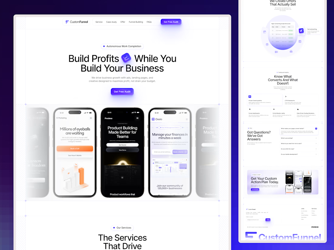
Designed a SaaS dashboard where the old version felt like a wall of numbers.
The biggest change wasn’t adding more features. It was deciding what each screen actually needed to answer.
Our rule was simple:
→ One primary question per screen
→ Everything else stays secondary
→ Fewer widgets
→ Larger, clearer type
→ One accent color for status and state
The result? A dashboard that was easier to scan and easier to understand.
Support tickets around “where do I find…” dropped noticeably after the redesign.
Good SaaS UI doesn’t show users everything at once. It helps them find the right thing faster.



The network for creativity
Join 1.25M professional creatives like you
Connect with clients, get discovered, and run your business 100% commission-free
Creatives on Contra have earned over $150M and we are just getting started
Trending
retrofuturism
Share your favorite designs from the past exploring the distant future. Or your own take on the aesthetic 🚀
halftone
Dots. Texture. Grain. Let's see your designs using the halftone technique.

Midjourney
Creatives are showing off what they're making with Midjourney.
colorgrade
Video editors sound off: How do you enhance the mood of your video in color grading?





Related posts


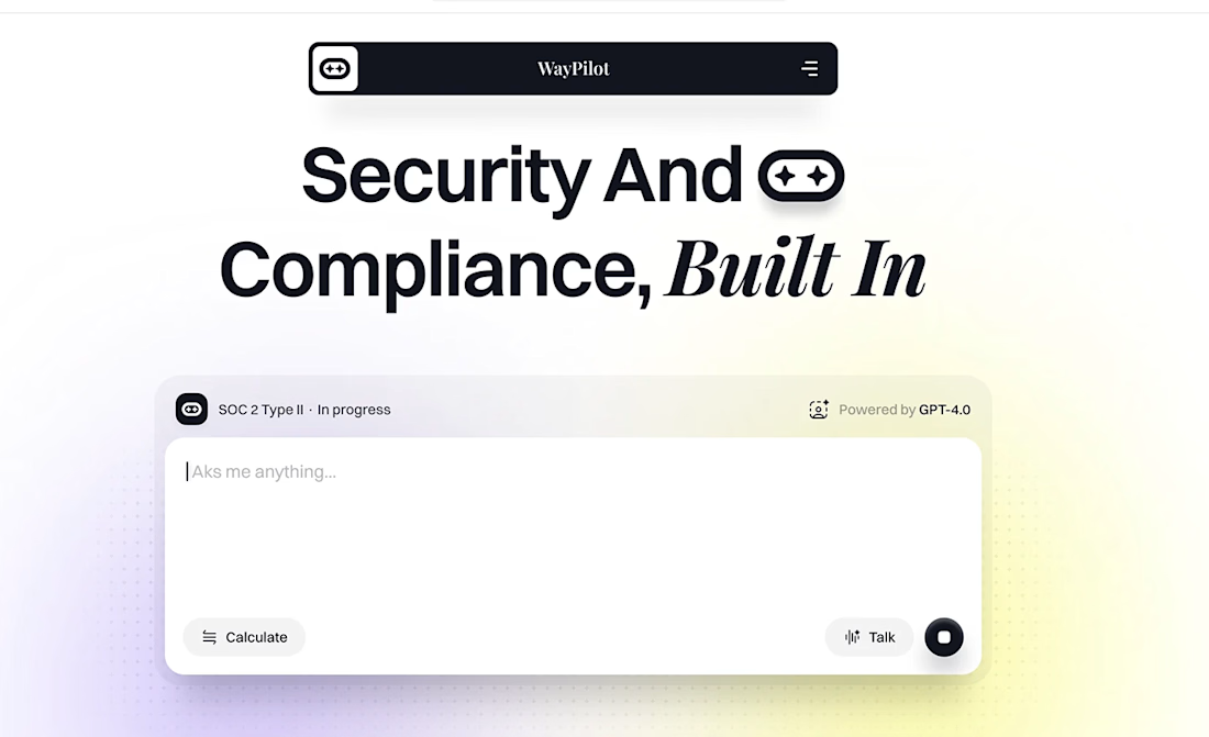
took us 2 weeks to design this page
1st week:
- Research
- Copywriting
- Wireframing
2nd week:
- colors & typography
- custom illustrations
- pixel-perfect UI
the client loved the final results
then came another 2 weeks of development to bring every detail to life

Amazing work


Amazing work!

Not a filter. A living field of dots that reacts to you! ⚪
Halftone Engine redraws your photo or clip as a grid of dots that pull colour from the footage - rippling, drifting and reacting to your cursor, live. (Take a look →)
✨ (Have a peek) - make something different, specially for you :)
Fully customizable with 10 shapes · 10 presets · 8 motions · 4 colour modes · full dot & halftone control. One canvas, no dependencies.
Perfect for your hero, avatar, or banner. Happy building..🙂

Wow, this is cool!