The network for creativity
Join 1.25M professional creatives like you
Connect with clients, get discovered, and run your business 100% commission-free
Creatives on Contra have earned over $150M and we are just getting started
Back to feedPost


Late last year I jumped onto a project to help with the branding for Dawn, a company building a product around 24/7 therapy.
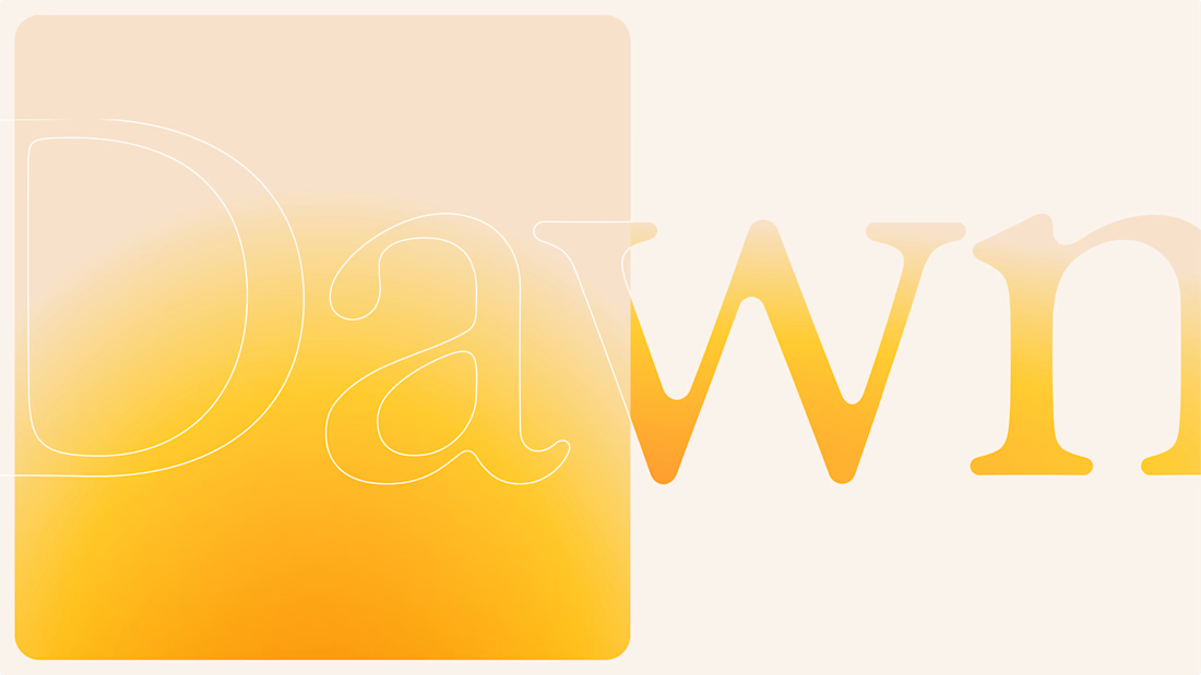
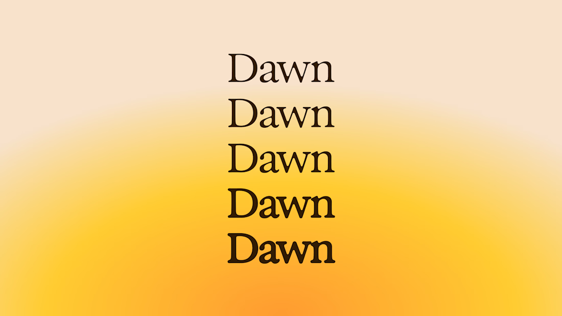
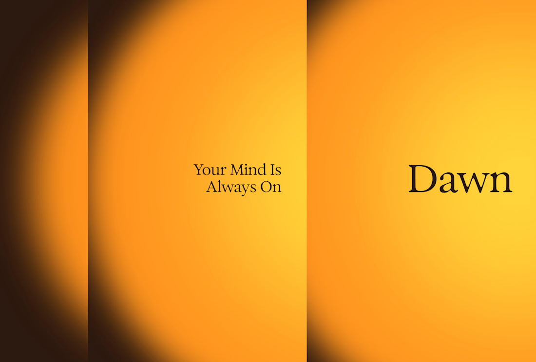
One of the concepts I explored was inspired by sunrise, using light and movement to create a sense of calm and clarity.
The logotype would react to the time of day, slowly fading as night drew in.
We ended up keeping a version of the logotype, but I still think this concept could have worked beautifully on the website, changing and reacting as you scrolled.
Even the D logomark followed the same idea, breaking down into segments inspired by a rising sun.
Always fun looking back at the ideas that never quite made it.

Damn! So good! 💛
Thanks dude

beautifully done.
Thank you

So goodddddd
Thank you :)

Gorgeous and super peaceful! The sun concept is super present, love this!
Thanks Anita. 😃

That concept of the D logomark breaking down into rising sun segments is brilliant. It would have looked incredible reacting to the scroll, especially for a brand centered around clarity
I know! Gutted we couldn't make it happen
No worries at all! The version you ended up with still looks fantastic though

Wow! The earthy tones and minimal typography for Seido look amazing 😍

Absolutely Fantastic! I saw your post on Linkedin. =)


Good work👏🔥🔥

Fantastic work! Presentation is top-notch 💯


The sunrise idea is really nice. Would’ve been cool to see that logotype react as you scroll too.

Brilliant🔥
This Dawn logo concept is so beautiful! 🔥

Love this!

The sunrise idea is really nice. I like how the logo and website concept could work together instead of feeling separate.

The gradient is a great fit for this logo design!

The colors really relate with each other well

This gradient is craaazy good! 🚀

The design choices make the brand instantly recognizable. 😍

Your work is very inspiring Alex :)

nice work

I really need to come learn at your feet....dope

Like it a lot! Last screen reminds me of psychedelic 60s and the same time looks up to date. Great!

The trade-off worth naming: a mark that shifts with time of day is lovely, but for a 24/7 therapy product, recognition consistency might matter more than mood — worth testing if users still read it as "the same brand" at 2am vs. 2pm.

This concept is amazing

This is dope

Well planned

damn, the look and feel is so good!!

love the time-reactive logotype idea. feels like the motion has a reason, not just polish.

Awesome!

Outstanding logo design 👏

Nice
The network for creativity
Join 1.25M professional creatives like you
Connect with clients, get discovered, and run your business 100% commission-free
Creatives on Contra have earned over $150M and we are just getting started







Related posts
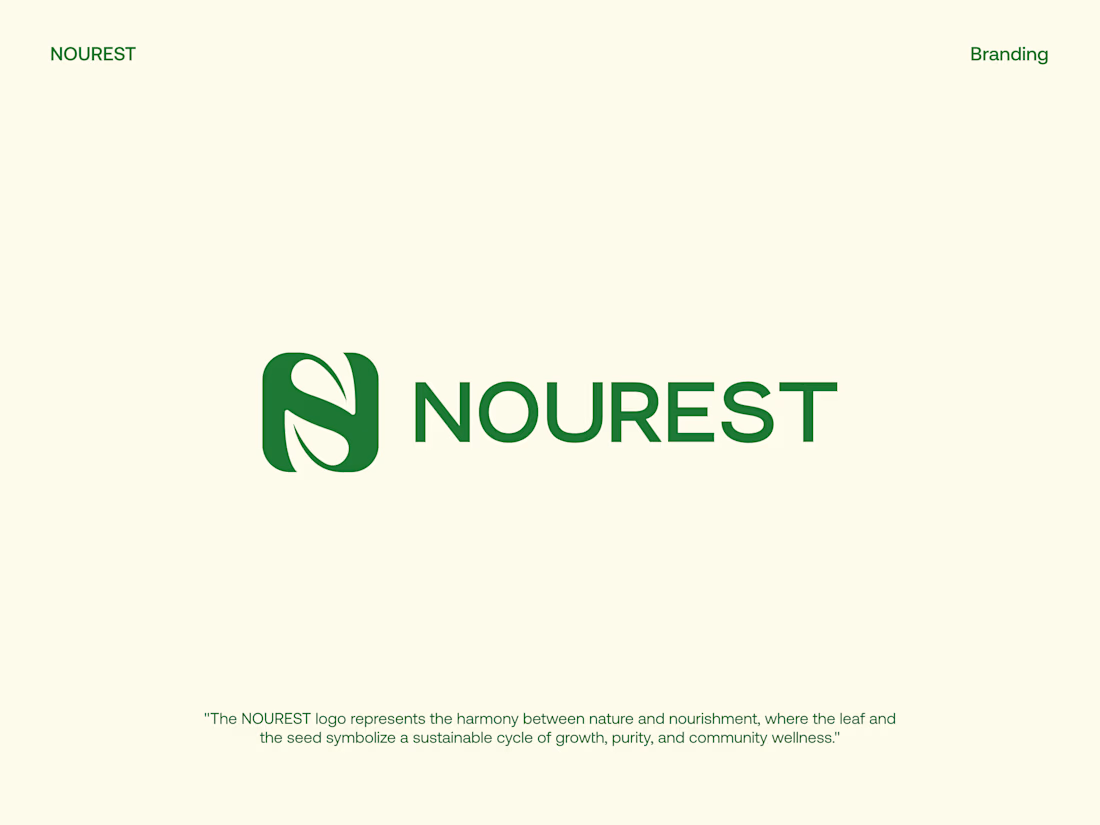
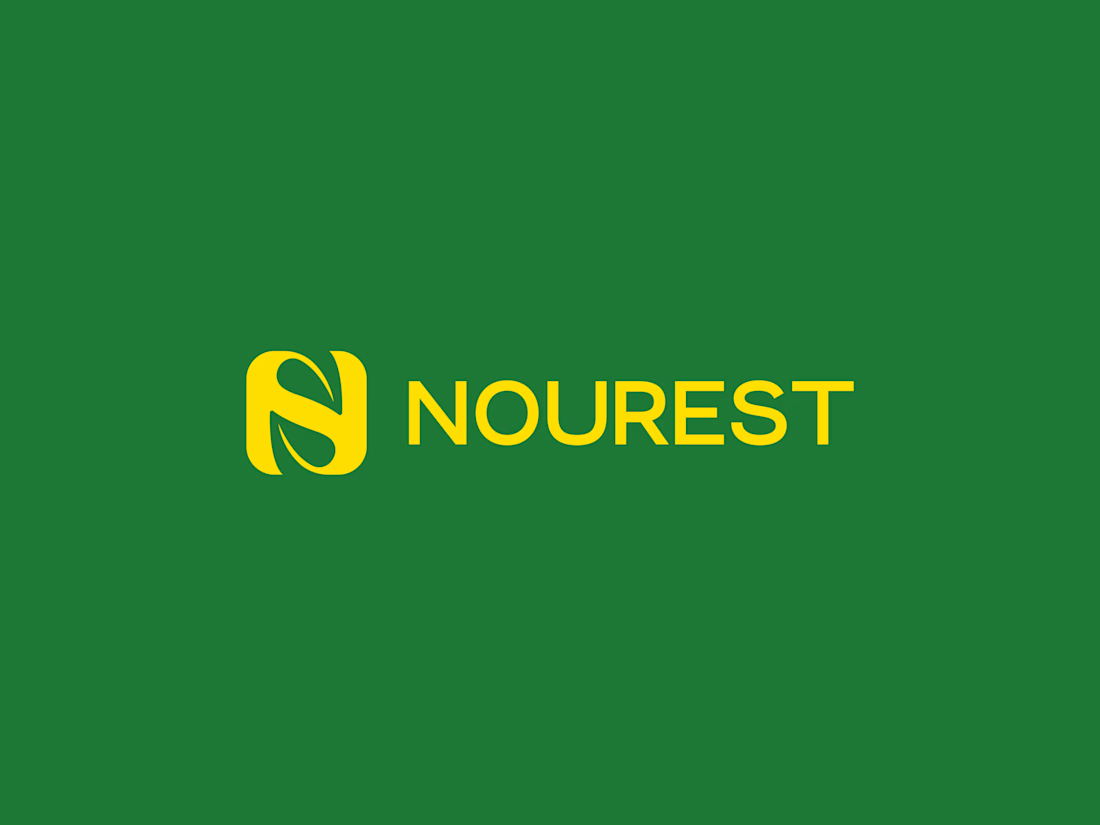
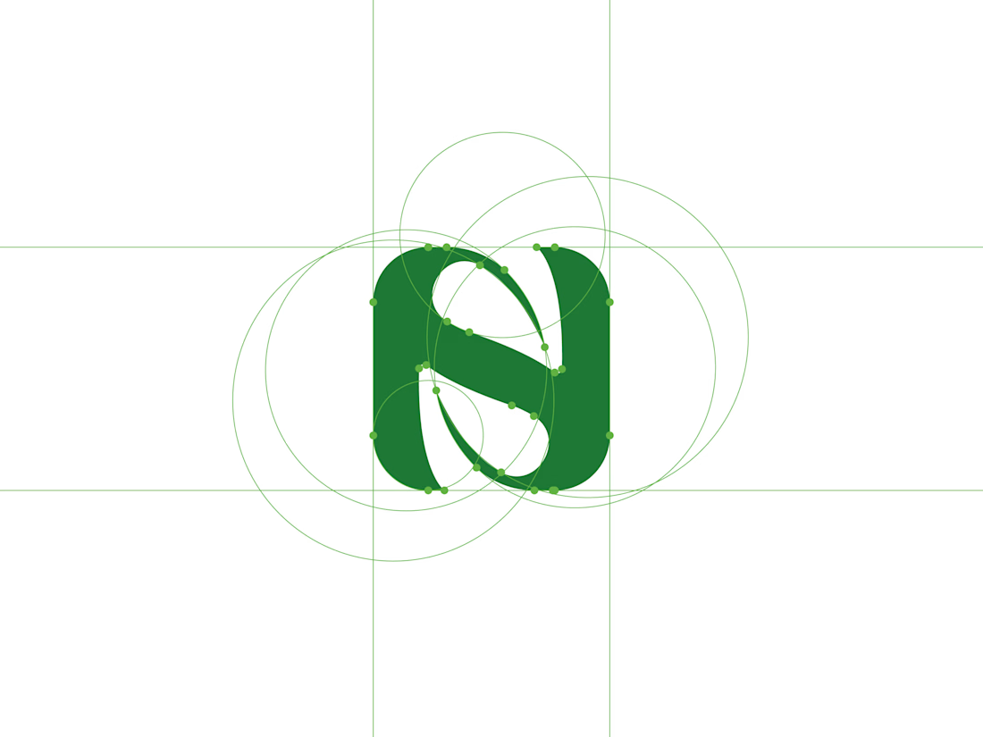
NOUREST — Nature-Led Brand Identity Design.
A brand about nature should feel natural at every touchpoint. 🌿
That's the idea behind NOUREST from its leaf-inspired monogram and green-led palette to packaging and brand materials.
One identity.
A consistent experience.
🏀 Full Design Showcase – Better View on Dribbble.
✅ https://dribbble.com/shots/27799268-NOUREST-Sustainable-Brand-Identity


Recent work on MAE - Visual identity


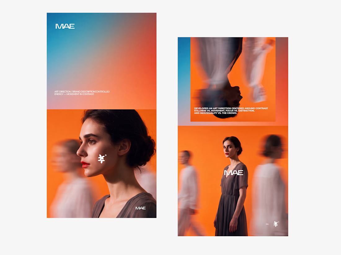

The motion blur on the figures gives the orange-to-blue gradient a reason to be there, and the small star mark stays readable on both the cheek and the shirt. Did the star come first as a standalone mark, or did it grow out of the photography direction?

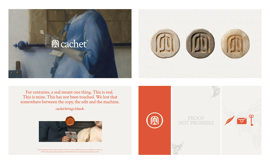
Cachet brand exploration.
Exploring patterns, textures, materials and hand-drawn illustrations

That's interesting I like it that's really unique ❤️❤️🎉🎉