The network for creativity
Join 1.25M professional creatives like you
Connect with clients, get discovered, and run your business 100% commission-free
Creatives on Contra have earned over $150M and we are just getting started
Back to feedPost
Taste Test

Taste test 👀
Same scene. Two directions.
One keeps the focus entirely on the message.
The other adds supporting UI elements and a bit more motion context.
At first, the version with extra elements felt more alive…
but now I’m wondering if it actually weakens the main headline.
Does it help tell the story - or just split the attention?
Which one works better - and why?
48 voted
51%
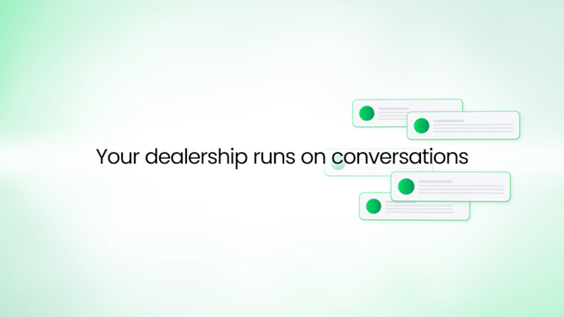
46 voted
49%
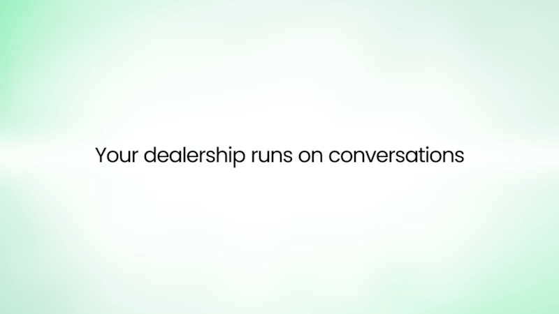
94 votes
Closed


First one, the more simple, the better

Love this brother

version 1

Version 1 is good

Version 2 🔥🙌 keeps the focus, I feel V1 motion is nice but i feel the motion is kinda distracting from the main message.

Both versions have strong points honestly.

Version 1 looks good with the microinteraction!

I will go for 1

same here

Voted Version 1. The headline is doing all the heavy lifting extra UI elements around it create visual competition rather than context. There's a principle I use in SaaS design too: if you have to choose between "more alive" and "clearer message," clearer message wins every...

Version 1

The cleaner version almost always wins. Extra motion feels exciting in the making but the audience just needs to receive the message without friction

The first one is great

I think version 2 looks cleaner and less busy


I think the UI elements would be more impactful if they didn't crowd the text

For me it's version 2. Like some have said already: the simpler, the better. I think that version 1 immediately takes your attention to the word "conversation" and for this message in particular it's important to also read "dealership". Those extra elements create more noise than actual visual harmony.

Version 2 for it's clarity 🙌

I will go for version 2 because it is clearer. Version 1 explains better, but it feels too clustered together.

I like option 2. It shows what the post means instead of just telling

I think left one is more impressive
The network for creativity
Join 1.25M professional creatives like you
Connect with clients, get discovered, and run your business 100% commission-free
Creatives on Contra have earned over $150M and we are just getting started
Related posts


It’s interesting to see how the feeling of a design can completely change just from the color alone, not to mention all the seemingly small details that can lead to a totally different perception.
Which design feels more appealing to you?
23 voted
33%
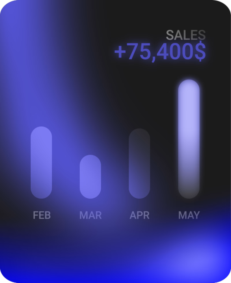
46 voted
67%
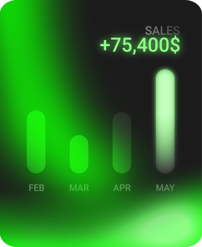
69 votes
Closed



Which one feels better?
Built one entirely from scratch in Framer.
Prompted the other to Claude as a creative partner.
Curious if you can tell which is which. Write in comments below ->

21 voted
45%
26 voted
55%
47 votes
Closed

The interface feels very intentional and professionally crafted 👏


I made a design for children's day. But made two different version. Which do you think is better?
1 voted
11%

8 voted
89%
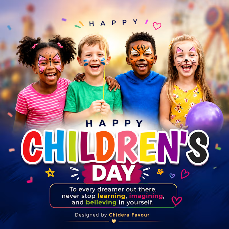
9 votes
Closed

looks good







Trending

Claude
Claude has entered the design space. How are you using Claude Design?

Contra University
Learn from expert creatives how to earn more using next-gen AI tools.
creativeaiflow
Creative AI workflows are evolving. What tools do you use, and what are their strengths and weaknesses?
portfolioreview
The best portfolios tell a story, not just show a grid. Share yours for feedback.
freelancerlife
Freelancer life is wins, pivots, and everything in between. What’s yours right now?