The network for creativity
Join 1.25M professional creatives like you
Connect with clients, get discovered, and run your business 100% commission-free
Creatives on Contra have earned over $150M and we are just getting started
Back to feedPost
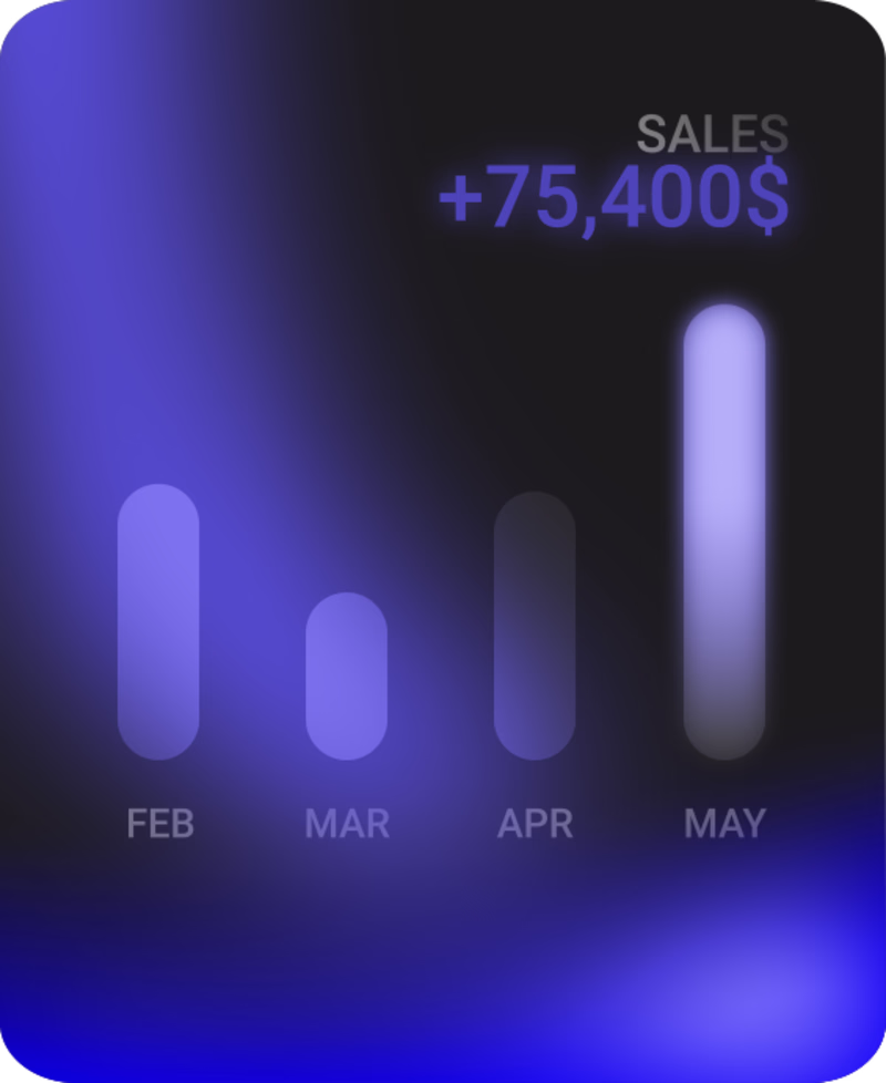
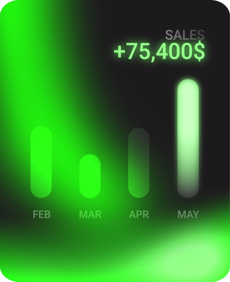
Taste Test
It’s interesting to see how the feeling of a design can completely change just from the color alone, not to mention all the seemingly small details that can lead to a totally different perception.
Which design feels more appealing to you?
23 voted
33%
46 voted
67%
69 votes
Closed
GOing for the green version
I like the green
Blue version it feels smooth af vote it💀
both are dope, but they give completely different feelings. thanks! 💯
I agree blue one it gives more smooth shape value
Green version
They are all good, just depends on the project design system
I like green the most
thank u mate!
I really appreciate such insightful information and the time you took to write this comment
I’ll definitely keep it in mind =)
Green looks better
i vote the blue version
Green all the way
They're both good. If you're going for more clarity tho, the green is the choice.
thank you!
numbers are clearer in green.
Green. Both are pretty hard to read because of the contrast but the contrast in blue is way worse. It seems like the details are behind the gradient blurs and makes them hard to read.
I really appreciate your opinion and I’ll take it into consideration.
thank you all so much! 💯
The blue version feels more user-friendly and familiar. However the glow effect might throw users off as this seems to be an anylitics design.
appreciate it man! 🔥
It’s green for me! I can’t vote on the phone😅
The network for creativity
Join 1.25M professional creatives like you
Connect with clients, get discovered, and run your business 100% commission-free
Creatives on Contra have earned over $150M and we are just getting started
Related posts
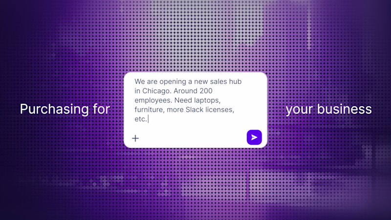
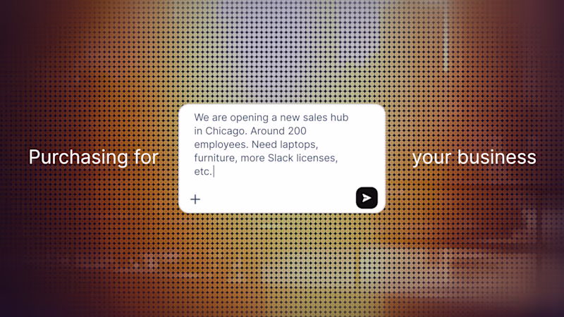
Testing how much a color palette can change the perception of the exact same scene.
Same layout. Same composition. Same UI.
Just different art direction.
Which version works better for you?
🟣 Purple (AI / tech)
🟠 Orange (enterprise / business)
Drop your choice in the comments
23 voted
43%
31 voted
57%
54 votes
Closed
Orange looks great!
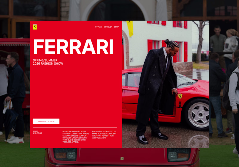
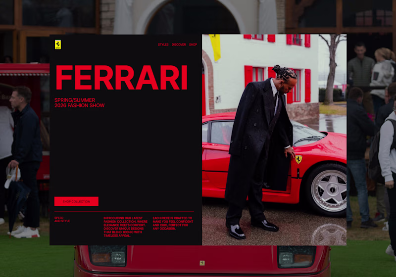
I’m exploring two hero directions for a Ferrari-inspired fashion landing page concept and testing which visual direction feels stronger.
Direction 1 uses the classic Ferrari red as the main brand moment. It feels bold, energetic, and instantly recognizable, with a cleaner fashion editorial layout.
Direction 2 shifts the experience into a darker, more luxury-driven direction. The black background makes the red feel sharper and gives the page a more premium, high-fashion feel.
Both directions have a different impact:
Direction 1: bold, iconic, energetic
Direction 2: luxury, dramatic, fashion-forward
I’m leaning toward Direction 2 because it feels more elevated and editorial, but I’d love to hear which one feels stronger at first glance.
12 voted
48%
13 voted
52%
25 votes
Closed
its actually a tough choice to make ngl. But i have to go with direction 2 as the colors are much more influenced by the main image
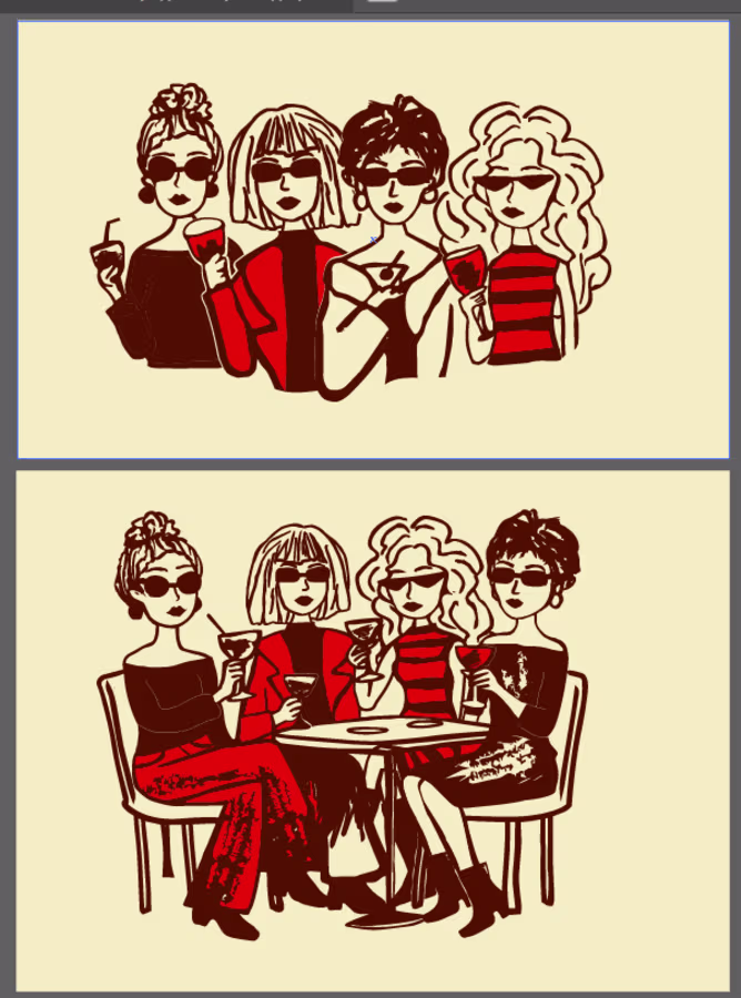
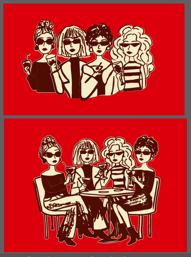
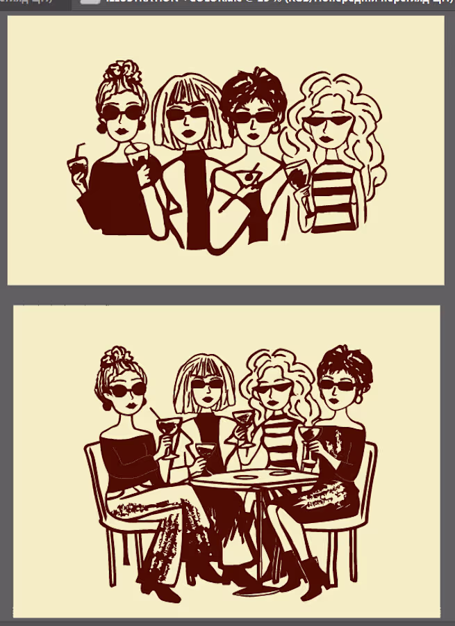
I’m working on the branding for a women’s bar, and I’m currently at the stage of creating illustrations. I can’t decide which color option would be best for presenting them in the project. Which one do you think works best (1, 2, or 3)?
P.S. This is not just a bar or another place for cocktails — it’s a space for friends where you can talk about life without censorship. I’ve even created a whole story and scenario around it.
Maybe first
Trending
Claude
Claude has entered the design space. How are you using Claude Design?
Contra University
Learn from expert creatives how to earn more using next-gen AI tools.
MagicPath
The canvas is infinite, and exploration is becoming the workflow. How are you using MagicPath?
creativeaiflow
Creative AI workflows are evolving. What tools do you use, and what are their strengths and weaknesses?
freelancerlife
Freelancer life is wins, pivots, and everything in between. What’s yours right now?