The network for creativity
Join 1.25M professional creatives like you
Connect with clients, get discovered, and run your business 100% commission-free
Creatives on Contra have earned over $150M and we are just getting started
Back to feedPost

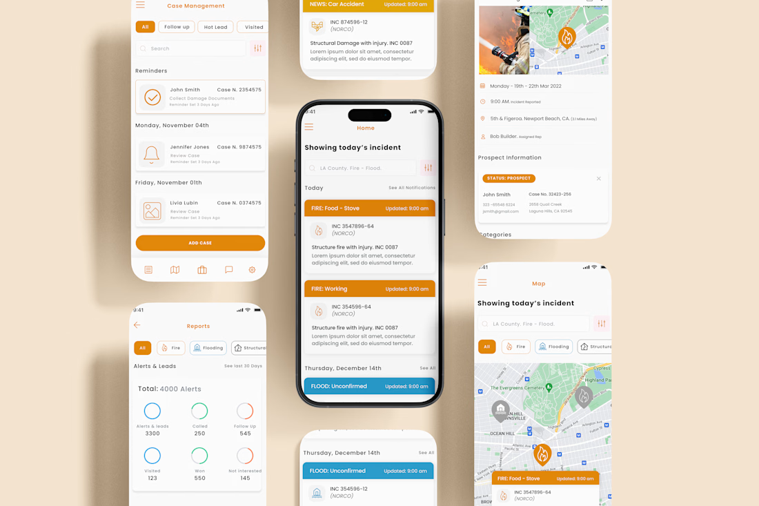
Fire Incident & Case Management App, B2B Mobile UX
Designed a B2B mobile application for firefighters and incident response teams to track, manage, and report real-time emergency incidents.
The product focuses on:
• Live incident alerts & mapping
• Case and lead management
• Incident reporting & follow-ups
• Clear dashboards for responders and stakeholders
Built with a clean, high-contrast UI to support fast decision-making in critical situations.
Role: Lead UX Designer


The network for creativity
Join 1.25M professional creatives like you
Connect with clients, get discovered, and run your business 100% commission-free
Creatives on Contra have earned over $150M and we are just getting started

Challenges
View all


Related posts

NEXOR — Creative Digital Agency Website 🔥
NEXOR is a futuristic website concept for a creative digital studio focused on digital products, brand systems, and bold digital experiences.
The goal was to create a memorable first impression while keeping the agency’s services and next steps clear.
Special attention was given to:
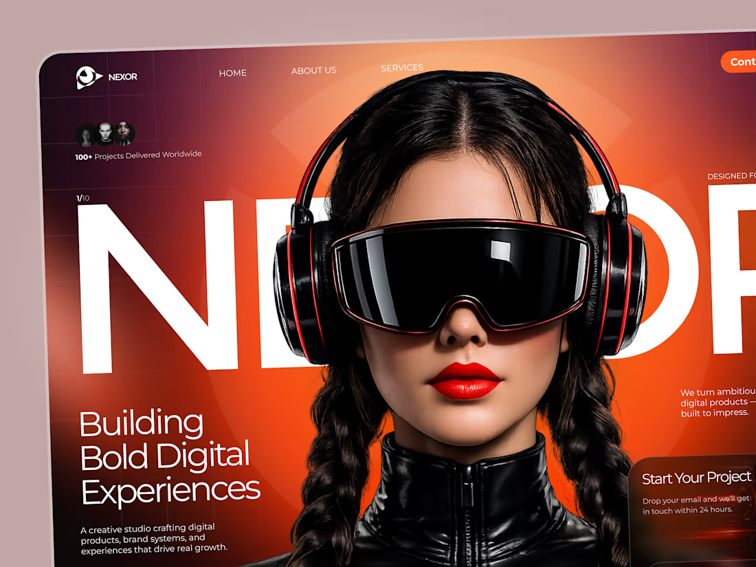
• a bold hero composition with oversized typography and futuristic imagery;
• a vibrant orange and black palette that creates a distinctive visual identity 🟠;
• a strong visual hierarchy that balances creative expression with usability;
• clear CTAs for starting a project or booking a call;
• a contact form integrated directly into the hero section;
• responsive mobile layouts that preserve the visual impact 📱;
• a full-screen mobile menu with intuitive navigation and prominent contact options.
The result is an expressive digital experience that combines bold visual storytelling with a clear path to conversion.
Looking to create a distinctive website for your creative agency, digital studio, or technology brand? Let’s build something extraordinary together ⚡

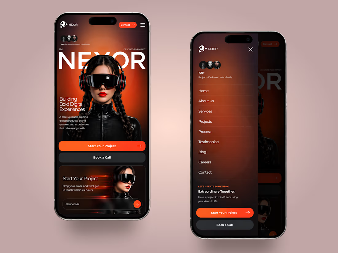
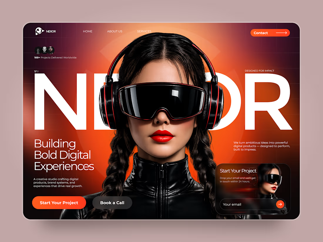

The orange-and-black system has real presence, and the mobile frames show the hierarchy holding together rather than just shrinking. The clear CTA placement is a smart counterweight to the oversized hero type.


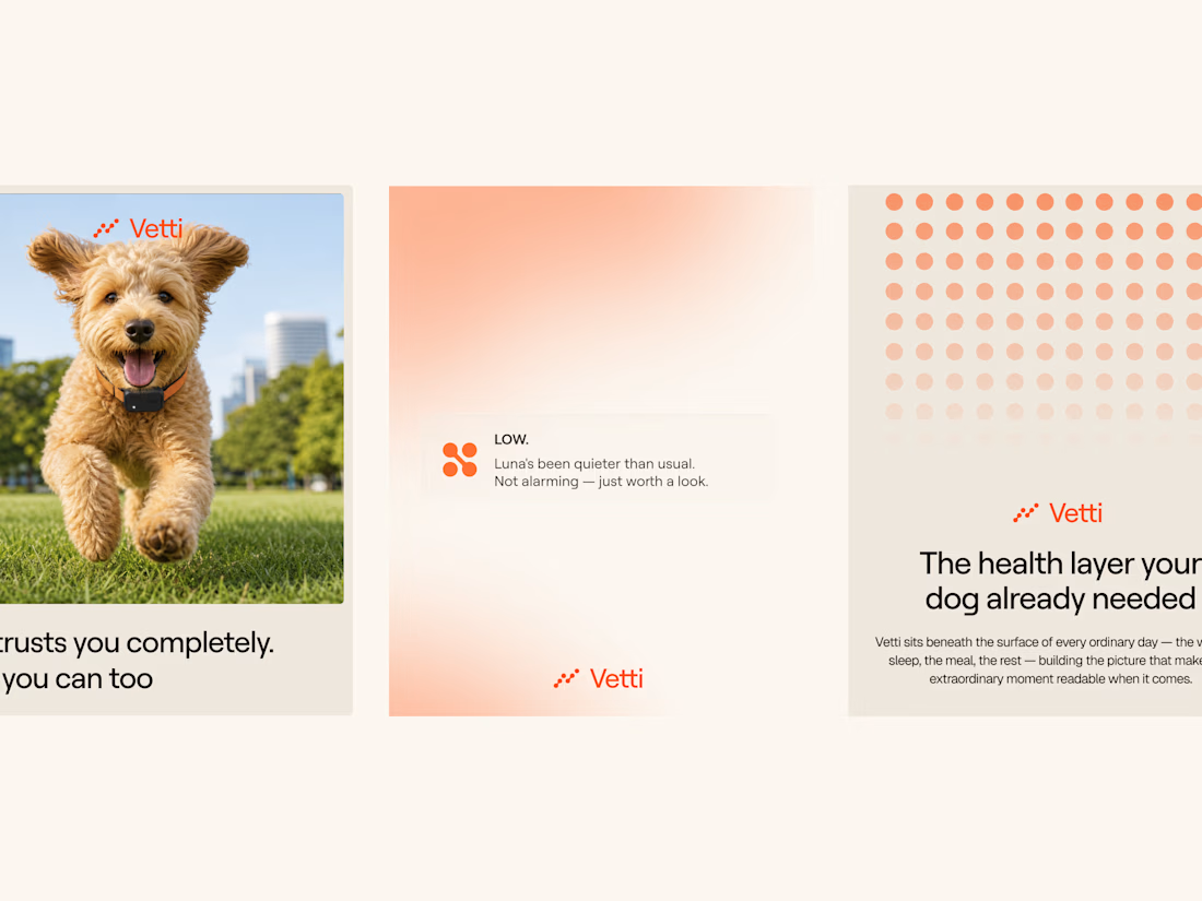
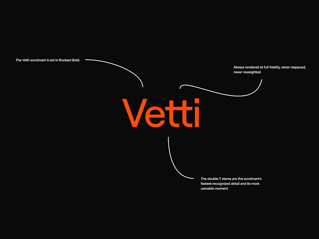
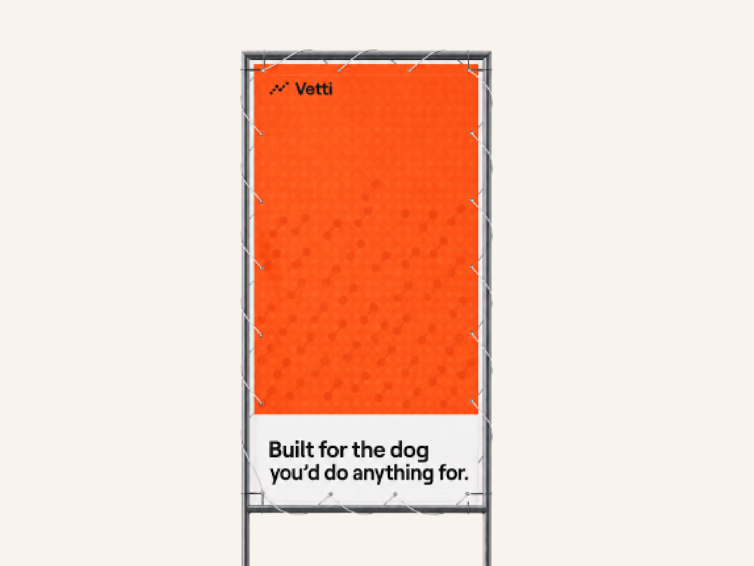
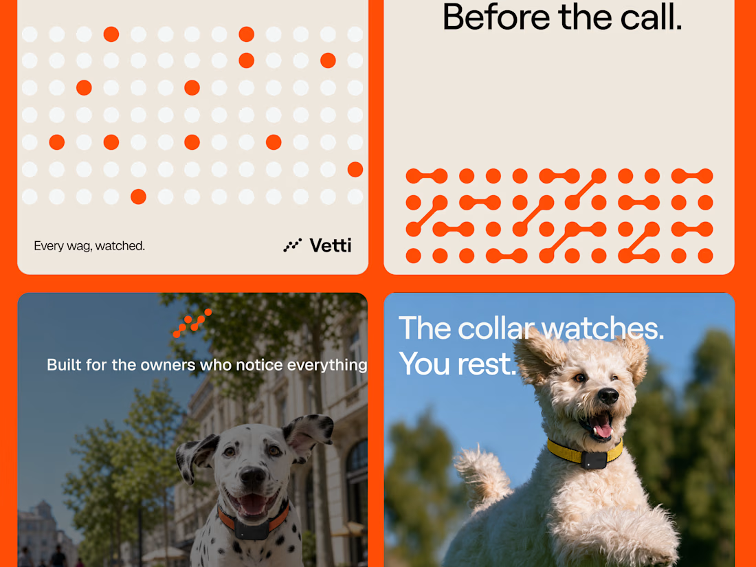
A fuller look at the brand identity work we for Vetti, a dog health monitoring brand.
The connected dots carry through the whole identity. They form the mark, expand into patterns and give the campaign a recognisable language of its own. Sometimes they fill the layout.
Paired with warm orange and cream the system has room for both the technology and the dogs it’s there for.

Looks very nice welldone

Which layout is better?
.
.
Curious which one wins? Follow along for more tests like this x.com/rightnextstep
20 voted
67%
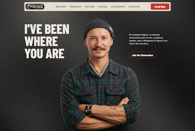
10 voted
33%
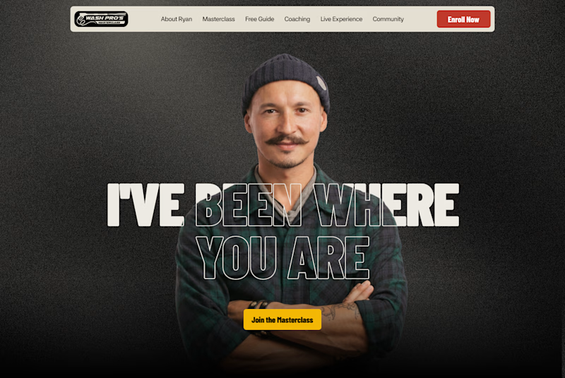
30 votes
Closed
Hero 1 shows the hero text very well but you might need to work on the Hero CTA for "join the masterclass", I will probable miss it as a key action if I was a regular user