The network for creativity
Join 1.25M professional creatives like you
Connect with clients, get discovered, and run your business 100% commission-free
Creatives on Contra have earned over $150M and we are just getting started
Back to feedPost


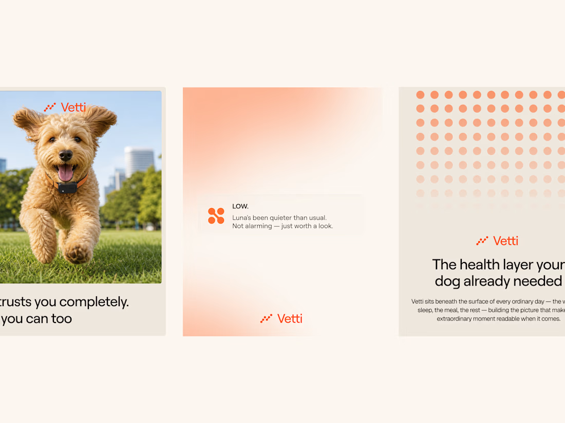
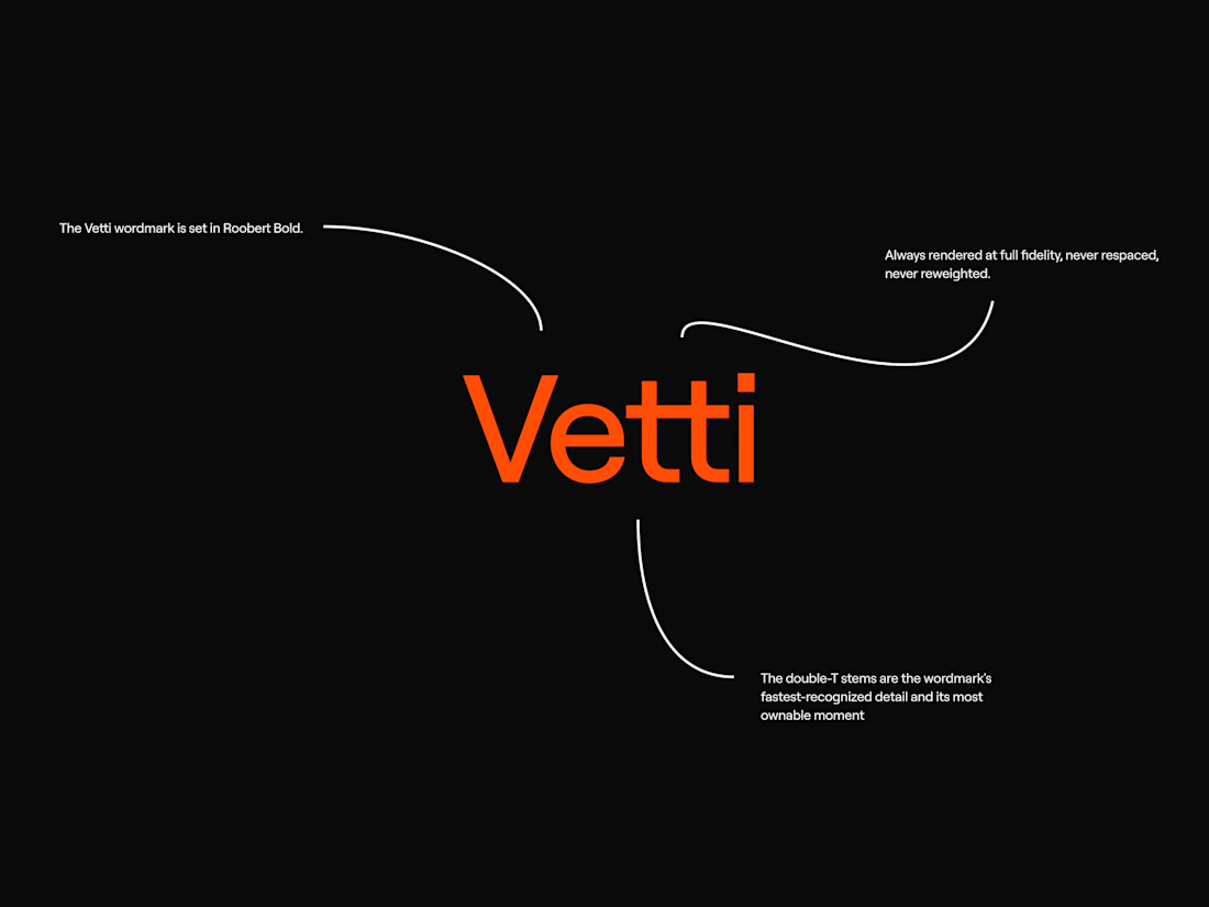
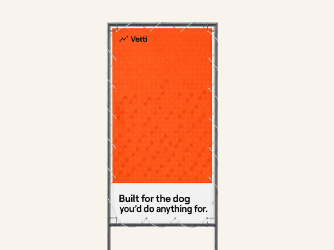
A fuller look at the brand identity work we for Vetti, a dog health monitoring brand.
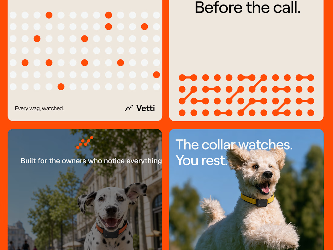
The connected dots carry through the whole identity. They form the mark, expand into patterns and give the campaign a recognisable language of its own. Sometimes they fill the layout.
Paired with warm orange and cream the system has room for both the technology and the dogs it’s there for.


this is so distinctive & energized, even at first glance!

Looks very nice welldone

The connected-dots device doing triple duty as the mark, the pattern, and the campaign language is what makes this read as a real system rather than a logo with decoration. The warm orange also keeps a health-tech brand from feeling clinical.

A mark that expands into pattern is what gives a small brand enough assets to actually fill a campaign, and the usual failure is the density — past a point the dots stop reading as the brand and just become texture. Did you set a rule for how far the pattern can go before it has to sit next to the wordmark?

I like how simplicity it goes!

The connected-dot system is doing real work here—mark, pattern, and campaign language all feel like one coherent identity rather than separate assets.

Good Work!

Using the connected dots as an actual data motif instead of a random pattern is a nice touch, it makes the brand mark do double duty as an icon for the monitoring itself. Was that dual meaning there from the first round of concepts or something you landed on later?
The network for creativity
Join 1.25M professional creatives like you
Connect with clients, get discovered, and run your business 100% commission-free
Creatives on Contra have earned over $150M and we are just getting started

Challenges
View all


Related posts


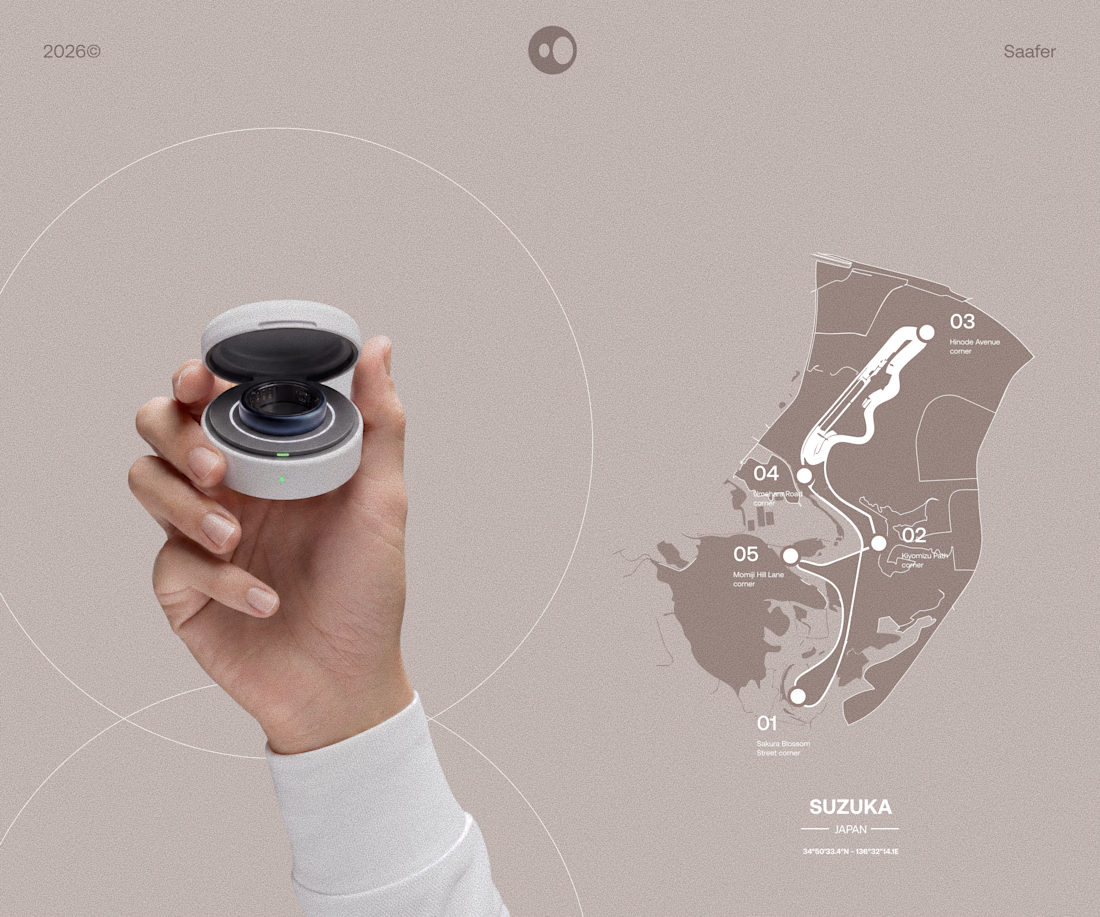
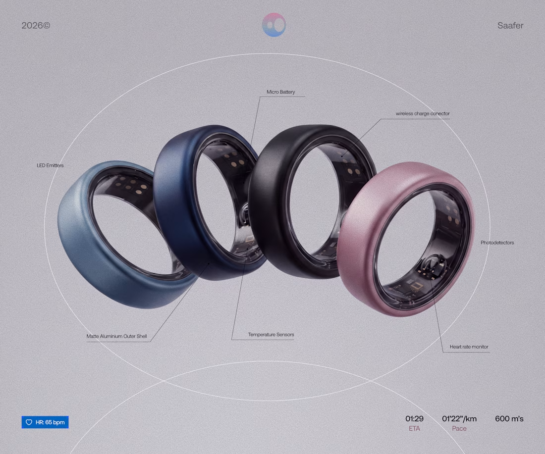
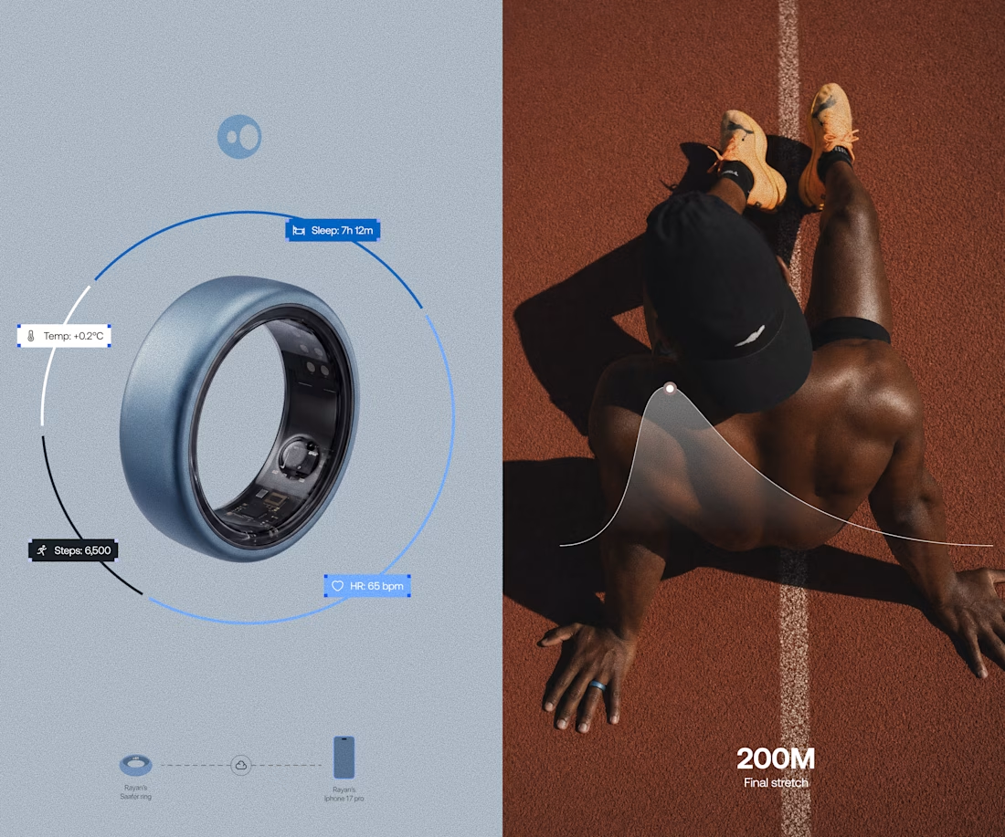
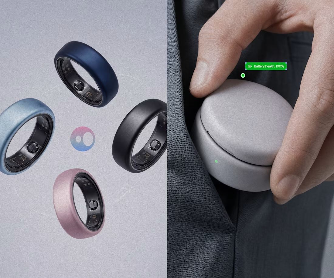
Model rendering and branding done for Saafer's smart ring (Health tech)



Crafting the Visual Identity for Elichi Coffee | Case Study
For Elichi, the goal was to build a brand identity that captures the ritual of craft coffee. The visual direction balances modern simplicity with a warm, sensory feel—creating a clean yet inviting identity across every touchpoint.
Design Highlights:
Custom Typography: Paired clean, modern letterforms with subtle editorial accents to establish an elevated, boutique feel.
Packaging & Collateral: Used generous white space and structured layout grids so the physical packaging feels premium in hand.
Palette & Materials: Blended deep, roasted tones with soft, muted neutrals to reflect the warmth of the space and the richness of the brew.
I’d love to get your feedback on this direction:
How does the balance between modern typography and warm tones feel to you?
Does the packaging strike the right balance between minimal and welcoming?


Cool work 🙌

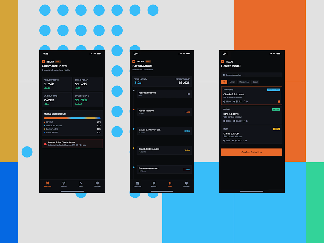
Some quick mockups for Relay, an AI infrastructure platform concept built around model routing, observability, and performance.
Exploring what a mobile command center could look like for teams managing multiple AI models, with a focus on clear data, fast decisions, and a developer-first UX.
Product design, mobile UI, AI tools, and a little systems thinking all in one.




the blue dots and orange blocks pop. did you build this in Framer?