The network for creativity
Join 1.25M professional creatives like you
Connect with clients, get discovered, and run your business 100% commission-free
Creatives on Contra have earned over $150M and we are just getting started
Back to feedPost

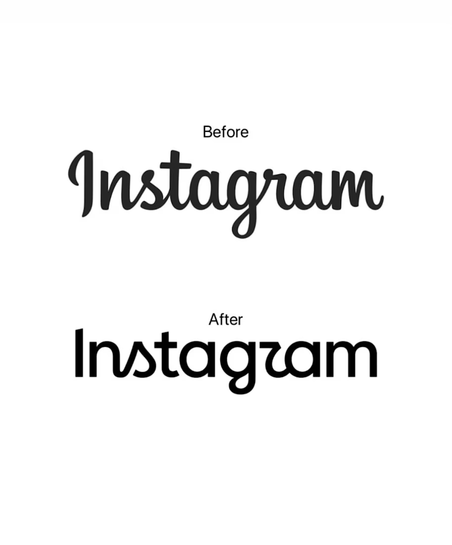
Instagram changed its wordmark.
And honestly? It was overdue.
The old wordmark had become deeply tied to the Instagram we knew in the 2010s. So when I first saw the new one, my first thought wasn't “Do I like it?”
It was:
“Why did they change it?”
Then I started looking at it as a designer.
They didn't completely destroy what already worked. They kept the handwritten DNA, the personality, and the recognition — but pushed it toward something more contemporary.
And that's where the real lesson is.
A rebrand doesn't always mean starting over.
Sometimes, it means knowing what your audience already recognizes, what has built equity, and what can be evolved without losing the soul of the brand.
Could the new wordmark be more legible? Absolutely.
Did they get a little too clever with some of the letterforms? Probably. 😂
But strategically, I respect the decision.
Because the goal of branding isn't simply to make something look new.
It's to make something feel relevant without making it feel unfamiliar.
And that's a line every designer has to learn how to walk.
What do you think of Instagram's new wordmark — evolution or unnecessary change?
The network for creativity
Join 1.25M professional creatives like you
Connect with clients, get discovered, and run your business 100% commission-free
Creatives on Contra have earned over $150M and we are just getting started
Trending
retrofuturism
Share your favorite designs from the past exploring the distant future. Or your own take on the aesthetic 🚀
halftone
Dots. Texture. Grain. Let's see your designs using the halftone technique.

Midjourney
Creatives are showing off what they're making with Midjourney.
colorgrade
Video editors sound off: How do you enhance the mood of your video in color grading?


Related posts


The 400% zoom crowd will find something in every rebrand. Curious if it reads as a z at normal app icon size too or if that's a zoomed in artifact only.

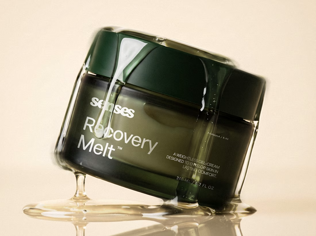
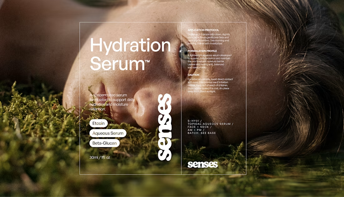
Redesigning Senses started with one question:
How can a wellness brand feel trustworthy without feeling clinical?
The answer became a system built around contrast: precise typography and packaging, paired with tactile photography, natural textures, and motion.


Beautiful work 😍

Logo design exploration from the last few months.
Some locked, others discarded.