The network for creativity
Join 1.25M professional creatives like you
Connect with clients, get discovered, and run your business 100% commission-free
Creatives on Contra have earned over $150M and we are just getting started
Back to feedPost

What if the typography wasn't just part of the brand, but the actual artwork?
Pentagram's new identity for the Poetry Foundation takes a pretty interesting approach.
Instead of relying on photography or decorative graphics, they've made the poets' own words the main visual element.
The redesign also introduces custom typography, bold colour combinations, and a reimagined Pegasus symbol that can appear in four different poses.
What I particularly like is how the system gives the content itself room to become the identity.
It's expressive without feeling random, and flexible enough to work across everything from magazine covers to exhibitions and digital platforms.
Sometimes the strongest branding comes from making the subject itself the hero.

The network for creativity
Join 1.25M professional creatives like you
Connect with clients, get discovered, and run your business 100% commission-free
Creatives on Contra have earned over $150M and we are just getting started






Related posts

I shared this redesign for Deep Mark YC (F26) around two months ago, but recently revisited it to refine the concept and explore how much the identity system could communicate.
The idea behind Deep Mark was to evolve its existing D into a subtle voice-call symbol connotation, reflecting what the platform does which is to authenticate AI-generated voices in this AI era ( more of like a watermark)
The cyan element that connects with the phone shape represents the layer or missing piece of verification, bringing the idea of trust and authentication into the mark without making it overly literal.
The logo itself is intentionally minimal. most of the storytelling happens through the broader visual system, where the shapes, colors, and applications give the mark its meaning.
Let me know what you think.
Who said a logo has to be a vector?
&Walsh just redesigned Insomnia Cookies, and the new logo is literally a photograph of a half-eaten chocolate chip cookie shaped like a crescent moon.
And somehow, it works.
The identity combines bold typography, deep purple, playful illustrations, and product photography that makes the cookies look ridiculously good.
What I find particularly interesting is how they approached the logo. Instead of simplifying everything into another geometric symbol, they made the actual product the hero.
They still created a vector version for smaller applications, but the photographic version carries the personality.
It's a great example of breaking conventional design rules without sacrificing functionality.
Would you use a photographic logo for a brand?

So cool 🔥

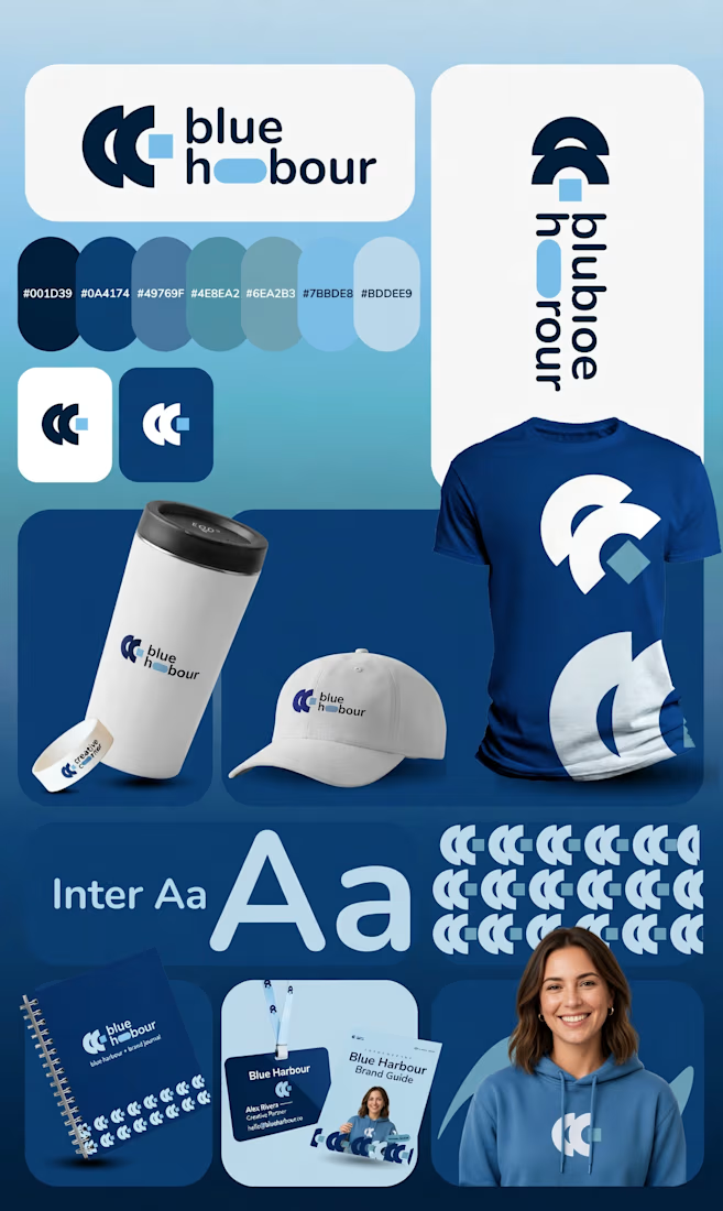
Blue Harbour — a premium brand identity built on deep navy blues (#001D39, #0A4174) and clean Inter typography. A calm, trustworthy system designed to work consistently across
stationery, packaging and social. Full case study on my profile — link below.https://contra.com/p/qkQ7LNW6-blue-harbour-premium-brand-identity-board

A great concept with a really nice visual flow.