The network for creativity
Join 1.25M professional creatives like you
Connect with clients, get discovered, and run your business 100% commission-free
Creatives on Contra have earned over $150M and we are just getting started
Back to feedPost
I shared this redesign for Deep Mark YC (F26) around two months ago, but recently revisited it to refine the concept and explore how much the identity system could communicate.
The idea behind Deep Mark was to evolve its existing D into a subtle voice-call symbol connotation, reflecting what the platform does which is to authenticate AI-generated voices in this AI era ( more of like a watermark)
The cyan element that connects with the phone shape represents the layer or missing piece of verification, bringing the idea of trust and authentication into the mark without making it overly literal.
The logo itself is intentionally minimal. most of the storytelling happens through the broader visual system, where the shapes, colors, and applications give the mark its meaning.
Let me know what you think.

Treating the cyan piece as the missing verification layer is a strong idea. My one question is scale: at favicon size, does the gap between the D and the phone shape still read as deliberate, or does it start to look like a rendering glitch?

It works well at a favicon scale as well.
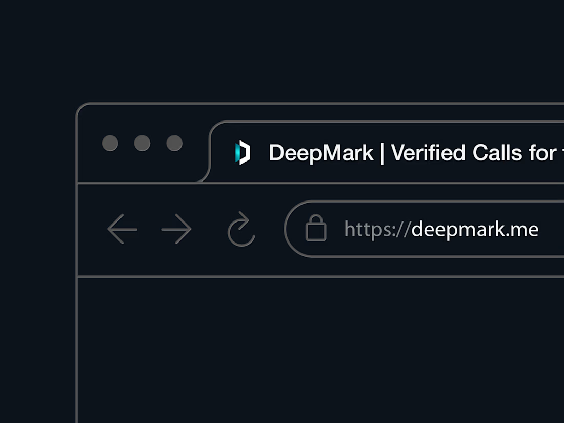
Good to see it in an actual tab. The notch stays clear at that size, which is where a mark like this usually gets tested hardest.
The network for creativity
Join 1.25M professional creatives like you
Connect with clients, get discovered, and run your business 100% commission-free
Creatives on Contra have earned over $150M and we are just getting started





Related posts

My latest branding project for the Atlanta Museum of Paleontology.
Check out the full project at maximjungle.com


A T-rex drawn in one thin outline is such a good mark 🦖 I'd happily visit that museum.


How far can you take a logo beyond the first draft?
I started with Recraft's Logo Maker and a fictional idea: Bibu's Paws, a cosy little dog rescue and adoption shelter.
I wanted the identity to feel warm, homely and full of character, so I explored a few logo directions before settling on the little dog tucked inside a house.
From there, I took the idea further, building out the visual identity with an earthy colour palette, typography, illustrations and a few real-world applications: the shelter space, dog merchandise and an adoption welcome kit.
I enjoyed seeing how a small starting point could grow into a brand with its own personality and world.
Now I'm curious: if you were building a brand around this logo, what would you create next?






It turned out so cozy, you did great