The network for creativity
Join 1.25M professional creatives like you
Connect with clients, get discovered, and run your business 100% commission-free
Creatives on Contra have earned over $150M and we are just getting started
Back to feedPost


This is incredible!

I just published (finally) my visual identity portfolio.
There's still a lot to fix, projects to add, and the UI to improve further, but I already think it's quite usable.
The network for creativity
Join 1.25M professional creatives like you
Connect with clients, get discovered, and run your business 100% commission-free
Creatives on Contra have earned over $150M and we are just getting started

Challenges
View all


Related posts


Just posted mobile design for event platform 🎫 Share your feedback


Looks sharp


Calibration as a moment of realization.
For Nibu, we made "learning the environment" a core part of the brand experience.
High-grain visuals. Deep shadows. A soft, warm glow. The interface tells you that the air is being sensed before the first data point even hits the screen.
Clarity beats polish.
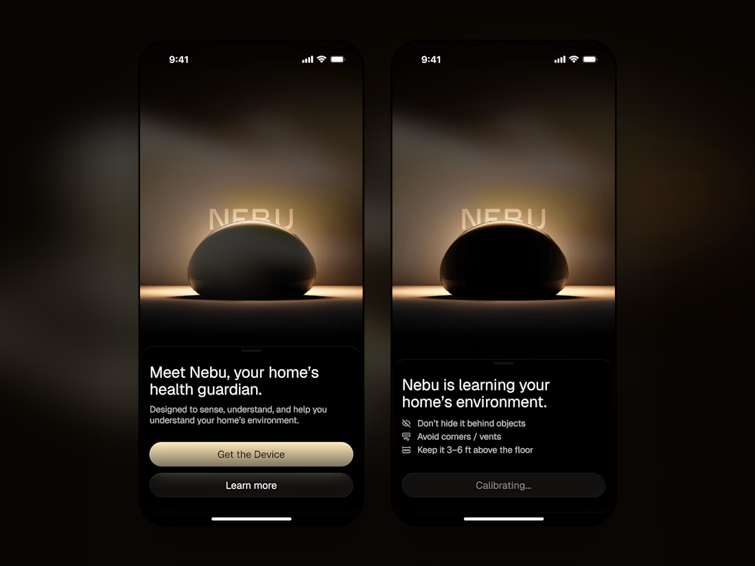

"Clarity beats polish" shows in the calibrating screen especially. Telling the user the air is being sensed before the first reading builds trust in the wait instead of making it feel like a loading bug.

This is sooo true! 😂

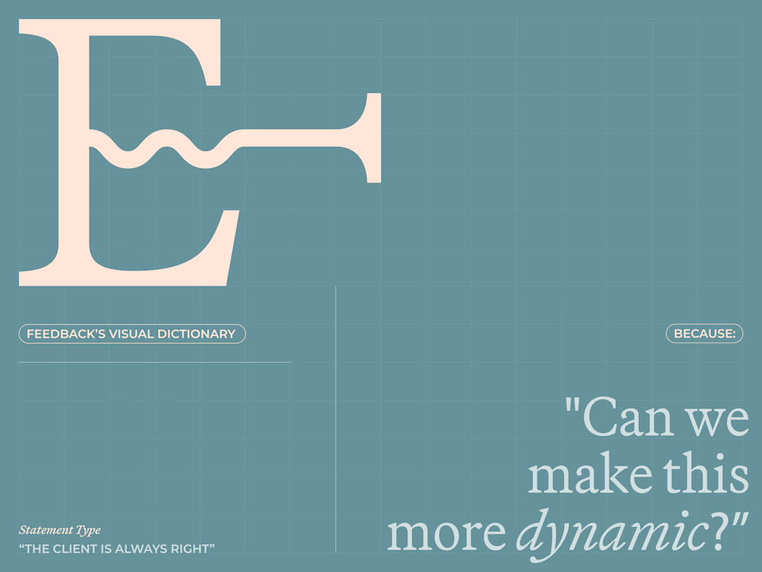
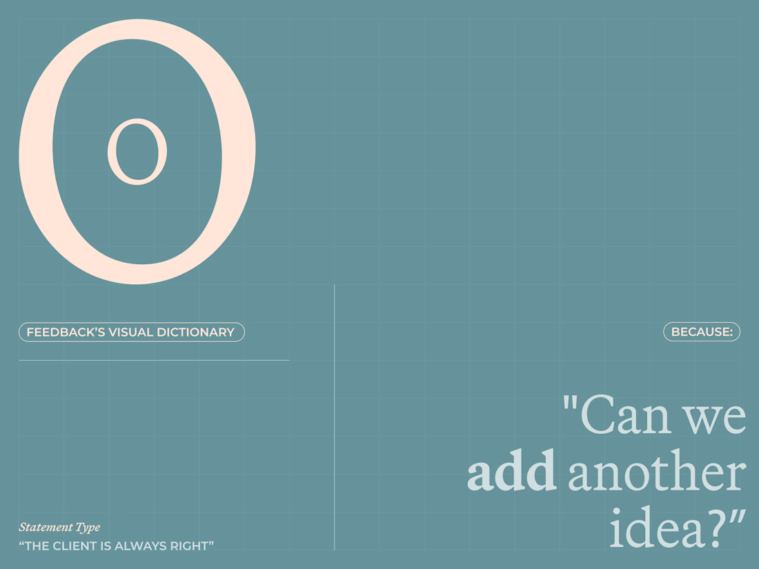
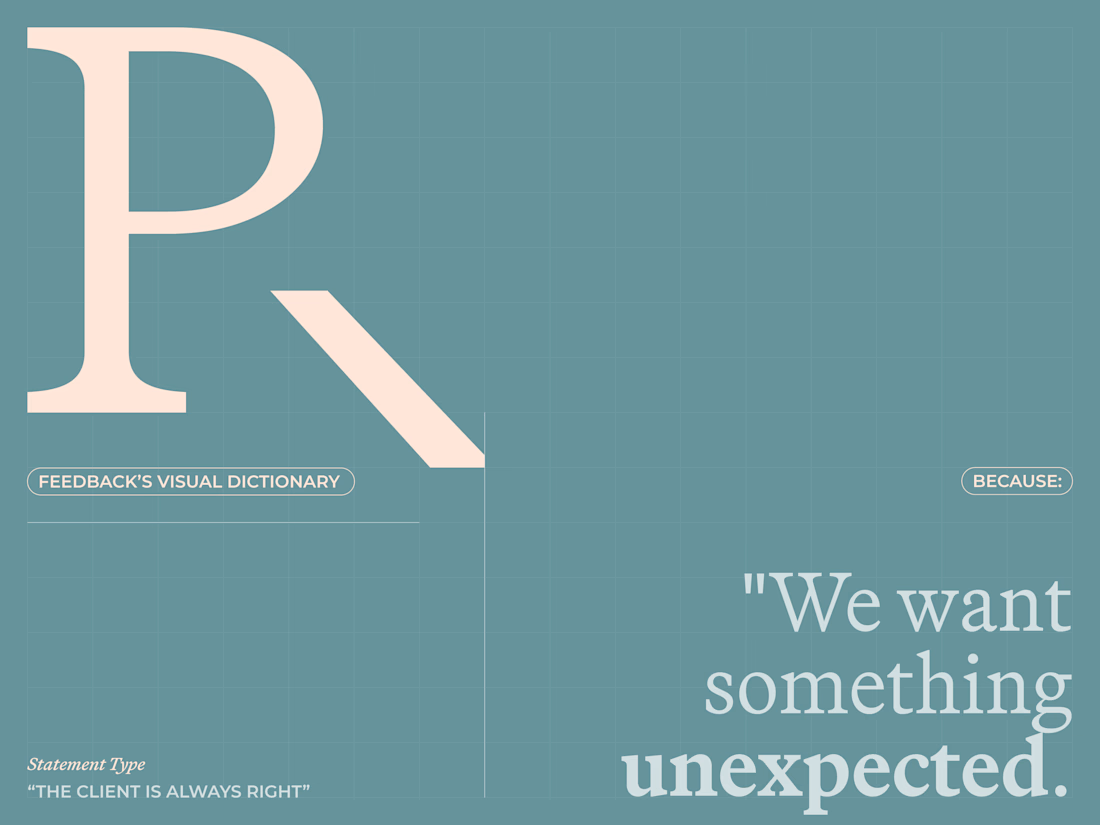
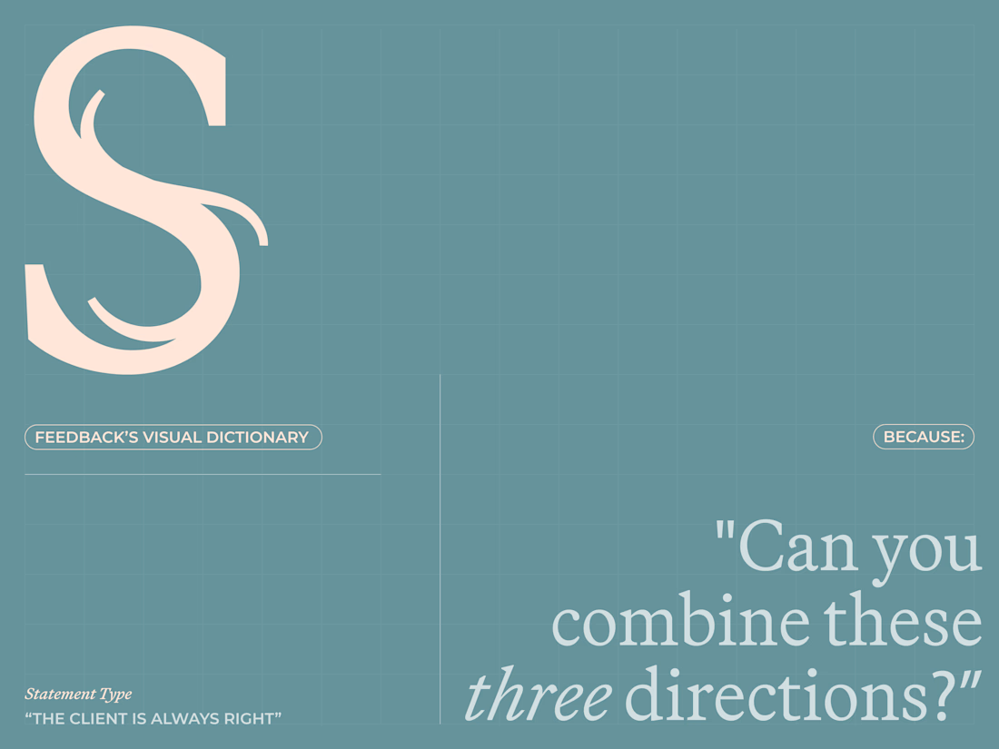
Are clients always right? 😀
I created a lettering system where every letterform represents one of the things designers routinely hear from clients.
The typeface becomes a visual dictionary of bad creative feedback, that proves the statement wrong.
Give me your worst client...

This is lovely, nice creative


