The network for creativity
Join 1.25M professional creatives like you
Connect with clients, get discovered, and run your business 100% commission-free
Creatives on Contra have earned over $150M and we are just getting started
Back to feedPost


Just posted mobile design for event platform 🎫 Share your feedback


Looks sharp

The barcode, ticket details, and colorful event art create a nice tension. which part drove the visual direction?

Really Good!


So aesthetic and understandable. Really nice!


the tilted phone looks great. the ticket screen is easy to read.


looks great

Superb 🔥


It’s very hard to play with highly saturated colors and white space at the same time in UI. I loved the swipe button and its use. It looks so intuitive. Well done with the UX design, Oleksandra! 🔥

That's great🔥

This deserves more than just liking, this deserves to be featured! 🏆 High-contrast ticketing components make event mobile flows look completely seamless.


Really clean experience. Event platforms need to balance information and action, and this feels nicely structured.

Nice 🔥 🎉

Super clean UI! The high-contrast elements make the ticket details stand out really nicely. Did you design this primarily in Figma ?

love it! I really need that app!! 😍 Does it work in Kyiv?


Love the style. Well done 👏👏

the ui is so clean

looks clean ,good work

Great designs

Such a clean digital ticket UI! The physical notch details give it so much character, and the electric blue color palette looks stunning. That QR code interaction slider at the bottom is pure genius! 🎫✨

I hope to see this come to live, i have done a similar project for events before and the execution didn't come out as planned. Nice work


It is all making sense

Nice work

Love this concept 🧡

Looks dope

Sleek 🔥🔥🔥

Good interaction with the show QR code button

The QR Code swiper is such a nice UX idea, lovely work.

Would love to have a ticket like this😍
The network for creativity
Join 1.25M professional creatives like you
Connect with clients, get discovered, and run your business 100% commission-free
Creatives on Contra have earned over $150M and we are just getting started











Related posts

Pulse Athletics... Branding & App design✨
Check it out
#app #sport #productdesign #uiuxdesign #uidesigner #uxdesigner #pulse #branding #brandidentity #brandstrategy #brandguidelines #logo #homepage


That's really stunning app design🔥🔥🔥
Great job Ziva🎉🎉🎉

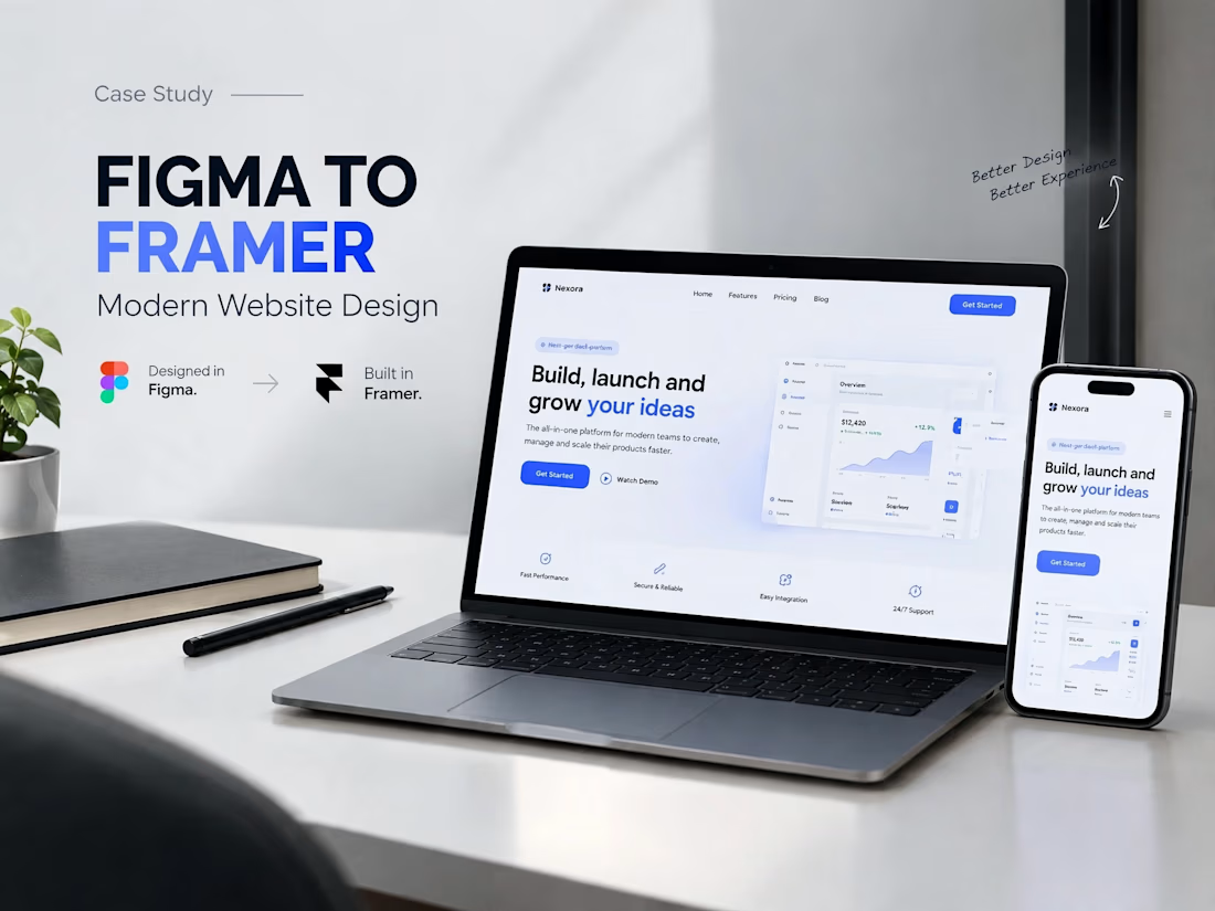
A modern SaaS website concept designed in Figma, featuring clean layouts, intuitive navigation, consistent visuals, and a user-friendly experience across different screen sizes.


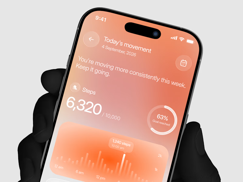
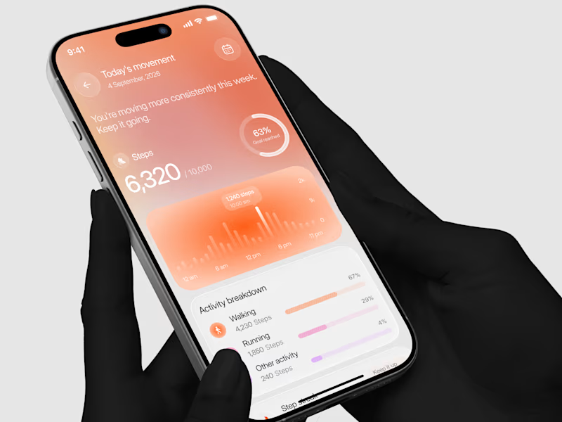
Designed a step tracking screen where you can see your daily progress and weekly trend in one glance.
Same screen, two shots. Which one would stop your scroll? 👀

11 voted
73%
4 voted
27%
15 votes
Closed