The network for creativity
Join 1.25M professional creatives like you
Connect with clients, get discovered, and run your business 100% commission-free
Creatives on Contra have earned over $150M and we are just getting started
Back to feedPost

This is sooo true! 😂

Are clients always right? 😀
I created a lettering system where every letterform represents one of the things designers routinely hear from clients.
The typeface becomes a visual dictionary of bad creative feedback, that proves the statement wrong.
Give me your worst client...
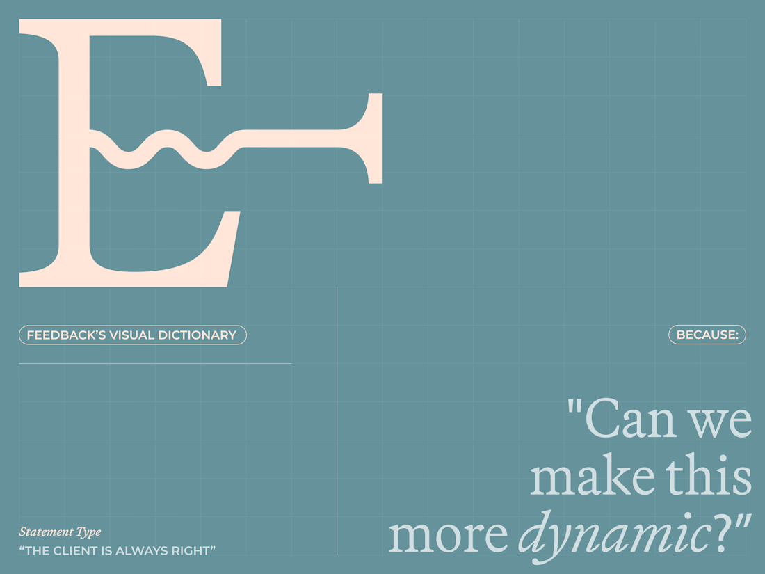
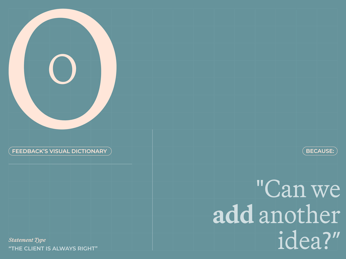
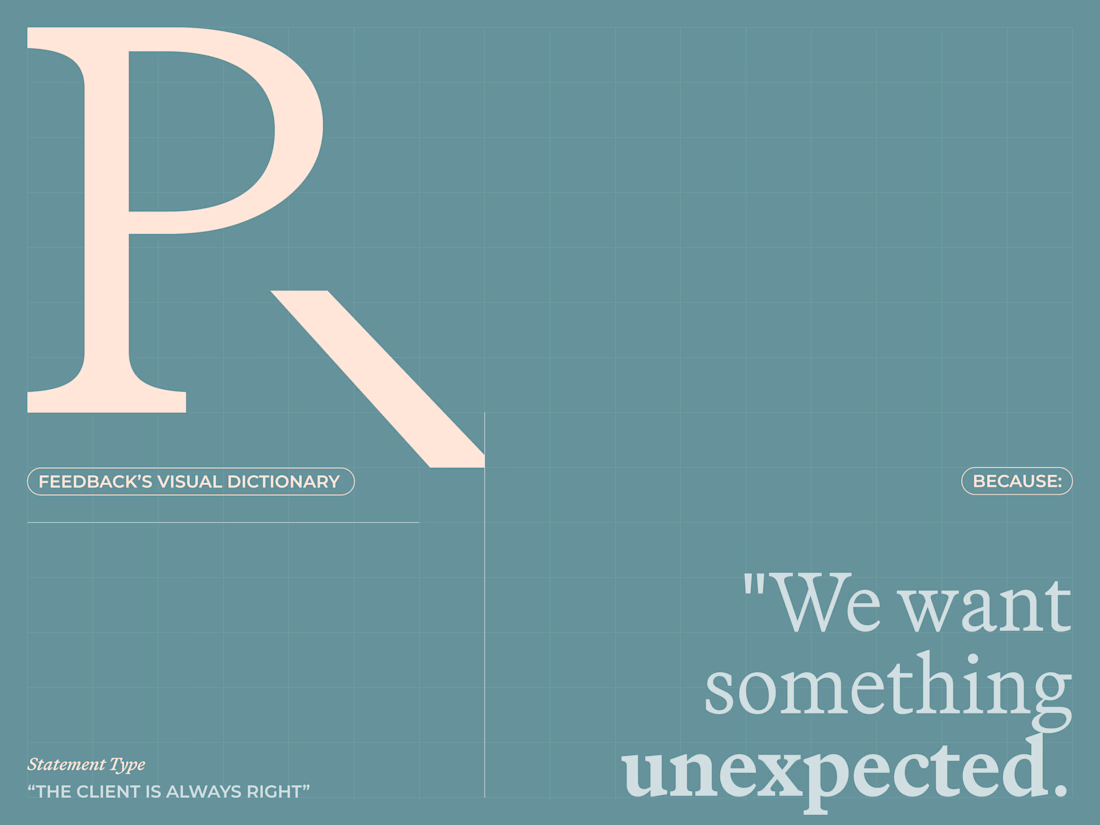
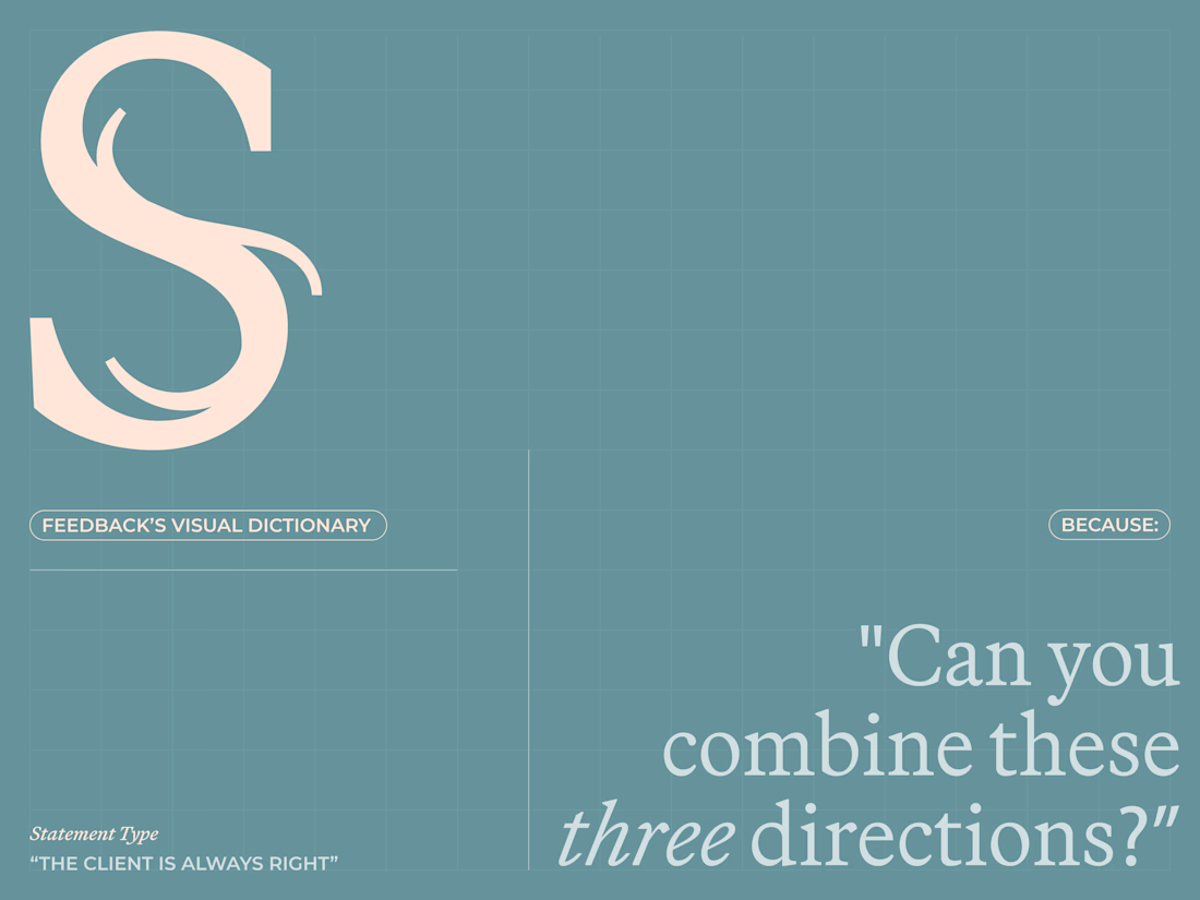

The R paired with "we want something" is oddly perfect, you can feel the vague brief coming before you even finish reading it. Smart way to turn a pain point into an actual typeface.

Loool that is so funny 😂
The idea of turning client feedback into the actual letterforms is clever. Each one basically becomes a tiny case study in scope creep.

Great job! haha
The network for creativity
Join 1.25M professional creatives like you
Connect with clients, get discovered, and run your business 100% commission-free
Creatives on Contra have earned over $150M and we are just getting started
Related posts

what you think of the experimental poster i just made.
A conceptual halloween party "Dress for the dark".
which one should we go for light or dark.
7 voted
50%
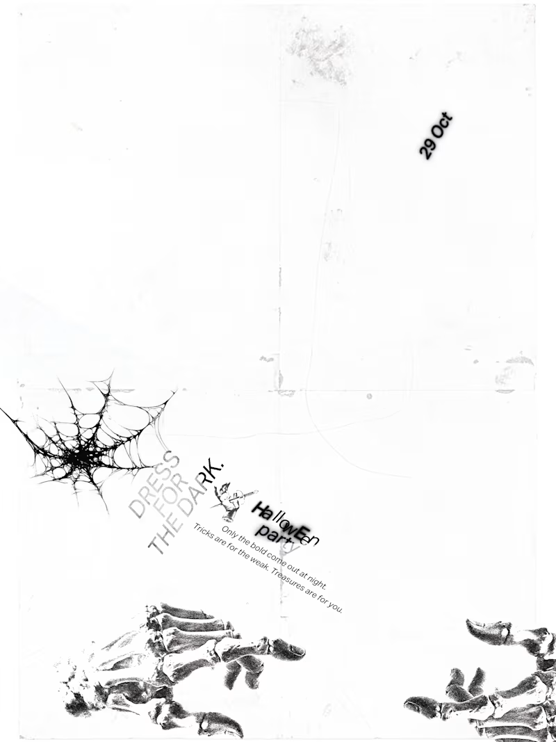
7 voted
50%
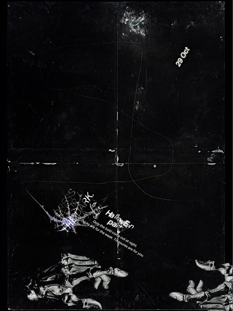
14 votes
Closed

Dark for me. The photocopy grain, cobweb and plant shapes feel like a scratched film print on black, perfect for a party in the dark. Would you bump the small type so it reads from across the room?

Wow 🔥🔥


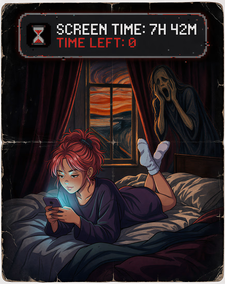
Can AI really juggle 10 REFERENCES? Let's put it to the test!! 👀
👁️ Goal: Create a Halloween poster: a girl doomscrolling in bed while Munch's Scream screams right behind her, and she doesn't notice, the title is "Screen time: 7h 42m. Time left: 0.", while mixing drastically...
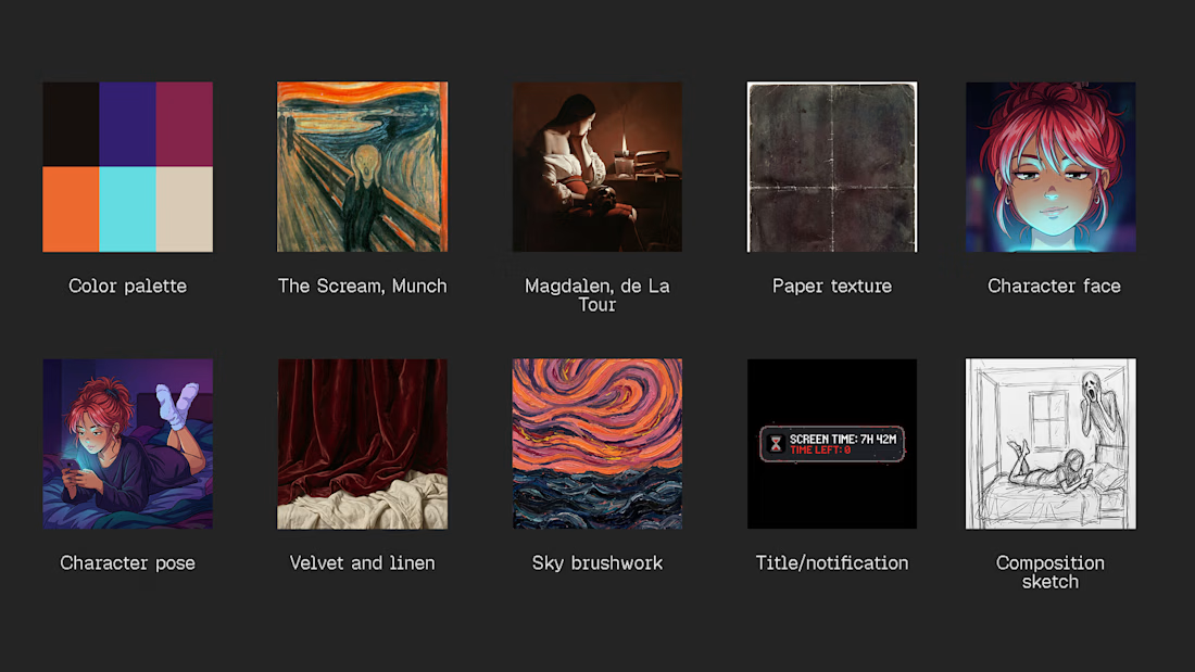
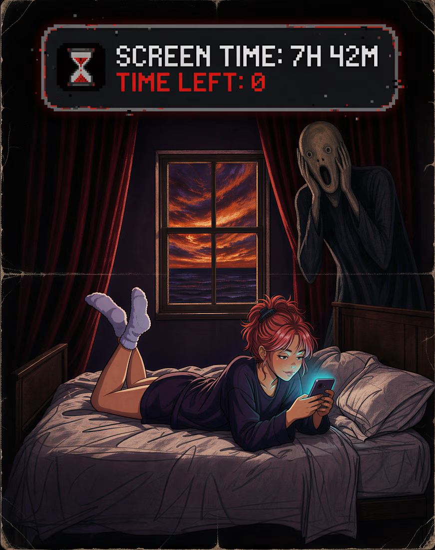



I'm OBSESSED with the chaotic, dark, weird vibe of your projects! 🖤