The network for creativity
Join 1.25M professional creatives like you
Connect with clients, get discovered, and run your business 100% commission-free
Creatives on Contra have earned over $150M and we are just getting started
Back to feedPost
Taste Test
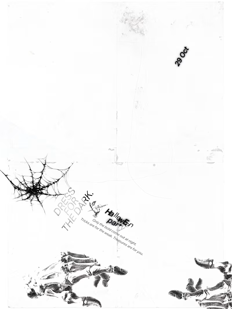
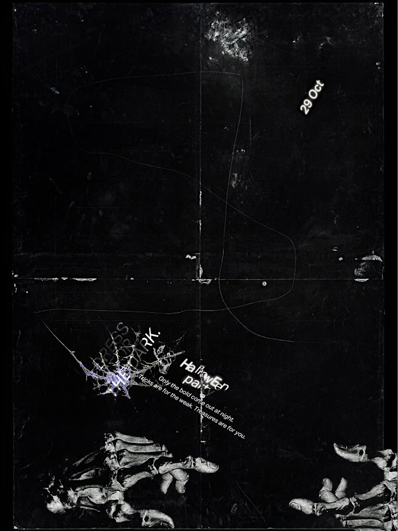
what you think of the experimental poster i just made.
A conceptual halloween party "Dress for the dark".
which one should we go for light or dark.
7 voted
50%
7 voted
50%
14 votes
Closed

Dark for me. The photocopy grain, cobweb and plant shapes feel like a scratched film print on black, perfect for a party in the dark. Would you bump the small type so it reads from across the room?

thank you so much ivan for you review. Yeah i know i should increase the size, i would if i was working on it for a client but here for aesthetic purposes i wanted to fill in so chose this size.
Fair enough, your poster your rules, legibility can wait for the client brief 😄 And honestly the dark one already looks like a real film print, so the tiny type kind of sells it.
thank you ivan, i know what you are talking about it's not legible but here i am just playing so you know left it like that😂 .

Great job

The dark version fits the 'Dress for the dark' theme perfectly!

LIGHT

Dark for sure! The grunge + skeleton hands fit "Dress for the dark" perfectly. Light would lose the edge. 🔥

Well it did say "Dress for the dark" so Dark it is :-)

Beautiful!
😍

Dark one for me. With the theme being dress for the dark, the black version just fits the idea better.
The network for creativity
Join 1.25M professional creatives like you
Connect with clients, get discovered, and run your business 100% commission-free
Creatives on Contra have earned over $150M and we are just getting started
Related posts




Which color palette feels more masculine to you?
16 voted
15%
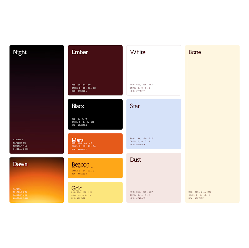
94 voted
85%
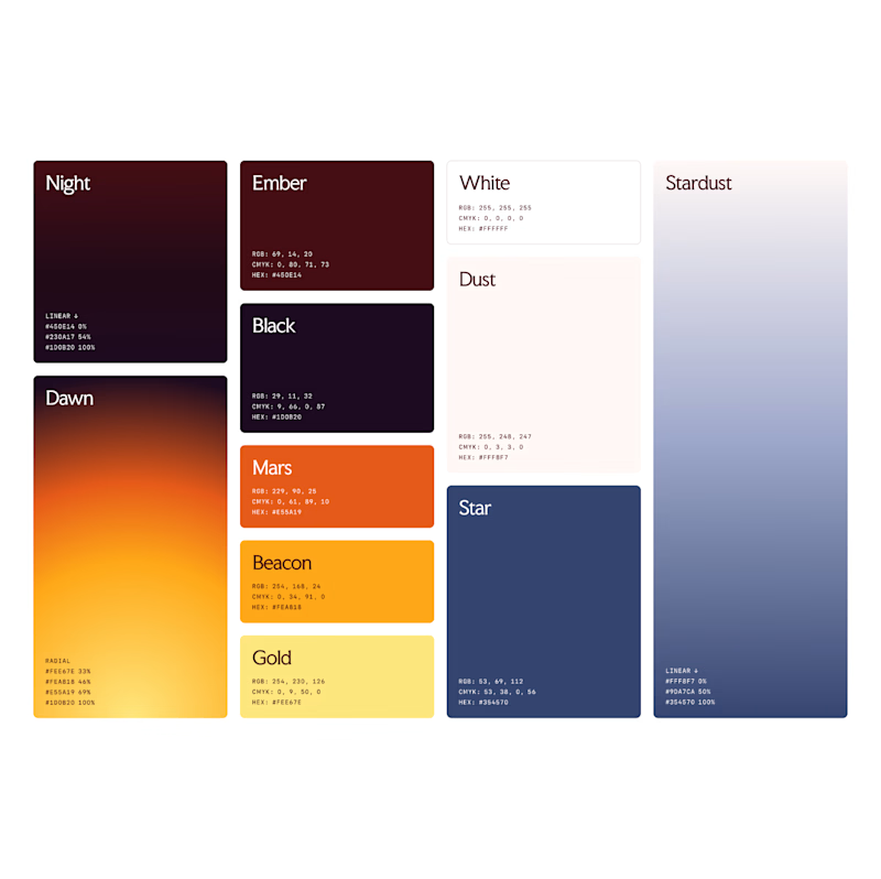
110 votes
Closed


Such a neat experiment in AI-assisted spatial design! Using 10 photos of a real setup to train a local model like FLUX 3 Klein is next-level prototyping.
Both options look great, but Option A totally wins on the cozy lighting front for me. Check out the post and drop your vote


Turned my real desk into a tiny clay diorama ☕️
Made with FLUX 3 Klein running locally, using 10 photos of my actual setup as references: the pegboard wall, headphones, mug, shelves...
Which one do you like more, A or B?
21 voted
58%
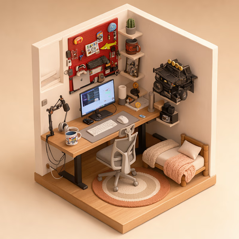
15 voted
42%
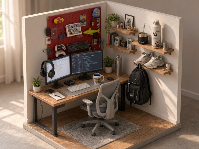
36 votes
Closed
This is insane! Option A is my favorite - the details are so realistic!
Love how you turned your real setup into clay with FLUX 3 locally, super creative idea!