The network for creativity
Join 1.25M professional creatives like you
Connect with clients, get discovered, and run your business 100% commission-free
Creatives on Contra have earned over $150M and we are just getting started
Back to feedPost

I just published (finally) my visual identity portfolio.
There's still a lot to fix, projects to add, and the UI to improve further, but I already think it's quite usable.


That is so incredible and unique ! I love this type of work!
The network for creativity
Join 1.25M professional creatives like you
Connect with clients, get discovered, and run your business 100% commission-free
Creatives on Contra have earned over $150M and we are just getting started











Related posts

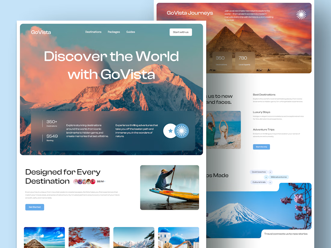
GoVista Journeys - A travel landing page designed to make people dream of their next destination.
A travel company based in Leicester, UK, needed a visually engaging landing page to showcase its destinations and travel experiences while its larger website was being prepared.
The goal was simple: make a strong first impression through beautiful travel imagery, a clean layout, and a design that makes people want to explore more.
Because in travel, the journey can begin long before the booking. ✈️
What catches your attention first on a travel website: the images, the destinations, or the overall design? 👇

I like this very much, very good concept

Accidentally made app navigation look more satisfying than the actual music!😍
16 seconds of spatial audio, smooth transitions, and tactile UI motion. Testing how far you can stretch digital minimalism✨
Feedback and love from the design community are always appreciated🙌
UI DesignmotiongraphicsmobileappdesignuiuxdesignMotion DesignUX DesignAdobe After EffectsCinema 4DFigma


This is so satisfying Raheel! 🔥 You nailed that tactile UI motion - 16 seconds but it feels so premium! The spatial audio card with that depth + smooth transition from Home to Made for Spatial Audio is chef's kiss. Minimalism stretched perfectly without losing the Apple Music...

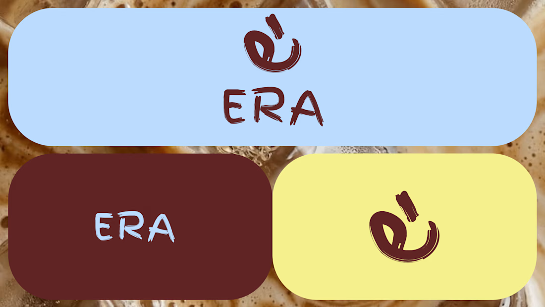
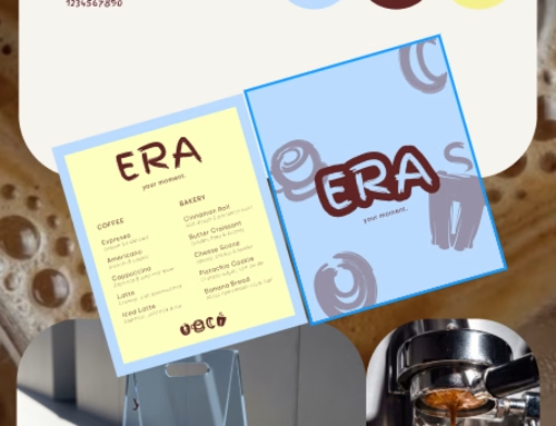
ERA Coffee brand
ERA Coffee is a contemporary café concept based in Panama, created around the idea of making everyday moments feel special. Its visual identity combines bold and vibrant tones blended together with expressive typography to create a modern brand that represents an era.


Premium branding