The network for creativity
Join 1.25M professional creatives like you
Connect with clients, get discovered, and run your business 100% commission-free
Creatives on Contra have earned over $150M and we are just getting started
Back to feedPost

Just published a new brand identity case study: Fogo & Grelha 🔥
Fogo & Grelha is a Brazilian barbecue delivery brand built around fire, flavor, packaging, and the unmistakable feeling of a real churrasco.
The challenge was to create a strong visual identity for a delivery-first restaurant — a brand without a dining room, where the customer experience happens through the meal tray, kraft bag, sealed packaging, uniforms, social media, and the food itself.
The result is a fire-driven identity system with bold typography, rustic textures, warm colors, delivery packaging, and appetite-focused visuals designed to make churrasco feel real, even inside a takeaway box.
Take a look at the full project on my Contra profile.


The network for creativity
Join 1.25M professional creatives like you
Connect with clients, get discovered, and run your business 100% commission-free
Creatives on Contra have earned over $150M and we are just getting started



Related posts

What if sending money felt a little more like giving a gift?
For Nova, I explored a banking app that brings payments, cards, and a bit of personality together. You can check your balance, browse recent transactions, send or request money, top up, and pay bills.
My favorite part is the digital postcard feature. Before sending a transfer, you can add a little illustrated card—a heart, a birthday greeting, or a playful character. A simple way to make birthday money or a thank-you feel more personal.
I carried that same 3D character into onboarding, pairing it with bold red gradients and large, clear payment details. There’s room for play, while the recipient and amount stay easy to check.
Would you add a postcard to a transfer? I’d love to know what occasion you’d use it for.






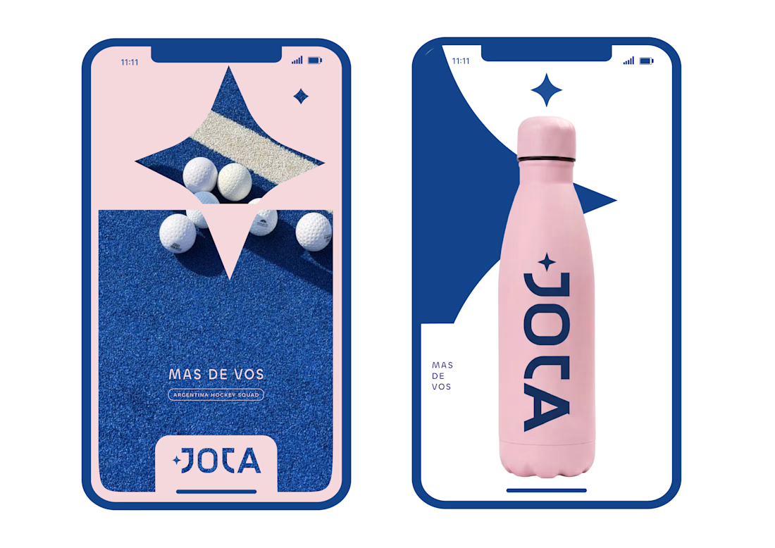
JOTA is an Argentine field hockey brand built for players who play with personality. The founder reached out to rethink how the brand shows up beyond the stick itself.


Wow project

Most rebrands start with a mood board. This one started with a punctuation mark.
For we make the slash in the name became the logo, the monogram, the layout tool and even the campaign line: "we make you grow."
When one small idea can carry a whole brand, every new touchpoint designs itself.
Founders does your name have a hidden idea like this?
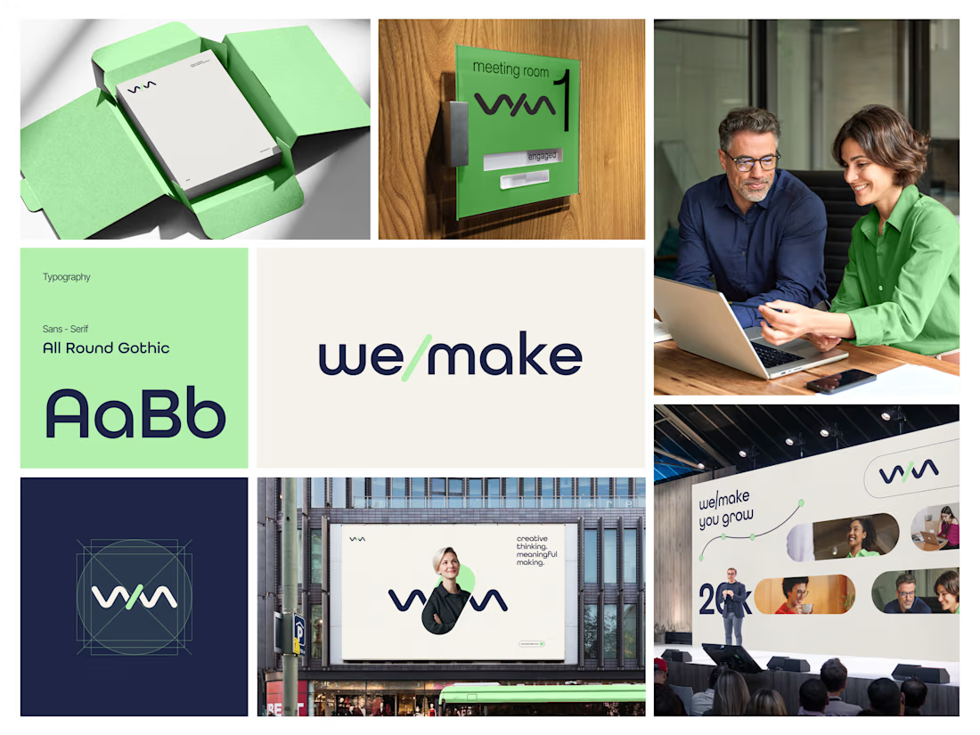

Turning the slash into the logo, monogram and layout device is such a smart move, and it feels wonderfully consistent across the mint-green packaging, signage and stage visuals. The rounded geometric type pairs beautifully with that fresh green and deep navy. Did the slash idea...