The network for creativity
Join 1.25M professional creatives like you
Connect with clients, get discovered, and run your business 100% commission-free
Creatives on Contra have earned over $150M and we are just getting started
Back to feedPost

Most rebrands start with a mood board. This one started with a punctuation mark.
For we make the slash in the name became the logo, the monogram, the layout tool and even the campaign line: "we make you grow."
When one small idea can carry a whole brand, every new touchpoint designs itself.
Founders does your name have a hidden idea like this?

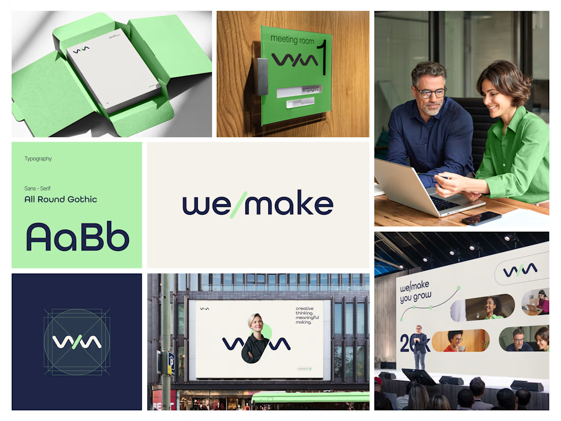

Turning the slash into the logo, monogram and layout device is such a smart move, and it feels wonderfully consistent across the mint-green packaging, signage and stage visuals. The rounded geometric type pairs beautifully with that fresh green and deep navy. Did the slash idea...

Turning the slash into the logo and the tagline is smart. The green and navy pairing looks great across the signage too.
The network for creativity
Join 1.25M professional creatives like you
Connect with clients, get discovered, and run your business 100% commission-free
Creatives on Contra have earned over $150M and we are just getting started
Related posts


A little throwback to one of our favorite collaborations with Lion Pose! 🧡
We worked with the founders to bring their vision to life through core brand identity, logo, and packaging design, creating a bold, playful visual language that feels fresh in the skincare space.
So lovely to see Lion Pose grow from its early days to the shelves of Sephora, with our packaging work recognized at the 2024 Dieline Awards!


Nice work


Designers, which direction would you go with: photography or illustration?
83 voted
69%
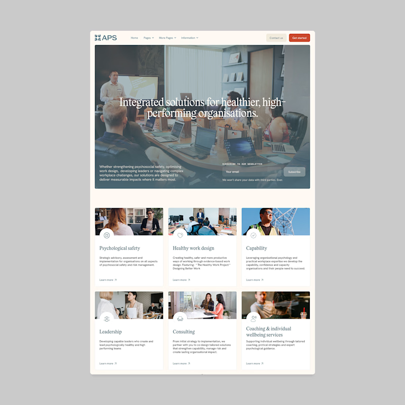
37 voted
31%
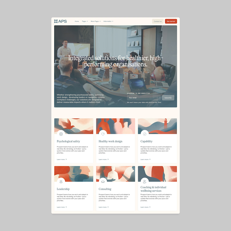
120 votes
Closed

I'll prefer photos, specially talking about organizations in your page, human faces and real scenarios can have a better effect in this case.

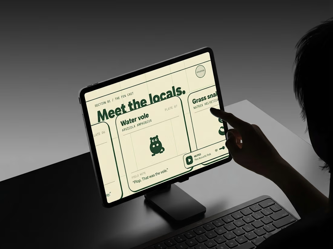
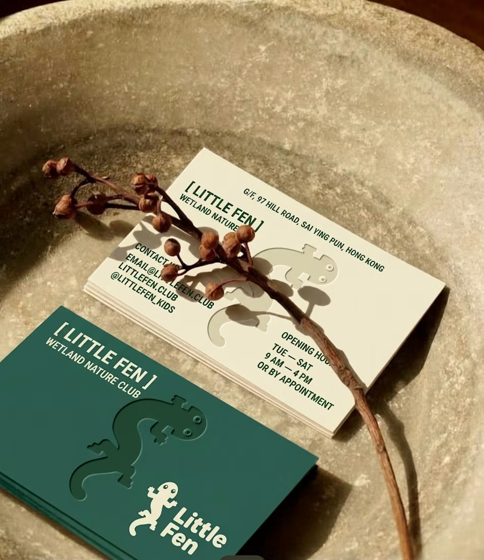
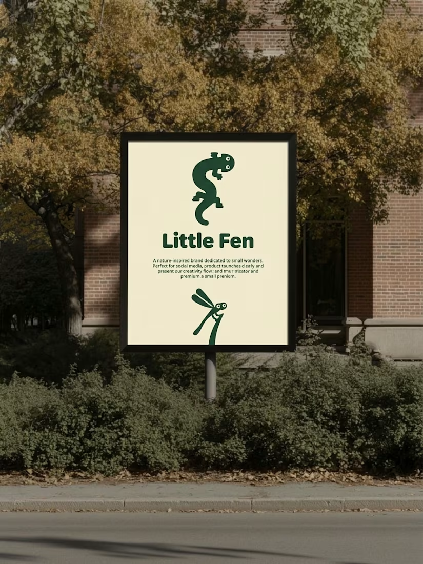
Every creature in this identity is watching you.
Little Fen, a wetland club for kids. 50 creatures. 3 colors. Everyone gets eyes.
Case study drops soon.
Which creature goes first?

Hey Little Fen,
Can you see me?


