The network for creativity
Join 1.25M professional creatives like you
Connect with clients, get discovered, and run your business 100% commission-free
Creatives on Contra have earned over $150M and we are just getting started
Back to feedPost
Taste Test


Which box would you put in the trolley?
One is calm and warm: cream carton with a gold sun mark, a ceramic bowl on travertine, honey pooling at the edge and oat rings dropping into milk against deep blue.
The other is loud and saturated: a tapered purple pack with an embossed monogram, fluted glass bowl, berry pieces spiralling through a pink splash on acid green.
One is a quiet morning. The other is a wake up call. 👇
#brandconcept #packagingdesign #artdirection
2 voted
50%

2 voted
50%

4 votes
Closed

Love The Purple colour it looks sharp


Nice work

Cant decide... both are looking too good.
The network for creativity
Join 1.25M professional creatives like you
Connect with clients, get discovered, and run your business 100% commission-free
Creatives on Contra have earned over $150M and we are just getting started











Related posts

Brand identity exploration
Which one do you think it fits better?
36 voted
77%

11 voted
23%

47 votes
Closed

Cobalt is great Gold is unique 🎉🎉🔥🔥

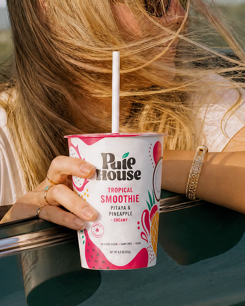
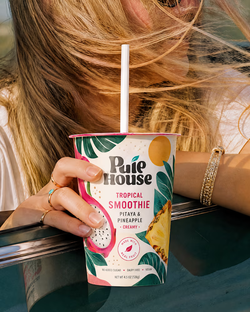
Exploring Two Branding Concepts
I explored two distinct visual directions for Pulp House, focusing on how color, composition, and design elements can shape a brand's identity.
This comparison reflects my approach to creating thoughtful, cohesive visuals that help businesses present their brands with confidence.
1 voted
5%
20 voted
95%
21 votes
Closed

Fun concepts, Mati!

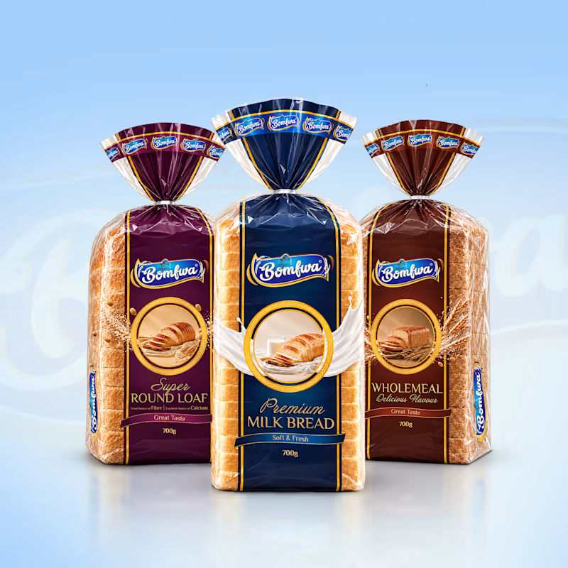
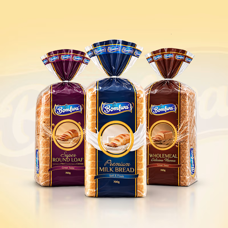
Which background color works better for this bread lineup I am working on to showcase to a client, is it cool blue background on the left, or the warm cream background on the right?
I thought of using blue as it gives a consistent and wholesome feel while matching with the front bread but the yellow one I think looks more appetizing and makes the designs shine.
I’d love to hear what stands out to you. Which one makes the packaging feel more appealing and eye-catching?
2 voted
25%
6 voted
75%
8 votes
Closed


cream for me. the blue makes the milk bread wrapper kinda disappear into the background