The network for creativity
Join 1.25M professional creatives like you
Connect with clients, get discovered, and run your business 100% commission-free
Creatives on Contra have earned over $150M and we are just getting started
Back to feedPost
Taste Test
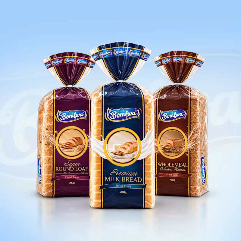
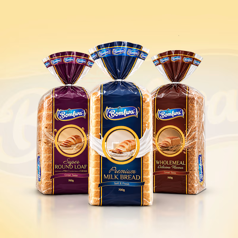
Which background color works better for this bread lineup I am working on to showcase to a client, is it cool blue background on the left, or the warm cream background on the right?
I thought of using blue as it gives a consistent and wholesome feel while matching with the front bread but the yellow one I think looks more appetizing and makes the designs shine.
I’d love to hear what stands out to you. Which one makes the packaging feel more appealing and eye-catching?
8 votes
Ends in 3h

Option 2 is better because it's background suitable for a toast brand❤️

That's precisely right, I will go with this color to add in my final presentation. Thank you for the great suggestion.
Absolutely 👍
Pardon Keshav❤️


cream for me. the blue makes the milk bread wrapper kinda disappear into the background
Yes, you are correct, and it kind of also throws off the balance for the other two breads with unmatched color with the background. Thank you for the suggestion.
The network for creativity
Join 1.25M professional creatives like you
Connect with clients, get discovered, and run your business 100% commission-free
Creatives on Contra have earned over $150M and we are just getting started







Related posts

Which colour palette would you choose for the banner design for a domain business? 🔥 Fiery or 🧊 Frosty?
20 voted
36%
35 voted
64%
55 votes
Closed

Frosty seems really cool for me!!

Covers are my weakest muscle. I can build a whole visual world, and then freeze at one thumbnail 😅
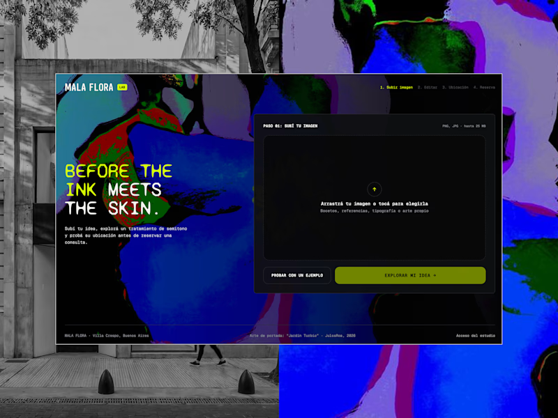
MALA FLORA: a tattoo studio + gallery built from my painting Jardín Turbio. A shows the site on the street, B shows the flow in motion.
Which one makes you want to click?
3 voted
20%
12 voted
80%
15 votes
Closed
B, the tattoo frames moving made me stop scrolling where A reads more like a site screenshot

The previous poll on this preloader had exactly 50-50 results between Horizontal gallery and Circle intro. Now I'm continuing with 2 other options. Which one is better? Check the live preview here
19 voted
53%
17 voted
47%
36 votes
Closed

Team mosaic!!