The network for creativity
Join 1.25M professional creatives like you
Connect with clients, get discovered, and run your business 100% commission-free
Creatives on Contra have earned over $150M and we are just getting started
Back to feedPost

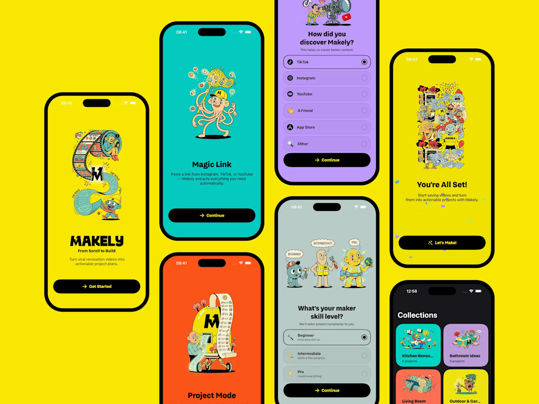
Currently building an iOS app called Makely — a project organizer for turning video inspiration into actionable plans.
The core idea:
You find a renovation or DIY video (even without a proper description), share it to Makely, and the app uses AI to break it down into:
• materials (with estimated cost)
• tools required
• step-by-step phases
So instead of just saving content, you can actually execute the project.
Design-wise, I’m exploring a more playful, character-driven system combined with bold colors and simple UI flows — aiming to make something that feels approachable but still structured and useful.
Would love feedback from designers on:
• overall visual direction (too playful vs. balanced?)
• clarity of onboarding flow
• how the illustrations work within a product UI
Trying to refine this before App Store launch.



Love the colors 🔥


looks good

Colorful & fun UI design with colors & typography btw!

Great design

The network for creativity
Join 1.25M professional creatives like you
Connect with clients, get discovered, and run your business 100% commission-free
Creatives on Contra have earned over $150M and we are just getting started




Related posts

Which color direction feels right for this digital payment app?
While designing a full digital payment app experience, from bills overview to payment confirmation, I explored two different color systems for the entire flow. Same screens, same functionality, just a different accent palette and personality.
Option 1 - Neon Green. Bold, high-energy, and gives a sharp, fintech-forward feel throughout the journey.
Option 2 - Cyan/Blue. Cool, modern, and leans more premium and trustworthy across the whole app.
Would love your honest UX/UI take, which direction feels more trustworthy, engaging, and appropriate for a digital payment app, and why? 👇
3 voted
38%
5 voted
62%
8 votes
Closed

Cyan/Blue


Some logos try to say everything.
The best ones say just enough.
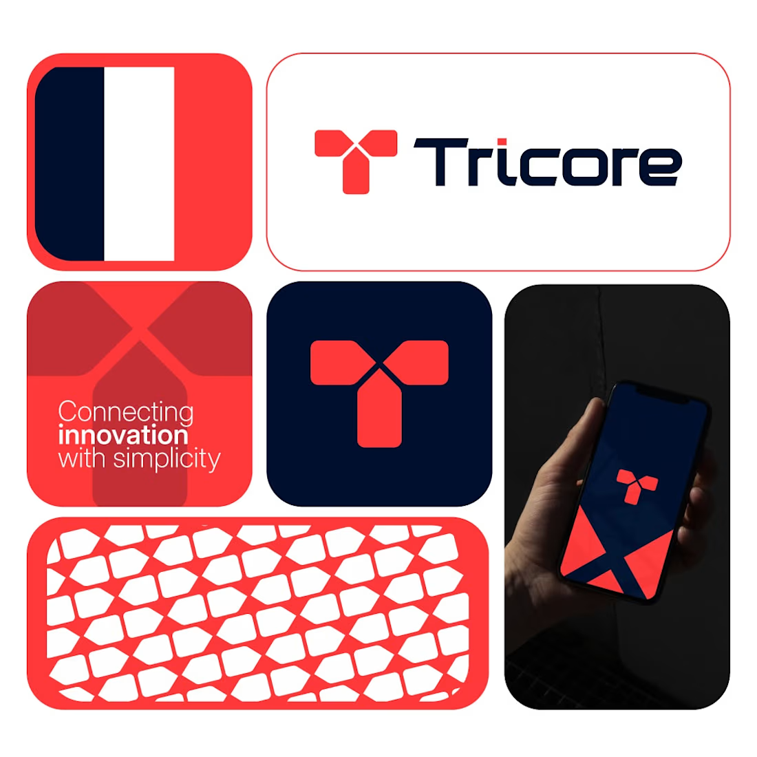
Tricore was built around a simple visual concept:
three connected elements working together as one system.
No unnecessary details.
No visual noise.
Just a clean identity designed to be memorable across screens, products, and future brand applications.
A strong logo should still be recognizable when:
• Scaled down
• Viewed quickly
• Seen from a distance
That's the standard I try to design for.
What's your first impression of this identity?
👇 One word only.



Cohesive.

Still looking for someone to give your brand’s online presence a little more life?
I’m one.
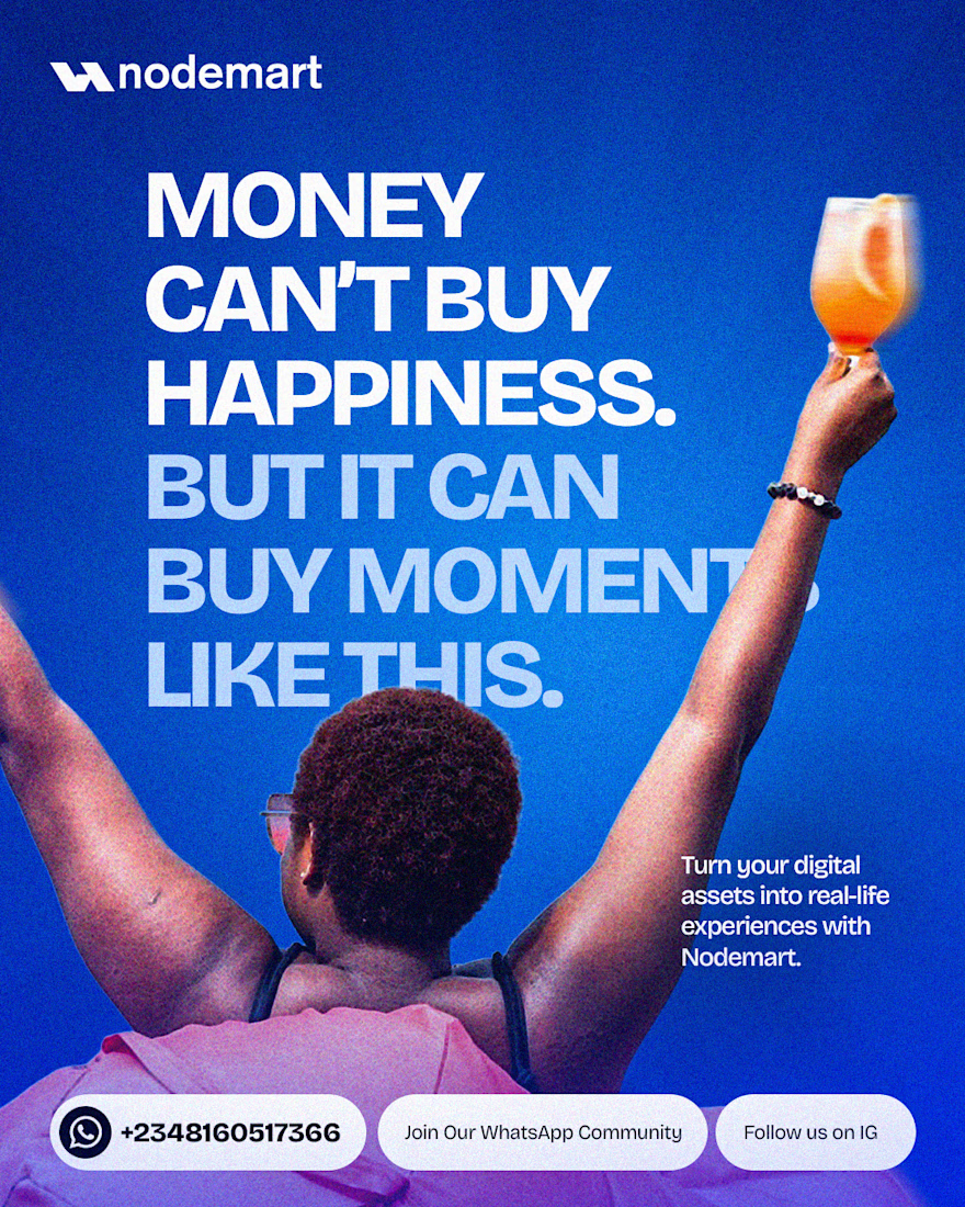
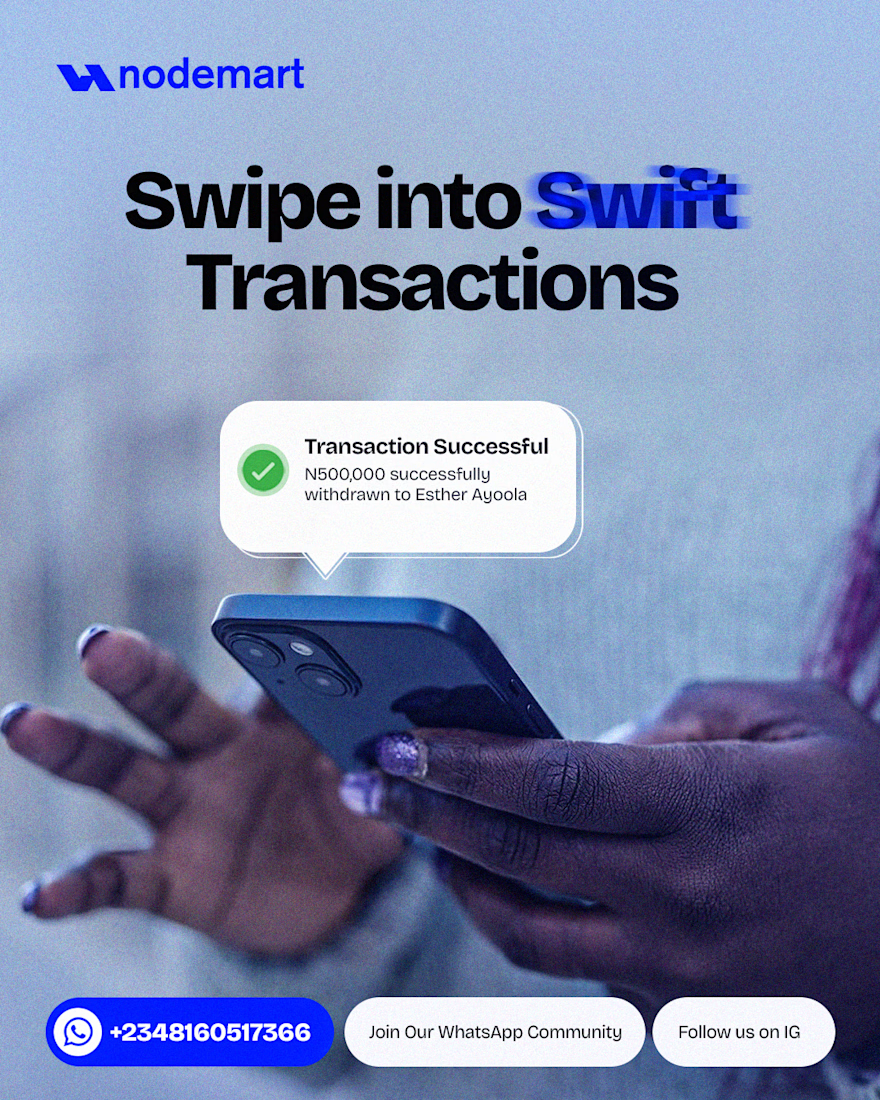
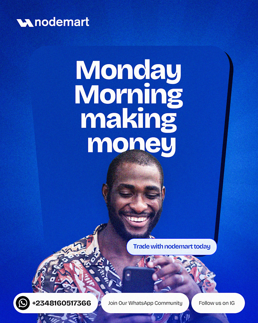
A few pieces from my work for Nodemart — different messages, different moments, but one visual language throughout.
I’m Damilola, a Product Designer who also designs the visual presence around the product.


Great work