The network for creativity
Join 1.25M professional creatives like you
Connect with clients, get discovered, and run your business 100% commission-free
Creatives on Contra have earned over $150M and we are just getting started
Back to feedPost
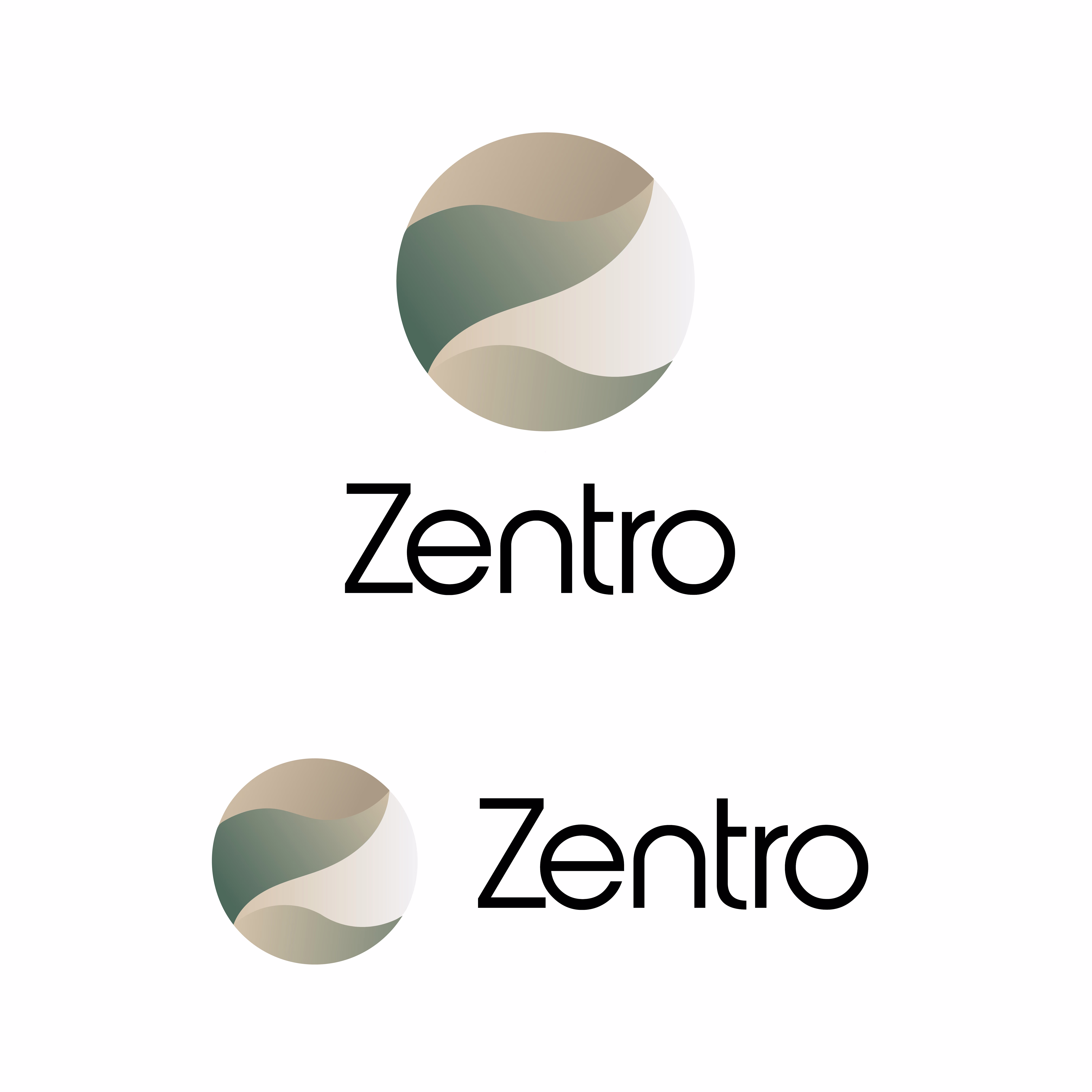
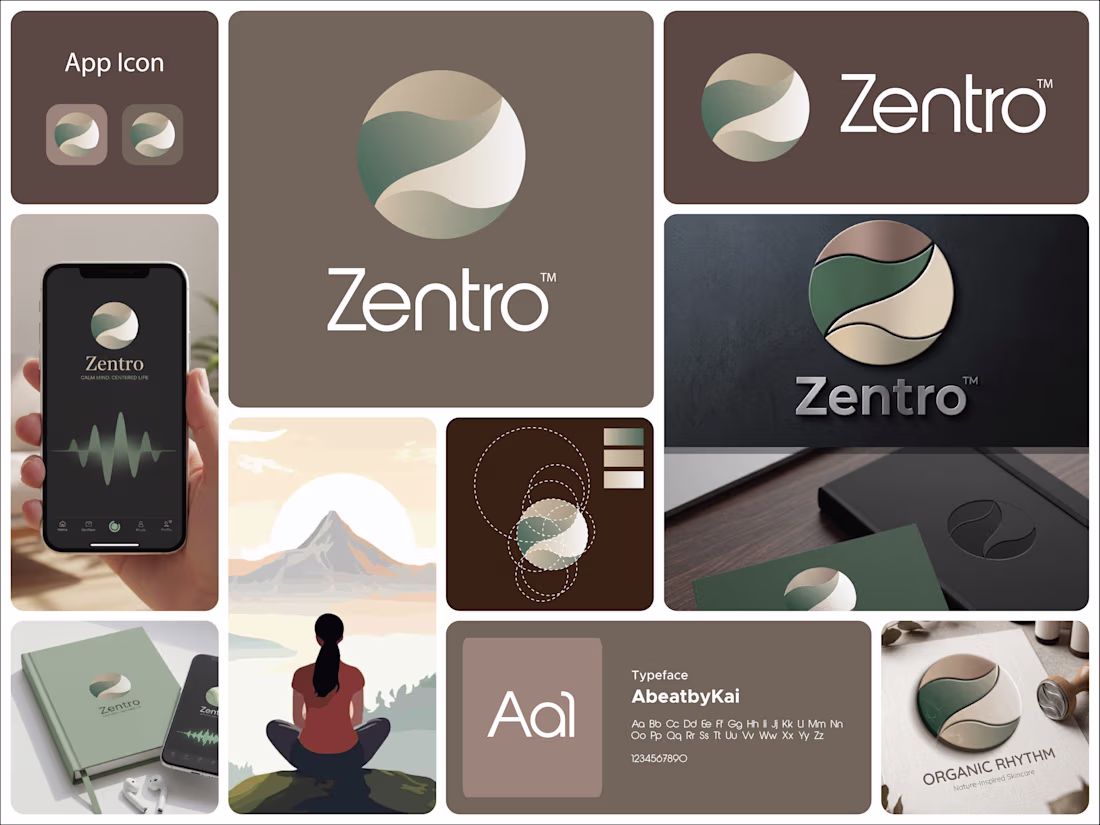
This logo for Zentro is built around calm, balance, and centered living.
The symbol is a circular form, representing wholeness, unity, and completeness. It reflects the idea of being centered, both mentally and emotionally, which aligns perfectly with a meditation or mindfulness-focused brand.
Inside the circle, the flowing shapes create a soft, continuous movement. These curves feel natural and organic, almost like a gentle path or breath flow. They subtly guide the eye through the mark, reinforcing a sense of calm and balance rather than tension or sharp direction.
There’s also a quiet suggestion of a path or journey within the form. It hints at self-discovery and inner alignment without being literal, keeping the design minimal but meaningful.
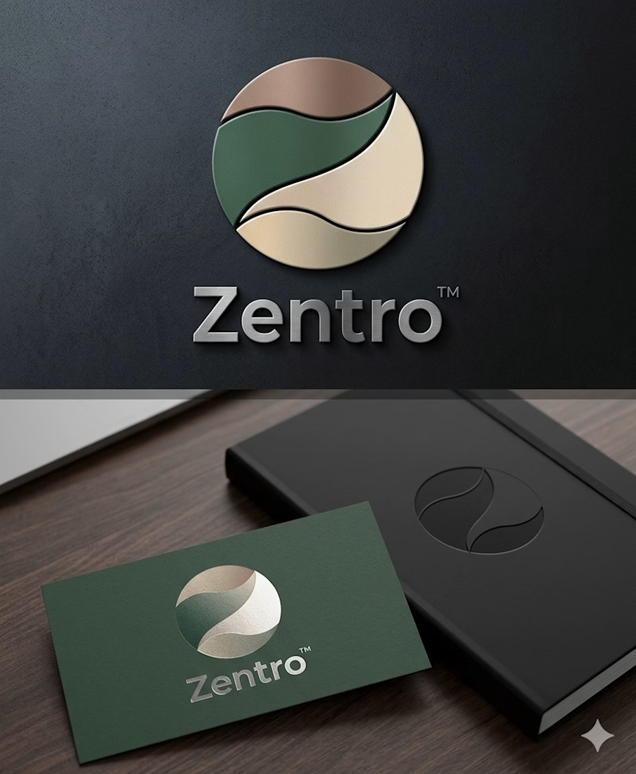
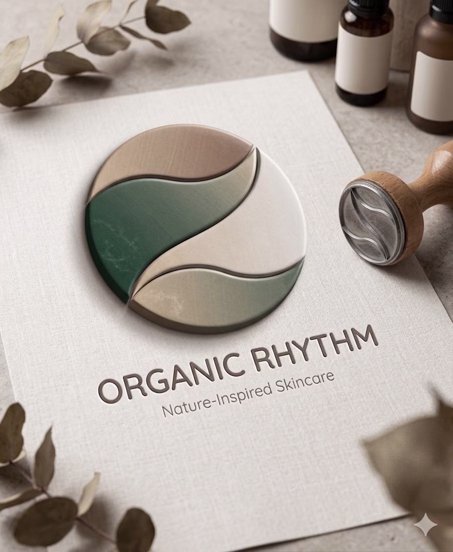
The color palette plays a big role here. The muted greens and earthy beige tones bring a grounded, natural feeling. Green connects to growth and harmony, while the warm neutrals add softness and stability. Together, they create a peaceful and reassuring visual tone.
The typography is clean and modern, providing contrast to the organic symbol. It keeps the identity clear and professional while letting the icon carry the emotional and conceptual weight.
Overall, the logo communicates a simple idea: Zentro is about finding balance, staying centered, and moving through life with calm and clarity.
The network for creativity
Join 1.25M professional creatives like you
Connect with clients, get discovered, and run your business 100% commission-free
Creatives on Contra have earned over $150M and we are just getting started
Related posts
GenLayer is a brand for thinking machines. So the identity had to think too.
Instead of a static pattern I built a fluid animation system: lines that continuously flow into one another, the way AI evolves through new thoughts and ideas. One system, endless moments, the same waves that breathe on the website also carry a conference wall or a product reveal.
That's my bar for an AI-driven brand style: not "does it look techy," but "does it behave like the product."
Curious how other designers handle this: when your identity is animated or generative, how do you keep it recognizable without freezing it into a template?
That line about one system with endless moments really lands, especially paired with the waves visual. Did you build the animation in After Effects directly or block it out somewhere else first?
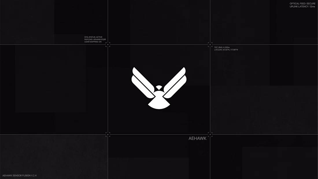
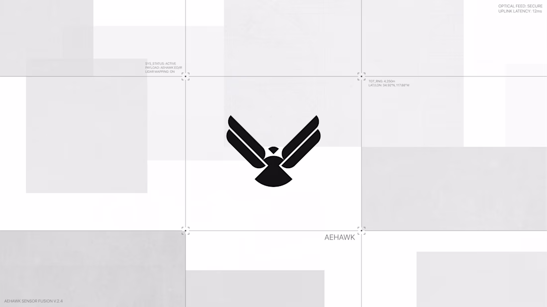
The AEHAWK wing mark is a great middle ground, reads as aerospace/defense without going full clip-art eagle. Testing it on both black and light backgrounds like that, is contrast across different deployment contexts a big requirement for this client?
Hi Contra Community! 👋
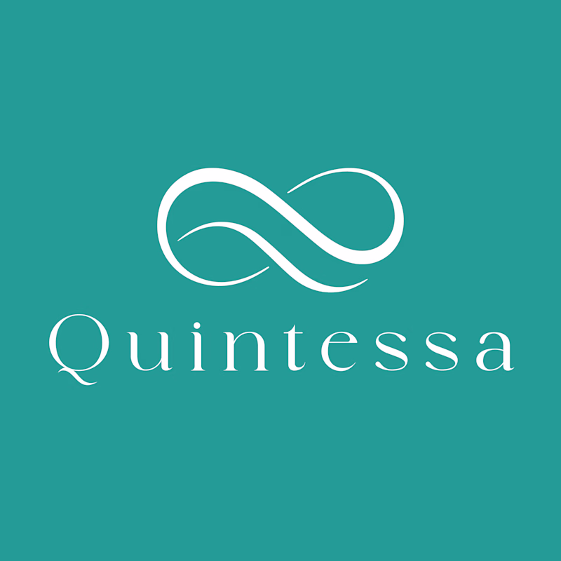
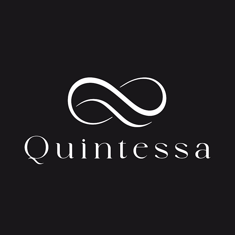
I'm presenting this logo concept for Quintessa, an ultra-luxury brand, and I'd love to hear your honest feedback.
Which color combination best communicates luxury, trust, and exclusivity?
Also, if you have suggestions for improving the logo itself, I'm all ears. Your feedback is greatly appreciated!
3 voted
38%
5 voted
62%
8 votes
Closed
I noticed how the overlapping ribbon mark subtlely tapers right at the intersection points, creating a smooth sense of dimensional depth and continuous motion without needing heavy drop shadows or complex gradients. It balances really well with the clean stroke contrast of the...
Trending
Claude
Claude has entered the design space. How are you using Claude Design?
Contra University
Learn from expert creatives how to earn more using next-gen AI tools.
creativeaiflow
Creative AI workflows are evolving. What tools do you use, and what are their strengths and weaknesses?
freelancerlife
Freelancer life is wins, pivots, and everything in between. What’s yours right now?