The network for creativity
Join 1.25M professional creatives like you
Connect with clients, get discovered, and run your business 100% commission-free
Creatives on Contra have earned over $150M and we are just getting started
Back to feedPost

GenLayer is a brand for thinking machines. So the identity had to think too.
Instead of a static pattern I built a fluid animation system: lines that continuously flow into one another, the way AI evolves through new thoughts and ideas. One system, endless moments, the same waves that breathe on the website also carry a conference wall or a product reveal.
That's my bar for an AI-driven brand style: not "does it look techy," but "does it behave like the product."
Curious how other designers handle this: when your identity is animated or generative, how do you keep it recognizable without freezing it into a template?


Amazing work!

That line about one system with endless moments really lands, especially paired with the waves visual. Did you build the animation in After Effects directly or block it out somewhere else first?


One of the best designs I’ve seen today. Really solid work 👏 That continuous flow system would look breathtaking live on a Framer canvas.

That distinction between looking techy and behaving like the product is a sharp way to frame it. I usually keep recognizability by locking one constant, like a color pairing or line weight, and letting everything else move freely around it.

nice work

The flowing-line system holds together from the website to the conference wall. How do you decide which features of a generative identity must stay fixed for it to remain recognisable?
The network for creativity
Join 1.25M professional creatives like you
Connect with clients, get discovered, and run your business 100% commission-free
Creatives on Contra have earned over $150M and we are just getting started










Related posts

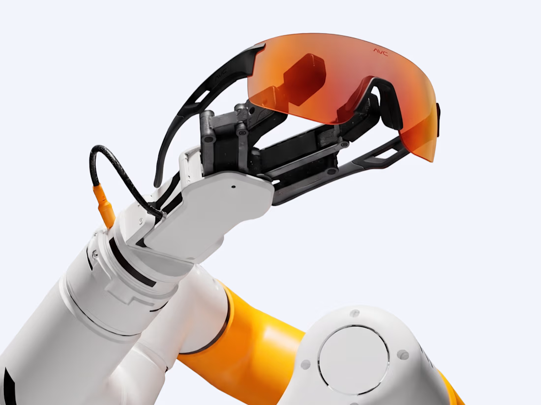
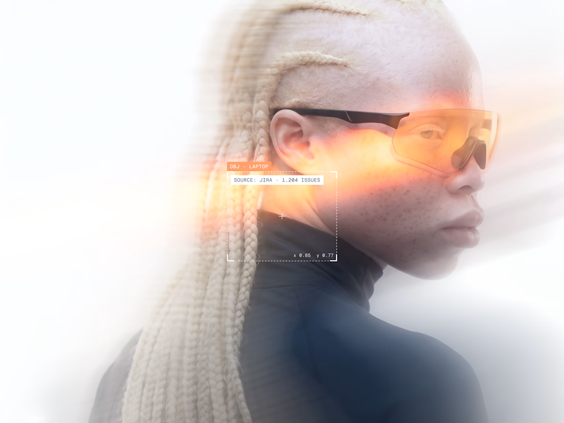
A personal brand concept exploring the future of AI-powered performance eyewear.
I wanted to create something that blends sports, technology, and futuristic aesthetics into one cohesive visual identity.
From the eyewear design and product visuals to art direction, 3D renders, and motion every detail was developed to give AVC its own distinctive character.
Not just another pair of sports glasses. A vision of what next-generation wearable technology could look like.
More explorations coming soon.


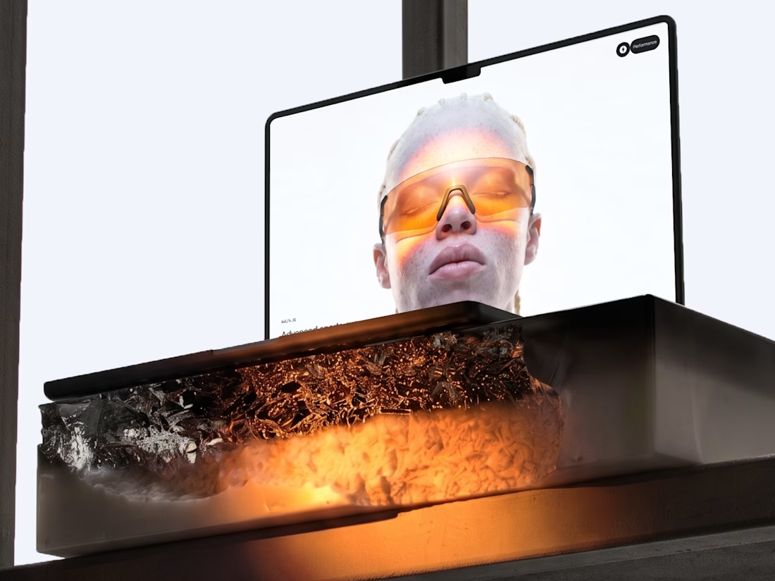

Blending sports and tech into eyewear is a tough positioning, but the system holds together — the renders, art direction, and product visuals all speak the same visual language rather than competing. Where the execution lands next will be in the packaging and retail touches; if...


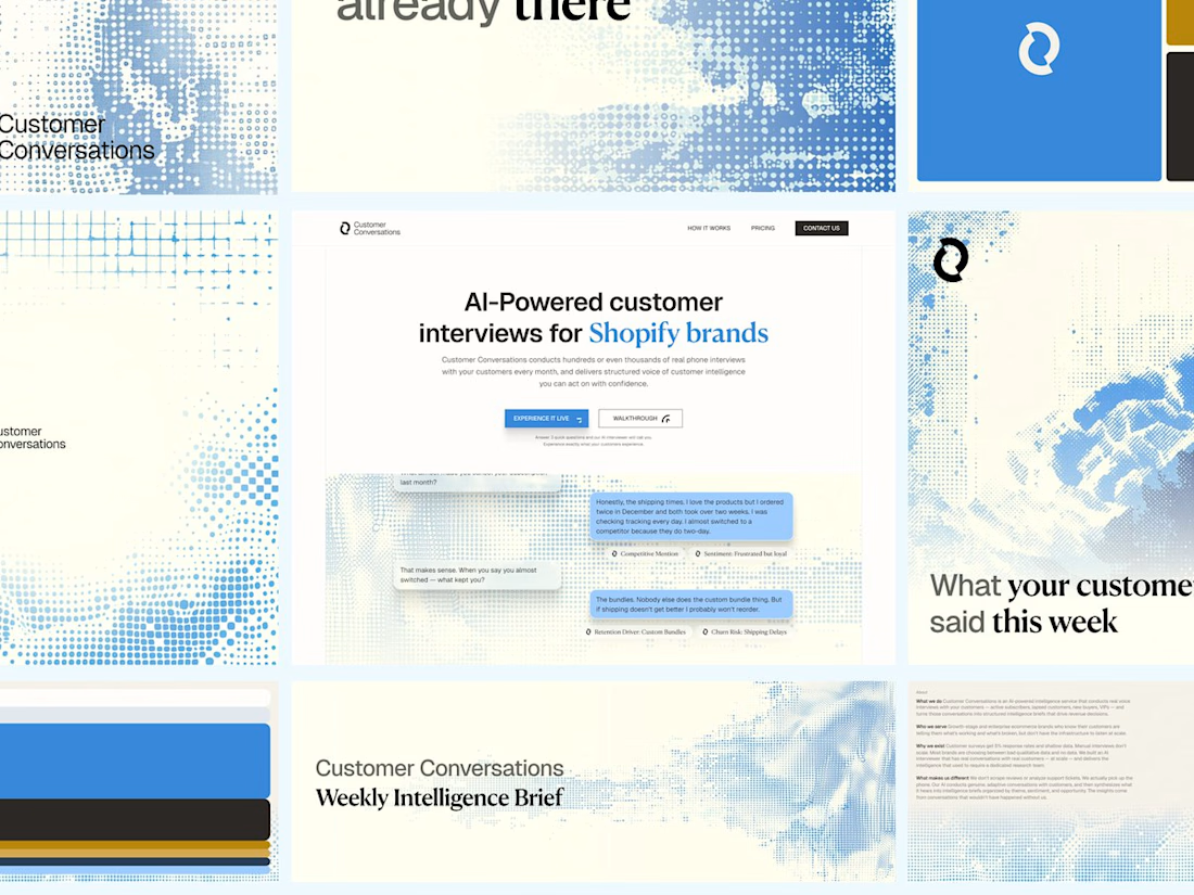
Customer Conversations is an AI that calls a store's customers and interviews them. Explaining that took half of every sales call.
Three weeks after Bryan Starck brought it to us, it had a brand and a homepage built to do the explaining. Answer three questions and the AI calls you for a real interview in 60 seconds.

Nice design
A personal brand concept exploring the future of AI-powered performance eyewear.
I wanted to create something that blends sports, technology, and futuristic aesthetics into one cohesive visual identity.
From the eyewear design and product visuals to art direction, 3D renders, and motion every detail was developed to give AVC its own distinctive character.
Not just another pair of sports glasses. A vision of what next-generation wearable technology could look like.
More explorations coming soon.
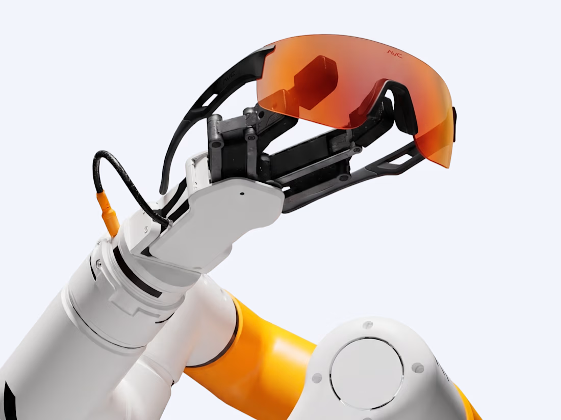
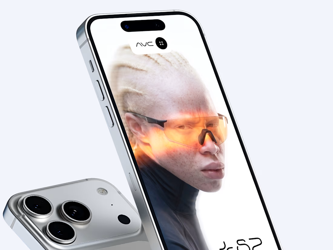
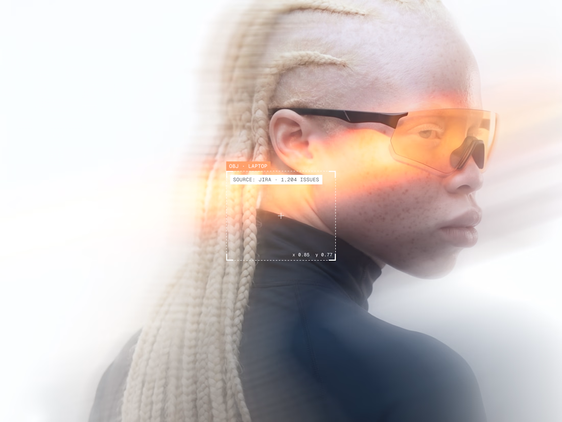

This is next level! 🔥 The way you blended sports + tech + futuristic aesthetic is insane. That robotic arm holding the orange lens and the HUD-style glare effects are so sick. Feels like Oakley meets Apple Vision. Super cohesive identity!