The network for creativity
Join 1.25M professional creatives like you
Connect with clients, get discovered, and run your business 100% commission-free
Creatives on Contra have earned over $150M and we are just getting started
Back to feedPost
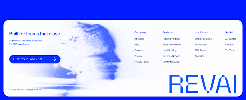
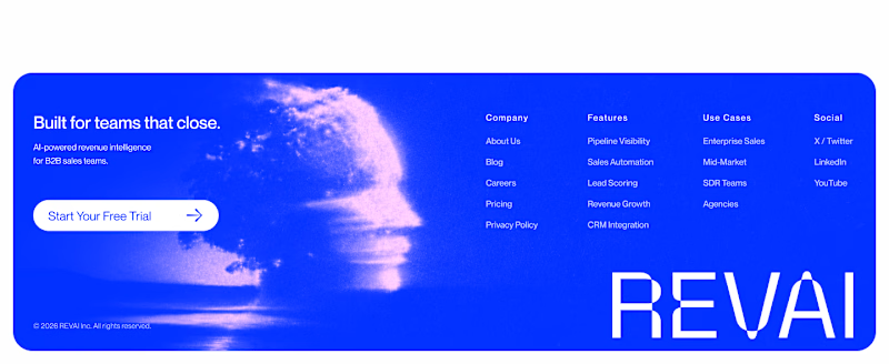
Taste Test

Footer exploration for an AI-powered platform built for B2B sales teams.
Which one would you pick — 1 or 2?

57 votes
Ends in 8h

The blue footer feels more confident for a B2B sales product—the contrast gives the navigation and CTA a clearer presence. I’d pick Blue Footer.
Thanks for your comment! In my opinion, the CTA, logo, and navigation integrate better in the blue option.

Blue footer, no contest, it makes REVAI feel like it's still in motion instead of just sitting there. Did the client already have a pull toward one before you showed them these two?
Thanks for commenting! Yes, on the blue background the illustration looks more dynamic, with movement. It’s not for a client, just a design exercise.

White footer for me here. B2B sales tools live or die on feeling trustworthy and easy to scan, and a heavy blue block at the bottom can start competing with the CTAs above it. I'd save the color for one strong accent instead of the whole footer.
I think what you say is fair — white can convey more seriousness and clarity, while blue, in my opinion, looks more dynamic.

blue footer...🔥

I'd pick Blue Footer


Premium look !


Going with 2 (Blue). The gradient gives it that premium AI feel, which works well for a B2B sales tool. White is clean but blue has more personality for a product trying to stand out.
Completely agree with you — the blue version has more of an AI character than the white one and more personality, while the white feels more serious. Thanks!

This one really depends on the section above - both look great, but still going for Blue because its clearer:)
Yes, you’re right — it totally depends on the previous section. The idea is just to see the perception in the footer. Thanks a lot for commenting!

The blue footer 💯
Great work, Ivan
Thanks, I'm glad you like it!

The full blue background feels way more grounded and intentional.
Yup, I feel the blue shows more personality and character than the white one

Use Cases is split by buyer, Enterprise Sales through Agencies, so the footer does routing rather than just listing links. That structure holds in either colour.
Yes, that doesn’t change — the idea is to see the interpretation in terms of what each one visually expresses.


blue one

blue footer all day, that deep blue gives the CTA way more weight and the whole thing feels more premium. white one kinda fades out at the bottom for me

i love a blue footer 💖

The network for creativity
Join 1.25M professional creatives like you
Connect with clients, get discovered, and run your business 100% commission-free
Creatives on Contra have earned over $150M and we are just getting started

Challenges
View all


Related posts


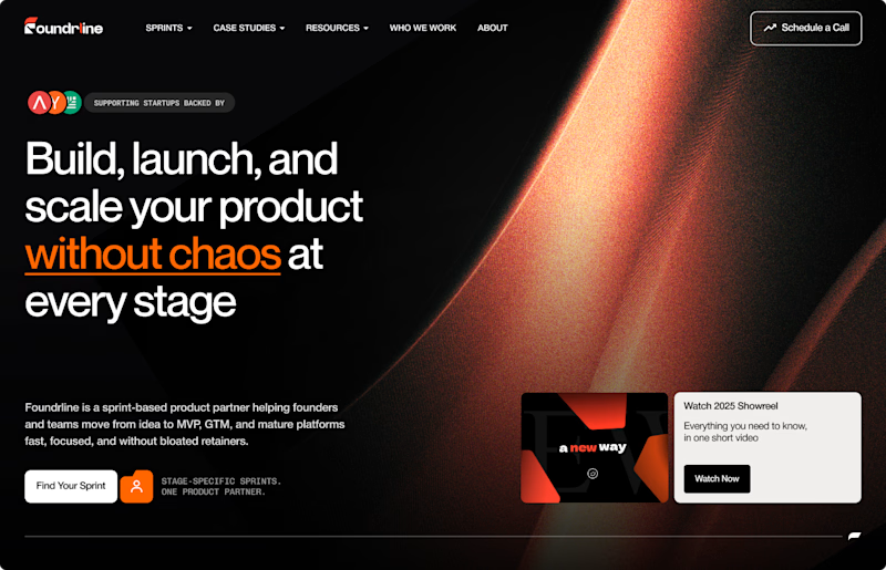
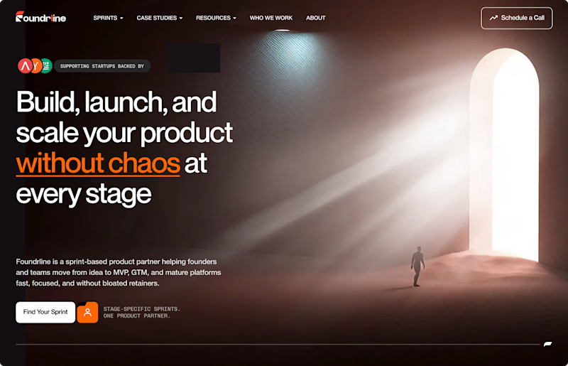

The path someone needs to follow for light to scale. Perfect!


Help me decide which game icon is good..!
Web game link: https://playgama.com/game/starweave-make-constellations?clid=p_11001f19-1b7d-4d6f-bf33-8e495b474e06
4 voted
19%

17 voted
81%

21 votes
Closed

Star with obstacle

More visuals from the rejected brand direction I shared earlier.
Really good to see this direction resonating with so many of you. It was one of our favourite explorations to build, from the narrative behind it to the visual world that brought it to life.
Great work doesn’t always make the final cut, and sometimes the reason has little to do with the quality of the direction.
Curious why this one was rejected? I’ve shared the story in the first comment✨


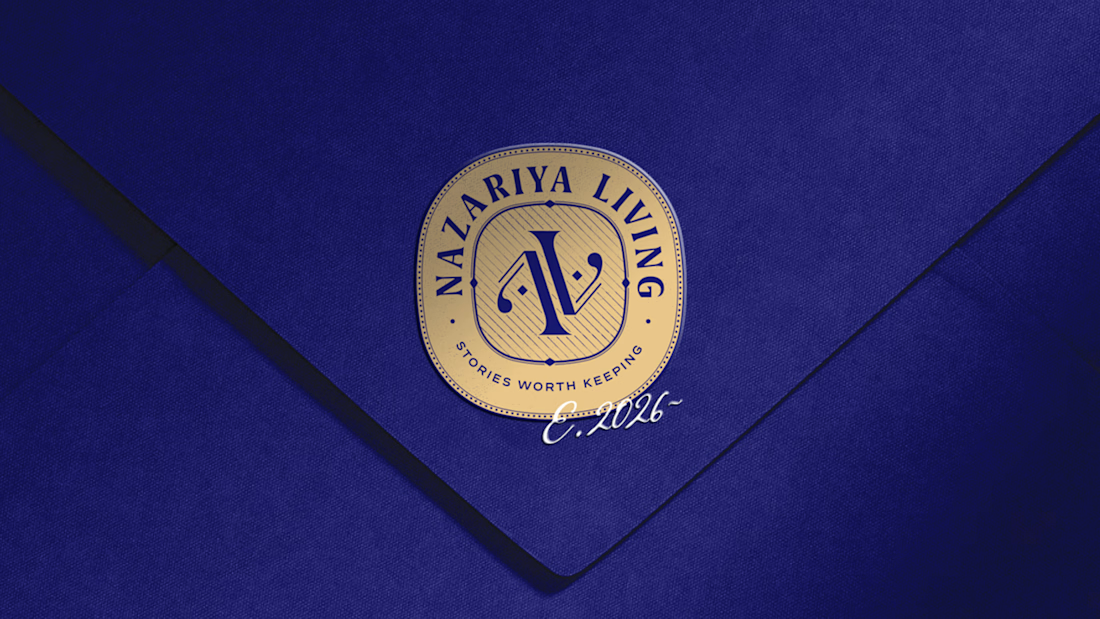
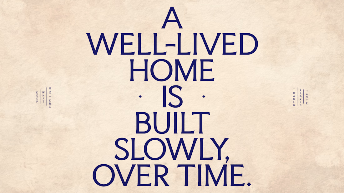
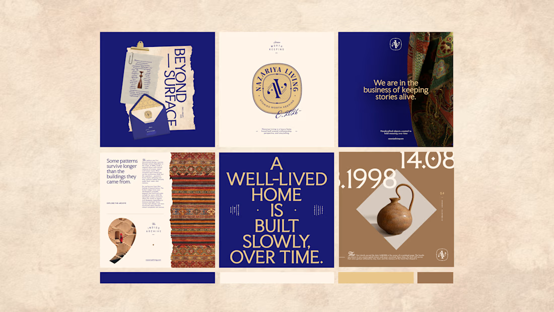
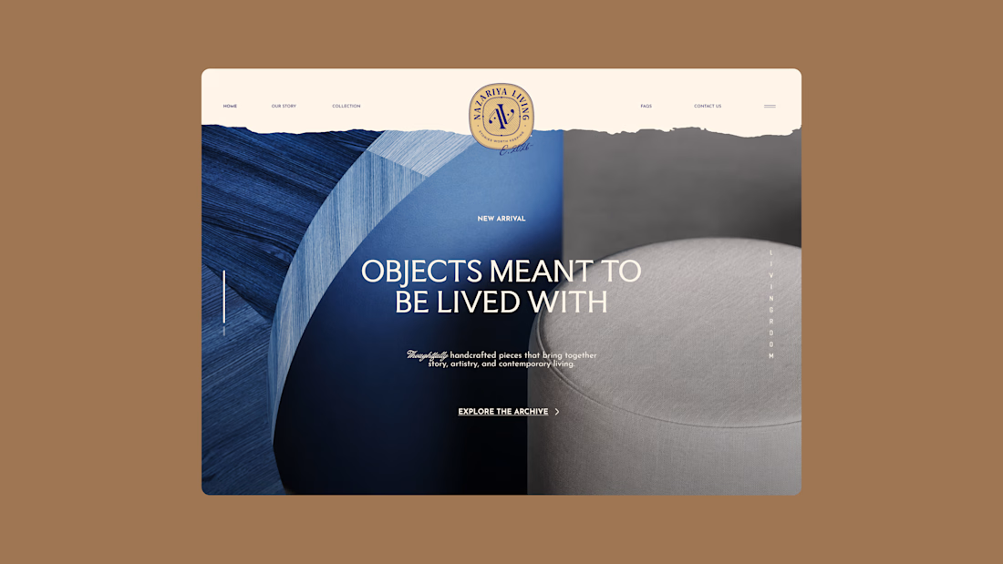
Nazariya Living is a premium carpet and home décor brand shaped by craftsmanship, culture and the stories objects carry into our homes.
This direction brought that idea to life through a seal-inspired logo, archival textures, unexpected colours and editorial typography, creating...