The network for creativity
Join 1.25M professional creatives like you
Connect with clients, get discovered, and run your business 100% commission-free
Creatives on Contra have earned over $150M and we are just getting started
Back to feedPost

Archevia Designs Luxury Architectural & Interior
The Vision
When a studio designs high-end, bespoke residential spaces, their own brand identity must reflect the exact level of precision, luxury, and tranquility they deliver to their clients. Archevia Designs needed a visual presence that instantly communicated architectural expertise and refined taste to high-net-worth homeowners, setting them apart from standard interior decorating firms.
The Execution
To capture the essence of structural elegance, I designed a minimal, monoline emblem utilizing symmetrical arches. This subtle nod to classical architecture and vaulted ceilings creates a sense of space and balance.
Rather than stark black and white, I anchored the identity in a warm, stone-neutral color palette—utilizing rich earth tones, soft creams, and taupe. This strategic color choice makes the brand feel grounded, organic, and incredibly sophisticated. The icon is paired with a sleek, airy sans-serif wordmark that gives the brand a modern, editorial finish.
The Value
A luxury service requires a luxury facade. This cohesive brand system allows Archevia Designs to present themselves with undeniable authority. Whether embossed on a business card, displayed as 3D wall signage in a studio, or acting as the header of a six-figure design proposal, this identity justifies a premium price point.
Project Scope & Deliverables:
Brand book
Primary Arch Emblem & Minimalist Wordmark
Logo dissections
Logo variations/ lockups
Source files / printable files / SVGs
Website materials
Stationary designs
Email signatures
Table signboard designs
Signboard / bill board designs
Thank you card design
Custom Stone-Neutral Color Palette
Typography System
Photorealistic Environmental Mockups (Interior Signage & Print)
Your high-end services deserve a visual identity to match. If you are ready to position your business for a premium market and attract higher-paying clients, let’s connect and discuss your vision.
- Caden -


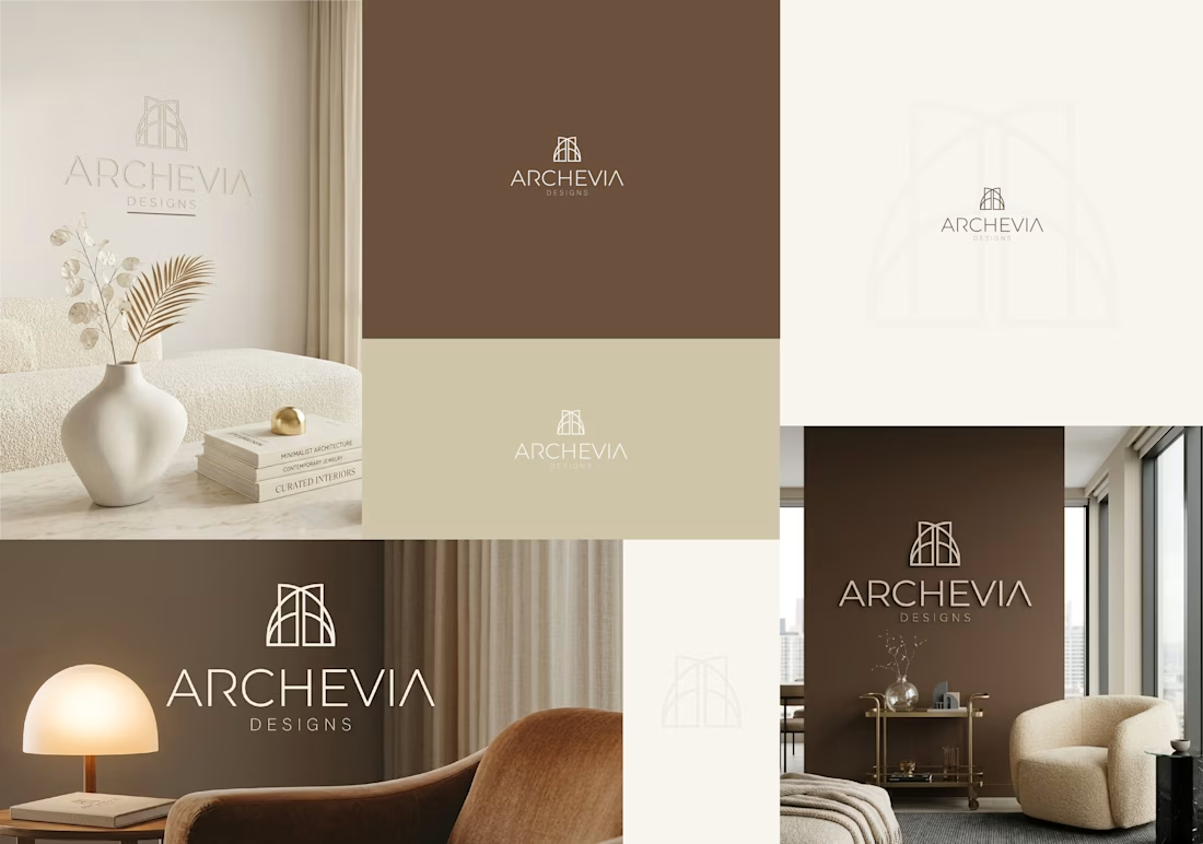

Monoline plus embossing is the pairing I'd pressure-test here — thin even strokes lose their edge once they're cut in relief, and with a stone-neutral mark on a warm neutral wall the only thing separating the arch from its background is the shadow the depth throws. Did you set a...
The network for creativity
Join 1.25M professional creatives like you
Connect with clients, get discovered, and run your business 100% commission-free
Creatives on Contra have earned over $150M and we are just getting started







Related posts

What if Google Maps had been designed in the 1920s? 👀
For the #revival challenge, I reimagined Google Maps through the visual language of Soviet Constructivism.
Routes become bold diagonals, turns become oversized arrows, and ETA and distance become strong typographic statements. Navigation stops feeling like a quiet interface and starts feeling like a piece of graphic propaganda telling you exactly where to go.
Such a fun exercise in taking something extremely familiar and asking how differently it could have been designed in another time.
Your turn!
What modern product would you send back in time, and to which era? 👀

Curious whether the diagonals fought you at phone size — Constructivist posters were built for one long look from across a room, while a nav screen only gets half-second glances from someone already moving. For your question: airline safety cards, sent back to 1960s Swiss...

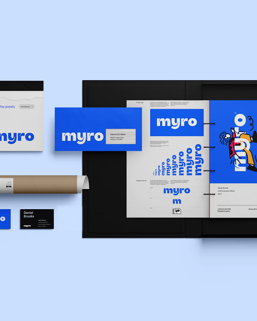
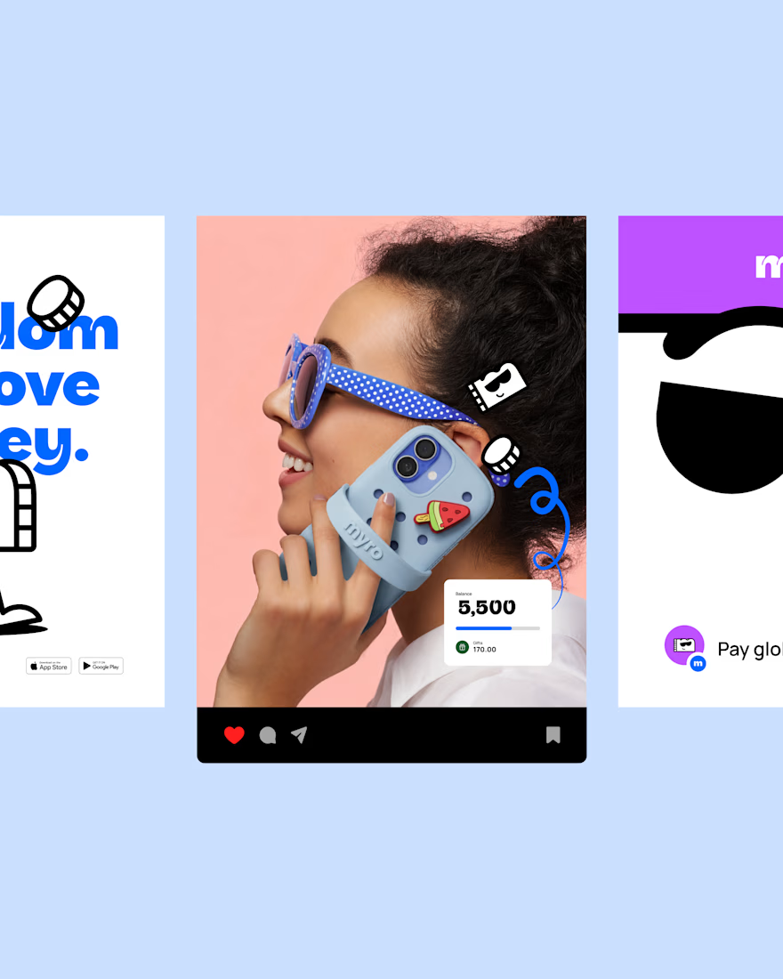
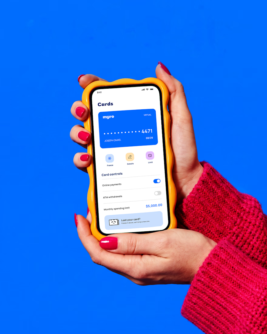
Myro Brand Identity 2026
https://www.behance.net/gallery/254845405/MYRO-Branding
In collab with @ADEDIJI ZACCHEAUS


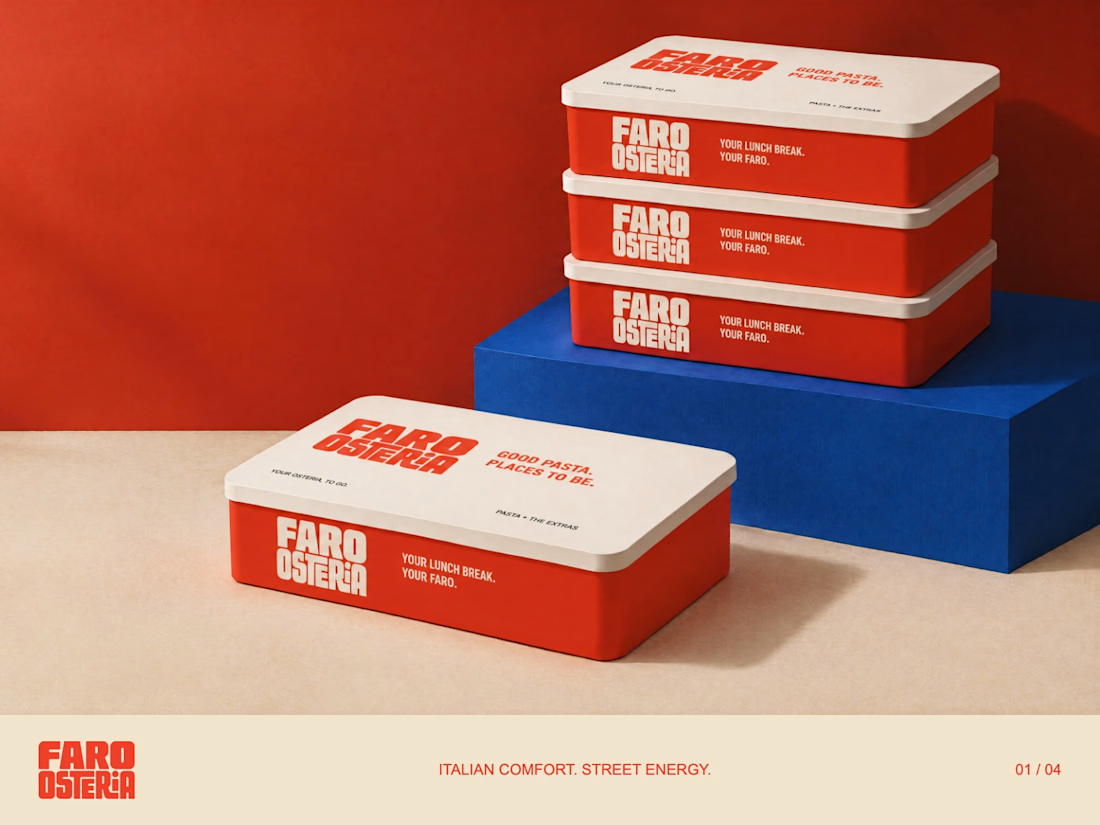
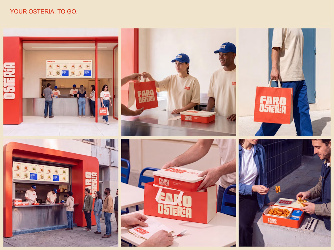
FARO OSTERIA — Italian comfort. Street energy.
A brand and takeaway concept built around the entire meal: bold packaging, a clear digital menu and a street presence that carries the same identity from counter to customer.
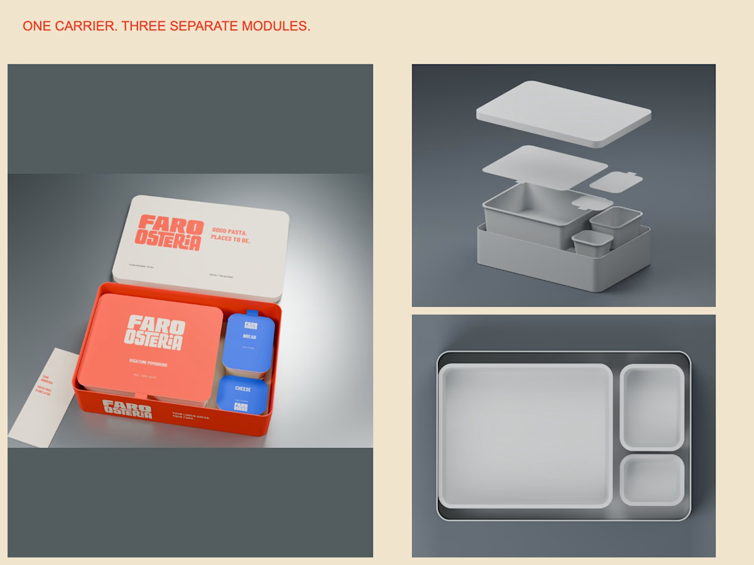
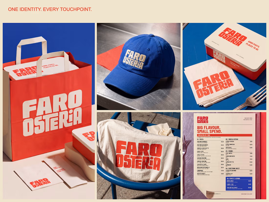
The packaging study uses one carrier with separate pasta, bread and cheese modules. The visual system extends through a $5–$7 pasta menu, uniforms, bags and editorial campaign imagery.
Creative Direction — Mauricio Pontual.
Concept study. Packaging modelled in Blender; campaign imagery developed with AI-assisted tools and art direction.
Explore the complete project:
https://www.behance.net/gallery/255879863/Faro-Osteria-Food-Branding-Packaging-Design



Amazing🙌