
Caden
Hi, I’m Caden. I design modern high end brands & websites
New to Contra
Caden is ready for their next project!
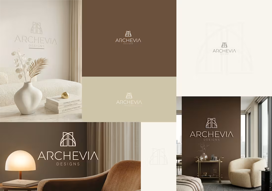
Archevia Designs Luxury Architectural & Interior
The Vision
When a studio designs high-end, bespoke residential spaces, their own brand identity must reflect the exact level of precision, luxury, and tranquility they deliver to their clients. Archevia Designs needed a visual presence that instantly communicated architectural expertise and refined taste to high-net-worth homeowners, setting them apart from standard interior decorating firms.
The Execution
To capture the essence of structural elegance, I designed a minimal, monoline emblem utilizing symmetrical arches. This subtle nod to classical architecture and vaulted ceilings creates a sense of space and balance.
Rather than stark black and white, I anchored the identity in a warm, stone-neutral color palette—utilizing rich earth tones, soft creams, and taupe. This strategic color choice makes the brand feel grounded, organic, and incredibly sophisticated. The icon is paired with a sleek, airy sans-serif wordmark that gives the brand a modern, editorial finish.
The Value
A luxury service requires a luxury facade. This cohesive brand system allows Archevia Designs to present themselves with undeniable authority. Whether embossed on a business card, displayed as 3D wall signage in a studio, or acting as the header of a six-figure design proposal, this identity justifies a premium price point.
Project Scope & Deliverables:
Brand book
Primary Arch Emblem & Minimalist Wordmark
Logo dissections
Logo variations/ lockups
Source files / printable files / SVGs
Website materials
Stationary designs
Email signatures
Table signboard designs
Signboard / bill board designs
Thank you card design
Custom Stone-Neutral Color Palette
Typography System
Photorealistic Environmental Mockups (Interior Signage & Print)
Your high-end services deserve a visual identity to match. If you are ready to position your business for a premium market and attract higher-paying clients, let’s connect and discuss your vision.
- Caden -
2
2
65
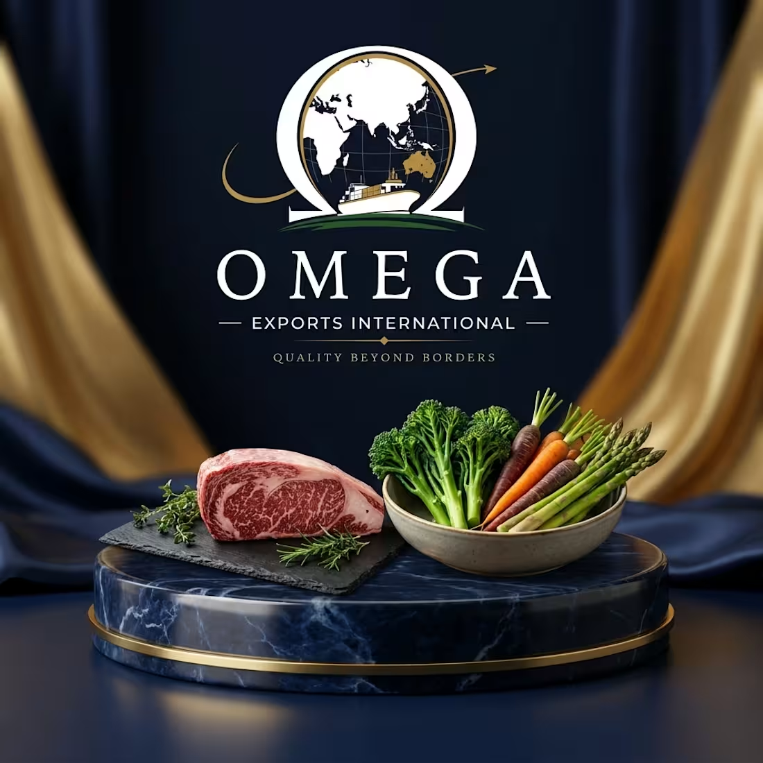
Omega Exports International – Corporate Brand Identity
The Overview
In the high-stakes logistics and international trade sector, trust is a company's most valuable currency. Omega Exports International needed a visual identity that instantly communicated global scale, reliability, and established corporate authority. The goal was to build a brand that commands respect in international boardrooms and stands out in the competitive export market.
The Strategic Design
I developed a comprehensive, authoritative emblem that seamlessly integrates the structural strength of the Omega symbol with maritime logistics and global reach.
Visual Iconography: The design anchors the globe within the Omega letterform, while a sweeping gold arrow introduces dynamic, forward momentum perfectly visualizing their tagline, "Quality Beyond Borders." The detailed cargo ship roots the brand in its core industry without feeling generic.
Color Palette: To position Omega as a premium corporate entity, I utilized a classic deep navy and refined gold color system. This specific combination is psychologically linked to security, wealth, and unwavering reliability.
Typography: A sophisticated, tailored serif wordmark was chosen to give the brand a timeless, established feel. It is structured to hold its weight beautifully, whether it is printed on premium corporate letterheads or scaled up on the side of a shipping container.
The Result
A commanding corporate identity that elevates Omega from a standard logistics service to a trusted global authority. It proves that B2B and industrial branding can still be highly sophisticated and visually striking.
Services Provided:
Brand Strategy & Positioning
Primary & Secondary Logo Design
Color Palette & Typography Curation
Corporate Brand Guidelines
Corporate high end website design / development & deployment - https://omegaexportsinternational.com.au
2
96
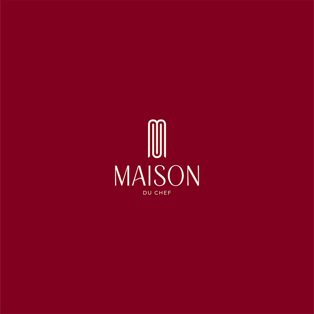
Maison Du Chef – Premium Private Fine-Dining
For Maison Du Chef, a bespoke private chef service offering elite fine-dining experiences, I developed a sophisticated visual identity that captures the essence of culinary mastery and exclusivity.
The Goal:
The client required a brand identity that felt intimate yet prestigious, communicating high-level personal service for those seeking a Michelin-standard experience in a private setting. The visual presence needed to reflect professional craftsmanship and an elevated level of hospitality.
The Solution:
I designed a refined, minimalist monogram that utilizes rhythmic, vertical lines to create an elegant, abstract representation of the letter "M". This linear icon is paired with a high-contrast, classic serif typeface, emphasizing a sense of heritage and artisanal precision. To evoke a feeling of richness and warmth, I implemented a palette of deep burgundy, soft cream, and gold accents. This combination ensures the brand feels both sophisticated and welcoming, perfectly positioning Maison Du Chef as a premier choice for luxury private culinary rituals.
0
88
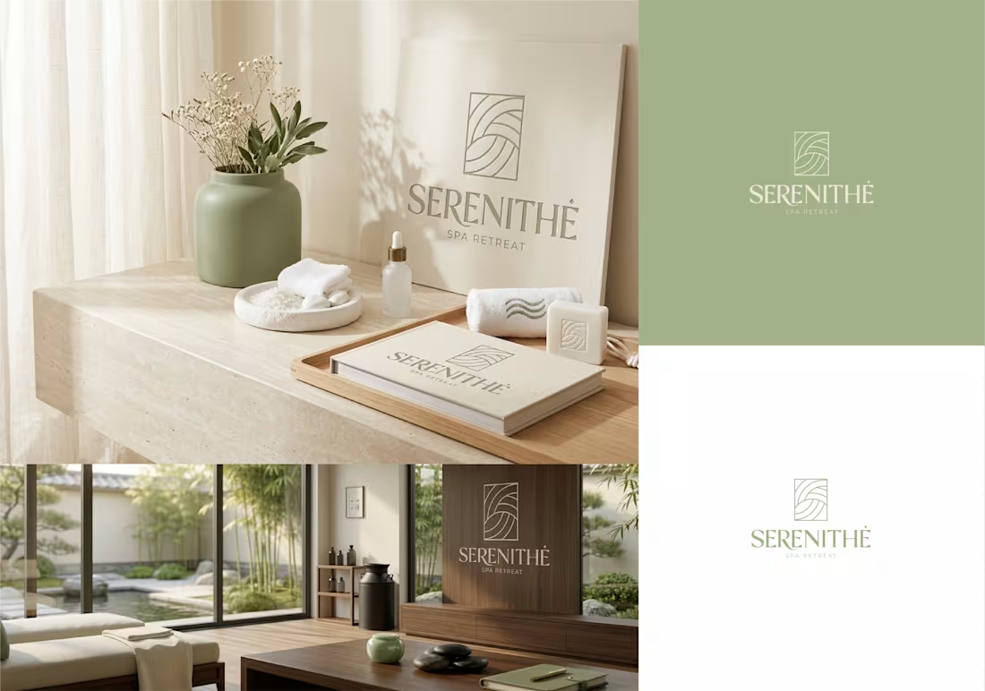
Serenithé Spa Retreat - Holistic Luxury & Wellness
😍
For Serenithé Spa Retreat, a wellness sanctuary offering holistic treatments and luxury spa rituals, I developed a sophisticated visual identity designed to inspire a sense of immediate tranquility.
The Goal:
The client required a premium brand presence that bridges the gap between ancient holistic traditions and modern luxury. The visual identity needed to feel high-end and exclusive while maintaining an organic, calming atmosphere that reflects the restorative nature of their rituals.
The Solution:
I designed a refined, abstract monogram that represents the letter "S" through a series of fluid, rhythmic lines. This linear approach symbolizes the movement of serene energy and the gentle flow of a wellness journey. To anchor the brand in a nature-inspired aesthetic, I utilized a sophisticated color palette of sage green, warm sand, and crisp white. This combination of minimalist linework and earthy tones ensures a professional and premium aesthetic, positioning Serenithé as a premiere destination for restorative wellness.
0
117